What-if analysis is an extremely powerful tool for decision making. Being able to explore different scenarios and understand the potential impact on your business is critical when deciding if, when, and how to implement changes. But if you have ever tried building this type of tool in Tableau, chances are, you have run into a few limitations.
When your simulations are limited to changing a single data point or a single measure, parameters are a helpful way to calculate the impact of that change. For example, if you wanted to increase the price of all of your products by a specific percentage, you can use a parameter to play with that percentage and see the overall impact. Ok, but what if there is a change in costs that is driving the need to adjust prices? Well, I guess you could use two parameters. But what if those changes aren’t uniform across all of your products? How do you change some, but not others, and how do you apply different changes to different sets of products? Well, at this point, most people will dump their data into Excel and do the work there. But I’m here to tell you that there is a better way.
This technique still leverages parameters, but all of the changes are stored in a single, long, string parameter. You can make as many changes as you want and all of the data is stored in one giant string. Then, there are a number of calculations you can use to parse that string into usable fields.
If you are a frequent visitor to this blog, you probably know that a lot of my blog posts are about building Useless Charts. Funny enough, I figured out this technique when I was attempting to build possibly the most useless chart of all time; a functioning Rubik’s Cube in Tableau. I have since used the same technique in several other other Tableau Public visualizations, including Checkers and the Tableau Drawing Tool. So although we’re going to be walking through a specific use case today, this same technique can be applied to countless other situations. So I’m going to focus mostly on the technique, and less on this specific use case.
What-If Scenario
Here is the scenario we are going to look at today. Our user wants to select a group of stores, and then be able to make the following changes to any Product Category, Product Sub-Category, Manufacturer, or individual Product. The user should be able to
- Apply a percentage price change (ex. +/- 10%)
- Apply a specific price change (ex. New Price = $5)
- Apply a percentage change to units to account for the impact to demand from the price change
- Apply a percentage change to unit cost
- Measure the impact to Revenue, Cost of Goods Sold, and Profit by Store, by Product Category, and Overall
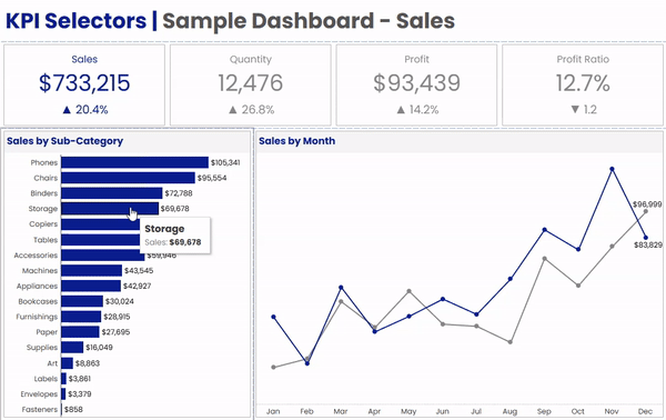
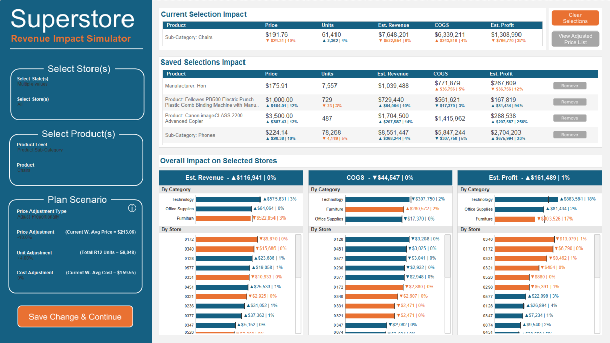
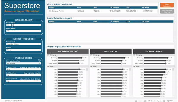
Well, it just so happens that I recently published a visualization for this exact scenario. I would recommend downloading the workbook from here if you want to follow along. Here is a quick look at that this tool in action.
In the GIF above, I made the following changes to all of the stores in Massachusetts and Connecticut
- For the Sub-Category “Phones”, I increased the price by 10% and reduced the expected units by 5%
- For the Product “Canon imageClass…” I changed the price to $3,500
- For the Product “Fellowes PB500 Electric…” I changed the price to $1,000 and reduced the expected units by 3%
- For the Manufacturer “Hon”, I increased the Unit Cost by 5%
- For the Sub-Category “Chairs”, I reduced the price by 10% and increased the expected units by 4%
In a matter of minutes I was able to make adjustments to different groups of products, change different metrics for each group by different amounts, and then view the overall impact to Revenue, Cost of Goods Sold, and Profit. And all without ever leaving Tableau.
The Data Source
The data for this example is very simple, and can be downloaded here. The granularity for the data source is by store and by product, with 1 record for each store/product combination. We have a few store attributes (State, City, Region, and Store ID), a few product attributes (Category, Sub-Category, Manufacturer, and Product Name), and our measures (Current Price, R12 Units, R12 Sales, and Current Unit Cost)
The Simulation Options
As I mentioned before, this technique can apply to countless scenarios. The technique will stay the same, but the options will change depending on your situation. For my use case, I separated the options into 3 groups; Store Selection, Product Selection, and Scenario Adjustments. Your use case may, and most likely will, call for completely different options. But I will touch on the Sets & Parameters I used for my example use case
Store Selection
For my use case I used two sets; one for selecting state(s) and one for selecting store(s). The reason I chose to use sets instead of filters is so that you could apply the changes to certain stores (and not others) and then view the company wide impact. Keep in mind, that this approach will not let you apply different changes to different stores. All changes will be applied to all of the selected stores. However, if that was a requirement, you could adjust your options to be able to do that.
Product Selection
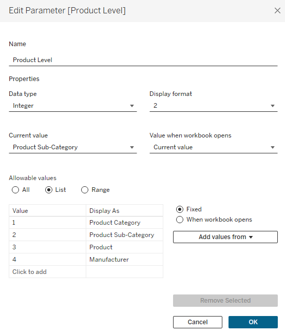
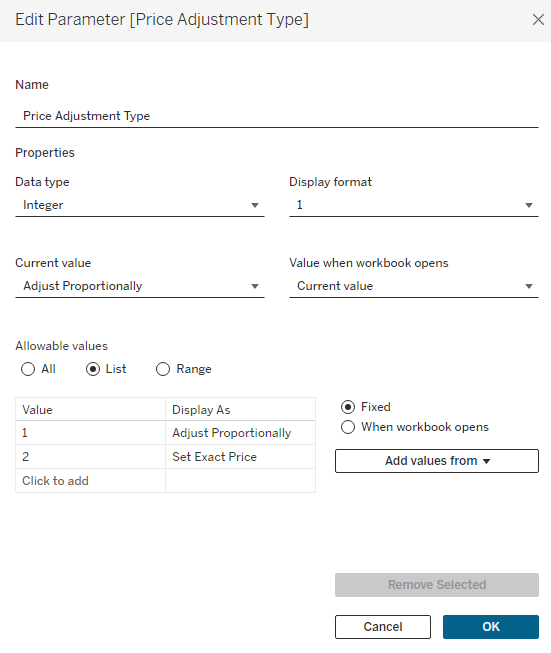
The requirements for this tool called for being able to adjust prices at 4 different product “levels”, or groups of products. So the first option I added was to select that Product Level. I chose to use an Integer parameter with values 1 to 4, with each number assigned to a different Product Level ( 1=Product Category, 2=Product Sub-Category, 3=Product, and 4=Manufacturer)
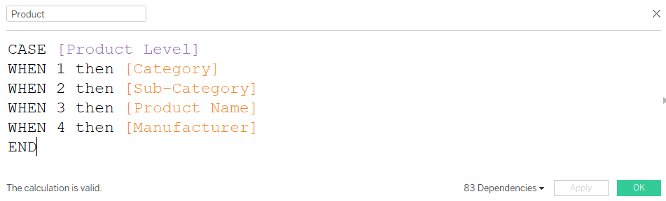
Next, I created a simple case statement to return the appropriate values depending on which Product Level is selected and called this [Product]
And finally, I created a set using the [Product] field called [Product Set]. Even if you are using just a single field for your use case (instead of the 4 I have here), you will still want to create a Set to be used for the selection on the dashboard (or you can use a Parameter).
In order to add my Sets to my dashboard (so users could make their selections), they need to be on a worksheet that is on the dashboard. I created a hidden worksheet called “Options” that has all 3 of my sets either on Detail, or on the Filter Shelf (the State Set is on the Filter Shelf so that the options in the Store Set are limited to the selected States). There is also 1 other field on the Filter Shelf that we will revisit later. This is to remove products from the list that have already been adjusted. I added this sheet as a Floating object to my dashboard, and set it so that the X and Y coordinates were 0,0 and the Height/Width were 1,1.
Its important to note that for this technique to work, you must limit the selection for the thing you want to change, in this case [Product], to a single selection at a time. When displaying this Set on the dashboard, make sure to select “Single Value (dropdown)” and in the “Customize” menu, de-select the “Show All Value” option.
Scenario Adjustments
For my use case there were 3 measures that we need to adjust; Price, Units, and Cost. The Price one is a little more complicated than the rest. If you are adjusting the price for an entire Product Category, you would probably want to apply a % change. But if you were adjusting the price for a single product, then you would probably want to enter a specific price. So my use case is built to handle both of these situations.
The first option is to choose how you want to adjust the price, either proportionally (with a % change), or by setting an exact price. Similar to the Product Level parameter, this is an Integer Parameter where 1=Proportional and 2=Exact.
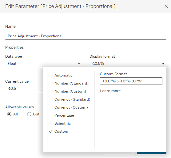
Next, I have 2 separate parameters for the Pricing Adjustment and I am using Dynamic Zone Visibility to display the appropriate one depending on which Price Adjustment Type is selected. These are both ‘Float’ types, but one is formatted as Currency and one is formatted to display as a percentage.
Finally, I have 2 more ‘Float’ type parameters for my last two options; one for the unit adjustment %, and one for the unit cost adjustment %.
This is completely optional, but for my 3 parameters that are based on % change (proportional price change, unit change, and unit cost change), I wanted to make it a little easier on the user to enter the percentages. For a change of 10.5% instead of having them type .105, I set it up so that they could type 10.5. Visually, I did that with the help of custom formatting, and then I’ll adjust that value with a calculation later on.
Capturing the Adjustments
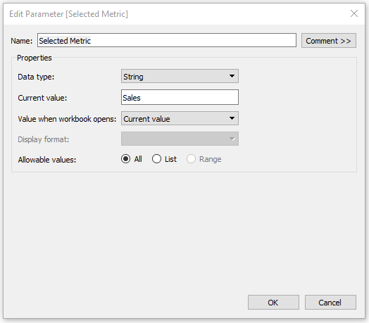
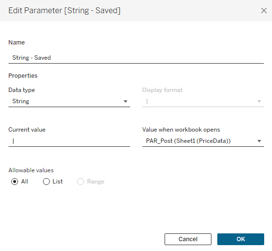
Now on to the fun part. We have set up our dashboard with all of the options we want for our users, now we just need to capture their inputs. The first thing we need to do is to create one more parameter to store all of the user selections. I’m going to call this [String – Saved], it’s going to be a String Type parameter, and the default value will be a ‘|’. I would recommend creating a calculated field with just ‘|’ and setting that field in the ‘Value when workbook opens’ option.
I’m using ‘|’ because it’s a character that is unlikely to show up in any product names. Each Product (or group of products) that is adjusted will be stored in this string, and they will be separated with a ‘|’. Think of each Product as a section in the string, and that section will contain the Product, and all of the other options set by the user for that Product. These options, within each section, will be separated by another character that is unlikely to appear in the Product Name. I typically use a ‘~’. An example with 2 Products (Sub-Category=Chairs and Manufactuer=Hon) adjusted would look something like this:
|Chairs~1~2~50~-4~0|Hon~4~1~0~0~10|
Building the String
There are a few things we need to do here. First, we need to create a calculated field to capture all of the current selections by the user. And second, we need a calculated field that combines that value with all of the changes that have already been saved.
String – Current
Here is my calculation to capture all of the user’s current selections. Note, that your calculation will likely look much different. Since this won’t be a copy and paste situation, I’ll walk through the structure of this calculation so you can modify it to fit your needs. Note that because this is a String parameter, you’ll need to Cast all of your numeric parameter values as string using STR(). Also, each line of the calculation, except for the last one, ends with adding ‘~’ to separate that input in the string.
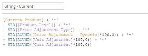
Line 1 – [Current Product] is a calculated field to capture what is selected in the [Product Set].
IFNULL({MIN(if [Product Set] then [Product] end)},”)
Line 2 – This casts the Product Level parameter (which is an integer) as a String. The Product Level parameter is the integer parameter that let’s users choose between Product Category, Product Sub-Category, Manufacturer, and Product.
Line 3 – This casts the Price Adjustment Type parameter (which is an integer) as a String. The Price Adjustment Type parameter is the integer parameter that allows users to choose between adjusting a price proportionally, or setting an exact price.
Line 4 – [Price Adjustment – Dynamic] is a calculated field that returns the value of either the Proportional or Exact parameter depending on what is selected for the Price Adjustment Type, and casts it as a String
CASE [Price Adjustment Type]
WHEN 1 then [Price Adjustment – Proportional]
WHEN 2 then [Price Adjustment – Exact]
END
*You will notice that this line of the calculation is rounded and multiplied by 100. The same is true with the next two lines. The reason for this is that Tableau does not handle rounding well when you are casting a decimal value as a string. You can round to 0 decimal points just fine, but are not able to round to 2, 3, etc. So this part of the calculation multiplies the value by 100 and then rounds to 0 decimal places (which would be the equivalent of rounding to 2 decimal points once you translate it back to a decimal value later on). If you need to be more precise than 2 decimal places, you can increase this value to 1000, 10000, etc.
Line 5 – This casts the Unit Adjustment parameter (which is Float) as a String
Line 6 – This casts the Cost Adjustment parameter (which is Float) as a String
Now you have a string that captures all of the current selections/options, with each option separated by a ‘~’. Here is an example:
- Product = Chairs
- Product Level = Sub-Category (parameter value = 2)
- Price Adjustment Type = Adjust Proportionally (parameter value = 1)
- Price Adjustment = +10%
- Unit Adjustment = -4.5%
- Cost Adjustment = +2%
Our string would look like this:
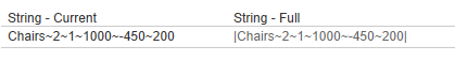
Chairs~2~1~1000~-450~200
- Chairs = The current Product Selection
- 2 = the Product Level parameter value (Sub-Category)
- 1 = the Price Adjustment Type parameter value (Adjust Proportionally)
- 1000 = 10 X 100 rounded to 0 decimal places
- -450 = -4.5 X 100 rounded to 0 decimal places
- 200 = 2 X 100 rounded to 0 decimal places
As I mentioned before, this calculation is going to look different depending on your use case, but the format should be the same. It’s the thing your changing + all of the different options you are giving the user, with each piece of the calculation separated by a ‘~’ (or another similarly unused character).
[Thing You’re Changing] + ‘~’ + [Option 1] + ‘~’ + [Option 2] + ‘~’ + [Option 3] and so on.
String – Full
This calculation is far simpler, and you should be able to copy and paste this no matter what your set up looks like. All it is doing is taking the [String – Current] value that you just built, and adding it to what has already been saved in the [String – Saved] parameter. So you build a string with all of the current options, then hit the “Save” button to add that string to the rest of the changes. This is how the string continues to build.
‘|’ + [String – Current] + [String – Saved]
Let’s say the string we built above was our 1st change. The result of the [String – Full] calc would be this. It’s just our [String – Current] value with a Post on each end
Now, let’s say we saved that change and then decided to increase the price of all Phones by 5%. Now our string calculations would look something like this.

Now the [String – Current] field has the selections for the Phones that we are currently working on, and the [String – Full] field has the selections for the Phones, and the selections for the Chairs that we already saved.
Saving the String
Now that we have our string, we need to build the mechanism to save it. This is pretty straightforward. You just build a worksheet with some type of button and drag the [String – Full] field to Detail. I’m using a Custom Shape, but you can also use any of the native Tableau Shapes or even Text. Customize it however you would like.
Then add that sheet to your dashboard and add a Parameter Action to update the [String – Saved] Parameter with the [String – Full] Field.
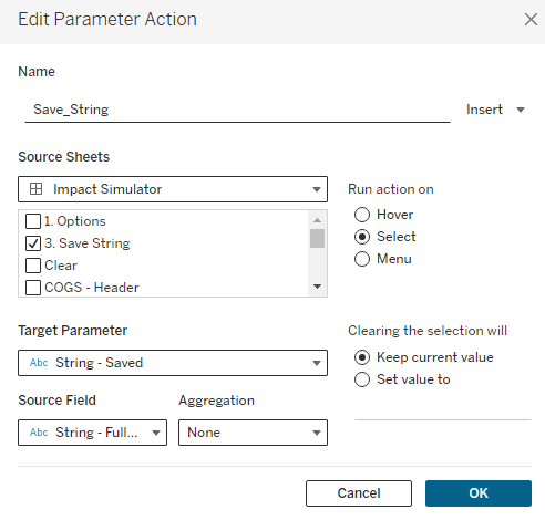
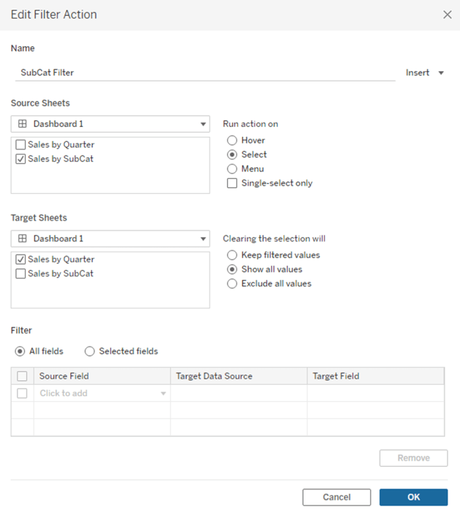
You can also add additional Parameter Actions from this ‘Save’ button. In my sample dashboard I am setting all of the Options back to 0 and clearing the Product Set each time this button is clicked. This gives the user a clean slate for each change and reduces the risk of applying unintended changes. I am also using the ‘Filter Action‘ technique to disable the highlighting when you click this button.
Parsing the String
We’re about half-way there. We have the ability to save all of the user’s selections but we still need to get that data into a usable format. The first thing we need to do is to identify which records in our data source are being adjusted. We’re going to do this by testing each of the Product Level fields (in this case those fields are Product Category, Product Sub-Category, Product, and Manufacturer) to see if they contain the Products in our String. This formula will change depending on your use case, but the basic premise is to check all of the fields that could have been used to populate the [Thing You’re Changing] in the [String – Current] calculation to see if there is a match. And if there is a match, to return that value. Here is my calculation called [Parse – Product].
if CONTAINS([String – Full],”|”+[Product Name]+”~”) then [Product Name]
elseif CONTAINS([String – Full],”|”+[Sub-Category]+”~”) then [Sub-Category]
elseif CONTAINS([String – Full],”|”+[Manufacturer]+”~”) then [Manufacturer]
elseif CONTAINS([String – Full],”|”+[Category]+”~”) then [Category]
END
Line 1 tests the Product Name field to see if that value exists anywhere in the [String – Full] calculation, Line 2 tests the Sub-Category field, Line 3 tests the Manufacturer field, and Line 4 tests the Category field. The result of this calculation will be the appropriate Product Level value for any records that are being adjusted, and will be NULL for all records that are not being adjusted.
And notice that it is not just looking for the field value in [String – Full], it’s looking for that value with a ‘|’ at the front and a ‘~’ at the end (since this is how we built our String). This ensures that it is an exact match, and excludes partial matches. An example of this would be if we had two products, one named ‘Binder Clips‘ and one named ‘Binder Clips 2-pack‘. If we made changes to ‘Binder Clips 2-pack‘ (ex. string would be |Binder Clips 2-pack~3~1~500~0~0) and not ‘Binder Clips‘, then ‘Binder Clips‘ would still return as a match, since that Product Name is contained in the String (even though it’s not an exact match). The string would contain ‘Binder Clips‘, but it would not contain ‘|Binder Clips~‘ so it would not return as a match.
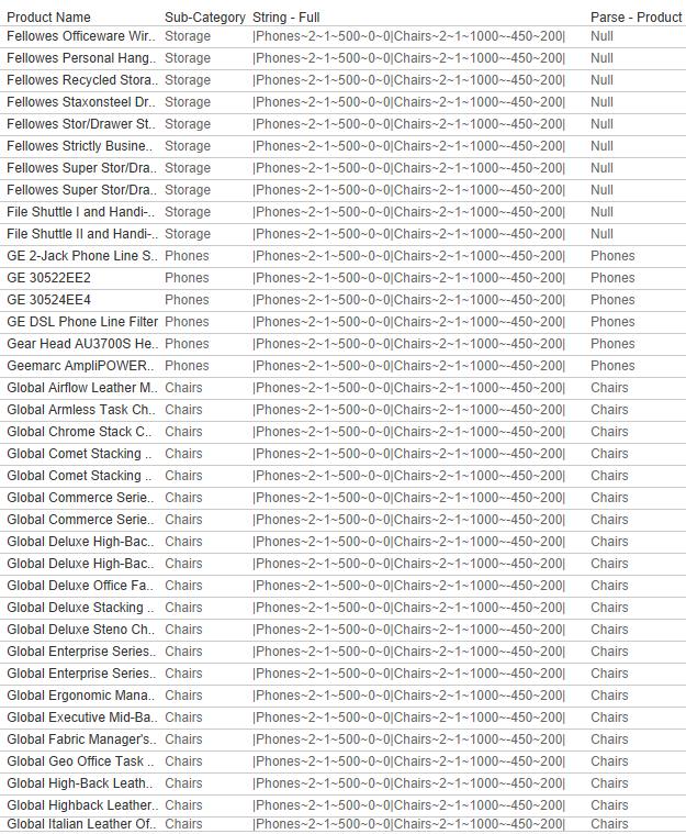
Continuing on with our Phones|Chairs example, you can see below that the [Parse – Product] calculation will return the value ‘Phones’ for any products where the Sub-Category = ‘Phones’, ‘Chairs’ for any products where the Sub-Category = ‘Chairs’, and NULL for all other records.
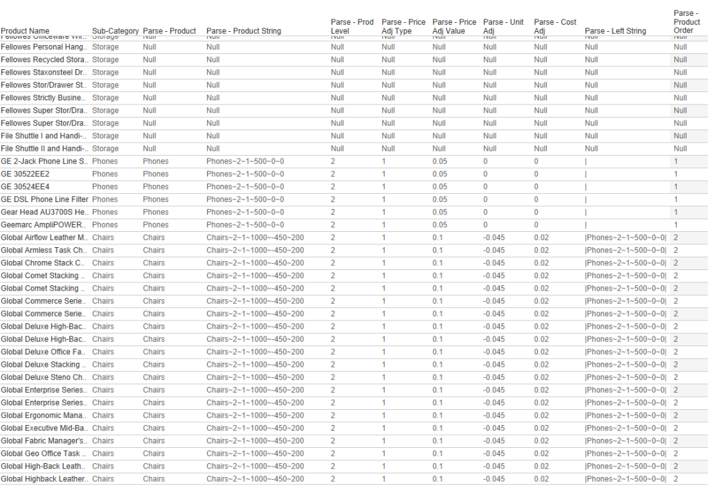
Next, we want to isolate the appropriate section of the [String-Full] field for each Product. I’m going to do this with a Regex calculation, but it could also be done with FIND/MID. Here is my calculation called [Parse – Product String]
REGEXP_EXTRACT([String – Full],'(‘+[Parse – Product]+’.*?)\|’)
This REGEX calculation will look to the [String – Full] field and capture everything starting at, and including, the value that was returned in the [Parse – Product] calculation, up through the first ‘|’. With this calculation in place, we now have all of the options selected by the user, in a single field, in the appropriate rows.

Now all we need to do is parse this single field into individual fields, which can easily be done with the SPLIT() function. We already have product, so we don’t need to split the first value, which leaves 5 remaining fields. If you look back at how we constructed our string, the order of these fields is 1. Product Level, 2. Price Adjustment Type, 3. Price Adjustment, 4. Unit Adjustment, 5. Cost Adjustment. So we will create a calculated field for each of these.
Parse – Product Level = INT(SPLIT([Parse – Product String],’~’,2))
Parse – Price Adj Type = INT(SPLIT([Parse – Product String],’~’,3))
Parse – Price Adj Value = FLOAT(SPLIT([Parse – Product String],’~’,4)) / if [Parse – Price Adj Type]=1 then 10000 else 100 END
Parse – Unit Adj = FLOAT(SPLIT([Parse – Product String],’~’,5))/10000
Parse – Cost Adj = FLOAT(SPLIT([Parse – Product String],’~’,6))/10000
These calculations are all pretty straightforward. I’m splitting the field using the ‘~’ character that we used to build our string, and I’m using either INT() or FLOAT() to turn these strings back into numbers. On the last 3 calculations, you may notice that I am dividing the result by 10,000. This is to turn those values back into decimals. When building the strings I multiplied the value by 100 so I could round them. But in the % parameters, I also allowed users to enter whole numbers instead of real percentages. So to translate those into decimals, I need to divide by 100 again. So to turn one of those percentage values into an actual percentage I need to divide by 10,000 (100 X 100). The Price Adj Value has a little extra logic because if they are changing a price proportionally (they entered a percentage change) I need to divide by 10,000, but if they are setting an exact price, I only need to divide by 100 (to account for when the value was multiplied by 100 when building the string).
There are 2 additional calculations you can build here but they are completely optional. They are only used to get an Order of the products in the string. I would recommend building these for two reasons. It will allow you to sort the Products on your dashboard if you are displaying all of the changes, and it will let you separate the Product that is currently being adjusted vs ones that have already been saved. I like to separate these in the dashboard so users can review the impact in a separate table before saving the change.
The first calculation will look at the [String – Full] field and return everything to the left of the [Parse – Product String]. The second calculation will count the number of ‘|’ that appear in that value to calculate the Order.
Parse – Left String = LEFT([String – Full],FIND([String – Full],[Parse – Product String])-1)
Parse – Product Order = LEN([Parse – Left String])-LEN(REPLACE([Parse – Left String],’|’,”))
At this point we have captured every single option entered by the user, for every product (or group of products), and we have all of those values separated out into individual fields for the appropriate rows. Pretty cool right?
Applying the Changes
Our next step, now that we have captured all of the changes and parsed them into usable fields, is to apply those changes so our users can view the impact. This can be done with just a few relatively simple calculation.
Determine Which Rows to Adjust
Our first few calculations are row-level calcs that determine if our changes should be applied to that row. We will build one calc to test if a specific Store should be included, another calc to test if a specific product should be included, and then one last calc that combines them.
First, our [Selected Store Filter] is just a boolean calc that tests to see if a store is in the State Set and in the Store Set. I am including a check on both sets because if a user selects just a state, and doesn’t change anything in the Store set, I want to make sure that it captures just the Stores in the selected State(s).
Selected Store Filter = [State/Province Set] and [Store Set]
Our next calc, [Selected Product Filter] is another simple boolean calc that tests to see if a specific product was included in any of the adjustments. For this, we’ll go back to one of our previous calcs. The [Parse – Product] field will only be populated when that product was included in the adjustments. So if it’s not NULL, then it’s included.
Selected Product Filter = NOT ISNULL([Parse – Product])
Now we’ll just combine those into one more boolean calc, so we don’t have to address them separately in the rest of the calculations. We’ll call this [Row Adjust] and it will be a boolean value telling us whether or not the values in that specific row should be adjusted or not.
Row Adjust = [Selected Store Filter] and [Selected Product Filter]
Apply the Changes
Now we know which rows we should adjust, and which rows shouldn’t change. The next step is to create calculated fields to adjust the 3 measures that we gave our users the ability to change; Price, Units, and Cost. These are all relatively simple, but the Price one is a little more complicated because we gave the users multiple options for adjusting it. Let’s start with that one.
The [Price – Adj] field will look like this. Line 1 checks to see if the row should be adjusted. If it should NOT be adjusted, then it returns the value of the [Price] field, which represents the current Price. Line 2 checks to see if there was a price change at all (it’s possible that the user just modified the units or cost to see the impact). If they did not change the price, the value of the Price Change Parameters would have stayed at 0. So if that value is 0, once again, we’ll return the current [Price]. Next, if the user had selected to enter an Exact price ([Price Adjustment Type]=2) then we’ll use the value that was entered. And finally, if the user had selected to enter a Proportional Change ([Price Adjustment Type]=1), then multiply the current [Price] by 1+ the % Change.
if not [Row Adjust] then [Price]
elseif [Parse – Price Adj Value]=0 then [Price]
elseif [Parse – Price Adj Type]=2 then [Parse – Price Adj Value]
elseif [Parse – Price Adj Type]=1 then [Price]*(1+[Parse – Price Adj Value])
END
The [Units – Adj] and [Unit Cost – Adj] calculations are much more straightforward as the user could only enter a % change for these. For both of these calculations, if the row should be adjusted, we’ll multiply the current value * 1 + the % change, and if the row should not be adjusted, we’ll keep the current value.
Units – Adj = if [Row Adjust] then [R12 Units]*(1+[Parse – Unit Adj]) else [R12 Units] END
Unit Cost – Adj = if [Row Adjust] then [Unit Cost]*(1+[Parse – Cost Adj]) else [Unit Cost] END
Measure the Impact
If we go back to the requirements for this dashboard, the users wanted to be able to measure the impact on Revenue, Cost, and Profit. So our next step is to calculate estimates for those values based on the current Price, Units, and Unit Cost, and estimates for those values based on the new Price, Units, and Unit Cost.
There are a lot of ways you can do this, but I am just going to use the Rolling 12 month Units, and the current Price and Cost to calculate our baseline. You could also use different lengths of time, or use forecasts in place of actuals. But this analysis is basically comparing what our Revenue, Profit, and COGS would look like if we sold the exact same units as we did last year, at our current Price and Cost, versus what our Revenue, Profit, and COGS would look like if we applied all of our adjustments.
These are all very simple calculations. Let’s start by calculating the Estimated Revenue, Estimated COGS, and Estimated Profit for our baseline.
Est Revenue = [R12 Units]*[Price]
Est COGS = [R12 Units]*[Unit Cost]
Est Profit = SUM([Est Revenue])-SUM([Est COGS])
Now we’ll repeat the exact same calculations, but with our ‘Adjusted’ measures
Est Revenue – Adj = [Units – Adj]*[Price – Adj]
Est COGS – Adj = [Units – Adj]*[Unit Cost – Adj]
Est Profit – Adj = SUM([Est Revenue – Adj])-SUM([Est COGS – Adj])
And now we can compare our baseline to our estimates from all of the applied changes
Est Revenue Change = SUM([Est Revenue – Adj])-SUM([Est Revenue])
Est COGS Change = SUM([Est COGS – Adj])-SUM([Est COGS])
Est Profit Change = [Est Profit – Adj]-[Est Profit]
And that’s it! Now you can aggregate these measures any way you want to show the impact at different levels (Overall, by Store, by Product Category, etc.)
Optional (but Encouraged) Enhancements
But we aren’t quite done yet. There are a few other ‘Optional’ Enhancements I would recommend incorporating into your dashboard. At the very least, I would strongly encourage you to build in 1 thru 3 from the list below, and at the absolute minimum, add number 1. But they don’t take very long, and they make for a better user experience, so go ahead and add them all.
1. Block Products From Being Selected Again After Adjustment
The way this technique is set up, because the string we are working off of is a combination of ‘Saved’ adjustments, and the ‘Current’ adjustment, it can act a little strange if the Product that is currently selected is already in the Saved String. Basically, this Product will appear twice and the ‘Current’ will override the ‘Saved’. There are 2 different ways this can happen.
- After you click the ‘Save’ button, the same Product is still selected. So even though you have Saved that change, it won’t show up in your Saved changes, because it’s appearing twice in the string (once for the Current and once for the Saved). Once you select a different Product, you’ll see that Product show up in the Saved Changes. This can be really confusing for the user.
- If you have already adjusted a Product, but then manually select that same Product from the list again.
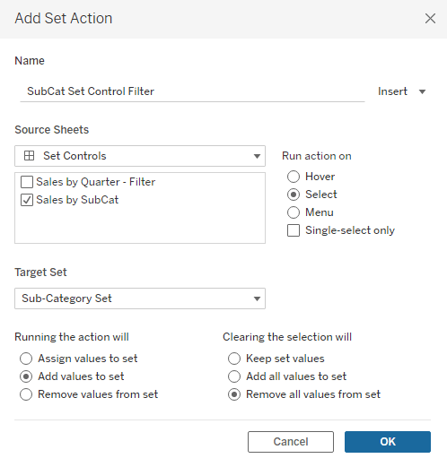
To combat number 1, we just need to add one additional Action to our ‘Save’ button. Make sure that the [Product Set] is on Detail on your Save button. Also, make sure that it is showing as ‘Product Set’ and not ‘IN/OUT (Product Set)’. If it is showing as ‘IN/OUT…’, just right click on that field and select ‘Show Members in Set’. Then we are going to create a Set Action that clears our Product Set when you click on the Save button. The Set Action should look like this. And don’t worry about the Warning at the bottom, the Action will still function as intended (if you want to get rid of the error, you can put [Product] on Detail, just make sure that you are filtering the Save sheet to what is in the set so your button doesn’t duplicate. But this isn’t necessary as it will still work with the error showing).
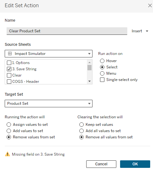
Once this action is in place, when you click the ‘Save’ button, the selection in the Product Set will go to ‘None’ and your adjustments will show up in the ‘Saved’ changes.
To combat number 2, we just need to add a filter to our ‘Options’ sheet. This is the sheet we built at the beginning of this process to be able to display our Sets on the dashboard. To start, we are going to create a calculated field, similar to our [Parse – Product] calculation, but in this case, we only want to check the [String – Saved], not the [String – Full], which contains the Saved and Current adjustments. This is exactly the same as [Parse – Product], but we’re going to swap out those two fields and call it [Parse – Product – Adj]
if CONTAINS([String – Saved],”|”+[Product Name]+”~”) then [Product Name]
elseif CONTAINS([String – Saved],”|”+[Sub-Category]+”~”) then [Sub-Category]
elseif CONTAINS([String – Saved],”|”+[Manufacturer]+”~”) then [Manufacturer]
elseif CONTAINS([String – Saved],”|”+[Category]+”~”) then [Category]
END
Similar to the [Parse – Product] field, this field will return the appropriate value if it exists in the Saved changes, and Null if it’s not in the Saved Changes. So we can just drag this field onto our Filter Shelf, filter on NULL and then add that filter to Context. Then, on our Dashboard, right click on the Product Set and choose the ‘All Values in Context’ option. Now, once a Product has been saved, it cannot be selected again.
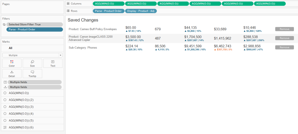
2. Displaying Current vs Saved Changes
When I am using this technique in a dashboard, I like to show all of the relevant information for the changes in Tables, so the user has a clear view of everything that has been adjusted and how those adjustments are impacting the overall metrics. I also like to separate the adjustment they are currently working on from the ones that have already been saved. The good news is, if you went ahead and built the 2 additional Parse fields earlier in this process, [Parse – Left String] and [Parse – Product Order], this is really easy to do. If you decided to skip those steps, I would go back to that section now and create those.
Once those calculations are available, you can filter on [Parse – Product Order]=1 to get the ‘Current’ change, and then in a separate sheet, exclude 1 and NULL to get all of the ‘Saved’ changes. I also like to sort my Saved Changes in Ascending Order on the [Parse – Product Order] field, so that the most recent Saved changes always appear the top.
I also set up my tables using multiple Axes, rather than using Measure Names/Values, so I have more control over how I can display the information. My table for Saved Changes would look something like this. This table design also helps with #3 on the list, which we’ll discuss next.
3. Add option to Remove changes
One important feature that I like to add is the ability to ‘Remove’ a change once it’s saved. In #1 we made it so that users can’t select a Product that has already been adjusted, so in order for them to change an adjustment, they’ll need a mechanism for deleting it from the ‘Saved’ changes. Because I set up my table using multiple axes, I can leverage one of these to add a ‘Remove’ button.
In my example, I am using a custom shape, but you can use whatever you would like here (custom shape, native shape, text, etc.). We’re then going to create one additional calculated field called [Remove – String] and add this to Detail on that last axes.
Remove – String = REPLACE([String – Saved],[Parse – Product String]+”|”,”)
This calculation will be used to update the [String – Saved] parameter with a modified string that replaces the whole string for the selected product with just a “|”. It will essentially ‘Delete’ that Product from the [String – Saved] parameter. Once this field is on Detail, we just need to create one additional Parameter Action driven from our Saved Changes worksheet.
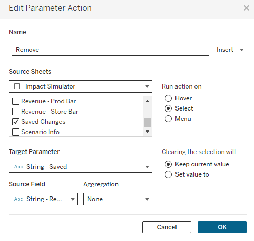
After adding this action, users will be able to click on the ‘Remove’ button you’ve added to remove it from their Saved Changes. One thing to keep in mind is that clicking on any of the Row Headers will also remove that row. Because of that, I will typically float a Blank object over the table, covering everything except for the ‘Remove’ column.
4. Reset button
This is a nice feature, but not completely necessary. Since this will most likely be used on Tableau Server or Tableau Cloud, the user could just refresh the browser if they wanted to start over. But to make it a little easier for the user, I put a ‘Clear Selections’ button right on the dashboard. This is just a sheet, with a custom shape for the button, that uses a series of Dashboard Actions to reset all of the Parameters
5. Hiding Save button until changes are made
This is another completely optional feature. I like to hide the ‘Save’ button until the user has actually made some type of change. This just helps to avoid accidentally saving something before the user finishes with their adjustments. For this, I am using Dynamic Zone Visibility, and using a calculated field called [Show Save Button]. This calculation checks all of the different Adjustment parameters to see if a value has been entered or if they are all still set to 0.
([Price Adjustment Type]=1 and [Price Adjustment – Proportional]!=0) or
([Price Adjustment Type]=2 and [Price Adjustment – Exact]!=0) or
[Unit Adjustment]!=0 or
[Cost Adjustment]!=0
Recap
That about covers it. This is a pretty complicated technique, but it can be an extremely powerful tool for your users. As I mentioned a few times throughout this post, this post walked through a specific use case, but this same technique can be applied to countless others. The specifics will change, but the overall process and technique will stay the same. No matter what the situation, these are the steps you will want to follow
- Build your Selection Options
- For the ‘Thing that is being changed’, in this case ‘Product’, make sure that the user can only select one value at a time
- You can use a Parameter, or a Set (but I recommend Set so you can remove products that have already been adjusted)
- If you are using a Set, make sure that on the dashboard you choose ‘Single Value Dropdown’ and disable the ‘Show All’ option
- You can use a Parameter, or a Set (but I recommend Set so you can remove products that have already been adjusted)
- Create a numeric parameter for each of the measures you want to adjust
- For the ‘Thing that is being changed’, in this case ‘Product’, make sure that the user can only select one value at a time
- Capture the Selections
- Use a calculated field to capture the ‘Current’ adjustments in a string
- Make sure that the ‘Thing that is being changed’ appears first in the string. The order after that does not matter
- Make sure to use unique characters to separate the data in your string
- Make sure to cast all numeric values as strings. If you need to capture decimals, use the multiply and round approach from earlier in this post
- Use a parameter to capture the ‘Saved’ adjustments
- Build a ‘Save’ button that combines the ‘Current’ adjustments string with the ‘Saved’ adjustments string and pass that to your Saved String Parameter
- Remember #1 from the Optional Enhancements section – Use additional actions to clear the Set/Parameters used for selections
- Build a ‘Save’ button that combines the ‘Current’ adjustments string with the ‘Saved’ adjustments string and pass that to your Saved String Parameter
- Use a calculated field to capture the ‘Current’ adjustments in a string
- Parse the Data
- Use the calculated fields in the ‘Parsing the String’ section to parse the selection string into usable fields
- First, parse the ‘Thing that is being changed’
- Second, capture the section of the full string for that ‘Thing that is being changed’, along with all of the other selections
- Third, build one calculated field for each user option to parse that selection into it’s own field
- Fourth, use the two calculated fields provided (Parse – Left String and Parse – Product Order) to calculate the order in which the ‘Things’ have been adjusted
- Use the calculated fields in the ‘Parsing the String’ section to parse the selection string into usable fields
- Apply the Changes
- Determine which rows need to be adjusted
- Use calculated fields to return the current value for rows that are not being adjusted, and the adjusted value for rows that are being adjusted
- Measure the Impact
- Create calculated fields to create ‘baseline’ and ‘adjusted’ values
- Create additional calculated fields to compare the ‘baseline’ to ‘adjusted’ values
- Visualize the Impact
- Add visuals to your dashboard
- I would recommend showing a table view of the ‘Saved’ and the ‘Current’ changes. I like to do this in separate tables
- Build additional views to visualize the impact of the adjustments
- Add visuals to your dashboard
I hope you enjoyed this post. If you use this technique in your work, please let me know. I am very interested to see some of the different applications of this technique. And, as always, if you have any questions about this post, or run into issues trying to implement this technique, please feel free to reach out to me on Twitter or LinkedIn. Thanks for reading!