
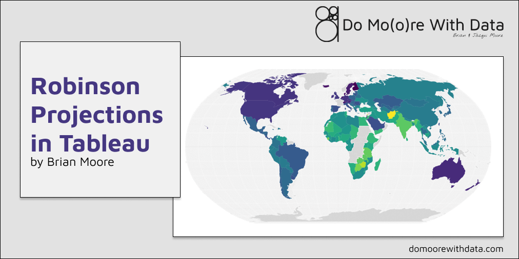
When it comes to visualizing data, it’s no secret that the Mercator Projection has it’s issues. Certain countries, especially in the northern hemisphere, appear much larger than they are in reality, and it gets worse the farther you move from the equator. Just look at the difference in the size of Greenland between the Mercator and Robinson projections.

That’s because this particular projection was created for one specific purpose…to aid in navigation. And it is perfect for that purpose, but not so perfect for visualizing data. But when it comes to Tableau, it’s our only option…or is it?
I’d like to use this opportunity to point out that I did not come up with the methods discussed in this blog post, but they are techniques that I use pretty frequently, and something I get asked about a lot. So the goal of this post is to combine information from various sources, provide you with all of the files needed to create your own Robinson projections, and walk through, step by step, multiple approaches to building these maps in Tableau. For more information, I recommend checking out this blog post by Ben Jones, and this post by John Emery
I also want to use this opportunity to point out that these methods are more complicated, and less performant than using Tableau’s standard mapping, so I would recommend using them with caution.
Different Methods
This post is going to cover three different methods for creating Robinsons Projection Maps in Tableau.
- Using a Shapefile
- Using a CSV File (for countries)
- Using a CSV File (for cities)
You can find all of the files needed for these methods here, as well as a sample workbook with all of the maps built.
Method 1: Using a Shapefile
This is by far the easiest method, but it’s a little less flexible than using a CSV File. To get started, download the following 4 files from the link above, and place them all in the same folder somewhere on your machine.
- Country_ShapeFile_Robinson.DBF
- Country_ShapeFile_Robinson.PRJ
- Country_ShapeFile_Robinson.shp
- Country_ShapeFile_Robinson.SHX
Now, let’s set up our data source
Building the Data Source
One quick note before we start. This particular Shapefile only has the 2-digit codes for countries. In order to relate this file to your data, you’ll need to make sure that your source also contains these codes (would not recommend trying to relate on country name). You can find a full list of codes here. Now let’s build our data source.
- Connect to your Data
- If you do not have data and just want to practice these techniques, you can use the Happiness_Scores.xlsx (from the World Happiness 2022 Report) file in the Google Drive
- Connect to the Shapefile
- From the Data Source Page, click “Add” at the top left to add a new connection
- In the “To a File” options, select “Spatial File”
- Navigate to the location where you stored the files above and select the Country_ShapeFile_Robinson.shp file
- Drag the Shapefile into the data source pane
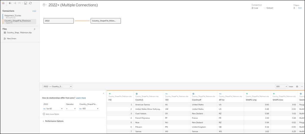
- Update the relationship
- Click on the noodle connecting the two sources
- In the lower section, select the country code in each file (called ISO in Shapefile)
When complete, your data source should look like this
Building the View
- Create a new worksheet
- Double-click on the [Geometry] field
- Add the 2-digit country code from your primary source onto Detail (in the sample data it’s called ISO A2)
- Add whatever measure you would like to Color and assign your desired palette (in this example, I placed [Happiness Score] on color and assigned a Viridis palette)
When complete, your worksheet should look something like this.

Well, that’s a bit strange, isn’t it? Here’s an extremely quick explanation of what’s happening. Tableau only supports the Mercator projection. Also, in Tableau, you are limited to just the Map Mark Type for Shapefiles. When you add the [Geometry] field, Tableau generates the latitude and longitude for each polygon in your Shapefile and plots them on the map. But the coordinates that make up those polygons in our Shapefile are for a Robinson projection. So here you can see our Robinson Projection overlaid on Tableau’s Mercator Projection. There’s some magic happening behind the scenes in those Shapefiles that allows this to happen. You can read more about it in John’s post.
So now, let’s get rid of the Mercator Projection (or at least hide it).
First, you’ll want to remove the “Search” Map option. This search is based on the positions of countries in the Mercator Projection, not our new Robinson Projection, so if you try to search for a country, it’s going to bring you to the wrong place. I’d recommend disabling all of the Map options, but that’s up to you
- In the upper toolbar, click on Map
- Click on Map Options
- Deselect the box labelled “Show Map Search”
- Optional – Deselect all other options
Next we’ll want to remove all of the Map Layers
- In the upper toolbar, click on Map
- Click on Map Layers
- Deselect all of the boxes in the Map Layers Window along the left side of the screen
The Map Layers Window should look like this

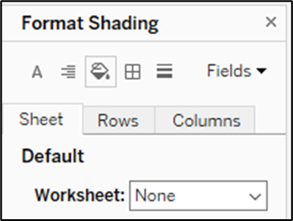
Finally, let’s remove our Worksheet Shading, just in case we want to put this on a colored dashboard, or lay it over a background image
- In the upper toolbar, click on Format
- Click on Shading
- Change the first option (on the Sheet tab, under Default, labelled “Worksheet”) from White to None
And that should do it! At this point, your map should look something like this.

Wait a second…something’s still not right. Antarctica has no permanent population, so how did they respond to the World Happiness Survey? Well, they didn’t. In fact, there are several countries that are showing up on this map as yellow that aren’t in the World Happiness data. But because we’re using relationships, and because these countries exist in the Shapefile, they are being shown on the map and colored the same as the lowest value in the data source. This can be misleading, so let’s get rid of those.
- Drag the measure (the same one currently on color) to the filter shelf
- Click on “Special”
- Select “Non-Null” Values

Ok, now we should be all set.

I got to be honest, something about this still bothers me. I would love to be able to see the countries that are missing data, but unfortunately, Tableau does not have the capability to ignore null values in the color application. But we have a few options.
Option 1: Create bins off of your measure and assign a color to each bin. Null will have its own bin
Option 2: The same as option 1 but use a calculated field to set thresholds instead of creating bins
Option 3: Duplicate our map worksheet, remove the measure from filter, remove the measure from color, set the color to how we want the “missing” values to appear, and then stack these two maps on top of each other on our dashboard (set to floating and set x, y, w, and h the same). The result would look something like this

Much better! Any of these methods will work, but I’m partial to the 3rd. This is mainly because you can use a diverging or continuous color palette instead of having to figure out which colors to assign to each “bin” with Option 1 and 2.
Now let’s move on to the CSV File method
Method 2: Using a CSV File (for countries)
This method has a lot of similarities to the first one, so I won’t go in to too much detail. The two main differences are; we are going to use a csv instead of a shapefile, and we are going to use the polygon mark type instead of a map.
To get started, download the CountryShapes.csv file from the Google Drive.
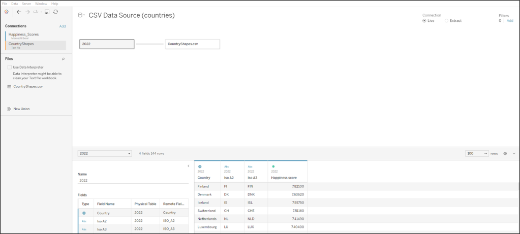
Building the Data Source
We’re going to set up our data source the same way as we did in Method 1. Connect to your data, add a connection for the csv file, and set up the relationship. This csv file, unlike the shapefile, has a ton of different country identifier fields. Do some prep work in advance to figure out which of these identifiers match what is in your data source, and set up the relationship using that field. When you’re finished, it should look something like this.
Building the View
Building the view is a little more complicated with this method. This csv file has the coordinates to “draw” all of the countries. But take a look at what happens if we try to use those coordinates as-is.

Now that looks an awful lot like a Mercator Projection. Well, that’s because it is. This file has the all of the coordinates to “draw” each country, but they are based on the Mercator Projection. So we need to re-calculate those latitude and longitude values. We’re going to build two new calculated fields, R_Lat (for our new latitude), and R_Lon (for our new longitude).
R_Lat
IF [Latitude]=0 THEN [Latitude]
ELSEIF ABS([Latitude])<5 THEN 0.5072 * (0+(0.0620-0) * ((ABS([Latitude])-0)/5)) * SIGN([Latitude])
ELSEIF ABS([Latitude])<10 THEN 0.5072 * (0.0620+(0.1240-0.0620) * ((ABS([Latitude])-5)/5)) * SIGN([Latitude])
ELSEIF ABS([Latitude])<15 THEN 0.5072 * (0.1240+(0.1860-0.1240) * ((ABS([Latitude])-10)/5)) * SIGN([Latitude])
ELSEIF ABS([Latitude])<20 THEN 0.5072 * (0.1860+(0.2480-0.1860) * ((ABS([Latitude])-15)/5)) * SIGN([Latitude])
ELSEIF ABS([Latitude])<25 THEN 0.5072 * (0.2480+(0.3100-0.2480) * ((ABS([Latitude])-20)/5)) * SIGN([Latitude])
ELSEIF ABS([Latitude])<30 THEN 0.5072 * (0.3100+(0.3720-0.3100) * ((ABS([Latitude])-25)/5)) * SIGN([Latitude])
ELSEIF ABS([Latitude])<35 THEN 0.5072 * (0.3720+(0.4340-0.3720) * ((ABS([Latitude])-30)/5)) * SIGN([Latitude])
ELSEIF ABS([Latitude])<40 THEN 0.5072 * (0.4340+(0.4958-0.4340) * ((ABS([Latitude])-35)/5)) * SIGN([Latitude])
ELSEIF ABS([Latitude])<45 THEN 0.5072 * (0.4958+(0.5571-0.4958) * ((ABS([Latitude])-40)/5)) * SIGN([Latitude])
ELSEIF ABS([Latitude])<50 THEN 0.5072 * (0.5571+(0.6176-0.5571) * ((ABS([Latitude])-45)/5)) * SIGN([Latitude])
ELSEIF ABS([Latitude])<55 THEN 0.5072 * (0.6176+(0.6769-0.6176) * ((ABS([Latitude])-50)/5)) * SIGN([Latitude])
ELSEIF ABS([Latitude])<60 THEN 0.5072 * (0.6769+(0.7346-0.6769) * ((ABS([Latitude])-55)/5)) * SIGN([Latitude])
ELSEIF ABS([Latitude])<65 THEN 0.5072 * (0.7346+(0.7903-0.7346) * ((ABS([Latitude])-60)/5)) * SIGN([Latitude])
ELSEIF ABS([Latitude])<70 THEN 0.5072 * (0.7903+(0.8435-0.7903) * ((ABS([Latitude])-65)/5)) * SIGN([Latitude])
ELSEIF ABS([Latitude])<75 THEN 0.5072 * (0.8435+(0.8936-0.8435) * ((ABS([Latitude])-70)/5)) * SIGN([Latitude])
ELSEIF ABS([Latitude])<80 THEN 0.5072 * (0.8936+(0.9394-0.8936) * ((ABS([Latitude])-75)/5)) * SIGN([Latitude])
ELSEIF ABS([Latitude])<85 THEN 0.5072 * (0.9394+(0.9761-0.9394) * ((ABS([Latitude])-80)/5)) * SIGN([Latitude])
ELSEIF ABS([Latitude])<90 THEN 0.5072 * (0.9761+(1-0.9761) * ((ABS([Latitude])-85)/5)) * SIGN([Latitude])
END
R_Lon
IF [Latitude]=0 THEN [Longitude]
ELSEIF ABS([Latitude])<5 THEN [Longitude] * (1-((ABS([Latitude])-0)/5) * (1-0.9986))
ELSEIF ABS([Latitude])<10 THEN [Longitude] * (0.9986-((ABS([Latitude])-5)/5) * (0.9986-0.9954))
ELSEIF ABS([Latitude])<15 THEN [Longitude] * (0.9954-((ABS([Latitude])-10)/5) * (0.9954-0.9900))
ELSEIF ABS([Latitude])<20 THEN [Longitude] * (0.9900-((ABS([Latitude])-15)/5) * (0.9900-0.9822))
ELSEIF ABS([Latitude])<25 THEN [Longitude] * (0.9822-((ABS([Latitude])-20)/5) * (0.9822-0.9730))
ELSEIF ABS([Latitude])<30 THEN [Longitude] * (0.9730-((ABS([Latitude])-25)/5) * (0.9730-0.9600))
ELSEIF ABS([Latitude])<35 THEN [Longitude] * (0.9600-((ABS([Latitude])-30)/5) * (0.9600-0.9427))
ELSEIF ABS([Latitude])<40 THEN [Longitude] * (0.9427-((ABS([Latitude])-35)/5) * (0.9427-0.9216))
ELSEIF ABS([Latitude])<45 THEN [Longitude] * (0.9216-((ABS([Latitude])-40)/5) * (0.9216-0.8962))
ELSEIF ABS([Latitude])<50 THEN [Longitude] * (0.8962-((ABS([Latitude])-45)/5) * (0.8962-0.8679))
ELSEIF ABS([Latitude])<55 THEN [Longitude] * (0.8679-((ABS([Latitude])-50)/5) * (0.8679-0.8350))
ELSEIF ABS([Latitude])<60 THEN [Longitude] * (0.8350-((ABS([Latitude])-55)/5) * (0.8350-0.7986))
ELSEIF ABS([Latitude])<65 THEN [Longitude] * (0.7986-((ABS([Latitude])-60)/5) * (0.7986-0.7597))
ELSEIF ABS([Latitude])<70 THEN [Longitude] * (0.7597-((ABS([Latitude])-65)/5) * (0.7597-0.7186))
ELSEIF ABS([Latitude])<75 THEN [Longitude] * (0.7186-((ABS([Latitude])-70)/5) * (0.7186-0.6732))
ELSEIF ABS([Latitude])<80 THEN [Longitude] * (0.6732-((ABS([Latitude])-75)/5) * (0.6732-0.6213))
ELSEIF ABS([Latitude])<85 THEN [Longitude] * (0.6213-((ABS([Latitude])-80)/5) * (0.6213-0.5722))
ELSEIF ABS([Latitude])<90 THEN [Longitude] * (0.5722-((ABS([Latitude])-85)/5) * (0.5722-0.5322))
END
Ok, so those calculations are a bit intense. But luckily, they are the only calculations that we need. Now let’s build our Robinson Projection.
- Right click on [R_Lon] and drag it to Columns. When prompted, choose R_Lon without any aggregation
- Right click on [R_Lat] and drag it to Rows. When prompted, choose R_Lat without any aggregation
- Right click on your measure (Happiness score in the sample data) and drag it to Color. Choose MIN() when prompted
- Drag [Polygon ID] to Detail
- Drag [Sub Polygon ID] to Detail
- Right click on [Point ID] and drag it to Path. When prompted, choose Point ID without any aggregation
- Right click on the R_Lat axis, select “Edit Axis” and fix the axis to Start at -.6 and end at .6
- Right click on the R_Lon axis, select “Edit Axis” and fix the axis to Start at -200 and end at 200
It should look something like this

You’ve probably noticed that we have the same problem as we did before. Countries that were not in our data are showing up in the map and colored the same as the lowest value. To remove these, you can follow the same process as we did with the first method (drag measure to filter, click on All Values, click on “Special”, select “Non-null values”). Another way to remove these is to just drag the country field from your data file to Detail.
Now, if we want to view those missing countries, but not apply the color, we could do exactly what we did with the first method (duplicate and stack). Or…we can do something a bit different. Let’s add a background image.
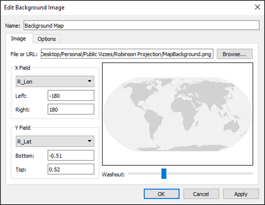
From the Google Drive, download the MapBackground.png file.
Now, let’s add that as a background image to our map
- In the upper toolbar, click on Map
- Click on Background Images
- Select your data source (the same one used for the map)
- Click “Add Image”
- Give your background image a name like “Background Map”
- Click “Browse” and select the MapBackground.png file
- Under “X Field” make sure R_Lon is selected and set the Left = -180 and the Right = 180
- Under the “Y Field” make sure R_Lat is selected and set the Left = -.51 and the Right = .52
- Adjust the “Washout” for a lighter or darker map
The Background Image options should look like this when you’re done
You can also find or create your own background images, you’ll just have to play with them a bit to get them lined up correctly.
At this point, you’re pretty much done, but I would recommend a few finishing touches (similar to the first method)
- Disable all Map Options
- Hide the X and Y axes
- Remove all Lines (Grid lines/Zero lines/etc.)
- Remove Worksheet Shading (change White to Null)
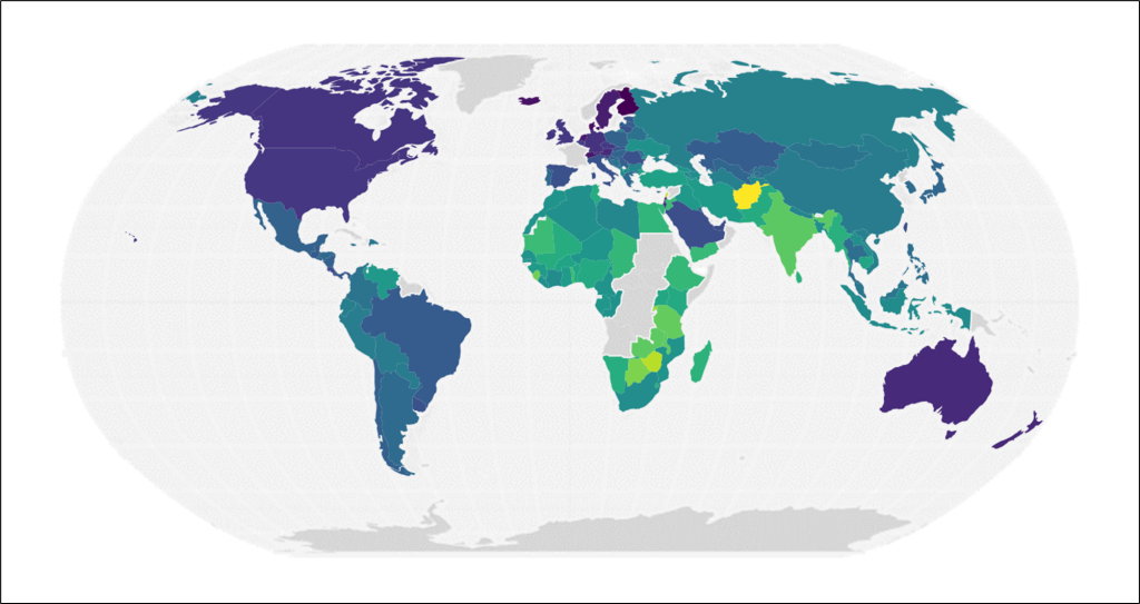
And now, you’re map should look something like this
Alright, we’re going to cover one more method, but I promise, this one will be short. These two methods are great if you’re mapping countries, but what if you want to map cities?
Method 3: Using a CSV File (for cities)
In order to plot cities on a Robinson Projection, your data source will need to have the Latitude and Longitude values. Don’t have those? Well, let Tableau do the work for you. Here’s a link to a quick tutorial on how to export the generated Latitude and Longitude values from Tableau
How to get latitude and longitude values from Tableau
Once you have those in your data source, connect to your file, and let’s start building. If you don’t have a file, you can download the “OlympicGames_Cities.xlsx” file from our Google Drive.
Building the View
So we have the coordinates for each of our cities, but similar to the last example, if we try to plot these in Tableau, it’s going to plot them using the Mercator Projection. So we are going to use the same R_Lon and R_Lat calculations that we used in the previous method. They’re crazy long, so I’m not going to paste them here, but you can find them earlier in the post.
Once you have those calculations built, the process is nearly identical to Method 2.
- Right click on [R_Lon] and drag it to Columns. When prompted, choose R_Lon without any aggregation
- Right click on [R_Lat] and drag it to Rows. When prompted, choose R_Lat without any aggregation
- Drag City to Detail
- Right click on the R_Lat axis, select “Edit Axis” and fix the axis to Start at -.6 and end at .6
- Right click on the R_Lon axis, select “Edit Axis” and fix the axis to Start at -200 and end at 200
- Make any other design adjustments desired (change mark type to circle, add field to color, adjust size, adjust transparency, etc)
Now, just follow the same exact process from Method 2 to add your Background Map and to put on the finishing touches. And you should have something like this

Well that’s it for this post. I hope you enjoyed it, and as always, please reach out with any questions or to share your creations. We would love to see them. Thanks for reading, and see you next time!
