Categories
Design It Depends

Optical Illusions and Data Viz

What do optical illusions have to do with data visualization?

Aside from being kind of fun, optical illusions tell us a lot about how human visual perception changes how we interpret what we see. These illusions expose to us areas to be aware of when presenting information visually, and how perception can change the interpretation of the information when presented to different individuals or in different circumstances. As data visualization practitioners, we are communicating with images. Our work is subject to these same visual systems, but the result is less fun when your charts are misinterpreted, but they can also be used to benefit the user.

Let’s take a few examples:

  • Size
  • Color
  • Attention
  • Pattern Completion

Size

Which of the two orange circles is larger?
Ebbinghaus illusion showing distortion of perception of size based on relative objects
Ebbinghaus Illusion | Source Wikimedia Commons

Our brains interpret the right circle as larger due to its size relative to the smaller circles around it. In reality, the circles are the same size.

Ebbinghaus illusion showing distortion of perception of size based on relative objects with lines showing the equal sizes

When we use size to encode data, being aware of how a mark appears relative to other objects in a chart can help avoid misinterpretation of the data. For example, from the Superstore dataset, I have placed Discount on size.

Scatter plot demonstrating difficulty identifying size

It’s difficult to see what marks have the same discount, until they are highlighted using color.

Scatterplot with colors to identify identically sized marks

We can run into this effect any time we are encoding data on size, so double encoding the data may be needed to make the visual more clear.

Which Line is Longer?
Müller-Lyer illusion shows distortion of size based on arrows added to the ends of the lines
Müller-Lyer illusion | Source UChicago News

This illusion illustrates the effect additional shapes can have on the perception of length.

If the additional shape equally impacts all marks, such as with a dumbbell or lollipop chart, this is less of a concern. The precision of the chart can be affected, but the interpretation won’t be heavily impacted.

If we are using additional marks to encode more information, we should be aware of the fact that it can alter the interpretation, or change the perceived (or actual) size of the primary mark.

Now, this doesn’t mean you can’t use shapes with other marks. If the actual value is less important than the information conveyed with additional marks, perhaps this is ok. It depends on the goals of the visual.

Color and Shade

Which Color is Darker?
Illusion demonstrating changing color perception based on background gradient
Color Saturation Illusion
Illusion demonstrating changing color perception based on background gradient

In this illusion, we can see that the circles appear darker on a lighter background, and lighter on a darker background, even though they are the same color.

When using a continuous color palette, we want to beware that a color can be interpreted differently depending on how the shades are distributed.

So a similar value could be interpreted as being good or bad simply based on the other marks in close proximity, even though the number itself is the same. This can be used to call attention to outliers, like an unusual seasonal ordering pattern, if that is the intention of the chart.

Heatmap demonstrating relative color distortion

When using gradient backgrounds, it can also alter the perception of the colors used in the visual, making those on the lighter section of the background appear darker, and those on the darker section of the background appear lighter.

Bar chart demonstrating distortion by background gradient

Many of us have seen the famous dress illusion or the pink sneaker illusion. Color is tricky! When using color to show dimensions, depending on the other colors used, those colors may be misinterpreted.

Using fewer colors and ensuring they are different enough in hue and value will help ensure this doesn’t hinder or alter the interpretation.

Bonus! It’s also better for users with color vision deficiency and impaired vision.

Attention

Look at right side of the fork. How many tines are there?
Now look at the left side of the fork. How many tines are there?
Impossible Trident illusion shows how changing focus point can alter illusion
Blivets or Impossible Trident Illusion | Source Wikimedia Commons

If we call attention to one thing, we are necessarily calling attention away from something else.

We can use this to our advantage to guide a story, if that is the goal. But, this also means that different users may see different things in a dashboard.

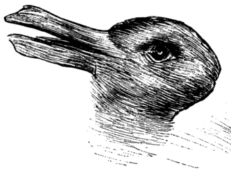
Is this a duck or a rabbit?
Duck-Rabbit Illusion | Source Wikimedia Commons

How, and how carefully, we use other visual attributes like color, labels, layout, and helper text can direct the attention and ensure the takeaway is consistent.

Giving the context needed to orient the viewer will take away the ambiguity. Even just a couple of crude lines to show feet, and a pink nose, and now it’s definitely a bunny.

Duck Rabbit illusion demonstrates different perception of same illustration
Duck-Rabbit Illusion with Markup

Pattern Finding

Humans have a brain that is made to find patterns. It’s what we do. And, it’s why data visualization can be so effective.

Do you see the white triangle?
Kanizsa triangles demonstrates how an object can be created by connecting whitespace
Kanizsa figures | Source Wikipedia

A shape or pattern can be suggested simply by the pattern of those objects (object completion). The brain is going to be looking for patterns, and things can be created out of the white space. This can help identify patterns or trends.

However, this can also trick the user into seeing a pattern that is incorrect based on the context, as this illusion illustrates.

Which lines connect?
Poggendorff illusion demonstrates potential inaccuracy in object completion phenomenon
Poggendorff Illusion | Source Wikimedia Commons

Using visual attributes to help ensure the eye follows the correct pattern can ensure the visual isn’t misinterpreted.

If we know that the human eye is going to be identifying a trend, we can call attention to specific areas to counter this effect. We can also visually identify when a pattern is or isn’t significant. Things like control lines or specifically calling out whether a trend is statistically significant can keep the brain’s pattern finding instinct from causing misunderstanding of what the data actually show or to force a focus on the purpose of the visualization.

For example, all my eye wants to see here is that the totals seem to be trending upward. There are spikes and lulls, but that’s not what my brain is focusing on.

basic bar chart

This may be fine if the visual is purely informational, and open to that type of interpretation and analysis. It is often helpful if we can anticipate this and identify if a trend is or is not significant. We can identify things like the impact of seasonality in data. Or we can use things like control charts or highlight colors and indicators to drive attention to the outliers rather than the trend.

basic bar chart with control lines

This post could probably go on forever, but I’ll stop here. Enjoy, go down the rabbit hole and look up some other optical illusions.

And Remember:

With great power comes great responsibility | Giphy
Categories
How-To's Tableau Techniques

Creating Useful Documentation

I’ve written a lot of documentation, and it’s a task that few people enjoy, and I am no exception. I’ve also read a lot of documentation and unwound a lot of undocumented reporting, and it’s a task that is often overlooked and underappreciated. Good documentation can be invaluable in maintainability, training, and knowledge transfer. I’ve certainly come back to a project I worked on six months later, and forgotten why something was done a certain way. Or dug my way through Tableau Workbooks and ETL code to find out where a certain piece of logic is coming from.

I find the most useful documentation in day-to-day work is the documentation that is right where you need it. Making documentation part of your workflow can save your own sanity, and pay dividends in time saved, either your own or whoever inherits your work.

This isn’t to say that a full technical document isn’t helpful or needed. These provide invaluable information on the business context, interactivity, use cases, logic, and more. However, documenting your process right in the tool where you are working will save immense amounts of time and confusion down the line, are easier to keep up-to-date, and you can even use this information at the end of a project to make the creation of technical documents and user documents easier.

So, where does this living documentation, well, live? Ideally, it lives everywhere the data is touched. Keep in mind, this type of documentation isn’t meant to be redundant, but to add context that isn’t immediately apparent.

Data Prep Stage

What to Include

  • Authors
  • Date created or modified
  • Designed purpose and limitations of the data source
  • Data lineage and dependencies. If you’re using a well-used database, it may not be as important as if you are connecting to spreadsheets or processes that need to be updated or maintained.
  • Data freshness timestamp, if applicable
  • Call out any inclusion/exclusion criteria, transformations done, business decisions, or logic explanations

Ensure this makes it to the users of the data! If they won’t open the workflow or see the SQL, then passing this information downstream is key.

Some tools, like dbt’s “Exposures”, include features to surface this type of information to others.

Ways to Document

Commenting and annotating code and workflows is helpful to quickly orient yourself or others on what is happening, where, and why. Naming conventions for fields, subqueries, views, etc. will also go a long way.

Using a very simple example based on the Superstore data set, I’ve shown some ways to document data preparation below. Most of the queries and workflows we create will be much more complex than this, so documentation becomes more important. For this example, I used Ken Flerlage’s SQL Server Superstore instance. If you need a server to connect to for learning how to use data prep tools, check out his post on FlerlageTwins.com!

How this might look in SQL:

  • Comments should clarify any changes, logic that may be seen as unneeded or is unclear in purpose
  • Aliases should be easy to identify
  • Clean formatting to allow easy reading to locate key information
  • All fields are prefixed with the source table alias
/* 
Author: Jacqui Moore
Date Created: 2023-01-19
Purpose: All Orders and returns for West Region
Modified: 2023-01-20 Ticket ABC-123
*/

SELECT 
	 o.[Order ID]
	,o.[Order Date]
	,o.[Ship Date]
	,o.[Customer ID]
	,o.[Customer Name]
	,o.Segment
	,o.[Product ID]
	,o.[Product Name]
	,o.[Category]
	,o.[Sub-Category]
	,o.Sales as [Amount Sold]
	,o.Quantity as [Quantity Sold]
--	,o.Discount as [Discount as Sold]  --Removed per ABC-123
--	,o.Profit as [Profit as Sold] -- Removed per ABC-123
        ,r.Returned
FROM 
	SuperstoreUS.dbo.Orders o
LEFT JOIN 
	SuperstoreUS.dbo.[Returns] r
	ON r.[ORDER ID]=o.[ORDER ID]
WHERE 
	o.Region = 'West'

How this might look in Alteryx:

  • Comment header to indicate name, purpose, creator, and important information about a workflow
  • Containers can be used to create a “Read Me” for additional information
  • Tools are annotated descriptively
  • Calculated fields are commented with assumptions, or additional context the next person needs to know
  • Containers are used to segment the steps and provide additional context on the processing of the data
Screenshot of Alteryx workflow showing annotations and comments

How this might look in Tableau Prep

  • While there are fewer ways to add notes with Tableau Prep, you can add a description to each step
screenshot of tableau prep workflow
  • Groups can be used to create a cleaner flow, with the ability to drill in on steps, and act similar to Alteryx containers in some ways
screenshot of tableau prep workflow
  • Calculations can be commented using // at the start of a comment line
screenshot of tableau prep calculation

Other helpful things to include

  • If you’ve used a macro, tool group, or snippet of code from somewhere else, include a link to the original source
  • If you’ve used a macro or tool group, include a brief description of the purpose and what operations are being performed

Visualization Stage

On the Data Source

  • Give your Tableau Data Source a descriptive name
tableau desktop data source view
  • Pre-filter any data in the data source, whenever possible
  • Rename the tables, if the names aren’t clear
  • If you are using Custom SQL, comment that code
  • If the data source is published, a description containing some of the high level information from the data source section is helpful context for users who might try to later connect to the data

On the Data Pane

  • Rename fields to use ‘friendly’ names, such as the common nomenclature for the field among the business users
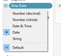
  • Set the right data types
tableau field type menu
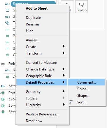
  • Add a comment to fields if your data source will be used for Ask Data or for business users who are less familiar with the data and/or Tableau
tableau comment properties

This will appear on hover in the data source pane and Ask Data on Server

tableau comment display
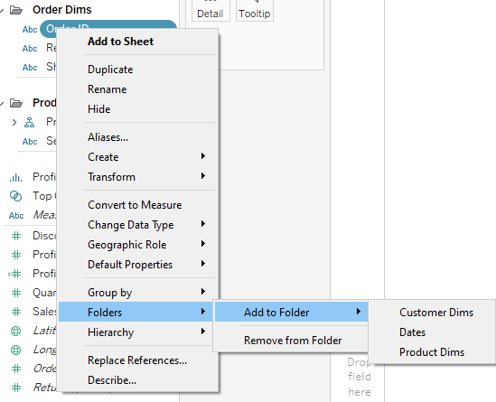
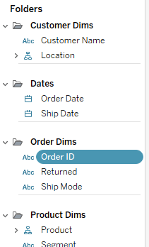
  • If the Table names are enough context to group the fields, then that is fine, but if the data source has a lot of fields, using Folders can be useful
tableau folders
tableau folders
  • Having a naming convention that makes it clear when LODs or Parameters are being used can be very helpful, but can also sometimes be less friendly with displaying the field names on views

Did you know the field descriptions are searchable? Yep, you can come up with a tag system and include it in the description, and search right in the Tableau Desktop data pane. Field descriptions are also visible on Ask Data.

tableau field comments
searching fields
  • In addition to the items above, calculations can be commented in the calculation window, just like any other type of code
commented calculation
  • When you’re ready to publish, cleanup…
    • Delete calculations you ended up not using, copies of fields, etc.
    • Hide all unused fields
    • Hide fields that aren’t meant to be used (such as id fields that you need, but don’t mean anything to the user, or base fields that were replaced with LOD calculations). If they can’t be hidden, putting them in a folder labeled “Do Not Use” is also helpful. If it will mess up someone’s analysis to use that field, hide it.

Sheets

  • Name the sheets descriptively, with leading names that help identify the section, dashboard, etc.
sheet names
  • Color coding your tabs can be very helpful. People use the colors for different things, but I like to use it to show when certain filters will apply
sheet colors
  • The reason I like to use the colors to show filters, is because when changing filter settings to apply to specific sheets, you can see these colors, making it much easier to select the right sheets for the right filters
sheet colors in filter menu
  • If you aren’t using the captions for display on a dashboard, you can use those to add notes on how a more complicated sheet is working
captions
  • You can include a sheet with a “Read Me” for developers, containing data source or workbook level information. This sheet doesn’t get published, but can contain a wealth of knowledge

Dashboards

  • Layout containers are awesome. Use layout containers! But, really, containers will help a lot with development, layout, save you from floating many items, and help organize
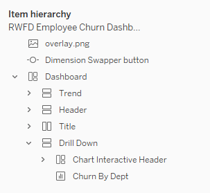
  • Name the containers so you can identify them in the layout pane. This has saved me on complicated dashboards, and is definitely worth the time it takes to do it.
named containers
  • Include clear chart headings, axis headings, and helper text so the user knows what they are looking at, and have answers to any logic questions
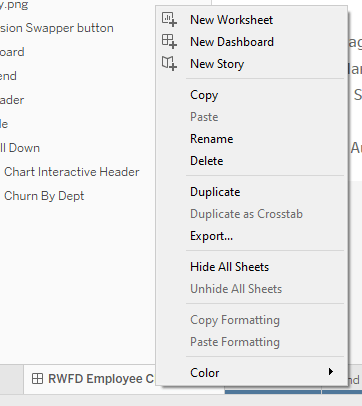
  • When you’re done, “Hide all sheets” will clean up your workbook. Delete any unused sheets that you don’t need to keep for a reason.
hide sheets

For The End User

So far, the types of documentation I’ve covered are for developers (or yourself). But, whether you create functional user documentation or not, having documentation baked into the dashboard will be appreciated by the end user. For some users, it’s the only type of documentation they ever even see.

  • Tool tips can contain descriptions of what the metrics mean, text indicating what actions are available, and more. Don’t neglect tooltips!
tool tips
  • Titles, labels and helper text are types of text that are displayed directly on the dashboard, and are important. These are things like clear axis labels, text describing interactivity, color legends, descriptive titles, and so on.
helper text
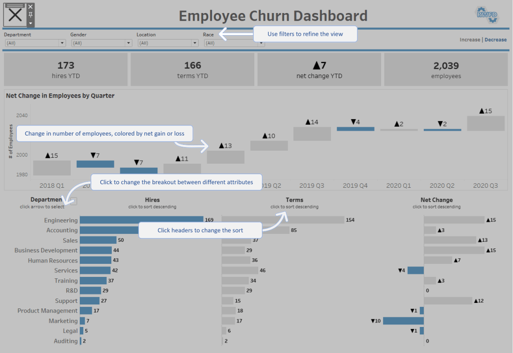
  • Overlays can be helpful for complicated dashboards with a lot of interactivity, where the visible helper text would be redundant, or just too much.
overlay instructions
  • Include in the header or footer of the dashboard things like:
    • Data refresh date
    • Date range included, if different from the refresh date
    • Business points of contact
    • Developer point of contact

And now that I have thoroughly talked about one of the most tedious parts of development, go forth and do good data!

Categories
How-To's Tableau Techniques

Happy New Year! Your Dashboard is Broken…

Hi Jacqui,

Hope you had a Happy New Year! Can you please look at <the super important dashboard>? It seems to be broken. Everything is blank…

Thanks!

Have you ever come into the office on the first day of the new year, and found that your dashboards are blank, broken, or still looking at last year? Don’t worry. You’re in good company. But, it doesn’t have to be that way. Using calculations, you can avoid some of the issues that can happen at the start of a new period.

The Challenge: When you have dashboards or views that filter on a specific year, or the current year and prior year, you will need to update filters, and colors, and hide previous years when the new year rolls around.

I have an example dashboard here. A simple dashboard showing the current year and previous year, with YoY Growth, and a monthly trend chart:

When the new year rolls around, it’s going to have new colors, and my YoY Growth sheet is going to need to be updated. I used a relative date filter, but if I had hard-coded the year in filters or calculations, that would need to be updated as well.

The Solution:

Rather than using the date field in your views, you can use calculations to ensure your rollover to the new year goes smoothly.

If I use a calculated field to determine the current and prior year, I avoid the issues above.

  • Create a calculation called “Period”
//Period
IF DATEDIFF('year',[Ship Date],TODAY()) = 0 THEN 'Current Year'
ELSEIF DATEDIFF('year',[Ship Date],TODAY()) = 1 THEN 'Prior Year'
END
  • Replace anywhere you are using the year with this new calculation. In my example, I’ve replaced the Color, and the Filter to use the “Period” calculation.

The dashboard looks the same, but now, when the year rolls over, I don’t need to make any updates. Without making any changes, my dashboard has rolled over to 2023 seamlessly.

Now, it is possible that your stakeholders would like to see the previous year until the first month of the new year is complete. To do this, we just need to incorporate a lag into our calculation.

There are several ways to approach this, depending on what kind of lag you want to include. Here, I’m saying, if the month is January, then I want to keep looking at the prior two years, otherwise, I want to look at the current year and prior year.

//Period With January Lag
IF MONTH([Current Date]) = 1 THEN 
    IF DATEDIFF('year',[Ship Date],[Current Date]) = 1 THEN 'Current Year'
    ELSEIF DATEDIFF('year',[Ship Date],[Current Date]) = 2 THEN 'Prior Year'
    END
ELSE
    IF DATEDIFF('year',[Ship Date],[Current Date]) = 0 THEN 'Current Year'
    ELSEIF DATEDIFF('year',[Ship Date],[Current Date]) = 1 THEN 'Prior Year'
    END
END

Now, if the current date is in January, it will still show me the previous two years. This prevents the blank dashboard when you arrive on January 2nd.

On February 1st, my dashboard will roll over seamlessly:

In addition, we can solve for a couple of other issues you may have.

If your analysis is for Year to Date (YTD):

We can modify this calculation to handle YTD filters, by adding a second part to the prior year calculation:

//Period To Date
IF DATEDIFF('year',[Ship Date],[Current Date]) = 0 THEN 'Current Year'
ELSEIF DATEDIFF('year',[Ship Date],[Current Date]) = 1 
    AND [Ship Date]<=DATEADD('year',-1,[Current Date]) 
THEN 'Prior Year'
END

We will end up with a dashboard that will always compare Current YTD to Prior YTD. This can also be combined with the lag logic from earlier.

If you only want to show the last COMPLETE month:

Often we will see the trend line taking a deep dive when a new month starts:

This can be avoided by setting up a lag, so you are looking at only the last complete month. We do this using DATETRUNC.

//Period with Complete Month Lag
IF DATEDIFF('year',[Ship Date],[Current Date]) = 0 
    AND [Ship Date]<DATETRUNC('month',[Current Date])
    THEN 'Current Year'
ELSEIF DATEDIFF('year',[Ship Date],[Current Date]) = 1 
    AND [Ship Date]<DATEADD('year',-1,DATETRUNC('month',[Current Date])) 
THEN 'Prior Year'
END

Now, we won’t see the line drop at the start of a new month, and we won’t see a blank dashboard on day one of the new year.

These are not the only way to perform these calculations. They may not even be the best way to write the calculation. However, you can take the concepts of these calculations, and apply them to a number of use cases, including:

  • Showing the last complete week, or month
  • Showing comparisons of specific time frames, such as last 30 days vs. prior 30 days.

For more of this, and so many other date calculations, check out this post over on the Flerlage Twins site.

Will Perkins also did a great presentation on use cases for DATEDIFF, which is also a great one to watch!

Now, go forth, and enjoy the last time you will spend the first week of the new year updating your dashboards 🙂

Categories
Design

Data Viz lessons I learned in art school

I didn’t have my start in analytics. Honestly, when I was a college student, analytics, data science, and data visualization majors weren’t a thing, and analyst was not one of the jobs that were introduced as a possible career path (maybe I’m aging myself). I don’t know if 20-year-old me would have picked the major, anyway.

No, I started my undergrad time as an art major. For a long time, I thought my way to my data viz career was a bit roundabout and happenstance. As I reflect on it, though, so many of the things I learned in art school have helped me be a better data visualization designer, and, believe it or not, a better analytics professional in general. This is not to say I’m the best artist (I’m not) or the best data viz designer (not that either), but I think anyone can use these lessons to help their creative process and improve their designs.

I want to share some of the most important lessons that have stayed with me. These lessons aren’t learned in a book or in lectures. These are learned through hours of studio time, sketching, critiques, and discussions. And, they are lessons that I use (or at least try to remind myself of) regularly. Without further ado…

Constraints help you to be MORE creative, not less

I clearly remember this day in class, and I don’t even have a great memory 😉 — we were, for the first time, given very specific requirements for the size, medium, and topic of the piece that we were to deliver at the end of 2 weeks. We could do anything we wanted as long as it met these requirements and it could be done on time. Everyone grumbled, and there were many questions.

You want me to do what!? meme

At this point, our professor gave a wonderful speech. I’ll badly summarize it here:

“Now that you don’t have to think about these things, you are free to do anything. We waste a lot of our creativity and brain power on these small decisions. If you can get that out of the way, your time and energy can be directed toward making the piece more meaningful and effective. Plus, if you want to do this for a living, you’re going to need to get used to constraints.”

You don’t have to take my word for it. As I’m getting ready to publish this post, I listened to the episode of Data Viz Today where the amazing information designer Stephanie Posavec discusses the same thing. If you haven’t listened to the episode, you should!

If you don’t have the constraints provided to you in the form of requirements and style guides, you can create it for yourself before you start design or development. It will be time well spent.

Sketch. Make a lot of bad stuff.

It takes making ugly stuff to improve your skills. You improve by practicing and experimenting. Some of that stuff will be bad, and that’s ok. Necessary, even.

You discover your own style, and voice by doing the work. As you do, you will also find more confidence and creativity.

It also takes making a lot of stuff to get to the good ideas. So build bad stuff. And sketch, so that you can make more bad stuff faster. That’s how you’ll get to the good one.

“When we say we need to teach kids how to “fail,” we aren’t really telling the full truth. What we mean when we say that is simply that creation is iteration and that we need to give ourselves the room to try things that might not work in the pursuit of something that will.”

Adam Savage, Every Tool’s a Hammer: Life Is What You Make It

Find your inspirations

Look everywhere, and if you can, capture it. I used to keep a sketchbook full of magazine clippings, quotes, sketches, ideas, and pieces by my favorite artists.

Just the act of paying attention for these things will feed your creativity. And, most importantly, collecting things that you want to emulate or that inspire you will come together in unique ways because nobody else has the exact same set of inspirations as you. Think of it like finding the stars in the sky so you can make a constellation — something completely different from the source.

Plus, it’s interesting to have something of a time capsule of things that piqued your interest at a moment in the past. And you may just re-discover something that you weren’t ready to run with at the time, but now inspiration strikes.

“Don’t just steal the style, steal the thinking behind the style. You don’t want to look like your heroes, you want to see like your heroes.”
― Austin Kleon, Steal Like an Artist: 10 Things Nobody Told You About Being Creative

Thinking and planning are part of the work

This is one of my biggest challenges to remember. These things don’t feel as productive as just doing the thing. But, it is. In fact, it’s like super-powering productivity later.

Will the observer know what went into the piece? No, ideally, they will have no idea. They may not know why, but they will see that thought and preparation went into the work.

Thinking about the outcome, possibilities, and potential issues. Using reference materials, sketching, iterating, prototyping, and planning. Exploring the data and the topic to understand the source data and the way that Tableau uses that data. These will all show in the final product. You will be better prepared to build a well-functioning, performant, and meaningful dashboard. But know when to stop preparing and start building… at some point, it can become a tool for procrastination.

Understand the principles

Having an understanding of the principles of data visualization and of design, and the study of work from those that came before you will make your work better.

Not because you will follow all of the “rules”. There is no one gold-standard design. It will always depend on the data, context, and audience, among other things.

You learn the rules so you can break them — consciously and artfully. The principles exist for a reason, and if you understand why a “rule” exists, you can decide when breaking it may be appropriate, and can defend that decision.

“Learn the rules like a pro, so you can break them like an artist.”

Pablo Picasso

The only way to really learn is to get your hands dirty

You have to do the work to get better. You can’t study your way to a deep comprehension of the lessons you are learning. You won’t really know the discipline or the tools you use unless you are out there working with the real deal.

Practice with different subjects, formats, materials, and techniques. See what’s out there, what you enjoy, and what you’re good at (they aren’t always the same). Learn about the challenges and the gotchas of your craft.

And then hone your craft in one or two to get better. (Don’t worry — You can still do the other ones later if you feel like it, they are still there.) This part may be controversial to some folks, but I believe using the same toolbox over and over allows you to discover your style and strengths.

If you aren’t busy trying to figure out how to do it, then you can figure out what works best. You can take your knowledge to any other set of tools you like, but you will grow more by pushing the limits of one toolset.

Less is definitely more

Give enough information to convey the story to the audience, not so much to distract or overwhelm. Does this element make the story more clear? Is it important for making another element work? No? Get rid of it.

If the viewer has a lot to take in visually, you have lost the ability to guide them to the story. It can make the viewer feel overwhelmed or confused, and people don’t like to feel this way — Especially if they aren’t an “art person” or, in our case, a “data person”.

Take away visual noise. Take away extraneous information. Take away until it makes it less effective. Put that one back, and then leave it alone.

Share your work. Get and give feedback.

Critiques are an integral part of the formal study of art. When you regularly have to hang your work on the wall for a whole class of peers and professionals to look at and give feedback on, it’s scary and humbling. But, everyone in the room is feeling the same way. It’s very vulnerable, sharing your work with others and being prepared to hear what they don’t like about something you’ve stayed up for days working on.

Then show it to your mom or your friends, just to build your ego back up enough to go back 😉 But seriously, the input of “laypeople” can give you a peek at what your viewers may struggle with.

You also have to give feedback. You feel like an imposter a lot of the time, but this peer-to-peer feedback is just as important as getting feedback from professors and professionals.

Learning to both give and receive feedback with the pure intent of helping someone to stretch themselves, learn, and improve… This was one of the most helpful aspects of formal study of art (Even if I didn’t feel like it at the time). It’s still something I struggle with but it is always valuable.


Thanks all for today folks! Thanks for reading. In my next post, I will talk about the Principles and Elements of art and design and how we can use them to make better data visualizations.

Header image credit: Photo by Martin de Arriba on Unsplash

Categories
How-To's It Depends Tableau Techniques

Building an Org Chart in Tableau: Two methods

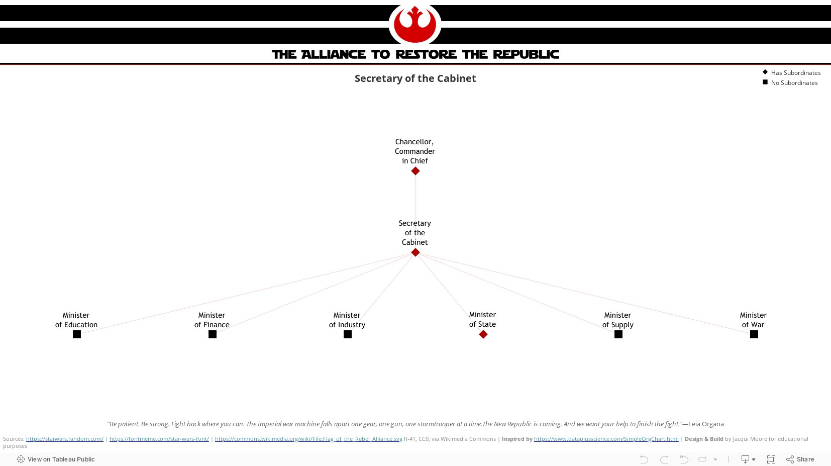
Many of us have been asked at some point to build an org chart, or something like it, in Tableau. And, like most of you, I started off with some ideas on how it could work, played with it a little bit, and then went to trusty ol’ Google, to see what the community had come up with. And as usual, the community delivered. I found two posts that set me on the right direction, even though they weren’t quite working for what I needed to do. So, credit, and a huge thank you to Jeff Schaffer, for his post on the subject from 2017, and to Nathan Smith for his post.

Starting with the data…

In order to build an org chart, you will need, at minimum — two fields:

  1. Employee
  2. Manager

Ideally you will have unique IDs for these records, and additional information such as departments and titles. But those two fields are all you really need.

Next, you will need to shape your data to create the hierarchical relationships between the Employee, their direct subordinates, and all of their supervisors. There are two approaches you can take to model the data. Whether you can transform the data using Tableau Prep, Alteryx, SQL, etc. will probably be the main factor in the decision. Both methods will produce the same end result from the user’s perspective.

Method 1: Preparing the data outside of Tableau Desktop

Using this method, we will prepare the data in Tableau Prep* to create a table that has one record for each employee-supervisor, and one record for each employee-subordinate relationship. We will then use the output to build the org chart visual in Tableau Desktop.

*I’ve used Prep to demonstrate because it does a nice job of visually showing what is happening, and many Tableau Creators have access to Tableau Prep. You can use the same concepts in your data prep tool of choice.

  • Pro: If the hierarchy becomes deeper, you can make the change once in the workflow and the Tableau dashboard will not need to be updated to scale with your organization. (If using Alteryx or SQL, this can be fully automated)
  • Con: You need the ability and access to use a data preparation tool and refresh the data on a schedule.

Learn how to use this method here >

Method 2: Preparing the data in Tableau Desktop

Using this method, we will create a data source in Tableau Desktop with one record for each employee with one column for each supervisor in the hierarchy, and one record for each employee-subordinate relationship. We will then use the data source to build the org chart visual.

  • Pro: You an do all the data preparation you need right within Tableau Desktop, with no other tools or schedulers necessary.
  • Con: There will be more to update in the event the organizational hierarchy gets deeper.

Learn how to use this method here >

The end result

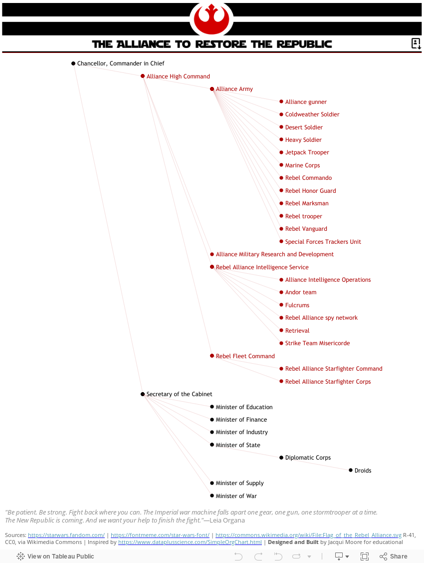
What I ended up with was an interactive org chart dashboard that thrilled my stakeholders, complete with name search and PDF downloads, and a lot of interactivity. I’ve published a couple of variations with fewer bells and whistles to my Tableau Public profile.

An interactive org chart navigator dashboard:

Org Chart - Interactive

And, a static vertical layout for printing to PDF:

Org Chart - Printable
Categories
Design Figma It Depends

It Depends: Using design tools in your dashboard design process

You may have heard people talk about Figma or Illustrator, or maybe you’ve heard people talking about wireframes or prototypes. Perhaps you’ve seen dashboards with custom backgrounds. Some questions seem to come up often: What do you use Figma for? What are wireframes? Do I need prototypes? Should I use background images in my dashboards? Are these tools just something to use for flashy dashboards for Tableau Public? Why wouldn’t you just do your mockup in Tableau?

These are all really good questions to be asking, especially if you haven’t used these tools in your work before. In this installment of the “It Depends” series, I’ll unpack how and when I use design tools in my dashboard development process.

Just a quick note to say, I might talk about Figma a lot here, but this post isn’t about Figma specifically. There are other tools that you can use to accomplish similar things to varying degrees. Plenty of people use PowerPoint, Google Slides, and Adobe Illustrator just to name a few. Autumn Battani hosted a series on her YouTube channel that demonstrates this very well (link). If you want to see how different tools can accomplish the same task, give them a watch!

Why would I use design tools?

In my mind, it boils down to two reasons to use a design tool like Figma in your process:

  1. Create design components such as icons, buttons, overlays, and background layouts, or
  2. Create wireframes, mockups, and prototypes

So, let’s get into when and why you might use these…

Design Components

For business dashboards, it’s usually best to try to keep external design components to a minimum, but when used effectively, they can improve your dashboard’s appearance and the user’s experience.

Icons and Buttons

Icons can be a nice way to draw the user’s eye or convey information in a small space. Custom buttons and icons can add polish to your dashboard’s interactivity. But, they can also be confusing to the user if they’re not well-chosen. So, what are some considerations that can help ensure your icons are well-chosen?

Is the meaning well understood?

While there are no completely universal icons, stick to icons that commonly have the same meaning across various sites, applications, operating systems, and regions.

For example, nearly every operating system you use will use some variation of an envelope to mean “mail”. They might look different, but we can usually figure out what they mean.

iOS mail icon, Microsoft mail icon, and Google mail icon

Are they simple and easy to recognize?

Avoid icons with a lot of details and icons that are overly stylized. Look for a happy medium. Flat, lower detail icons are generally going to be easier to recognize and interpret. Once you’ve chosen an icon style, use that style for all icons.

In this example below, the first icon is a very detailed, colorful mail icon, the second is a stylized envelope, and the third is a simple outline of an envelope. The third icon is going to be recognizable for the most people.

colored mail icon, stylized mail icon, simple mail icon
detailed, stylized, and minimal icon (From Icons8.com)

Is there a text label or will you include alt-text and tooltips?

Text labels and alt-text are not only important for accessibility, they can help bridge any gaps in understanding and clarity.

Does it improve the clarity or readability of the visualization?

Avoid icons that distract or are unnecessary. Using icons strategically and sparingly will ensure they draw the eye to the most important areas and reduce visual clutter.

This quote from the Nielsen Norman Group is a good way to think about using icons in your designs:

“Use the 5-second rule: if it takes you more than 5 seconds to think of an appropriate icon for something, it is unlikely that an icon can effectively communicate that meaning.”

Nielsen Norman Group

Some places to use icons:

  • Information:
    • Including an information icon can be a great way to use a small amount of real estate and a recognizable symbol to give users supplemental information about a dashboard without cluttering the dashboard
  • Filters:
    • Hiding infrequently used filters in a collapsible container can reduce clutter on the dashboard while still providing what is needed
  • Show/Hide alternate or detailed views:
    • An icon to allow the user to switch to an alternate view such as a different chart type or a detailed crosstab view, or to show a more detailed view on demand

Background Layouts

Background designs can help create a polished, slick, dashboard. Something you might use for marketing collateral, infographics, and executive or customer-facing dashboards. A nicely designed background can elevate a visualization but they do come with trade-offs.

Does it improve the visual flow of information?

Backgrounds can be used to add visual hierarchy, segmentation, and to orient or guide the user.

Does it distract from the information being presented?

When backgrounds are busy or crowded, they take away from rather than elevate the data being visualized.

Does it affect the maintainability of the dashboard?

Custom background images need to be maintained when a dashboard is changed, so they should be included thoughtfully.

Does it adhere to your company’s branding and marketing guidance?

Background images that are cohesive with other areas will feel more familiar to your users which can make your solution feel more friendly

Does it have text?

Whenever possible, use the text in Tableau as it will be easier to update and maintain, and is available to screen readers. If you need to put the text in the background image for custom fonts, you can use alt-text or hidden text within Tableau.

Find Inspiration

If you’re looking for a place to start with designing layouts, I suggest checking out Chantilly Jaggernauth’s blog series, “Design Secrets for a Non-Designer“, and conference presentation of the same name.

Look at Tableau Public, websites you find easy to use, product packaging. Take note of what works well (and what doesn’t).

This Viz of the Day by Nicole Klassen is a great example of using images that set the theme, elevate the visualizations, and create visual flow and hierarchy.

Of course, it’s not just the data-art and infographic style dashboards that can benefit from this. If you peruse Mark Bradbourne‘s community project #RWFD on Tableau Public, you’ll see plenty of examples using the same concepts to improve business dashboards. Don’t underestimate the impact of good design on usability and perception… It matters.

*Tip: When you use background layouts, you usually have to use floating objects— Floating a large container and tiling your other objects within that container can make it easier to maintain down the line #TeamFloaTiled

Overlays

Overlays can be used to provide instructions to users at the point where they need them. They provide a nice user experience, allow users to answer their own questions, and can save a lot of time in training and ad hoc questions.

Example overlay

Can instructions be embedded in the visualization headings or tooltips effectively?

Overlays are fantastic for giving a brief training overview to users, but they are not usually necessary. Instructions are usually most helpful if 1) the user knows they exist and 2) the information is accessible where it will be needed.

Does the overlay improve clarity, and reduce the need for the user to ask questions?

Overlays should help the user help themselves. If the user still needs training or hands-on help, then it might not be the right solution, or it might need to be changed to help improve the clarity. Sometimes the users just need to be reminded of how to find the information.

Is your dashboard too complex?

Sometimes dashboards need to be complex or they have a lot of hidden interactivity, and there’s nothing wrong with that. However, if you feel like you need to provide instructions it’s always a good idea to step back and consider if the solution is more complex than necessary, or if you can make the design more intuitive. Sometimes complexity isn’t a bad thing, but it’s always worth asking the question of yourself.

Will it be maintained?

Similar to background layouts, overlays will need to be changed whenever the dashboard is changed. Make sure there is enough value in adding an overlay, and that if needed, it will be maintained going forward.

Wireframes, Mockups, and Prototypes

Wireframes, mock-ups, and prototypes are a staple of UX design, and for a good reason. They help articulate the requirements in a way that feels more tangible, they force us to ask questions that will inevitably arise during the development process, and they help solidify the flow and structure. In dashboard design, they can get early stakeholder buy-in, ownership, and feedback. They also help us get clearer requirements before investing in data engineering and dashboard development (and having to rework things later — Tina Covelli has a great post on this subject here). You can talk conceptually about what they need to see, how it needs to work, and the look and feel earlier so it can save time on big projects. I’m a big fan of this process.

So, what’s the difference between wireframes, mockups, and prototypes, and when might you use them?

Wireframes

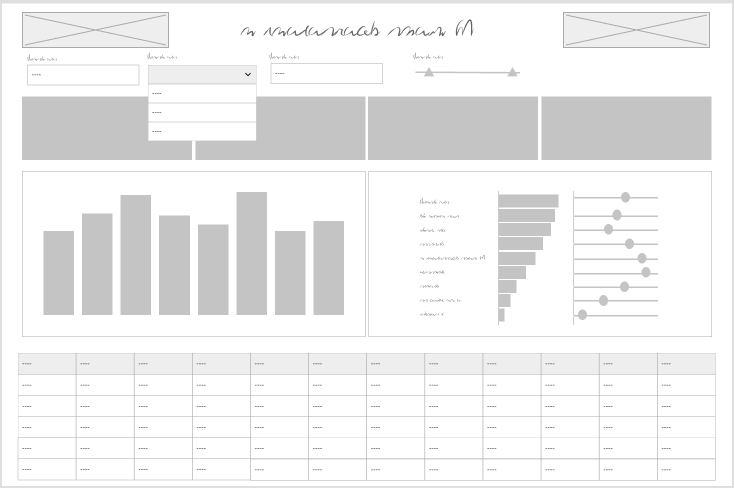
Wireframes are rough sketches of the layout and components. They can be very low fidelity — think whiteboard drawings of a dashboard. These are great very early on in your process.

Hand drawn wireframe

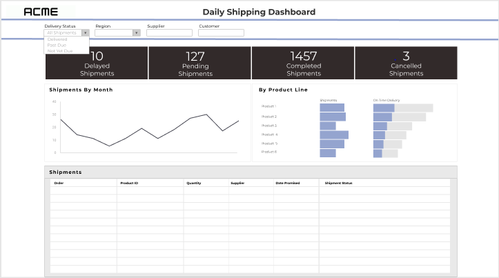
They can also be a slightly higher fidelity wireframe that starts to show what the dashboard components will be. These are the bones of a dashboard or interface, but can help articulate the dashboard design and move forward the requirements discussion.

Digital wireframe

Even if your stakeholders never see the wireframe, sketching out what your dashboard and thinking about what the layout, hierarchy, interactivity will look like helps organize your thoughts before you get too far or get locked in on a specific idea.

There’s really no reason not to start any project with a wireframe of some sort. This is a tool for the beginning of your process, but once you’ve moved on to mockups or design there’s no reason to do a wireframe unless a complete teardown and rebuild are needed.

Mockups

Mockups are a graphic rendering of what the dashboard might look like. These are high (or at least higher) fidelity designs that allow the user to see what the final product might look like. Exactly how high-fidelity to make the mockups will depend on the project and level of effort you want to invest. You don’t want to spend more time on this process than you would to just do it in Tableau.

Mockup

I think it’s worth noting here: the mockup should be done by the Tableau developer or someone who is very familiar with Tableau functionality. Otherwise, you run the risk that the mockup shows functionality that isn’t going to work well or appearances that aren’t accurate.

If a lot of data prep is required or you are working on a time or resource intensive project, a good mockup is worth its weight in gold. If you jump right into Tableau and find out that it’s more complicated than you initially thought, it’s not too late to pivot and come up with mockups.

Mockups can save you quite a bit of time in the development process. I will use mockups to think about the right data structure and level of detail, and think about how metrics will be calculated or what fields will be needed. And, if your users see a preview of the result and have an opportunity to get involved in feedback early, you are less likely to end up delivering a project that dies on the vine.

Prototypes

As soon as you need to demonstrate interactivity, prototypes come into play. These can be low-fi or high-fi but are useful whenever there is a lot of interactivity to demonstrate. To build interactivity, you’re going to need a prototyping tool. You can get creative and mark up your wireframes and mockups with arrows and comments to show how a user will interact, but prototypes make it feel more real.

The goal of prototypes isn’t to fully replicate the dashboard. A sampling of the interactivity can be included for a demonstration to better convey the idea without spending a lot of time.

You may not need prototypes on many projects, but similar to mockups, if you’re working on a large, complicated project where the stakeholders and users won’t get their hands on a fully functional product for some time, a prototype can be very helpful.

Some things to consider:

  • Is there interactivity that can’t be demonstrated by describing it?
  • Are your users unfamiliar with the types of interaction?
  • Is the user journey complex or multi-stepped?
  • How much functionality needs to be demonstrated?

To sum it up

I believe that involving your stakeholders and user representatives early in the process yields better requirements and a sense of ownership and buy-in. Your stakeholders and users are more likely to engage with, adopt, and encourage the adoption of your solution if they feel ownership.

Knowing that time isn’t an infinite resource, these steps can also take time away from other aspects of the solution or extend the timeline. Sometimes mocking up or iterating right in Tableau will be faster and produce the same result. If you start in the tool, presenting rough versions and getting feedback early is still valuable for the same reasons. Consider if these steps are taking more time than the build itself, or when they add a step that’s not needed to clarify or establish the end goal.

Bonus: Diagrams

Most design tools can also be used to create diagrams. While diagrams aren’t “dashboard design” per se, they are often an important part of documenting or describing a full data solution. What kinds of diagrams might you use in your data solution process?

  • Relationships
    • The good old entity relationship diagram, whether it is a detailed version used for data engineering, or an abstracted version to present to stakeholders
  • User journeys
    • Map out the ways a user can enter the solution, and how they progress through and interact
  • Process flows
    • Flow charts… whether it’s mapping out the process that creates the data, the process for how the solution will be used, or the steps in the data transformation process

Thanks for reading!