This will most likely be the shortest blog post that I ever write. Not because there’s not much to talk about when it comes to Best Practices for Dashboard Design. There certainly is. But, I would much rather demonstrate how to apply these principles than just talk about them. That’s why I built an interactive presentation (in Tableau of course), that walks through an actual rebuild of a dashboard. It goes step by step, applying various best practices and explaining why each of them are important. It focuses on key design elements including:
Chart Selection
Dashboard Layout
Chart Formatting
Color Application
Titles & Fonts
Branding
Tooltips
Dynamic Design
I will be sharing this presentation at various Tableau User Groups, but, to be honest, you don’t really need me. I would only be getting in the way. The presentation has everything you need to master your dashboard design. You can get started by checking out the links below. The first link is to the presentation. The second link can be used to download the starter workbook (if you want to follow along with the redesign).
A few years back I came across this beautiful, impactful viz by the incredibly talented Ivett Kovács. I was already amazed by the design, but when I realized that those gradient circles weren’t custom shapes, but actually built directly in Tableau using standard mark types, my mind was blown. I was brand new to the Tableau Community when this viz was published, and it was one of the first truly custom visualizations I had ever seen built entirely in Tableau. It was one of those AHA moments that you look back on years later and realize just how much of an impact it had on you. It was a sudden realization that with a little math and a little creativity, you can create things in Tableau that really just don’t seem possible…until somebody does it.
In her visualization (and her blog post about gradients), Ivett credits another amazingly talented individual, Ludovic Tavernier, for this gradient color concept. Ken & Kevin Flerlage have also done a lot of really cool stuff in Tableau with gradients. So I, in no way, shape, or form, invented the concept of creating gradients in Tableau. But, over the past couple of years, I have taken that concept and come up with a few different techniques for applying it in Tableau.
In this blog post, I’m going to cover 3 different methods. We’ll call them the No-Math Method, the Straight-Line Method, and the Vertex Method. If you would like to follow along with this post and build these yourself, you can download the sample data here and download the sample workbook here.
But before we get started, a quick disclaimer. Like most of the things I share on Tableau Public, I would never, ever, ever try to do something like this at work. Adding gradients to your charts will not make them better at communicating important information. They will, however, make them load much, much slower. All of the techniques we’re going to discuss today rely on data densification, where we are going to blow up our data source and create a bunch of new records that we can use to draw the lines and shapes needed to create that gradient effect. Also, if you don’t have any experience with data densification, or drawing curved lines and/or polygons, I would recommend checking out part 1 of the 3-part blog series below. Not required, but it might help.
This part is totally optional. The foundation of any of these methods, or the methods created by others before me, is that we are basically placing a bunch of overlapping but slightly offset marks on the Tableau canvas, and then assigning a sequential color palette to create that gradient effect. The measure we use on color will go from a lower value to a higher value, and that value will align with the shade the color (so low values have a lighter shade and high values have a darker shade or vice versa). So, in order for this to work, we need to have a sequential color palette available for each color we want to use in our viz. Tableau already has many of these available so you don’t necessarily need to create your own, but if you have custom colors that you want to use, this is how I would go about setting up your palettes.
The nice thing about sequential color palettes is that we really only need two color codes to build our gradients. We need a light shade on one end and a dark shade on the other end, and Tableau will automatically fill in all of the shades in between. One option to get these codes is to use an online color shade generator, like this one. You can enter your “base” color and then select a lighter shade and a darker shade to use in your palette. But I like to play around with the shades and see exactly how it’s going to look when I bring it in to Tableau. This way I can kind of lock it in before editing my preferences file and cut down on the back and forth that goes with editing color palettes. This is how I build and test my sequential palettes using PowerPoint
Building a Sequential Color Palette in PowerPoint
Open PowerPoint
Click on Insert > Shapes and select the Circle shape type
Format the Circle
Increase the size so you can see the gradient better (I set it to around 4 x 4 inches)
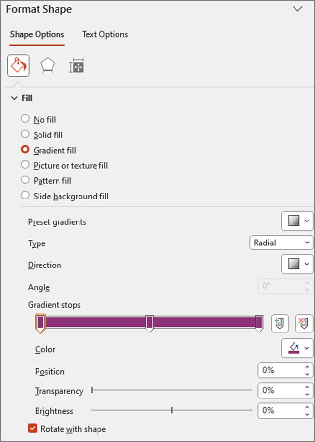
Right click on shape and select “Format Shape”
Change the “Fill” type to “Gradient Fill”
Change the “Type” to “Radial”
For “Direction” choose the center option (gradient radiates from the center of the shape)
Change the number of “Gradient stops” to 3 (add or delete stops so that you have a total of 3)
Click on each of the stops and set the color to your “base” color (in my example the base color is #8D3276)
Update Position of Each Stop
Stop 1: 0%
Stop 2: 50%
Stop 3: 100%
At this point your settings should look something like this and your shape should be a circle that appears to be one solid color (even though it is set to Gradient)
Edit the stop colors
Edit stop #1
Click on the 1st stop to select it
Below the stops click on the Color selector
Click on “More Colors”
Click on the “Custom” tab
Click and drag the arrow next to the color bar upward to change to a lighter shade of your “base” color
Edit stop #3
Click on the last stop to select it
Below the stops click on the Color selector
Click on “More Colors”
Click on the “Custom” tab
Click and drag the arrow next to the color bar downward to change to a darker shade of your base color
This is how my color selectors look for the 1st and last (3rd) stops
And here is what my gradient circle looks like
You can continue clicking on the 1st and 3rd stops and tweaking the shades lighter and darker until you have a gradient you are happy with. And then we just need to add these colors to our preferences file as a sequential color palette. You don’t have to include the “base” color, but I like to include it so I have it if I need to edit my palette later on.
Go to Documents > My Tableau Repository
Right click on your Preferences file and open with a Text Editor program (like Notepad)
Add the palette to the end of your preferences file before the line containing the </preferences> closing tag
The palette should be in the format below
Once your palette is added, close out of Tableau and re-open it. I have put a sample preferences file with a few of these gradient palettes in a Google Drive folder here.
Choosing the right Method
As I mentioned earlier, this post is going to cover three different methods for building gradients in Tableau. Which one is best? Well, as with most things Tableau…it depends.
The No-Math Method
I really like the No-Math method. It’s by far the easiest to implement, requires no complicated calculations, and it can be used on different mark types (gradient lines, bars, etc.). The only real downside is that you can’t really control the direction of the gradient or the “position” of the light source. With this method, the gradient will always be lightest in the center and darkest on the edges, as if the light source was shining from directly in front of the object. Another nice thing about this method is that you don’t have to worry about the size/shape of your view. In the other methods we are “drawing” the circles, so the X and Y axis ranges need to be equal, and the Height and Width of the view need to be equal when placed on the dashboard. Otherwise, you will end up with ovals instead of circles. But with this method we are using the Circle mark type, so we don’t have to worry about any of that.
The Straight-Line Method
This method requires a little bit of math, but nothing too complicated. It’s definitely easier than the Vertex Method, but more difficult than the No-Math method. This method provides some flexibility on the gradient direction, but the main limitation is that the gradient has to start on one edge of the object. With this method, the gradient will always be lighest on one edge and darkest on the opposite edge, as if the light source was shining from the side of the object.
The Vertex Method
This method is by far the most complicated, but it’s also my favorite, as it gives you the most flexibility in terms of design. With this method you can use parameters to “move” the light source so that it looks like the light is shining on the object from any direction, giving it a much more realistic 3D look compared to any of the other methods. But, just for reference, the no-math method uses 3 calculations, the straight-line method uses 7 calculations, and this method uses almost 20.
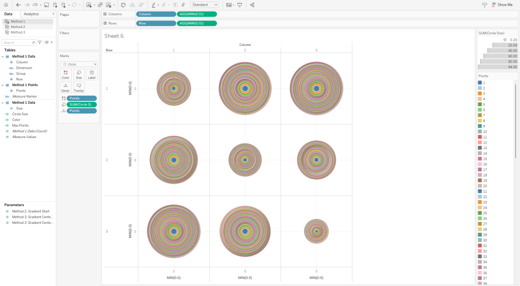
Method 1: The No-Math Method
Of the three methods in this post, this is the only one that does not use the Line mark type. The way that this one works is that we are basically stacking a bunch of circles right on top of each other. Each circle is a slightly different size and a slightly different shade of our “base” color. The smallest, and lightest colored circle will be on the top of the stack, and the largest, darkest colored circle will be on the top of the stack.
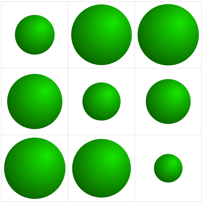
If you haven’t already I would recommend downloading the base data and sample workbook. Our base data (Method 1 Data) is a simple file with just 9 records. We have a Dimension field and a Size field (and a few other fields that aren’t required). And then we have a Densification table (Method 1 Densification), with 100 records and one column called “Points”. To build our Data source we are going to do a Physical join between these two tables by creating a join calculation, with a value = 1, on each side of the join. The result will be a data source with 900 records (100 densification records for each of our 9 data source records). It should look like this.
Now this part may get a little confusing as we’re going to be talking about two different types of circles here. So, for the rest of these section, I am going to refer to the main gradient circles that we are trying to create as “Design Circles” and the individual circles used to create the gradient effect as “Building Circles”. So in all of the screenshots above, those 9 gradient circles are our “Design Circles”, and each of those is made up of 100 “Building Circles”.
The exact way that you build this is going to depend on how your chart is set up. In this example, we are going to build a simple 3 x 3 Panel chart, using the Size field to determine the size of our “Design Circles”. So to build my panel, I’m going to use some of those extra columns from my data source (row and column, but these could be easily calculated in the workbook instead). I’ll change them both to dimensions and bring them out on to the Rows and Columns shelves respectively.
Also, on each of these shelves, I’m going to double click in the blank space on the shelf and enter MIN(0.0). The reason for this is that we need to have a numeric measure on columns and/or rows to be able to “stack” these marks on top of each other. Otherwise we’ll end up with a unit chart with 100 circles next to each other. However, if you were building a scatterplot, or something like that where you already have numeric measures on rows and/or columns, you would not need to do this. So to start, my rows and column shelves are going to look like this.
Next, let’s build the calculations we’re going to need for the size and color of each of our circles. First, we’re going to build an L.O.D. to get the maximum number of densification records (in our case, this will be 100)
Max Points = {MAX([Points])}
Now we’ll build a calculated field that determines the size of every “Building Circle”. So we already determined that we are going to use the [Size] field to determine the size of our “Design Circles”. So we need our largest “Building Circle” to have that same value. And then we want the size of the rest of our “Building Circles” to get smaller and smaller. In our densification table, we have 100 records with values from 1 to 100. So if we divide each of those values by the maximum value (in our case that’s 100) that will give us percentages from 1% to 100%. And then if we multiply that by our [Size] field, we’ll end up with 100 different values, with the largest value being equal to the [Size] field, and the smallest value being equal to 1% of that value. But note that you do not need exactly 100 records for this to work. Your densification table could have 200 records. The largest circle will still have the same value as the [Size] field, and the smallest would be equal to .5% of that value. Or it could have 1000 records. Or it could have 53,469 records. It doesn’t matter, as long as the numbers in the [Points] field are sequential and you’re dividing each [Points] value by the maximum [Points] value.
Circle Size = ([Points]/[Max Points])*[Size]
And then lastly we need a field to use on Color. The logic here is basically the same as our [Circle Size] calculation. We’re just dividing the [Points] value by the maximum value to get 100 evenly spaced values from 1% to 100%
Color = [Points]/[Max Points]
Now, let’s build our view
If you haven’t already, complete the first few steps mentioned above (drag rows/columns to shelves, add MIN(0.0) to both shelves)
Right click on [Points] and “Convert to Dimension”
Drag [Points] to Detail on the Marks Card
Set Mark Type to “Circle” on the Marks Card
Drag [Circle Size] to Size on the Marks Card
Drag [Color] to Color on the Marks Card
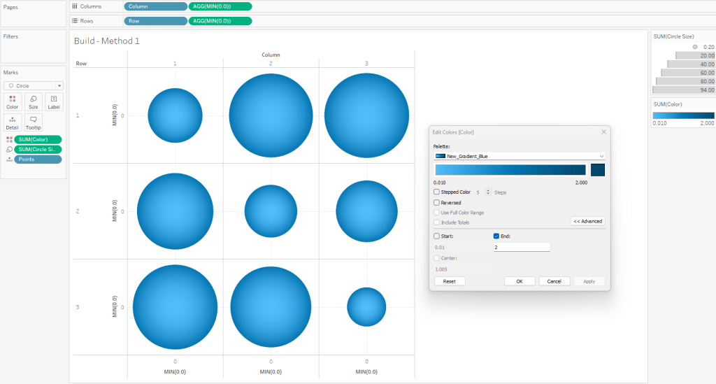
Edit the Colors
Click on the Color card and select Edit Colors
Select your sequential color palette from the “Palette” drop-down
Click on Advanced and tweak the “End” value
Using the standard color range usually results in the outer edge being too dark
If you want the gradient to match the one in PowerPoint, set the “End” value to somewhere between 1.5 and 2
When complete, your worksheet should look something like this
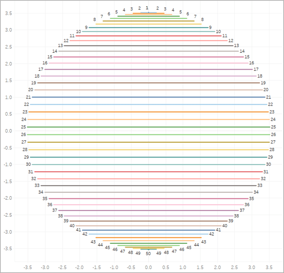
To illustrate how this method works, this is what this view would look like if we put the [Points] field on Color as a Dimension. You can see that each of our “Design Circles” is made up of 100 different “Building Circles”, each slightly bigger than the one on top of it and slightly smaller than the one below it.
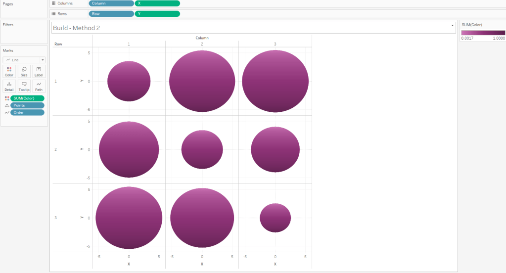
Method 2: The Straight-Line Method
On to Method #2. As I mentioned earlier, this method is going to use lines to create the gradient effect. In Method #1, we stacked 100 circles on top of each other. In Method #2, we are going to place 600 lines right next to each other.
The data source set up for this method is very similar to Method #1, except that it has 600 densification records instead of 100, and we are going to add an additional “table”. This “table” just has 1 field called [Order] and just two records (with values of 1 and 2). Alternatively you could just add this column to the Densification table and have two records for each [Points] value, but it’s a lot easier to increase or decrease the number of densification records (which I do pretty frequently) if you put this in it’s own table. So again, we are going to do a Physical join between our data table and our densification table and then we’ll add another join for our order table (once again using the join calculation).
As I mentioned earlier, the main limitation of this method is that the gradient has to start on one edge of the circle. But I like to make it dynamic so you can tweak where that starting edge is (top/bottom/left/right/etc.). So I use a numeric parameter where the range of acceptable values is between 0 and 1. This will be used to rotate the circle between 0% and 100%.
Now we’ll start building our calculations. The first one is going to be our [Max Points] field, which is the same as the one in Method #1
Max Points = {MAX([Points])}
In order to draw a circle in Tableau (check out the blog post at the beginning of this article if you haven’t already) using the method that I typically use, we need two inputs: radius and position. Let’s start with the radius. Once again we are going to use the [Size] field to size our circles, and that value is going to represent the Area of the circle. So if the [Size] field is the Area, then we can calculate the radius using the calculation below
Radius = SQRT([Size]/PI())
Now, the position. The position is a value between 0 and 1 (or 0% to 100%) that represents how far around the circle that point would appear. So 25% would be at 90 degrees, or 3 o’clock, 50% would be at 180 degrees, or 6 o’clock, and so on. So to get that value, similar to how we calculated the color and size in Method 1, we can just divide the [Points] value by the maximum [Points] value (and subtract 1 from both the numerator and denominator to start at exactly 0%). Let’s call this [Position_Base]
Position_Base = (([Points]-1)/([Max Points]-1))
Now if we were to plug our [Radius] and [Position_Base] fields into our X and Y calcs (which I will get to in a minute), we would end up with something like this. To make it a little easier to see, for this example, I limited the number of densification records to 50. So we end up with 50 points evenly spaced around a circle.
But now we need to adjust those positions a bit. Ultimately, what we want to do is to draw perpendicular lines across the circle. So in the example image above, we would want to draw a line from 1 to 50 (50 is hidden behind 1 in the image), another line from 2 to 49, then 3 to 48, and so on until we get all the way around the circle. So let’s start by getting all of our points on 1 side of the circle. And we’ll do that by dividing our [Position_Base] field in half. And we’ll call it [Position_Offset]
Position_Offset = [Position_Base]/2
So now, instead of our points being evenly spread between 0% and 100% around the circle, they are spread between 0% and 50%, with all of the points on the same side of the circle.
And now here is where our [Order] field comes in from that new table we added. Each of the points in the screenshots above actually consists of 2 records, one where [Order]=1 and one where [Order]=2. So we are going to create one more calculation that will basically create a mirror image of these points so that each [Point] value from our densification table has one mark on the right side of the circle, and then a second mark on the mirror opposite side of the circle. And this will be our final [Position] calc.
Position = if [Order]=1 then [Position_Offset] else 1-[Position_Offset] END + [Method 2: Gradient Start]
So if [Order]=1 we’ll use that position on the right side of the circle that we calculated previously. If [Order]=2, we’ll subtract that value from 1 to give us the position that is the mirror opposite of it on the circle. So for example, if our [Order]=1 mark is at 10%, the [Order]=2 mark would be at 90%. If 1 is at 35%, then 2 is at 65% and so on. And then finally, we add the value from the parameter we created earlier (in the screenshot below it is set to 0%) to “rotate” the circle. And then if we connected those marks, it would look something like this.
So that is the meat of this technique. Basically we are going to draw a bunch of perpendicular lines that go from one side of the circle to the mirror opposite side. Now for the rest of the calculations. Here are the [X] and [Y] calcs that I mentioned earlier that are used to actually plot the points around the circle using the [Radius] and [Position] inputs.
X = [Radius] * SIN(2 * PI() * [Position])
Y = [Radius] * SIN(2 * PI() * [Position])
And then finally our [Color] calculation is going to be exactly the same as Method #1. We’ll use the [Points] field to evenly calculate values between 0% and 100%.
Color = [Points]/[Max Points]
And now we are ready to build our view.
Similar to Method #1, if you are going to build a panel chart, drag the [Column] and [Row] fields to their respective shelves
Right click on [X] and drag to Columns shelf. When prompted, choose no aggregation
Right click on [Y] and drag to Rows shelf. When prompted, choose no aggregation
Change Mark Type to Line
Adjust the Size so the line thickness is at or near the minimum width
Change [Order] to a dimension and drag to Path
Change [Points] to a dimension and drag to Detail
Drag [Color] to color
Edit Colors and select your desired sequential palette
Use the parameter to rotate the circle if desired
Edit the X and Y axes so that the ranges are equal
It’s important to note that with this method, the X and Y axis ranges need to be equal for the circles to appear as perfect circles. If one axis range is longer/shorter than the other axis range, you will end up with ovals
It’s also important to note that when you place this worksheet on a dashboard, the Height and Width of the worksheet need to be equal to maintain it’s perfectly circular shape
When finished, your sheet should look something like this
If you are drawing large circles, you may need to add more densification records. Alternatively, you can increase the line thickness. But I have found that adding more records typically looks better than thicker lines, as the thickness of the lines can have an impact on the shape of the full circle. If you are drawing small circles, you can delete densification records. You can play around with the number of records you need until it looks just right.
Method 3: The Vertex Method
Now on to our final and most complicated method. There are a few differences between The Vertex Method and the Straight-Line Method, but the main difference is that our lines are going to use 3 points instead of 2. That 3rd point will allow us to control how the gradient appears (or where the “light” is coming from).
Setting up the data source for this method is exactly the same as Method #2. The only difference is that our Order table has 3 records instead of 2.
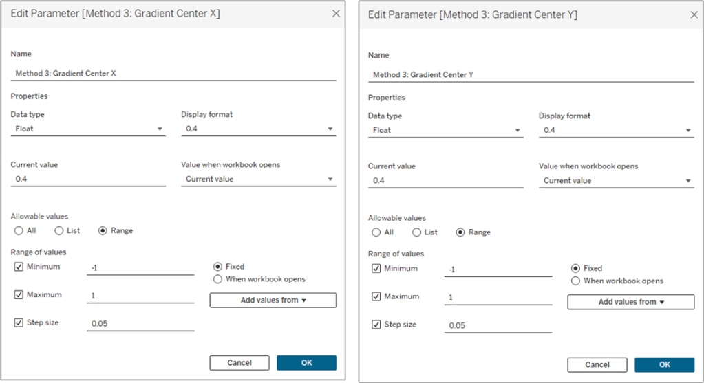
Similar to Method #2 we’re going to want to use parameters to “move” the light source, but in this case, we’ll have a lot more flexibility on how we can move it. We can move it up, down, left, right, basically anywhere. So we’ll use two parameters, one to move it up or down (adjusting the Y coordinate), and one to move it left or right (adjusting the X coordinate).
And then the start of this method is exactly the same as Method #2. We need to calculate our two inputs for the circle, the radius and the position. So our first few calculations are going to be identical.
Max Points = {MAX([Points])}
Radius = SQRT([Size]/PI())
Position_Base = (([Points]-1)/([Max Points]-1))
Position_Offset = [Position_Base]/2
Once again we’re calculating the Radius using the [Size] field, and then we’re calculating the Base position, and then dividing that by 2 to get all of our points evenly spaced along the right side of the circle. Now this is where the two methods begin to diverge. In Method #2, we were drawing perpendicular lines across the circle. With Method #3 the end of the line is going to be at the polar opposite of the start. Something like this.
So our lines will start on one side of the circle, pass through the center, and then end at the point directly opposite of the starting point. And then what we’ll do is use our parameters to “move” that center. But we’re not there quite yet. First, let’s finish calculating our [Position] field.
Position = [Position_Offset] + IF [Order]=3 THEN .5 ELSE 0 END
So if [Order]=1 it’s going to use the [Position_Offset] value, which is the starting point, or the position along the right side of the circle. And then if [Order]=3, it’s going to add .5 (or 50%) to that value, which would be the position at the direct opposite side of the starting point. Next, let’s plug our Radius and Position into our X and Y calculations, but we’re going to call them [X_Base] and [Y_Base] since we’re not quite done with them.
X_Base = [Radius] * SIN(2 * PI() * [Position])
Y_Base = [Radius] * SIN(2 * PI() * [Position])
So for each of our lines, we need 3 sets of coordinates, or 6 values in total. We need X and Y values for the start of the line, the center of the line, and the end of the line. We’ve already done all the math we need to calculate each of those, but to make things easier, let’s build a few really simple calculations to isolate these. Let’s start with the X coordinate calculations.
Line_X_Start = [X_Base]
Line_X_Center = [Method 3: Gradient Center X] * [Radius]
Line_X_End = [X_Base]
I told you they were simple calcs. For the Start and End of our lines, we already calculated those values. Those will just be equal to that [X_Base] calc we built above. And the center of the line is going to use that parameter we built to move the “light” source left and right across the X axis. We just multiply that value, which is a decimal between -1 and 1, by the radius to determine how far to move it.
-1 would be all the way to the left.
1 would be all the way to the right.
0 would keep it in the center.
-.5 would move it halfway between the center of the circle and the left edge
and so on
Now, let’s build our Y coordinate calculations, which are nearly identical the X calcs above, except they’re going to use the [Y_Base] field, and the Y coordinate parameter
Line_Y_Start = [Y_Base]
Line_Y_Center = [Method 3: Gradient Center Y] * [Radius]
Line_Y_End = [Y_Base]
And then a couple of final calculations to bring all of these values together.
X = CASE [Order] WHEN 1 then [Line_X_Start] WHEN 2 then [Line_X_Center] WHEN 3 then [Line_X_End] END
Y = CASE [Order] WHEN 1 then [Line_Y_Start] WHEN 2 then [Line_Y_Center] WHEN 3 then [Line_Y_End] END
With this method, the center point of the lines is going to be where the light source “shines”. So if we were to leave those parameters at 0 & 0, the light would shine at the center of the circle and look similar to what we built with Method #1. Our individual lines would look like they did in the screenshot above (and the one on the left below). But if we adjust those parameters to say, .5 and .5, then the center point of the lines would move up and to the right (like the one on the right below). And once we add the gradient color to our lines, it will look like the light is shining from the upper right of the object.
It’s all starting to come together. We’ve calculated all of the points we need to draw the lines, we just need to add some color. This part is a little trickier than it was in the other two methods, but nothing we can’t handle. Similar to the other methods, we are going to use a value between 0 and 1 (or 0% and 100%) to assign our color. The main difference here is that we are going to use the length of each line segment to calculate that value. Each of our lines has two segments; start to center, and center to end. We’re going to use the Pythagorean Theorem to calculate both of those.
Each line segment is essentially the hypotenuse of a right triangle, so we can calculate that if we know the lengths of the other two sides of the triangle…which we do. Let’s isolate one of the lines from our screenshot above. Here is Line #1
If it’s been a while since you’ve taken a Geometry class, which it certainly has for me, Pythagorean’s Theorem is a^2 + b^2 = c^2 where c is the hypotenuse. Now let’s look at this image again, but with the rest of our triangles drawn.
So for each of these triangles we can calculate the length of the “a” side, by subtracting the [Line_Y_Start] value (or [Line_Y_End] value depending on which segment you are measuring) from the [Line_Y_Center] value (result may be a negative number but the ABS of that value would equal the length). And we can get the length of the “b” side by subtracting the [Line_X_Start] or [Line_X_End] value from the [Line_X_Center] value. And with both of those, we can calculate the length of the “c” side, which is what we’re going to use in our color calculation.
First, let’s calculate the length of the first line segment, from the start of the line to the center of the line (which would be the red triangle in the screenshot above)
And to calculate the length of the second line segment, from the center of the line to the end of the line (the purple triangle above), it will be the same calculation but we’ll swap out the “Start” coordinates with the “End” coordinates.
And then one last calculation called [Line_Length] to bring those values together and assign a value to each [Order] value. So if [Order]=1 we want to use the length of the first line segment (from start to center). If [Order]=2, we want to use a value of 0. And if [Order]=3, we want to use the length of the second line segment (from center to end). This may be confusing at the moment, but stick with me.
Line_Length = CASE [Order] WHEN 1 then [Line_Length_Start_to_Center] WHEN 2 then 0 WHEN 3 then [Line_Length_Center_to_End] END
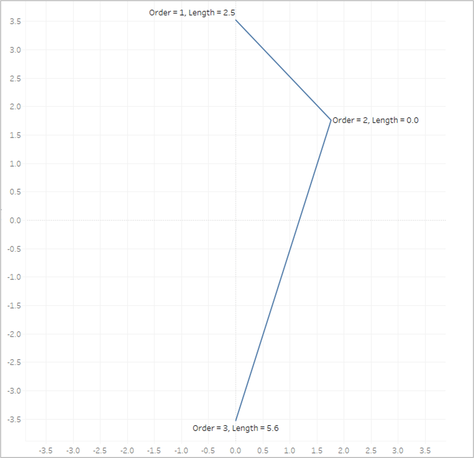
So let’s look at our example again with the Line Length value on Label
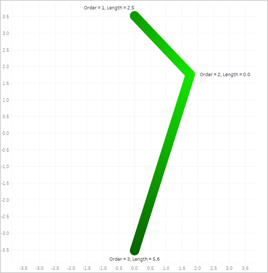
The length of the first line segment is 2.5, so we’ll assign that value to the 1st point, where [Order]=1. The length of the second line segment is 5.6, so we’ll assign that value to the last point, where [Order]=3. And when [Order]=2, we assign a value of 0. Now look what happens if we put that [Line_Length] field on Color and apply a sequential color palette.
Tableau assigns the lightest shade from our palette to the lowest number, which is 0, and assigns the darkest shade from our palette to the highest number, which is 5.6. And then it automatically generates all of the appropriate shades in between.
Now the last thing we need to do is to translate those numbers into percentages between 0 and 1. When we have different sized circles in the same view, they’re going to end up with different lengths, so we don’t want to use the actual length of each line, we want to use the length relative to the longest line for that circle. So the longest line will have a value of 1. And this will be our [Color] calculation.
Color = [Line_Length]/{FIXED [Dimension] : MAX([Line_Length])}
And now we are finally ready to build our view, which is going to be exactly the same as Method #2
Similar to Method #1 & #2, if you are going to build a panel chart, drag the [Column] and [Row] fields to their respective shelves
Right click on [X] and drag to Columns shelf. When prompted, choose no aggregation
Right click on [Y] and drag to Rows shelf. When prompted, choose no aggregation
Change Mark Type to Line
Adjust the Size so the line thickness is at or near the minimum width
Change [Order] to a dimension and drag to Path
Change [Points] to a dimension and drag to Detail
Drag [Color] to color
Edit Colors and select your desired sequential palette
Use the parameters to adjust the light source up/down/left/right
Similar to Method #2 you will need adjust the X and Y axis ranges so that they are equal (and make sure that the Height and Width of the worksheet are equal when placed on your dashboard)
When we’re done, our sheet should look like this
So this blog post is already much, much longer than I planned, but there is one last thing I want to touch on. What if you want to have multiple gradients in the same sheet?
Assigning Multiple Gradients
Use Map Layers. I’m not going to go through the entire process of building a view with map layers as that would double length of this already ridiculously long post. But that is how you would go about assigning multiple gradients. So in this last example, I’m going to use the [Group] field from our data source. It just has three different values, 3 of the records are assigned to Group A, 3 to Group B, and 3 to Group C.
I have 3 different groups that I want to assign 3 different colors, so I will create 3 different MAKEPOINT calculations.
Final_Group_A = if [Group]=’A’ then MAKEPOINT([X],[Y]) END
Final_Group_B = if [Group]=’B’ then MAKEPOINT([X],[Y]) END
Final_Group_C = if [Group]=’C’ then MAKEPOINT([X],[Y]) END
So each of these calculations will only return results if the records are in the associated group. The result will be null for anything outside of that group. Next, you just need to duplicate your [Color] field 3 times so you can assign a different palette to each Group
Color_Group_A = [Color]
Color_Group_B = [Color]
Color_Group_C = [Color]
And then you build the view exactly the same way, except that you add multiple layers, one for each of the Groups using the appropriate MAKEPOINT field. Instead of using the [X] and [Y] fields, it will use the generated latitude and longitude from those MAKEPOINT calcs. At the end, your view should look something like this.
Alright, that was a long one. As always, I hope you enjoyed this post, and please let us know if you try out any of these gradient methods. We would love to see what you create with them!
Have you ever published a dashboard to have the users come back and say “The dashboard is broken”?
Everyone should be raising their hands. We’ve all done it at some point.
Checklists to the rescue!
By going through a list of common data source and dashboard items before publishing, you can prevent a lot of common issues with data sources and dashboards from making it to your users.
Using a checklist such as this can help reduce errors, increase efficiency, improve confidence and trust, and act as training and process documentation. Having a checklist review as part of your dashboard development process can help catch bugs and errors that are sometimes easily overlooked — especially on large, complicated, or fast-moving projects.
Initial Development: Review the checklist prior to first publishing to production
Enhancements and Updates: Use the checklist as a script for regression testing when making changes
Code Review/Peer Review: Having a second set of eyes on your work will often catch items that you may not, being too close to the project
User Testing: Providing users a modified list of these items can provide guidance on what they should be testing and providing feedback on, which can produce more actionable and organized feedback
But, you’re not here to hear me talk about checklists, you’re here to see the checklist! So, without further ado…
This is not necessarily fully comprehensive of everything that can/should be tested or reviewed
However, it is fairly comprehensive and not every one of these items will apply to every dashboard, environment, or organization
I firmly believe processes should be helpful, not just add work. If a process is adding more overhead than it is adding value, modify it and make it suit your needs!
Think of this as a living document, and update it as the technology, product versions, and your own processes change. Make it work for you!
I didn’t come up with the concept of Publishing Checklists. This is mine. I’m certain there are others out there, so please share!
What do optical illusions have to do with data visualization?
Aside from being kind of fun, optical illusions tell us a lot about how human visual perception changes how we interpret what we see. These illusions expose to us areas to be aware of when presenting information visually, and how perception can change the interpretation of the information when presented to different individuals or in different circumstances. As data visualization practitioners, we are communicating with images. Our work is subject to these same visual systems, but the result is less fun when your charts are misinterpreted, but they can also be used to benefit the user.
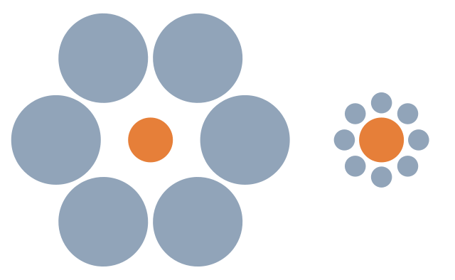
Our brains interpret the right circle as larger due to its size relative to the smaller circles around it. In reality, the circles are the same size.
When we use size to encode data, being aware of how a mark appears relative to other objects in a chart can help avoid misinterpretation of the data. For example, from the Superstore dataset, I have placed Discount on size.
It’s difficult to see what marks have the same discount, until they are highlighted using color.
We can run into this effect any time we are encoding data on size, so double encoding the data may be needed to make the visual more clear.
This illusion illustrates the effect additional shapes can have on the perception of length.
If the additional shape equally impacts all marks, such as with a dumbbell or lollipop chart, this is less of a concern. The precision of the chart can be affected, but the interpretation won’t be heavily impacted.
If we are using additional marks to encode more information, we should be aware of the fact that it can alter the interpretation, or change the perceived (or actual) size of the primary mark.
Now, this doesn’t mean you can’t use shapes with other marks. If the actual value is less important than the information conveyed with additional marks, perhaps this is ok. It depends on the goals of the visual.
Color and Shade
Which Color is Darker?
Color Saturation Illusion
In this illusion, we can see that the circles appear darker on a lighter background, and lighter on a darker background, even though they are the same color.
When using a continuous color palette, we want to beware that a color can be interpreted differently depending on how the shades are distributed.
So a similar value could be interpreted as being good or bad simply based on the other marks in close proximity, even though the number itself is the same. This can be used to call attention to outliers, like an unusual seasonal ordering pattern, if that is the intention of the chart.
When using gradient backgrounds, it can also alter the perception of the colors used in the visual, making those on the lighter section of the background appear darker, and those on the darker section of the background appear lighter.
Many of us have seen the famous dress illusion or the pink sneaker illusion. Color is tricky! When using color to show dimensions, depending on the other colors used, those colors may be misinterpreted.
Using fewer colors and ensuring they are different enough in hue and value will help ensure this doesn’t hinder or alter the interpretation.
Bonus! It’s also better for users with color vision deficiency and impaired vision.
Attention
Look at right side of the fork. How many tines are there?
Now look at the left side of the fork. How many tines are there?
If we call attention to one thing, we are necessarily calling attention away from something else.
We can use this to our advantage to guide a story, if that is the goal. But, this also means that different users may see different things in a dashboard.
How, and how carefully, we use other visual attributes like color, labels, layout, and helper text can direct the attention and ensure the takeaway is consistent.
Giving the context needed to orient the viewer will take away the ambiguity. Even just a couple of crude lines to show feet, and a pink nose, and now it’s definitely a bunny.
Duck-Rabbit Illusion with Markup
Pattern Finding
Humans have a brain that is made to find patterns. It’s what we do. And, it’s why data visualization can be so effective.
A shape or pattern can be suggested simply by the pattern of those objects (object completion). The brain is going to be looking for patterns, and things can be created out of the white space. This can help identify patterns or trends.
However, this can also trick the user into seeing a pattern that is incorrect based on the context, as this illusion illustrates.
Using visual attributes to help ensure the eye follows the correct pattern can ensure the visual isn’t misinterpreted.
If we know that the human eye is going to be identifying a trend, we can call attention to specific areas to counter this effect. We can also visually identify when a pattern is or isn’t significant. Things like control lines or specifically calling out whether a trend is statistically significant can keep the brain’s pattern finding instinct from causing misunderstanding of what the data actually show or to force a focus on the purpose of the visualization.
For example, all my eye wants to see here is that the totals seem to be trending upward. There are spikes and lulls, but that’s not what my brain is focusing on.
This may be fine if the visual is purely informational, and open to that type of interpretation and analysis. It is often helpful if we can anticipate this and identify if a trend is or is not significant. We can identify things like the impact of seasonality in data. Or we can use things like control charts or highlight colors and indicators to drive attention to the outliers rather than the trend.
This post could probably go on forever, but I’ll stop here. Enjoy, go down the rabbit hole and look up some other optical illusions.
And Remember:
With great power comes great responsibility | Giphy
I didn’t have my start in analytics. Honestly, when I was a college student, analytics, data science, and data visualization majors weren’t a thing, and analyst was not one of the jobs that were introduced as a possible career path (maybe I’m aging myself). I don’t know if 20-year-old me would have picked the major, anyway.
No, I started my undergrad time as an art major. For a long time, I thought my way to my data viz career was a bit roundabout and happenstance. As I reflect on it, though, so many of the things I learned in art school have helped me be a better data visualization designer, and, believe it or not, a better analytics professional in general. This is not to say I’m the best artist (I’m not) or the best data viz designer (not that either), but I think anyone can use these lessons to help their creative process and improve their designs.
I want to share some of the most important lessons that have stayed with me. These lessons aren’t learned in a book or in lectures. These are learned through hours of studio time, sketching, critiques, and discussions. And, they are lessons that I use (or at least try to remind myself of) regularly. Without further ado…
Constraints help you to be MORE creative, not less
I clearly remember this day in class, and I don’t even have a great memory 😉 — we were, for the first time, given very specific requirements for the size, medium, and topic of the piece that we were to deliver at the end of 2 weeks. We could do anything we wanted as long as it met these requirements and it could be done on time. Everyone grumbled, and there were many questions.
At this point, our professor gave a wonderful speech. I’ll badly summarize it here:
“Now that you don’t have to think about these things, you are free to do anything. We waste a lot of our creativity and brain power on these small decisions. If you can get that out of the way, your time and energy can be directed toward making the piece more meaningful and effective. Plus, if you want to do this for a living, you’re going to need to get used to constraints.”
You don’t have to take my word for it. As I’m getting ready to publish this post, I listened to the episode of Data Viz Today where the amazing information designer Stephanie Posavec discusses the same thing. If you haven’t listened to the episode, you should!
If you don’t have the constraints provided to you in the form of requirements and style guides, you can create it for yourself before you start design or development. It will be time well spent.
Sketch. Make a lot of bad stuff.
It takes making ugly stuff to improve your skills. You improve by practicing and experimenting. Some of that stuff will be bad, and that’s ok. Necessary, even.
You discover your own style, and voice by doing the work. As you do, you will also find more confidence and creativity.
It also takes making a lot of stuff to get to the good ideas. So build bad stuff. And sketch, so that you can make more bad stuff faster. That’s how you’ll get to the good one.
“When we say we need to teach kids how to “fail,” we aren’t really telling the full truth. What we mean when we say that is simply that creation is iteration and that we need to give ourselves the room to try things that might not work in the pursuit of something that will.”
Look everywhere, and if you can, capture it. I used to keep a sketchbook full of magazine clippings, quotes, sketches, ideas, and pieces by my favorite artists.
Just the act of paying attention for these things will feed your creativity. And, most importantly, collecting things that you want to emulate or that inspire you will come together in unique ways because nobody else has the exact same set of inspirations as you. Think of it like finding the stars in the sky so you can make a constellation — something completely different from the source.
Plus, it’s interesting to have something of a time capsule of things that piqued your interest at a moment in the past. And you may just re-discover something that you weren’t ready to run with at the time, but now inspiration strikes.
This is one of my biggest challenges to remember. These things don’t feel as productive as just doing the thing. But, it is. In fact, it’s like super-powering productivity later.
Will the observer know what went into the piece? No, ideally, they will have no idea. They may not know why, but they will see that thought and preparation went into the work.
Thinking about the outcome, possibilities, and potential issues. Using reference materials, sketching, iterating, prototyping, and planning. Exploring the data and the topic to understand the source data and the way that Tableau uses that data. These will all show in the final product. You will be better prepared to build a well-functioning, performant, and meaningful dashboard. But know when to stop preparing and start building… at some point, it can become a tool for procrastination.
Understand the principles
Having an understanding of the principles of data visualization and of design, and the study of work from those that came before you will make your work better.
Not because you will follow all of the “rules”. There is no one gold-standard design. It will always depend on the data, context, and audience, among other things.
You learn the rules so you can break them — consciously and artfully. The principles exist for a reason, and if you understand why a “rule” exists, you can decide when breaking it may be appropriate, and can defend that decision.
“Learn the rules like a pro, so you can break them like an artist.”
Pablo Picasso
The only way to really learn is to get your hands dirty
You have to do the work to get better. You can’t study your way to a deep comprehension of the lessons you are learning. You won’t really know the discipline or the tools you use unless you are out there working with the real deal.
Practice with different subjects, formats, materials, and techniques. See what’s out there, what you enjoy, and what you’re good at (they aren’t always the same). Learn about the challenges and the gotchas of your craft.
And then hone your craft in one or two to get better. (Don’t worry — You can still do the other ones later if you feel like it, they are still there.) This part may be controversial to some folks, but I believe using the same toolbox over and over allows you to discover your style and strengths.
If you aren’t busy trying to figure out how to do it, then you can figure out what works best. You can take your knowledge to any other set of tools you like, but you will grow more by pushing the limits of one toolset.
Less is definitely more
Give enough information to convey the story to the audience, not so much to distract or overwhelm. Does this element make the story more clear? Is it important for making another element work? No? Get rid of it.
If the viewer has a lot to take in visually, you have lost the ability to guide them to the story. It can make the viewer feel overwhelmed or confused, and people don’t like to feel this way — Especially if they aren’t an “art person” or, in our case, a “data person”.
Take away visual noise. Take away extraneous information. Take away until it makes it less effective. Put that one back, and then leave it alone.
Share your work. Get and give feedback.
Critiques are an integral part of the formal study of art. When you regularly have to hang your work on the wall for a whole class of peers and professionals to look at and give feedback on, it’s scary and humbling. But, everyone in the room is feeling the same way. It’s very vulnerable, sharing your work with others and being prepared to hear what they don’t like about something you’ve stayed up for days working on.
Then show it to your mom or your friends, just to build your ego back up enough to go back 😉 But seriously, the input of “laypeople” can give you a peek at what your viewers may struggle with.
You also have to give feedback. You feel like an imposter a lot of the time, but this peer-to-peer feedback is just as important as getting feedback from professors and professionals.
Learning to both give and receive feedback with the pure intent of helping someone to stretch themselves, learn, and improve… This was one of the most helpful aspects of formal study of art (Even if I didn’t feel like it at the time). It’s still something I struggle with but it is always valuable.
Thanks all for today folks! Thanks for reading. In my next post, I will talk about the Principles and Elements of art and design and how we can use them to make better data visualizations.
You may have heard people talk about Figma or Illustrator, or maybe you’ve heard people talking about wireframes or prototypes. Perhaps you’ve seen dashboards with custom backgrounds. Some questions seem to come up often: What do you use Figma for? What are wireframes? Do I need prototypes? Should I use background images in my dashboards? Are these tools just something to use for flashy dashboards for Tableau Public? Why wouldn’t you just do your mockup in Tableau?
These are all really good questions to be asking, especially if you haven’t used these tools in your work before. In this installment of the “It Depends” series, I’ll unpack how and when I use design tools in my dashboard development process.
Just a quick note to say, I might talk about Figma a lot here, but this post isn’t about Figma specifically. There are other tools that you can use to accomplish similar things to varying degrees. Plenty of people use PowerPoint, Google Slides, and Adobe Illustrator just to name a few. Autumn Battani hosted a series on her YouTube channel that demonstrates this very well (link). If you want to see how different tools can accomplish the same task, give them a watch!
Why would I use design tools?
In my mind, it boils down to two reasons to use a design tool like Figma in your process:
Create design components such as icons, buttons, overlays, and background layouts, or
Create wireframes, mockups, and prototypes
So, let’s get into when and why you might use these…
Design Components
For business dashboards, it’s usually best to try to keep external design components to a minimum, but when used effectively, they can improve your dashboard’s appearance and the user’s experience.
Icons and Buttons
Icons can be a nice way to draw the user’s eye or convey information in a small space. Custom buttons and icons can add polish to your dashboard’s interactivity. But, they can also be confusing to the user if they’re not well-chosen. So, what are some considerations that can help ensure your icons are well-chosen?
Is the meaning well understood?
While there are no completely universal icons, stick to icons that commonly have the same meaning across various sites, applications, operating systems, and regions.
For example, nearly every operating system you use will use some variation of an envelope to mean “mail”. They might look different, but we can usually figure out what they mean.
iOS mail icon, Microsoft mail icon, and Google mail icon
Are they simple and easy to recognize?
Avoid icons with a lot of details and icons that are overly stylized. Look for a happy medium. Flat, lower detail icons are generally going to be easier to recognize and interpret. Once you’ve chosen an icon style, use that style for all icons.
In this example below, the first icon is a very detailed, colorful mail icon, the second is a stylized envelope, and the third is a simple outline of an envelope. The third icon is going to be recognizable for the most people.
detailed, stylized, and minimal icon (From Icons8.com)
Is there a text label or will you include alt-text and tooltips?
Text labels and alt-text are not only important for accessibility, they can help bridge any gaps in understanding and clarity.
Does it improve the clarity or readability of the visualization?
Avoid icons that distract or are unnecessary. Using icons strategically and sparingly will ensure they draw the eye to the most important areas and reduce visual clutter.
This quote from the Nielsen Norman Group is a good way to think about using icons in your designs:
“Use the 5-second rule: if it takes you more than 5 seconds to think of an appropriate icon for something, it is unlikely that an icon can effectively communicate that meaning.”
Including an information icon can be a great way to use a small amount of real estate and a recognizable symbol to give users supplemental information about a dashboard without cluttering the dashboard
Filters:
Hiding infrequently used filters in a collapsible container can reduce clutter on the dashboard while still providing what is needed
Show/Hide alternate or detailed views:
An icon to allow the user to switch to an alternate view such as a different chart type or a detailed crosstab view, or to show a more detailed view on demand
Background Layouts
Background designs can help create a polished, slick, dashboard. Something you might use for marketing collateral, infographics, and executive or customer-facing dashboards. A nicely designed background can elevate a visualization but they do come with trade-offs.
Does it improve the visual flow of information?
Backgrounds can be used to add visual hierarchy, segmentation, and to orient or guide the user.
Does it distract from the information being presented?
When backgrounds are busy or crowded, they take away from rather than elevate the data being visualized.
Does it affect the maintainability of the dashboard?
Custom background images need to be maintained when a dashboard is changed, so they should be included thoughtfully.
Does it adhere to your company’s branding and marketing guidance?
Background images that are cohesive with other areas will feel more familiar to your users which can make your solution feel more friendly
Does it have text?
Whenever possible, use the text in Tableau as it will be easier to update and maintain, and is available to screen readers. If you need to put the text in the background image for custom fonts, you can use alt-text or hidden text within Tableau.
Look at Tableau Public, websites you find easy to use, product packaging. Take note of what works well (and what doesn’t).
This Viz of the Day by Nicole Klassen is a great example of using images that set the theme, elevate the visualizations, and create visual flow and hierarchy.
Of course, it’s not just the data-art and infographic style dashboards that can benefit from this. If you peruse Mark Bradbourne‘s community project #RWFD on Tableau Public, you’ll see plenty of examples using the same concepts to improve business dashboards. Don’t underestimate the impact of good design on usability and perception… It matters.
*Tip: When you use background layouts, you usually have to use floating objects— Floating a large container and tiling your other objects within that container can make it easier to maintain down the line #TeamFloaTiled
Overlays
Overlays can be used to provide instructions to users at the point where they need them. They provide a nice user experience, allow users to answer their own questions, and can save a lot of time in training and ad hoc questions.
Example overlay
Can instructions be embedded in the visualization headings or tooltips effectively?
Overlays are fantastic for giving a brief training overview to users, but they are not usually necessary. Instructions are usually most helpful if 1) the user knows they exist and 2) the information is accessible where it will be needed.
Does the overlay improve clarity, and reduce the need for the user to ask questions?
Overlays should help the user help themselves. If the user still needs training or hands-on help, then it might not be the right solution, or it might need to be changed to help improve the clarity. Sometimes the users just need to be reminded of how to find the information.
Is your dashboard too complex?
Sometimes dashboards need to be complex or they have a lot of hidden interactivity, and there’s nothing wrong with that. However, if you feel like you need to provide instructions it’s always a good idea to step back and consider if the solution is more complex than necessary, or if you can make the design more intuitive. Sometimes complexity isn’t a bad thing, but it’s always worth asking the question of yourself.
Will it be maintained?
Similar to background layouts, overlays will need to be changed whenever the dashboard is changed. Make sure there is enough value in adding an overlay, and that if needed, it will be maintained going forward.
Wireframes, Mockups, and Prototypes
Wireframes, mock-ups, and prototypes are a staple of UX design, and for a good reason. They help articulate the requirements in a way that feels more tangible, they force us to ask questions that will inevitably arise during the development process, and they help solidify the flow and structure. In dashboard design, they can get early stakeholder buy-in, ownership, and feedback. They also help us get clearer requirements before investing in data engineering and dashboard development (and having to rework things later — Tina Covelli has a great post on this subject here). You can talk conceptually about what they need to see, how it needs to work, and the look and feel earlier so it can save time on big projects. I’m a big fan of this process.
So, what’s the difference between wireframes, mockups, and prototypes, and when might you use them?
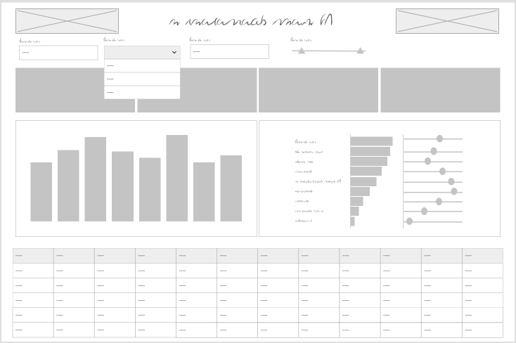
Wireframes
Wireframes are rough sketches of the layout and components. They can be very low fidelity — think whiteboard drawings of a dashboard. These are great very early on in your process.
Hand drawn wireframe
They can also be a slightly higher fidelity wireframe that starts to show what the dashboard components will be. These are the bones of a dashboard or interface, but can help articulate the dashboard design and move forward the requirements discussion.
Digital wireframe
Even if your stakeholders never see the wireframe, sketching out what your dashboard and thinking about what the layout, hierarchy, interactivity will look like helps organize your thoughts before you get too far or get locked in on a specific idea.
There’s really no reason not to start any project with a wireframe of some sort. This is a tool for the beginning of your process, but once you’ve moved on to mockups or design there’s no reason to do a wireframe unless a complete teardown and rebuild are needed.
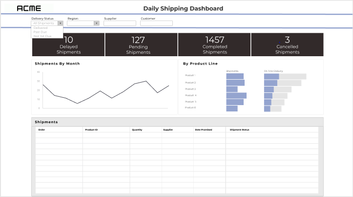
Mockups
Mockups are a graphic rendering of what the dashboard might look like. These are high (or at least higher) fidelity designs that allow the user to see what the final product might look like. Exactly how high-fidelity to make the mockups will depend on the project and level of effort you want to invest. You don’t want to spend more time on this process than you would to just do it in Tableau.
Mockup
I think it’s worth noting here: the mockup should be done by the Tableau developer or someone who is very familiar with Tableau functionality. Otherwise, you run the risk that the mockup shows functionality that isn’t going to work well or appearances that aren’t accurate.
If a lot of data prep is required or you are working on a time or resource intensive project, a good mockup is worth its weight in gold. If you jump right into Tableau and find out that it’s more complicated than you initially thought, it’s not too late to pivot and come up with mockups.
Mockups can save you quite a bit of time in the development process. I will use mockups to think about the right data structure and level of detail, and think about how metrics will be calculated or what fields will be needed. And, if your users see a preview of the result and have an opportunity to get involved in feedback early, you are less likely to end up delivering a project that dies on the vine.
Prototypes
As soon as you need to demonstrate interactivity, prototypes come into play. These can be low-fi or high-fi but are useful whenever there is a lot of interactivity to demonstrate. To build interactivity, you’re going to need a prototyping tool. You can get creative and mark up your wireframes and mockups with arrows and comments to show how a user will interact, but prototypes make it feel more real.
The goal of prototypes isn’t to fully replicate the dashboard. A sampling of the interactivity can be included for a demonstration to better convey the idea without spending a lot of time.
You may not need prototypes on many projects, but similar to mockups, if you’re working on a large, complicated project where the stakeholders and users won’t get their hands on a fully functional product for some time, a prototype can be very helpful.
Some things to consider:
Is there interactivity that can’t be demonstrated by describing it?
Are your users unfamiliar with the types of interaction?
Is the user journey complex or multi-stepped?
How much functionality needs to be demonstrated?
To sum it up
I believe that involving your stakeholders and user representatives early in the process yields better requirements and a sense of ownership and buy-in. Your stakeholders and users are more likely to engage with, adopt, and encourage the adoption of your solution if they feel ownership.
Knowing that time isn’t an infinite resource, these steps can also take time away from other aspects of the solution or extend the timeline. Sometimes mocking up or iterating right in Tableau will be faster and produce the same result. If you start in the tool, presenting rough versions and getting feedback early is still valuable for the same reasons. Consider if these steps are taking more time than the build itself, or when they add a step that’s not needed to clarify or establish the end goal.
Bonus: Diagrams
Most design tools can also be used to create diagrams. While diagrams aren’t “dashboard design” per se, they are often an important part of documenting or describing a full data solution. What kinds of diagrams might you use in your data solution process?
Relationships
The good old entity relationship diagram, whether it is a detailed version used for data engineering, or an abstracted version to present to stakeholders
User journeys
Map out the ways a user can enter the solution, and how they progress through and interact
Process flows
Flow charts… whether it’s mapping out the process that creates the data, the process for how the solution will be used, or the steps in the data transformation process


