
A few years back I came across this beautiful, impactful viz by the incredibly talented Ivett Kovács. I was already amazed by the design, but when I realized that those gradient circles weren’t custom shapes, but actually built directly in Tableau using standard mark types, my mind was blown. I was brand new to the Tableau Community when this viz was published, and it was one of the first truly custom visualizations I had ever seen built entirely in Tableau. It was one of those AHA moments that you look back on years later and realize just how much of an impact it had on you. It was a sudden realization that with a little math and a little creativity, you can create things in Tableau that really just don’t seem possible…until somebody does it.

In her visualization (and her blog post about gradients), Ivett credits another amazingly talented individual, Ludovic Tavernier, for this gradient color concept. Ken & Kevin Flerlage have also done a lot of really cool stuff in Tableau with gradients. So I, in no way, shape, or form, invented the concept of creating gradients in Tableau. But, over the past couple of years, I have taken that concept and come up with a few different techniques for applying it in Tableau.
In this blog post, I’m going to cover 3 different methods. We’ll call them the No-Math Method, the Straight-Line Method, and the Vertex Method. If you would like to follow along with this post and build these yourself, you can download the sample data here and download the sample workbook here.
But before we get started, a quick disclaimer. Like most of the things I share on Tableau Public, I would never, ever, ever try to do something like this at work. Adding gradients to your charts will not make them better at communicating important information. They will, however, make them load much, much slower. All of the techniques we’re going to discuss today rely on data densification, where we are going to blow up our data source and create a bunch of new records that we can use to draw the lines and shapes needed to create that gradient effect. Also, if you don’t have any experience with data densification, or drawing curved lines and/or polygons, I would recommend checking out part 1 of the 3-part blog series below. Not required, but it might help.
Creating Your Color Palettes
This part is totally optional. The foundation of any of these methods, or the methods created by others before me, is that we are basically placing a bunch of overlapping but slightly offset marks on the Tableau canvas, and then assigning a sequential color palette to create that gradient effect. The measure we use on color will go from a lower value to a higher value, and that value will align with the shade the color (so low values have a lighter shade and high values have a darker shade or vice versa). So, in order for this to work, we need to have a sequential color palette available for each color we want to use in our viz. Tableau already has many of these available so you don’t necessarily need to create your own, but if you have custom colors that you want to use, this is how I would go about setting up your palettes.
The nice thing about sequential color palettes is that we really only need two color codes to build our gradients. We need a light shade on one end and a dark shade on the other end, and Tableau will automatically fill in all of the shades in between. One option to get these codes is to use an online color shade generator, like this one. You can enter your “base” color and then select a lighter shade and a darker shade to use in your palette. But I like to play around with the shades and see exactly how it’s going to look when I bring it in to Tableau. This way I can kind of lock it in before editing my preferences file and cut down on the back and forth that goes with editing color palettes. This is how I build and test my sequential palettes using PowerPoint
Building a Sequential Color Palette in PowerPoint
- Open PowerPoint
- Click on Insert > Shapes and select the Circle shape type
- Format the Circle
- Increase the size so you can see the gradient better (I set it to around 4 x 4 inches)
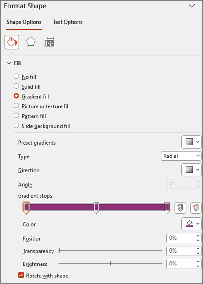
- Right click on shape and select “Format Shape”
- Change the “Fill” type to “Gradient Fill”
- Change the “Type” to “Radial”
- For “Direction” choose the center option (gradient radiates from the center of the shape)
- Change the number of “Gradient stops” to 3 (add or delete stops so that you have a total of 3)
- Click on each of the stops and set the color to your “base” color (in my example the base color is #8D3276)
- Update Position of Each Stop
- Stop 1: 0%
- Stop 2: 50%
- Stop 3: 100%
At this point your settings should look something like this and your shape should be a circle that appears to be one solid color (even though it is set to Gradient)
- Edit the stop colors
- Edit stop #1
- Click on the 1st stop to select it
- Below the stops click on the Color selector
- Click on “More Colors”
- Click on the “Custom” tab
- Click and drag the arrow next to the color bar upward to change to a lighter shade of your “base” color
- Edit stop #3
- Click on the last stop to select it
- Below the stops click on the Color selector
- Click on “More Colors”
- Click on the “Custom” tab
- Click and drag the arrow next to the color bar downward to change to a darker shade of your base color
- Edit stop #1
This is how my color selectors look for the 1st and last (3rd) stops

And here is what my gradient circle looks like

You can continue clicking on the 1st and 3rd stops and tweaking the shades lighter and darker until you have a gradient you are happy with. And then we just need to add these colors to our preferences file as a sequential color palette. You don’t have to include the “base” color, but I like to include it so I have it if I need to edit my palette later on.
- Go to Documents > My Tableau Repository
- Right click on your Preferences file and open with a Text Editor program (like Notepad)
- Add the palette to the end of your preferences file before the line containing the </preferences> closing tag
- The palette should be in the format below

Once your palette is added, close out of Tableau and re-open it. I have put a sample preferences file with a few of these gradient palettes in a Google Drive folder here.
Choosing the right Method
As I mentioned earlier, this post is going to cover three different methods for building gradients in Tableau. Which one is best? Well, as with most things Tableau…it depends.
The No-Math Method
I really like the No-Math method. It’s by far the easiest to implement, requires no complicated calculations, and it can be used on different mark types (gradient lines, bars, etc.). The only real downside is that you can’t really control the direction of the gradient or the “position” of the light source. With this method, the gradient will always be lightest in the center and darkest on the edges, as if the light source was shining from directly in front of the object. Another nice thing about this method is that you don’t have to worry about the size/shape of your view. In the other methods we are “drawing” the circles, so the X and Y axis ranges need to be equal, and the Height and Width of the view need to be equal when placed on the dashboard. Otherwise, you will end up with ovals instead of circles. But with this method we are using the Circle mark type, so we don’t have to worry about any of that.

The Straight-Line Method
This method requires a little bit of math, but nothing too complicated. It’s definitely easier than the Vertex Method, but more difficult than the No-Math method. This method provides some flexibility on the gradient direction, but the main limitation is that the gradient has to start on one edge of the object. With this method, the gradient will always be lighest on one edge and darkest on the opposite edge, as if the light source was shining from the side of the object.

The Vertex Method
This method is by far the most complicated, but it’s also my favorite, as it gives you the most flexibility in terms of design. With this method you can use parameters to “move” the light source so that it looks like the light is shining on the object from any direction, giving it a much more realistic 3D look compared to any of the other methods. But, just for reference, the no-math method uses 3 calculations, the straight-line method uses 7 calculations, and this method uses almost 20.
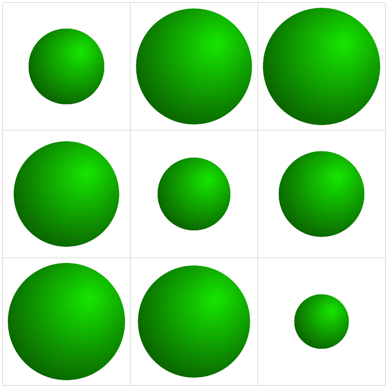
Method 1: The No-Math Method
Of the three methods in this post, this is the only one that does not use the Line mark type. The way that this one works is that we are basically stacking a bunch of circles right on top of each other. Each circle is a slightly different size and a slightly different shade of our “base” color. The smallest, and lightest colored circle will be on the top of the stack, and the largest, darkest colored circle will be on the top of the stack.
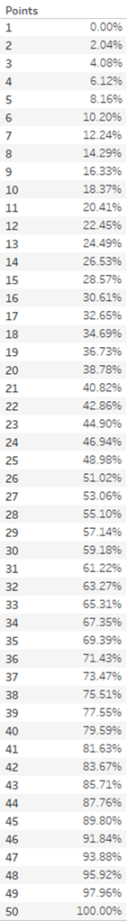
If you haven’t already I would recommend downloading the base data and sample workbook. Our base data (Method 1 Data) is a simple file with just 9 records. We have a Dimension field and a Size field (and a few other fields that aren’t required). And then we have a Densification table (Method 1 Densification), with 100 records and one column called “Points”. To build our Data source we are going to do a Physical join between these two tables by creating a join calculation, with a value = 1, on each side of the join. The result will be a data source with 900 records (100 densification records for each of our 9 data source records). It should look like this.

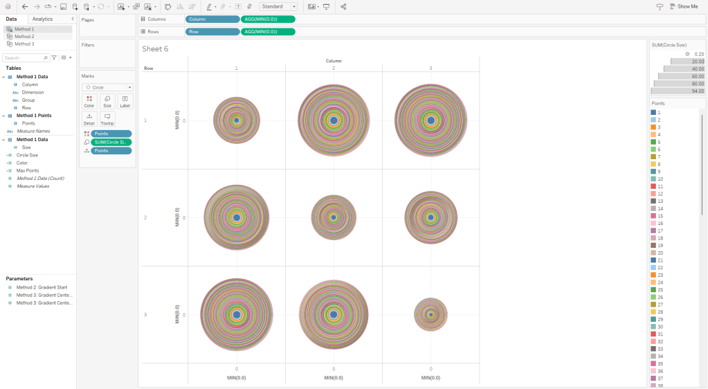
Now this part may get a little confusing as we’re going to be talking about two different types of circles here. So, for the rest of these section, I am going to refer to the main gradient circles that we are trying to create as “Design Circles” and the individual circles used to create the gradient effect as “Building Circles”. So in all of the screenshots above, those 9 gradient circles are our “Design Circles”, and each of those is made up of 100 “Building Circles”.
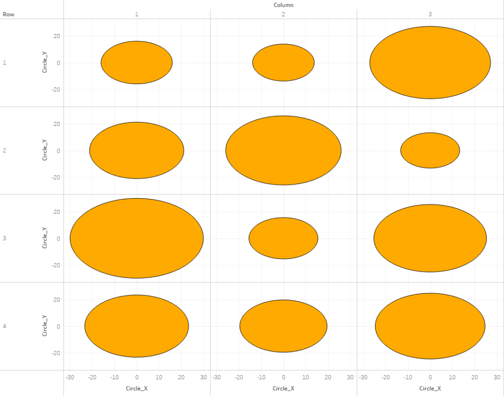
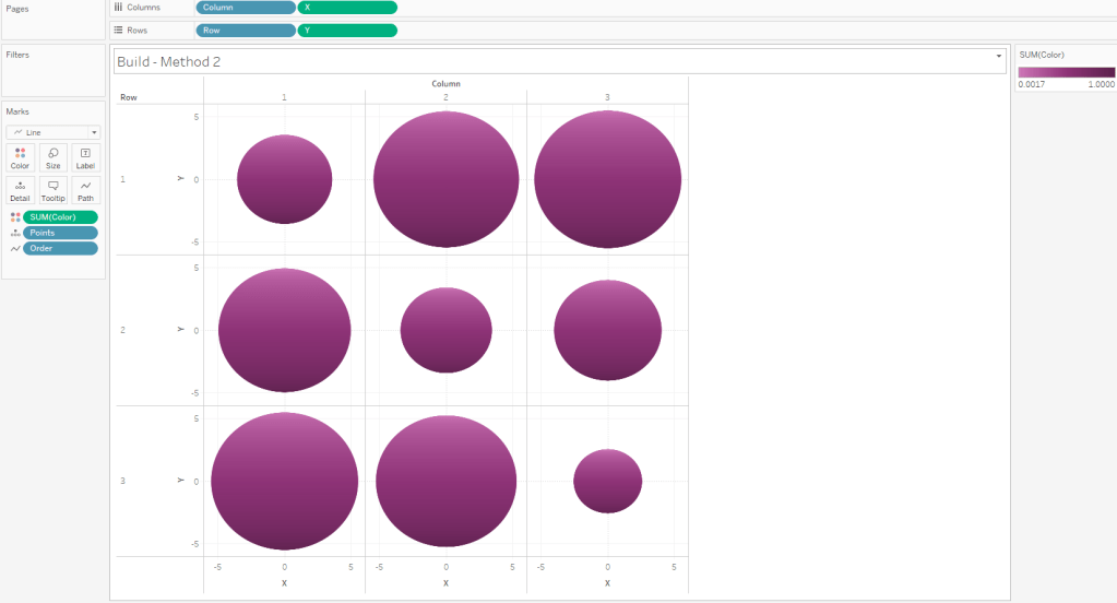
The exact way that you build this is going to depend on how your chart is set up. In this example, we are going to build a simple 3 x 3 Panel chart, using the Size field to determine the size of our “Design Circles”. So to build my panel, I’m going to use some of those extra columns from my data source (row and column, but these could be easily calculated in the workbook instead). I’ll change them both to dimensions and bring them out on to the Rows and Columns shelves respectively.
Also, on each of these shelves, I’m going to double click in the blank space on the shelf and enter MIN(0.0). The reason for this is that we need to have a numeric measure on columns and/or rows to be able to “stack” these marks on top of each other. Otherwise we’ll end up with a unit chart with 100 circles next to each other. However, if you were building a scatterplot, or something like that where you already have numeric measures on rows and/or columns, you would not need to do this. So to start, my rows and column shelves are going to look like this.

Next, let’s build the calculations we’re going to need for the size and color of each of our circles. First, we’re going to build an L.O.D. to get the maximum number of densification records (in our case, this will be 100)
Max Points = {MAX([Points])}
Now we’ll build a calculated field that determines the size of every “Building Circle”. So we already determined that we are going to use the [Size] field to determine the size of our “Design Circles”. So we need our largest “Building Circle” to have that same value. And then we want the size of the rest of our “Building Circles” to get smaller and smaller. In our densification table, we have 100 records with values from 1 to 100. So if we divide each of those values by the maximum value (in our case that’s 100) that will give us percentages from 1% to 100%. And then if we multiply that by our [Size] field, we’ll end up with 100 different values, with the largest value being equal to the [Size] field, and the smallest value being equal to 1% of that value. But note that you do not need exactly 100 records for this to work. Your densification table could have 200 records. The largest circle will still have the same value as the [Size] field, and the smallest would be equal to .5% of that value. Or it could have 1000 records. Or it could have 53,469 records. It doesn’t matter, as long as the numbers in the [Points] field are sequential and you’re dividing each [Points] value by the maximum [Points] value.
Circle Size = ([Points]/[Max Points])*[Size]
And then lastly we need a field to use on Color. The logic here is basically the same as our [Circle Size] calculation. We’re just dividing the [Points] value by the maximum value to get 100 evenly spaced values from 1% to 100%
Color = [Points]/[Max Points]
Now, let’s build our view
- If you haven’t already, complete the first few steps mentioned above (drag rows/columns to shelves, add MIN(0.0) to both shelves)
- Right click on [Points] and “Convert to Dimension”
- Drag [Points] to Detail on the Marks Card
- Set Mark Type to “Circle” on the Marks Card
- Drag [Circle Size] to Size on the Marks Card
- Drag [Color] to Color on the Marks Card
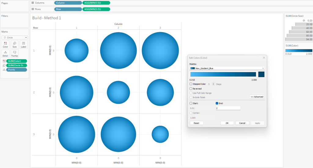
- Edit the Colors
- Click on the Color card and select Edit Colors
- Select your sequential color palette from the “Palette” drop-down
- Click on Advanced and tweak the “End” value
- Using the standard color range usually results in the outer edge being too dark
- If you want the gradient to match the one in PowerPoint, set the “End” value to somewhere between 1.5 and 2
When complete, your worksheet should look something like this
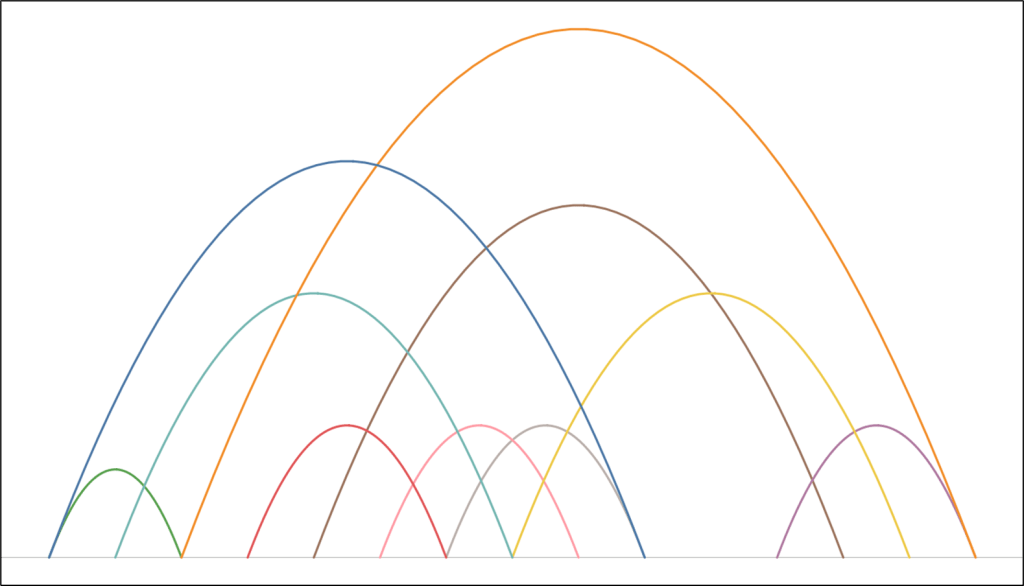
To illustrate how this method works, this is what this view would look like if we put the [Points] field on Color as a Dimension. You can see that each of our “Design Circles” is made up of 100 different “Building Circles”, each slightly bigger than the one on top of it and slightly smaller than the one below it.
Method 2: The Straight-Line Method
On to Method #2. As I mentioned earlier, this method is going to use lines to create the gradient effect. In Method #1, we stacked 100 circles on top of each other. In Method #2, we are going to place 600 lines right next to each other.
The data source set up for this method is very similar to Method #1, except that it has 600 densification records instead of 100, and we are going to add an additional “table”. This “table” just has 1 field called [Order] and just two records (with values of 1 and 2). Alternatively you could just add this column to the Densification table and have two records for each [Points] value, but it’s a lot easier to increase or decrease the number of densification records (which I do pretty frequently) if you put this in it’s own table. So again, we are going to do a Physical join between our data table and our densification table and then we’ll add another join for our order table (once again using the join calculation).

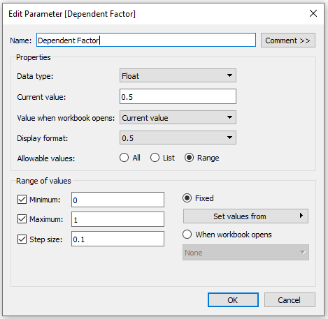
As I mentioned earlier, the main limitation of this method is that the gradient has to start on one edge of the circle. But I like to make it dynamic so you can tweak where that starting edge is (top/bottom/left/right/etc.). So I use a numeric parameter where the range of acceptable values is between 0 and 1. This will be used to rotate the circle between 0% and 100%.

Now we’ll start building our calculations. The first one is going to be our [Max Points] field, which is the same as the one in Method #1
Max Points = {MAX([Points])}
In order to draw a circle in Tableau (check out the blog post at the beginning of this article if you haven’t already) using the method that I typically use, we need two inputs: radius and position. Let’s start with the radius. Once again we are going to use the [Size] field to size our circles, and that value is going to represent the Area of the circle. So if the [Size] field is the Area, then we can calculate the radius using the calculation below
Radius = SQRT([Size]/PI())
Now, the position. The position is a value between 0 and 1 (or 0% to 100%) that represents how far around the circle that point would appear. So 25% would be at 90 degrees, or 3 o’clock, 50% would be at 180 degrees, or 6 o’clock, and so on. So to get that value, similar to how we calculated the color and size in Method 1, we can just divide the [Points] value by the maximum [Points] value (and subtract 1 from both the numerator and denominator to start at exactly 0%). Let’s call this [Position_Base]
Position_Base = (([Points]-1)/([Max Points]-1))
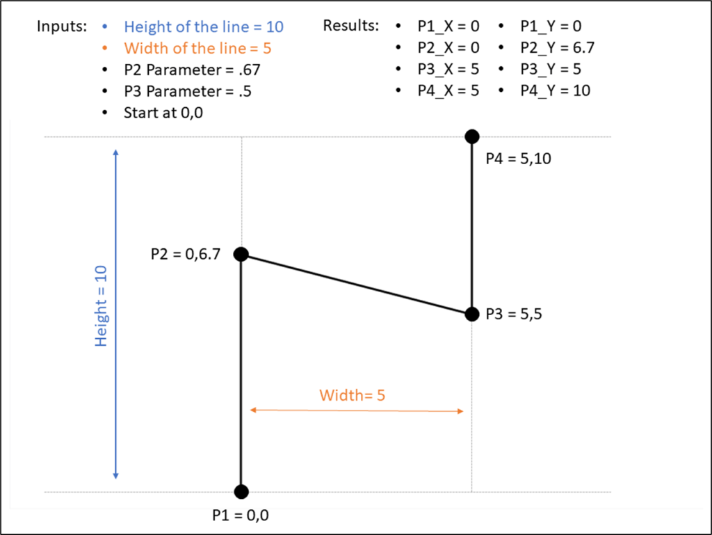
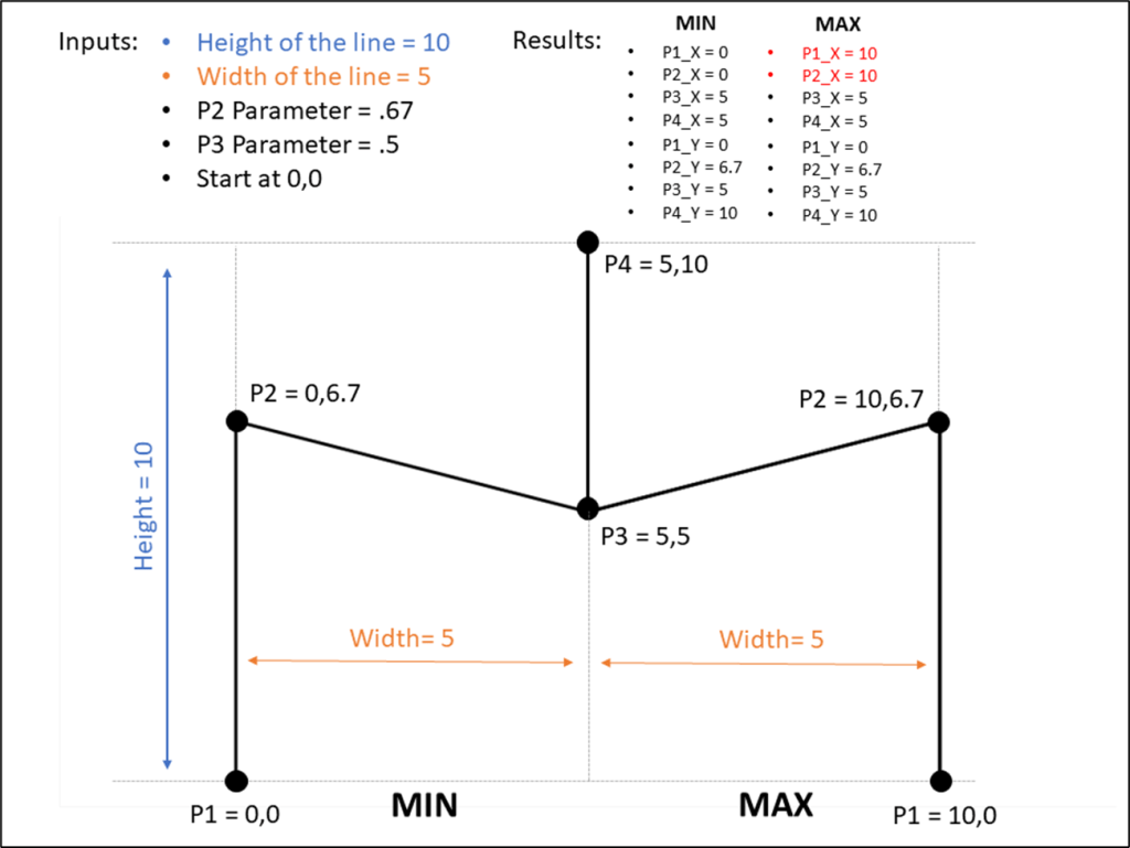
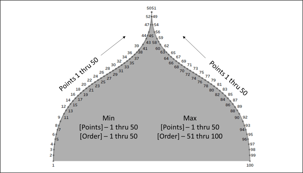
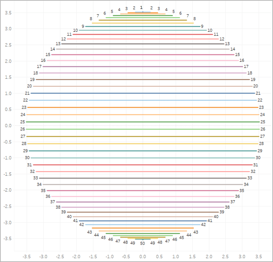
Now if we were to plug our [Radius] and [Position_Base] fields into our X and Y calcs (which I will get to in a minute), we would end up with something like this. To make it a little easier to see, for this example, I limited the number of densification records to 50. So we end up with 50 points evenly spaced around a circle.

But now we need to adjust those positions a bit. Ultimately, what we want to do is to draw perpendicular lines across the circle. So in the example image above, we would want to draw a line from 1 to 50 (50 is hidden behind 1 in the image), another line from 2 to 49, then 3 to 48, and so on until we get all the way around the circle. So let’s start by getting all of our points on 1 side of the circle. And we’ll do that by dividing our [Position_Base] field in half. And we’ll call it [Position_Offset]
Position_Offset = [Position_Base]/2
So now, instead of our points being evenly spread between 0% and 100% around the circle, they are spread between 0% and 50%, with all of the points on the same side of the circle.

And now here is where our [Order] field comes in from that new table we added. Each of the points in the screenshots above actually consists of 2 records, one where [Order]=1 and one where [Order]=2. So we are going to create one more calculation that will basically create a mirror image of these points so that each [Point] value from our densification table has one mark on the right side of the circle, and then a second mark on the mirror opposite side of the circle. And this will be our final [Position] calc.
Position = if [Order]=1 then [Position_Offset] else 1-[Position_Offset] END + [Method 2: Gradient Start]
So if [Order]=1 we’ll use that position on the right side of the circle that we calculated previously. If [Order]=2, we’ll subtract that value from 1 to give us the position that is the mirror opposite of it on the circle. So for example, if our [Order]=1 mark is at 10%, the [Order]=2 mark would be at 90%. If 1 is at 35%, then 2 is at 65% and so on. And then finally, we add the value from the parameter we created earlier (in the screenshot below it is set to 0%) to “rotate” the circle. And then if we connected those marks, it would look something like this.
So that is the meat of this technique. Basically we are going to draw a bunch of perpendicular lines that go from one side of the circle to the mirror opposite side. Now for the rest of the calculations. Here are the [X] and [Y] calcs that I mentioned earlier that are used to actually plot the points around the circle using the [Radius] and [Position] inputs.
X = [Radius] * SIN(2 * PI() * [Position])
Y = [Radius] * SIN(2 * PI() * [Position])
And then finally our [Color] calculation is going to be exactly the same as Method #1. We’ll use the [Points] field to evenly calculate values between 0% and 100%.
Color = [Points]/[Max Points]
And now we are ready to build our view.
- Similar to Method #1, if you are going to build a panel chart, drag the [Column] and [Row] fields to their respective shelves
- Right click on [X] and drag to Columns shelf. When prompted, choose no aggregation
- Right click on [Y] and drag to Rows shelf. When prompted, choose no aggregation
- Change Mark Type to Line
- Adjust the Size so the line thickness is at or near the minimum width
- Change [Order] to a dimension and drag to Path
- Change [Points] to a dimension and drag to Detail
- Drag [Color] to color
- Edit Colors and select your desired sequential palette
- Use the parameter to rotate the circle if desired
- Edit the X and Y axes so that the ranges are equal
- It’s important to note that with this method, the X and Y axis ranges need to be equal for the circles to appear as perfect circles. If one axis range is longer/shorter than the other axis range, you will end up with ovals
- It’s also important to note that when you place this worksheet on a dashboard, the Height and Width of the worksheet need to be equal to maintain it’s perfectly circular shape
When finished, your sheet should look something like this
If you are drawing large circles, you may need to add more densification records. Alternatively, you can increase the line thickness. But I have found that adding more records typically looks better than thicker lines, as the thickness of the lines can have an impact on the shape of the full circle. If you are drawing small circles, you can delete densification records. You can play around with the number of records you need until it looks just right.
Method 3: The Vertex Method
Now on to our final and most complicated method. There are a few differences between The Vertex Method and the Straight-Line Method, but the main difference is that our lines are going to use 3 points instead of 2. That 3rd point will allow us to control how the gradient appears (or where the “light” is coming from).
Setting up the data source for this method is exactly the same as Method #2. The only difference is that our Order table has 3 records instead of 2.

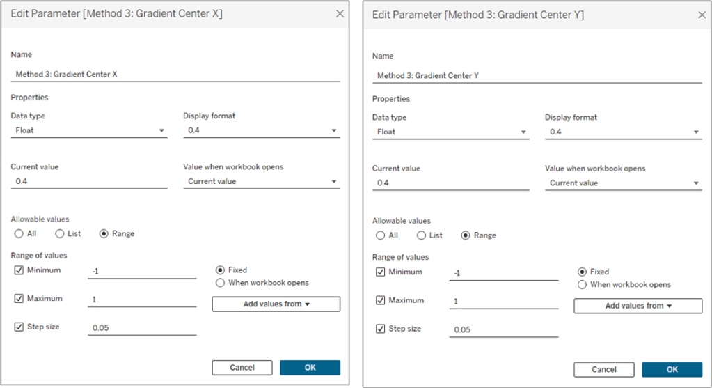
Similar to Method #2 we’re going to want to use parameters to “move” the light source, but in this case, we’ll have a lot more flexibility on how we can move it. We can move it up, down, left, right, basically anywhere. So we’ll use two parameters, one to move it up or down (adjusting the Y coordinate), and one to move it left or right (adjusting the X coordinate).
And then the start of this method is exactly the same as Method #2. We need to calculate our two inputs for the circle, the radius and the position. So our first few calculations are going to be identical.
Max Points = {MAX([Points])}
Radius = SQRT([Size]/PI())
Position_Base = (([Points]-1)/([Max Points]-1))
Position_Offset = [Position_Base]/2
Once again we’re calculating the Radius using the [Size] field, and then we’re calculating the Base position, and then dividing that by 2 to get all of our points evenly spaced along the right side of the circle. Now this is where the two methods begin to diverge. In Method #2, we were drawing perpendicular lines across the circle. With Method #3 the end of the line is going to be at the polar opposite of the start. Something like this.

So our lines will start on one side of the circle, pass through the center, and then end at the point directly opposite of the starting point. And then what we’ll do is use our parameters to “move” that center. But we’re not there quite yet. First, let’s finish calculating our [Position] field.
Position = [Position_Offset] + IF [Order]=3 THEN .5 ELSE 0 END
So if [Order]=1 it’s going to use the [Position_Offset] value, which is the starting point, or the position along the right side of the circle. And then if [Order]=3, it’s going to add .5 (or 50%) to that value, which would be the position at the direct opposite side of the starting point. Next, let’s plug our Radius and Position into our X and Y calculations, but we’re going to call them [X_Base] and [Y_Base] since we’re not quite done with them.
X_Base = [Radius] * SIN(2 * PI() * [Position])
Y_Base = [Radius] * SIN(2 * PI() * [Position])
So for each of our lines, we need 3 sets of coordinates, or 6 values in total. We need X and Y values for the start of the line, the center of the line, and the end of the line. We’ve already done all the math we need to calculate each of those, but to make things easier, let’s build a few really simple calculations to isolate these. Let’s start with the X coordinate calculations.
Line_X_Start = [X_Base]
Line_X_Center = [Method 3: Gradient Center X] * [Radius]
Line_X_End = [X_Base]
I told you they were simple calcs. For the Start and End of our lines, we already calculated those values. Those will just be equal to that [X_Base] calc we built above. And the center of the line is going to use that parameter we built to move the “light” source left and right across the X axis. We just multiply that value, which is a decimal between -1 and 1, by the radius to determine how far to move it.
- -1 would be all the way to the left.
- 1 would be all the way to the right.
- 0 would keep it in the center.
- -.5 would move it halfway between the center of the circle and the left edge
- and so on
Now, let’s build our Y coordinate calculations, which are nearly identical the X calcs above, except they’re going to use the [Y_Base] field, and the Y coordinate parameter
Line_Y_Start = [Y_Base]
Line_Y_Center = [Method 3: Gradient Center Y] * [Radius]
Line_Y_End = [Y_Base]
And then a couple of final calculations to bring all of these values together.
X = CASE [Order]
WHEN 1 then [Line_X_Start]
WHEN 2 then [Line_X_Center]
WHEN 3 then [Line_X_End]
END
Y = CASE [Order]
WHEN 1 then [Line_Y_Start]
WHEN 2 then [Line_Y_Center]
WHEN 3 then [Line_Y_End]
END
With this method, the center point of the lines is going to be where the light source “shines”. So if we were to leave those parameters at 0 & 0, the light would shine at the center of the circle and look similar to what we built with Method #1. Our individual lines would look like they did in the screenshot above (and the one on the left below). But if we adjust those parameters to say, .5 and .5, then the center point of the lines would move up and to the right (like the one on the right below). And once we add the gradient color to our lines, it will look like the light is shining from the upper right of the object.

It’s all starting to come together. We’ve calculated all of the points we need to draw the lines, we just need to add some color. This part is a little trickier than it was in the other two methods, but nothing we can’t handle. Similar to the other methods, we are going to use a value between 0 and 1 (or 0% and 100%) to assign our color. The main difference here is that we are going to use the length of each line segment to calculate that value. Each of our lines has two segments; start to center, and center to end. We’re going to use the Pythagorean Theorem to calculate both of those.
Each line segment is essentially the hypotenuse of a right triangle, so we can calculate that if we know the lengths of the other two sides of the triangle…which we do. Let’s isolate one of the lines from our screenshot above. Here is Line #1

If it’s been a while since you’ve taken a Geometry class, which it certainly has for me, Pythagorean’s Theorem is a^2 + b^2 = c^2 where c is the hypotenuse. Now let’s look at this image again, but with the rest of our triangles drawn.

So for each of these triangles we can calculate the length of the “a” side, by subtracting the [Line_Y_Start] value (or [Line_Y_End] value depending on which segment you are measuring) from the [Line_Y_Center] value (result may be a negative number but the ABS of that value would equal the length). And we can get the length of the “b” side by subtracting the [Line_X_Start] or [Line_X_End] value from the [Line_X_Center] value. And with both of those, we can calculate the length of the “c” side, which is what we’re going to use in our color calculation.
First, let’s calculate the length of the first line segment, from the start of the line to the center of the line (which would be the red triangle in the screenshot above)
Line_Length_Start_to_Center = SQRT(SQUARE([Line_Y_Center]-[Line_Y_Start])+SQUARE([Line_X_Center]-[Line_X_Start]))
And to calculate the length of the second line segment, from the center of the line to the end of the line (the purple triangle above), it will be the same calculation but we’ll swap out the “Start” coordinates with the “End” coordinates.
Line_Length_Center_to_End = SQRT(SQUARE([Line_Y_End]-[Line_Y_Center])+SQUARE([Line_X_End]-[Line_X_Center]))
And then one last calculation called [Line_Length] to bring those values together and assign a value to each [Order] value. So if [Order]=1 we want to use the length of the first line segment (from start to center). If [Order]=2, we want to use a value of 0. And if [Order]=3, we want to use the length of the second line segment (from center to end). This may be confusing at the moment, but stick with me.
Line_Length = CASE [Order]
WHEN 1 then [Line_Length_Start_to_Center]
WHEN 2 then 0
WHEN 3 then [Line_Length_Center_to_End]
END
So let’s look at our example again with the Line Length value on Label
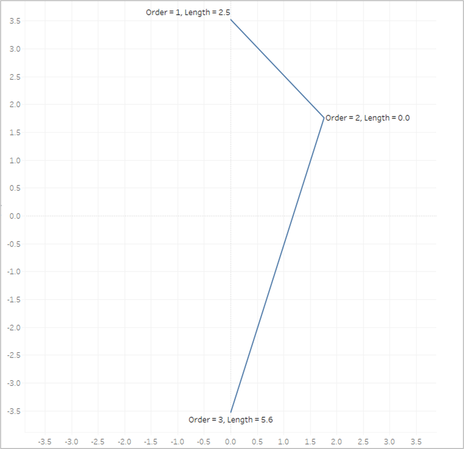
The length of the first line segment is 2.5, so we’ll assign that value to the 1st point, where [Order]=1. The length of the second line segment is 5.6, so we’ll assign that value to the last point, where [Order]=3. And when [Order]=2, we assign a value of 0. Now look what happens if we put that [Line_Length] field on Color and apply a sequential color palette.
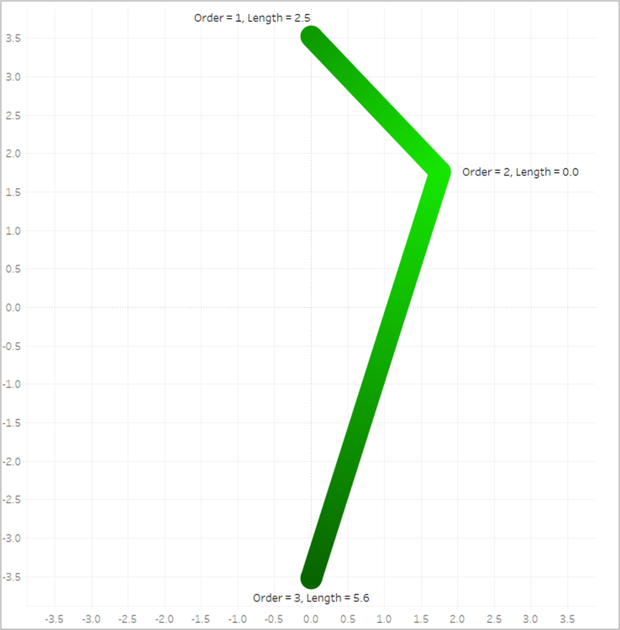
Tableau assigns the lightest shade from our palette to the lowest number, which is 0, and assigns the darkest shade from our palette to the highest number, which is 5.6. And then it automatically generates all of the appropriate shades in between.
Now the last thing we need to do is to translate those numbers into percentages between 0 and 1. When we have different sized circles in the same view, they’re going to end up with different lengths, so we don’t want to use the actual length of each line, we want to use the length relative to the longest line for that circle. So the longest line will have a value of 1. And this will be our [Color] calculation.
Color = [Line_Length]/{FIXED [Dimension] : MAX([Line_Length])}
And now we are finally ready to build our view, which is going to be exactly the same as Method #2
- Similar to Method #1 & #2, if you are going to build a panel chart, drag the [Column] and [Row] fields to their respective shelves
- Right click on [X] and drag to Columns shelf. When prompted, choose no aggregation
- Right click on [Y] and drag to Rows shelf. When prompted, choose no aggregation
- Change Mark Type to Line
- Adjust the Size so the line thickness is at or near the minimum width
- Change [Order] to a dimension and drag to Path
- Change [Points] to a dimension and drag to Detail
- Drag [Color] to color
- Edit Colors and select your desired sequential palette
- Use the parameters to adjust the light source up/down/left/right
- Similar to Method #2 you will need adjust the X and Y axis ranges so that they are equal (and make sure that the Height and Width of the worksheet are equal when placed on your dashboard)
When we’re done, our sheet should look like this

So this blog post is already much, much longer than I planned, but there is one last thing I want to touch on. What if you want to have multiple gradients in the same sheet?
Assigning Multiple Gradients
Use Map Layers. I’m not going to go through the entire process of building a view with map layers as that would double length of this already ridiculously long post. But that is how you would go about assigning multiple gradients. So in this last example, I’m going to use the [Group] field from our data source. It just has three different values, 3 of the records are assigned to Group A, 3 to Group B, and 3 to Group C.
I have 3 different groups that I want to assign 3 different colors, so I will create 3 different MAKEPOINT calculations.
Final_Group_A = if [Group]=’A’ then MAKEPOINT([X],[Y]) END
Final_Group_B = if [Group]=’B’ then MAKEPOINT([X],[Y]) END
Final_Group_C = if [Group]=’C’ then MAKEPOINT([X],[Y]) END
So each of these calculations will only return results if the records are in the associated group. The result will be null for anything outside of that group. Next, you just need to duplicate your [Color] field 3 times so you can assign a different palette to each Group
Color_Group_A = [Color]
Color_Group_B = [Color]
Color_Group_C = [Color]
And then you build the view exactly the same way, except that you add multiple layers, one for each of the Groups using the appropriate MAKEPOINT field. Instead of using the [X] and [Y] fields, it will use the generated latitude and longitude from those MAKEPOINT calcs. At the end, your view should look something like this.

Alright, that was a long one. As always, I hope you enjoyed this post, and please let us know if you try out any of these gradient methods. We would love to see what you create with them!