
How did you build that in Tableau? That’s a question I get pretty frequently. If you look at my Tableau Public profile you may notice that most of my visualizations are pretty unique. And there’s good reason for that. Every visualization I build for Tableau Public, I try to do something I haven’t done before, and preferably, something I haven’t seen anybody else do. What I love about this approach is that I am continuously learning. I am constantly learning new techniques, combining those with other things I have learned along the way, and creating something new and, to me at least, something exciting. My favorite part about building these unique visualizations is figuring out how to do it. Sometimes it’s really challenging, but it’s also extremely satisfying when you finally figure it out and see your ideas come to life.
There are, of course, downsides to this approach. Inspiration and ideas are very hard to come by. I hear people all the time saying that they have so many viz ideas and not enough time to work on them. It’s the complete opposite for me. I will come up with one good idea every couple of months, and then spend days, weeks, sometimes months, figuring it out. That’s why I only have about 55 vizzes on my profile, even though I’ve been using Tableau Public consistently for about 4 1/2 years. That’s an average of about 12 per year. Some people seem to publish that many each month.
But it seems that every time I do publish something, I get at least a handful of messages on Twitter and LinkedIn asking “How did you build that?”, or often times, a much more general question “Can you tell/teach me how to build things like that?”
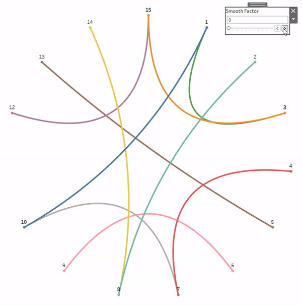
The first question is a little easier to answer, and could probably be done through a single blog post (which I plan to start doing in a new series with the same title “How did you build that in Tableau”). The second question is much harder to answer. It seems a lot of the time, people are looking for a silver bullet, one piece of advice, or one technique, that will allow them to build weird and crazy vizzes. And I really wish I had something like that to give them, but I don’t. As I mentioned earlier, every visualization I build is different. There isn’t a set technique or approach. But if I sit down and think about it, I do think there is a, at least somewhat, consistent process I go through with each build. And that’s what this post is about. This isn’t a technical walk-through, it’s more about the process. I will walk through a pretty basic example using that process, and if you’re interested in the calculations, please download the workbook here.
Step 1: The Idea
In my opinion, this is the hardest part. If you want to build something unique, you have to have a general idea of what it is you want to build. If you can imagine it, chances are there is a way to make it happen. And I am sending out an open invitation now: If you are taking the time to read this post, and you have a unique idea, but don’t know how to build it, feel free to reach out to me on Twitter or LinkedIn, and I will do my best to help you. As I mentioned earlier, I love trying to figure this stuff out.
Back to the idea. The idea gives you a starting point and something to work towards. But keep in mind that that idea is likely to change and evolve as you go through the rest of the process. I have very few examples of vizzes where the end result is exactly like what I had set out to build. It’s usually an iterative process. Come up with an idea, that idea doesn’t work the way you wanted it to work, but it sparks other ideas. Or maybe it did work, but along the way you got other ideas that would make it better. So the process I’m laying out here may not be completely sequential. You may find yourself back at this Step a few times before you build something you’re excited about.
Step 2: The Data
For me, this step and step 1 are interchangeable. I told you this process wasn’t always sequential right?
- Sometimes I have an idea and then I go looking for the specific data I need.
- Sometimes I come across a cool dataset, and then try to come up with ideas on how to visualize it.
- Sometimes I have 0 ideas and I just browse Kaggle, Data.World, or Google and a dataset will spark a cool idea.
- Sometimes I have an idea for a type of chart I want to try to build, and then go looking for any kind of interesting data I could use for that chart type.
There is no right way to do this. Think of it as writing a song. You need lyrics and you need music, but you don’t necessarily need to work on either of those things before the other. It could be a lyric or a melody that pops into your head and then you work around that. And chances are both the lyrics and the music are going to change when you start working them together.
So start with what you have and then go from there.
Step 3: The Plan
The next step is to start planning the build. You know what you want to build, but you need to figure out how to get there. If you want to start building truly unique visualizations in Tableau, you need to get comfortable with scatterplots. Nearly every single visualization on my profile is built using X and Y coordinates. I like to think of it like drawing, but more specifically, like drawing with connect-the-dots. That’s really all it is. It’s figuring out where to put the dots and how to connect them. With those two things figured out, you can draw anything you want in Tableau.
When I’m planning out my build, I like to break it out into smaller pieces. Let’s say we wanted to make this Smiley Face in Tableau, where would you start?

If I was trying to build this, I would start by figuring out the individual pieces that need to be built. In this case, I have one large yellow circle, two small black circles, and one curved black line. I don’t have to figure out how to build the entire thing at once, I just need to figure out how to build each piece and then figure out how to put them together.
I know how to draw circles in Tableau and I know how to draw curved lines in Tableau. I’m basically done. Not quite, but it’s a good start. Pretty much everything on my Tableau Public profile is built using some combination of circles and curved lines. The variety comes from combining those things in different ways. If you’re looking for more technical walk-throughs on how to build circles and curved lines in Tableau, check out the 3-part series on our blog:
For my Smiley Face, I am going to use Techniques from Part 1 and Part 2 of that series. I’m going to draw 3 circles and 1 bezier curve. I’m not going to share all of the formulas here, so if you’re interested in following along, I would recommend reading Part 1 and Part 2, and downloading the example workbook here.
Step 4: The Data Structure
This part can be difficult. Figuring out how to structure your data so you can build the pieces you need to build. If you are trying to build something unique, chances are you will not be able to use your data as is. You’ll have to put some work into it, and chances are, you’ll revisit it and change it and re-arrange it as you go through the build. The technique I typically use, I like to call a “Stacked” Densification Table. If you’re not familiar with Densification, we’re basically creating additional records in our data source that we can use in our calculations. I am blowing up my data source, but I’m doing it with purpose.
For this example, I am going to use a data source with just a single record. If I wanted to draw more than one smiley face, I could add more. But here is my “Base” data.
| Object ID | Object Name | Size |
|---|---|---|
| 1 | Smiley Face 1 | 10 |
Now I’ll create my Densification Table. I’ll start by adding records to “draw” my first object; the Left Eye.
| Type | Points |
|---|---|
| Left Eye | 1 |
| Left Eye | 2 |
| Left Eye | 3 |
| Left Eye | … |
| Left Eye | 20 |
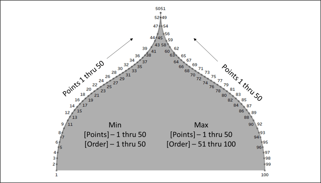
I used 20 points, which works pretty well for smaller circles. The more points you add, the smoother your curves/circles will appear. Curves in Tableau are essentially a bunch of really short straight lines, so the more lines you have, the shorter those lines will be, and the smoother the curves will appear.
Now, in the same table, I’ll add another 20 records for the Right Eye.
| Type | Points |
|---|---|
| Left Eye | 1 |
| Left Eye | … |
| Left Eye | 20 |
| Right Eye | 1 |
| Right Eye | 2 |
| Right Eye | 3 |
| Right Eye | … |
| Right Eye | 20 |
Then I’m going to add 100 points for the body or face or whatever you want to call it. I’m using more points for this because the circle is much larger. Then I’ll add another 50 points for the mouth. The end result should be a table with 190 records; 20 for the Left Eye, 20 for the Right Eye, 100 for the Body, and 50 for the Mouth
The reason I like to set it up this way is that I can use different calculations and different techniques on each section, or Type, and then combine them later using a couple of simple calculations.
The last step in setting up my data source is to join these 2 tables using a physical join and a join calculation.
Step 5: The Build
Once I have my data structure in place, it’s time to start building. When I’m on Step 3 and planning out my build, I identify the individual pieces that need to be built. When I’m on Step 4 and building out my data source, I create the data I need to build each one of those individual pieces. And when I’m on Step 5 and actually building the viz, I work on each one of those pieces individually. I’m going to start with the body/face because it’s the biggest and because the position of all of the other pieces are going to rely on that piece.
The Build Part A: Building the Circles
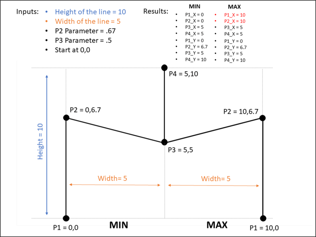
My first step in building this circle would be to go to a new worksheet, and filter on Type = Body, because that’s the piece I’m working on first. My next step would be to build the calculations. If you looked at Part 1 of the Fun with Curves series, you’ll know that in order to draw a circle in Tableau, we need two inputs; the distance of each point from the center of the circle (the radius), and the position of each point around the circle.
In this case, I’m going to use the [Size] field from my data source for the size of the body/face circle. That value is going to represent the Area of the circle, so I’ll calculate the radius using that, and that will be the first input. Once I have that, and the Position input, I plug those into my X and Y calculations and build the circle. When I’m done, it will look something like this.

So far so good.
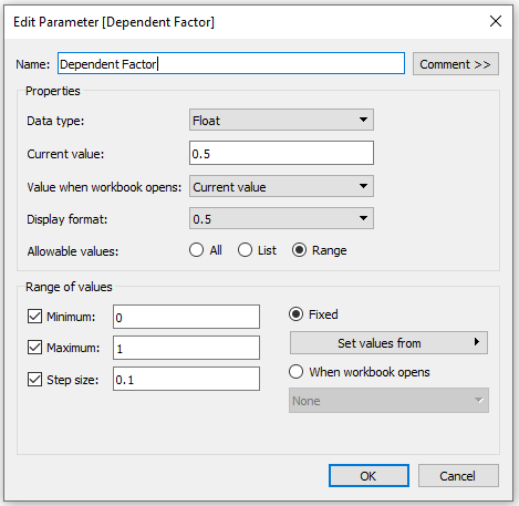
Next, I’m going to build the Left Eye. When I’m building something like this, I like to parametrize everything, so I can easily tweak the size and position of things, and so that the sizing will stay consistent, even if the values in the data change. And I always choose an “Anchor” value. Something I can use along with those parameters to calculate “relative” values for everything else. For this build, I’ll use the radius of the body/face as the “Anchor” because all of the other objects are going to go inside of (or really on top of) that main circle.
So in this case, I’ll build a parameter and set the value to .1 to start. Now, to calculate the radius for the eyes, I just multiply that parameter by the radius of the body/face. By using this technique, I can ensure that the radius of the eyes will always be 1/10th of the radius of the body/face. And I can also tweak that value to easily make the eyes larger or smaller.
My next step would be to repeat the process I used to build the body/face to build the left eye. I would go to a new worksheet, filter on Type = Left Eye, plug my eye radius and position into the X and Y calcs and build my circle. Then repeat for for the Right Eye.
The Build Part B: Placing the Circles
At this point, I would have 3 sheets and 3 sets of X and Y coordinates, one for each of the objects. Now I would bring them together with a couple of simple calculations called “Final_X” and “Final_Y”, which are just CASE statements that look at the TYPE field from my densification table and return the values of the appropriate X and Y fields that I have already calculated for each type.
Then I would go to a new sheet, filter on my 3 Types, and build the circles using those “Final” X and Y fields.
When I’m done, it would look something like this.

Hmmm, that looks exactly like the “Body” worksheet. One thing to always keep in mind when layering these objects is how Tableau sorts them. In this case, Tableau sorted the “Types” alphabetically, so the Body is in front of the Left Eye and Right Eye. So next, I would click on the color legend and drag Body to the bottom and the objects will sort correctly. With a lot of objects, sometimes this sorting piece can become pretty complicated. Once sorted, it would look something like this.

Now unless I was building a cyclops smiley face, this still doesn’t look right. As it stands now, all of my circles have the same starting point. They all start at 0,0 and build around that. I want the Body to start at 0,0 but I need to offset the eyes to get them in the right position. Basically, the eyes need new starting points.
Offsetting these values is really easy. If you want to move something up? Add a positive value to it’s Y coordinate. Want to move something down? Add a negative value to it’s Y coordinate. To the right? I’m sure you’ve guessed it, add a positive value to the X coordinate.
This is something I struggled with early on, but once I understood it, it became really simple. Basically, what I am trying to do is to create a new starting point for each of these circles, instead of starting them at 0,0. And to do that, all I have to do is add those new starting coordinates directly to the X and Y calcs for each of the circles, and all of the other points I have already calculated to form those circles, will move accordingly.
Once again I would use parameters to determine how far to move the circles, one for moving them up and down, and one for moving them left and right. Then it’s just a matter of multiplying those parameters by my “Anchor” value, the radius of the body/face, to get the actual values and then adding (or subtracting) those values to the X and Y fields for the Left and Right Eye.
After moving the eyes, I have something like this.

It’s starting to look pretty good, but, in my opinion, those eyes look a little too small, a little bit too spread out, and just a touch too high. This is why I use parameters. Now I can easily tweak all of my parameters to change the look of it.

This looks much better, but now I notice another problem. Now that I made the eyes a little bigger, I can really see the lines instead of a smooth curve. This happens to me pretty frequently, but there is an easy fix. I go back to my data source and add more rows to the “Stacked” Densification table for the Left Eye and the Right Eye. If I increase that count to 40 (from 20), it looks much better. No more jagged lines.

The Build Part C: Building the Line
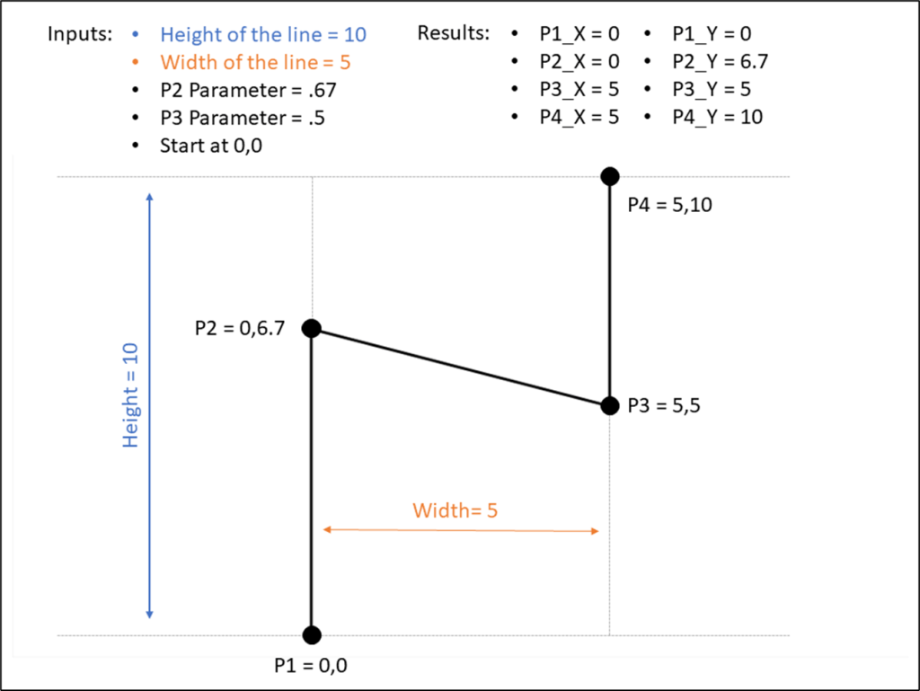
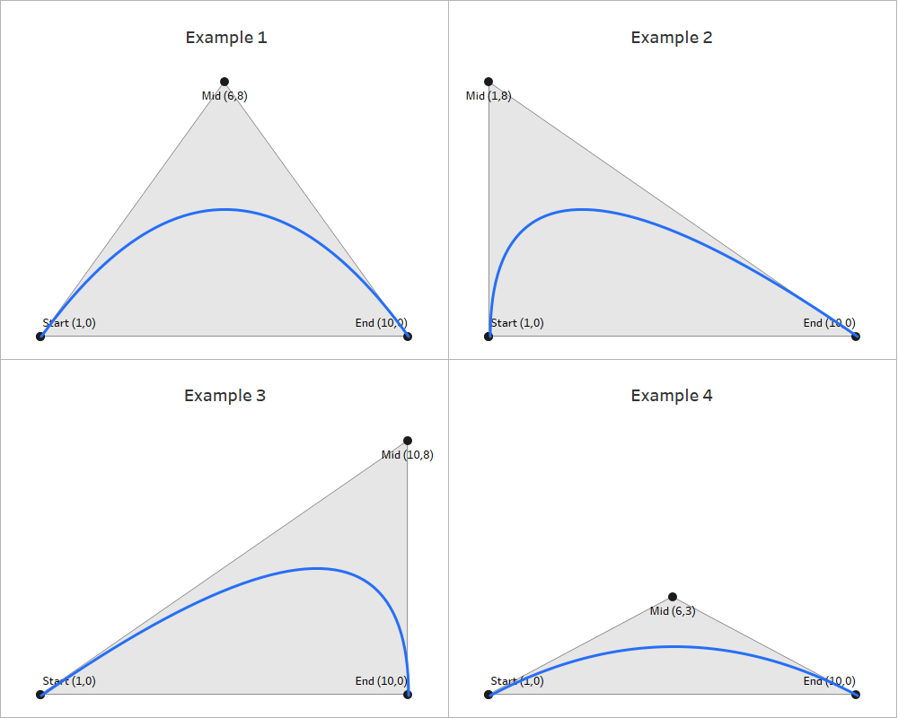
Now for the mouth. Like most things in Tableau, there are a couple of ways to accomplish this, but I am going to use a bezier curve. And I am going to start on this the same way I started with the circles, with a fresh worksheet filtered on the object I’m working on (in this case [Type] = Mouth).
To draw a bezier curve, I need the coordinates for 3 points…the Start of the line, the End of the line, and the Mid-point. And, just like I did for the eyes, I’m going to create some parameters so I can play with how the mouth looks. I’m going to create a total of 3 parameters; 1 for the width of the mouth, one for the vertical starting position of the line, and one for how far down the line dips. And again, just like I did for the eyes, I’m going to multiply these by the “Anchor” value to calculate the coordinates.
Once I have all of my calculations and I plug them into the X and Y calculations for bezier curves, I have something like this.

Now I have my curved line, but I can’t really tell what it’s going to look like until I place it on my Smiley Face. So I’ll do that next.
The Build Part D: Placing the Line
Now this part is a little tricky. I have my “Final_X”and “Final_Y” calcs that I used to bring the three circles together in the same view. But now I have 2 different mark types; Polygon for the Circles, and Line for the Mouth. So here is a technique I use to bring different Mark Types together on the same view.
I need to create a Dual Axis chart, so I can assign a different Mark Type to each axis. So Instead of “Final_X”, I would build “Final_X_Circle”, which would include all of my Circle X calculations, and “Final_X_Line”, which would include all of my Line X calculations. For each of those Fields, the result would be populated for the included “Types” and NULL for all other Types.
Then, I would add all of the Types to the “Final_Y” calculation. If I built separate calculations for the Mark Types here, I would not be able to layer them together in the view.
So I end up with a common measure for the Y axis, and two different measures for the X axis
Now I can create a dual axis chart, and set the appropriate mark type for each of my Types. With a few more minor tweaks, I have something like this.

Now, just like I did with the eyes, I can play around with the parameters to get the smile to look how I want.

Step 6: Ideate & Iterate
At this point, I have built what I set out to build, so I should stop right? As I mentioned earlier, as I’m working through this process, I usually have other ideas to try out. Now that the foundation is built, how can I make it better?
What if I added another record to my “Base” data?

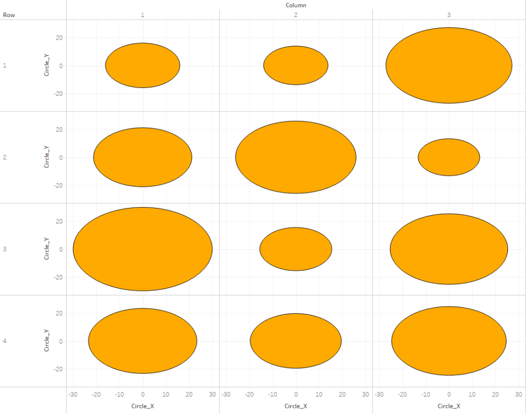
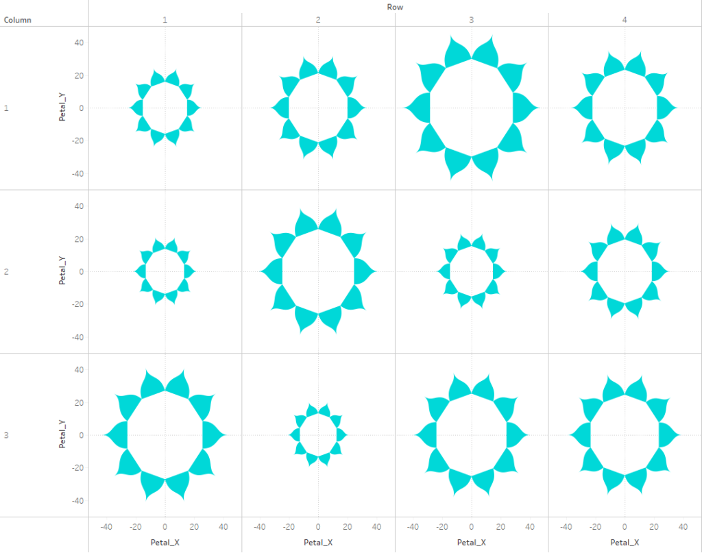
What if I added 100 records and made a 10×10 panel chart?

What if I put some real data behind this? Since I’m working with Smiley Faces, how about data from the World Happiness Report? What if I made them all the same size, but used color for the Happiness Score?

That’s looking better. But maybe the faces with the lower scores should be frowning instead of smiling. What if I could use the score to control the shape of the mouth too?

Now what if I used population on Size?

Hmmm, that doesn’t really work. Most of those faces are way too small. I would need to make them all bigger, but I can’t really do that with a panel/trellis chart. But what if I made this into a Packed Bubble Chart and limited it to the 50 largest Countries?

Ooohh, now we’re getting somewhere. Now what if I grouped the countries by Continent?

That’s it! That’s the one. Now it may seem like a huge leap going from a single smiley face to this, but it was actually a really easy update. I set up everything with parameters and used “Anchor” values, so no matter how many records I added to my data source, I would have a smiley face, with the correct proportions for the features, for every record.
And moving from a Panel Chart to a Packed Bubble chart was easy as well. CJ Mayes has a really great tutorial on Circular Packing, which is what I used. The output of that process is a file with an X coordinate, a Y coordinate, and a Radius for each circle. That means I could take what I had already built, and just add the X coordinate to my “Final” X calcs, and the Y coordinate to my “Final” Y calc to give all of my circles a new starting point. Then I swapped out the Radius calc I had used for the body/face with the one in the output. Because everything else I built was Anchored to that Radius value, everything updated and moved automatically.
Step 7: Final Touches
Now that I have built something I’m happy with, it’s time to finish off the design. I typically don’t spend a lot of time on this. If you look at my profile you’ll notice that nearly all of my vizzes are a single unique chart, with a light background, a title, some text, and some ways to interactive with the viz. I’m not a great designer, so I try not to put too much effort into the design. Also, I spend a lot of time building those charts, and I want those to be the focal point.
If I was going to publish this, it would probably look something like this.

I would play around with the design of the chart a little bit, add a Title and Subtitle, and some text describing the chart. If I was going to publish this I would also probably add some kind of interactivity to highlight specific countries to make them easier to find, and maybe bring this into Figma to add some labels for the continents. But, since I’m not publishing it, this seems like a good place to stop.
Wrap-Up
I hope you found this helpful. This is the exact process I would have gone through if I was trying to build a Smiley Face in Tableau. I know it is, because I wrote this post as I was building it. This was my actual process from trying to build this:

To actually building this:

As I mentioned earlier, there isn’t a single, universal technique that will let you build anything and everything in Tableau, but there is a process you can follow that may help you. I know it helps me. The most important parts of that process, in my opinion, are Step 1, Step 3, and Step 6.
Coming up with unique ideas is tough, but you have to know what you want to build, or at least attempt to build, before you can start building it. If you don’t have an idea, start looking for some interesting datasets, and then think of unique ways you can visualize it.
And then you have to plan. If you just sit down with an idea and start writing calculations, maybe you’ll get there, maybe you won’t, but your chances will increase significantly if you have a plan. These builds can be overwhelming, so you’ll want to break it down into smaller, more manageable pieces. Work on those pieces individually, and then start bringing them together. I recently published a few games, and although the goal of those was completely different than one of my visualizations, the process was exactly the same. I broke it down into smaller pieces. How would I build and position each of the pieces? What are the rules for the game? What has to happen each time a user clicks? What restrictions should there be when it’s time to make a move? How would a winner be determined? I sat down and thought through all of these questions before I ever opened Tableau and I came up with a plan for addressing each of them.
And then once you have something built, experiment with it. Every change you make might not be an improvement, but it’s still worth trying. Maybe you’ll love it, or maybe it’ll spark other ideas you can experiment with. Or maybe you’ll have to hit undo 100 times. It doesn’t matter, try it anyways.
If you use this process for a new visualization, or if you have your own process, please reach out and tell me about it. And, as I mentioned earlier, if you have a unique viz idea but can’t figure out how to build it, reach out and I’ll do my best to help. And keep an eye on our blog for the new series “How Did You Build That in Tableau”, where we’ll walk through the process of how we built specific vizzes.