Categories
How-To's Totally Useless Charts

Totally Useless Charts & How to Build Them – Curvy Bump Chart with Bars

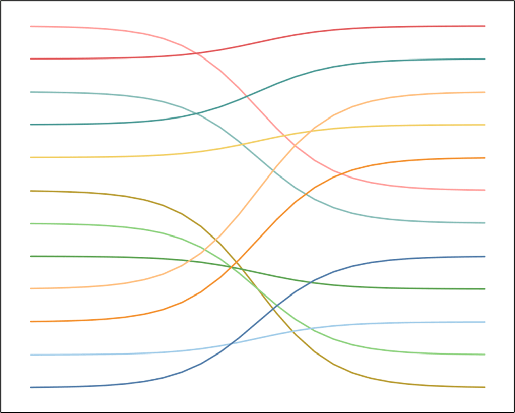
Ok, so this chart may not be totally useless, but I’m going to keep it in this category because it’s something I would never build at work. I love a good bump chart, but there is one major limitation with traditional bump charts. They are great for displaying changes in rankings over time, but what about the data driving those rankings. How much has a value changed from one period to the next? How much separation is there between #1 and #2? Surely a bar chart would be better for that type of insight right? Well, in this tutorial, we’re going to walk through building a chart that combines all of the benefits of bump charts and bar charts, and with some fancy curves to boot.

I’m sure I’m not the first to build this type of chart, but the first time I used it was in my 2020 Iron Viz Submission to show Happiness Scores by continent over time.

An image showing an example of this chart type used in a previous visualization

Looking back, there are definitely some things I would change about this, and I’m going to address those in the chart we are about to build. The data we’re going to be using for today’s walkthrough is on Browser Usage Share over the last 13 Years (showing usage at every 3-year increment). You can find the sample data here, and the sample workbook here. This is what we’re going to build.

An image of a curvy bump chart with bars displaying the percentage of usage share for different browsers

Building Your Data Source

Our data source (on the Data tab in the sample file) contains 5 fields. We have a Time Period (our Year field), a Dimension (the Browser), and a Value (the Share of Usage). There are also 2 calculated fields in this file. These could be calculated in Tableau using table calcs, but because of the complexity of some of the other calculations, we’re going to make it as easy as possible and calculate these in the data source. The [Period] field, is just a sequential number, starting at 1, and it is related to the Date field. The [Rank] field is the ranking of each Browser within that period.

On the next tab (Densification), we have our densification data. There is a [Type] field, which will allow us to apply different calculations, in the same view, for our bars and our lines. There is a [Points] field, which will be used to calculate the coordinates for all points for both the bars and the lines. And there is a [T] field, which will be used to draw the sigmoid curves connecting each of the bars.

If you are building this with a different set of data, just replace the Date, Browser, and Share fields in the Data Tab. The calculated fields should update automatically.

Now for joining this data. We are going to do two joins in the Physical layer in Tableau. We are going to do a self-join on the Data to bring in the rank for the next period, and we’re going to join to our densification data using a join calc.

To get started, connect to the Sample Data in Tableau and bring out the Data table. Then double-click to go into the physical layer. Now drag out the Data table again. First, join on [Browser]. Then create a join calculation on the left side of the join, [Period]+1 and join that to [Period]. Then set it as a Left Join. It should look something like this.

An image demonstrating a self-join

Now bring out your Densification table, and join that to the Data Table using a join calculation, with a value of 1 on both sides of the join. Like this.

An image demonstrating a join to a densification table

Now go to a new worksheet and rename the following fields.

Period(Data1) change to Next Period

Rank(Data1) change to Next Rank

I would also recommend hiding all other fields from the Data1 table to avoid confusion later on.

Building the Bars

To build the bars in this chart, we are going to use polygons. So we’ll need to calculate the coordinates for all 4 corners for each of our bars. Let’s start with Y, since that one is a little easier.

The first thing we are going to do is create a parameter to set the thickness of our bars. Create a parameter called [Bar Width], set the Data Type to Float, and set the Current Value to .75.

We are going to use the [Rank] field as the base for these calculations. Then, we are going to add half of the [Bar Width] value to get the upper Y values, and subtract half of the [Bar Width] value to get the lower Y values. Let’s create a calculated field for each of those, called [Y_Top] and [Y_Bottom].

Y_Top = [Rank]+([Bar Width]/2)

Y_Bottom = [Rank]-([Bar Width]/2)

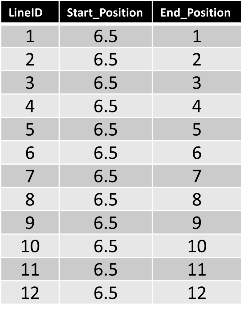
If you look back at our Densification table, we have 4 points for the Bars, one for each corner. The order of these doesn’t really matter (but it is important that you are consistent when calculating the X and Y coordinates). In this example, we are going to start with point 1 at the bottom left, point 2 at the top left, point 3 at the top right, and point 4 at the bottom right. Like this.

An image highlighting the 4 points of a rectangle, starting in the bottom left, and ending at the bottom right

Now we’ll create a calculated field that will calculate the Y value for all 4 points. Call this [Bar_Y]

CASE [Points]
WHEN 1 THEN [Y_Bottom]
WHEN 2 THEN [Y_Top]
WHEN 3 THEN [Y_Top]
WHEN 4 THEN [Y_Bottom]
END

Now we need to do something similar for our X values, but instead of calculating the top and bottom positions, we need to calculate the left and right positions. Here, we will use the [Period] field as the base (which will also be the left side value), and then add the length of the bar to get the right side values.

If you remember from earlier, our [Period] field is a sequential number, starting at 1, and in this example, ending at 6. So each period has a width of 1. But we don’t want our bars going all the way up to the next period, so we’ll use a parameter to add a little spacing. Create a parameter called [Period Spacing], set the Data Type to Float, and set the Current Value to .3.

With this parameter and it’s current value, our largest bar in the chart should have a length of .7 (or 1 minus .3). All of our others bars should be sized relative to that. But first, we need to find our max value, which we will do with a Level of Detailed Calculation called [Max Value].

Max Value = {MAX([Share])}

And now we’ll calculate the length of all of our bars by dividing their [Share] by that [Max Value], and then multiplying that by our maximum bar length of .7 (or 1 minus .3). Call this calculation [Bar Length]

Bar Length = ([Share]/[Max Value])*(1-[Period Spacing])

Now, similar to what we did for our Y values, we are going to create calculated fields for [X_Left] and [X_Right]. [X_Left] will just be the [Period] value, and [X_Right] is just the [Period Value] plus the length of the bar, or [Bar Length]

X_Left = [Period]

X_Right = [Period]+[Bar Length]

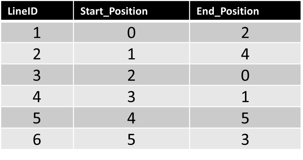
Let’s take another quick look at the order of points.

An image highlighting the 4 points of a rectangle, starting in the bottom left, and ending at the bottom right

So Point 1 should be the left value, Point 2 should also be the left value, Point 3 should be the right value, and Point 4 should also be the right value. So let’s use this to calculate [Bar_X].

CASE [Points]
WHEN 1 THEN [X_Left]
WHEN 2 THEN [X_Left]
WHEN 3 THEN [X_Right]
WHEN 4 THEN [X_Right]
END

Now let’s test out our calculations so far.

  • Drag [Type] to the filter shelf and filter on “Bar”
  • Right click on [Bar_X], drag it to Columns, and when prompted, choose [Bar_X] without aggregation
  • Right click on [Bar_Y], drag it to Rows, and when prompted, choose [Bar_Y] without aggregation
  • Right click on the Y axis, select Edit Axis, and then click on the “Reversed” checkbox
  • Change the Mark Type to “Polygon”
  • Right click on [Points], drag it to Path, and when prompted, choose [Points] without aggregation
  • Drag [Browser] onto Color
  • Right click on [Period], drag it to Detail, and when prompted, choose [Period] without aggregation

When finished, your view should look something like this.

An example of what the polygon bars should look like at this point

Now onto our lines!

Building the Lines

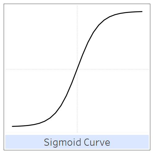
Before starting this section, I would recommend taking a look at Part 3 of the Fun With Curves Blog Series on Sigmoid Curves.

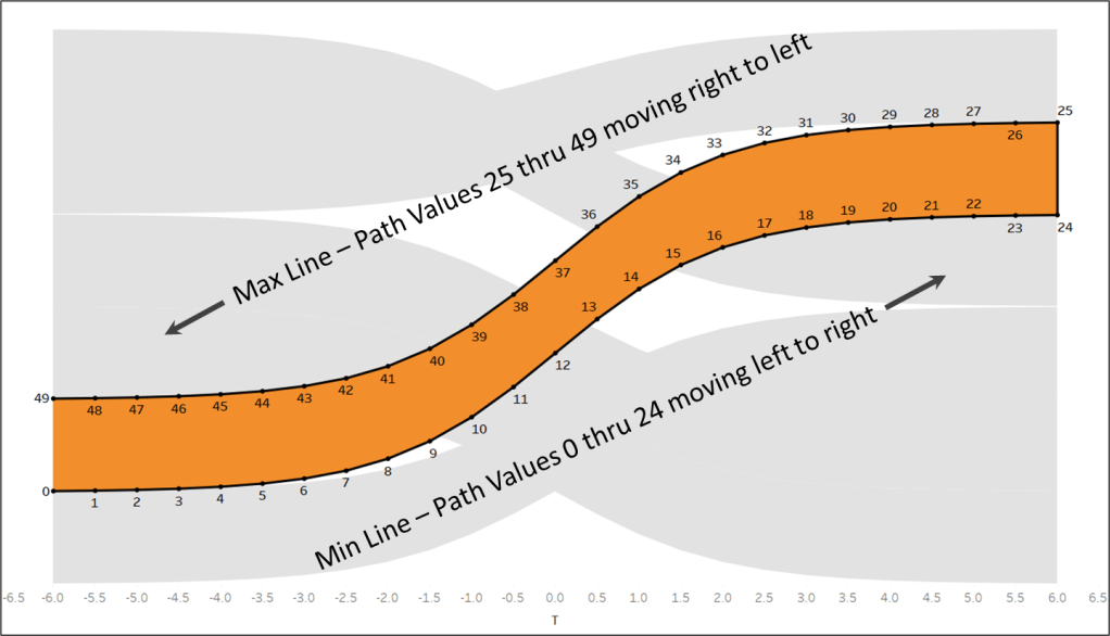
The first calculation we need is [Sigmoid]. As I mention in the post above, this is a mathematical function that will appropriately space our Y values.

Sigmoid = 1/(1+EXP(1)^-[T])

Now, let’s calculate the Y coordinates, which in this case, we’ll call [Curve]. To calculate this, we’re going to use the [Rank] field as our base. Then we’re going to calculate the total vertical distance between the rankings for one period and the next and multiply that by our Sigmoid function to get the appropriate spacing. In the calculation below, the first part is optional, and is included only for labelling purposes. For the final period, there is no [Next Period], so this value would end up being blank, resulting in no label in our final step. So feel free to skip it and just use the portion between ELSE and END if you’re not going to label the bars.

Curve = IF [Period]={MAX([Period])} THEN [Rank] ELSE [Rank] + (([Next Rank] – [Rank]) * [Sigmoid]) END

The [Curve] calculation will give us our Y coordinates for all of points, so we just need X. Before we do that, let’s create one more Parameter that will be used to add a little spacing between the end of the bar and the start of our line (so the line doesn’t run through the label, making it difficult to read). Call this Parameter [Label Spacing], set the Data Type to Float, and set the Current Value to .15.

Now, we’re going to create a calculation for the start of our lines, which will be the end of the bar + spacing. I’ve also added a little additional logic so that the amount of spacing will depend on whether the label is 1 or 2 characters. If the [Share] value is less than 10 (1 character), we’ll multiply the [Label Spacing] by .7, and if it’s over 10, we’ll use the [Label Spacing] as is. Call this calculation [Line_Start].

Line Start = [X_Right]+IF [Share]<10 THEN [Label Spacing]*.75 ELSE [Label Spacing] END

Our next calculation will calculate the horizontal spacing for our points. In our Densification table, we have 25 Points for the lines, and this calculation will be used to evenly space those points between the end of one bar (plus the spacing for the label), and the start of the next bar. Call this calculation [Point Spacing].

Point Spacing = if [Period]={MAX([Period])} THEN 0
ELSE ([Next Period]-[Line_Start])/({COUNTD([Points])-1})
END

Similar to the [Curve] calculation, the first part of this IF statement is only for labelling purposes. If you’re not going to label your bars, you can just use the portion of the calculation between ELSE and END.

And now, with our [Line_Start] and our [Point_Spacing] fields, we can calculate the X coordinates for all 25 of points of each line. Call this [Line_X].

Line_X = [Line_Start]+(([Points]-1)*[Point Spacing])

Now let’s test out our calculations.

  • Drag [Type] to the filter shelf and filter on “Line”
  • Right click on [Line_X], drag it to Columns, and when prompted, choose [Line_X] without aggregation
  • Right click on [Curve], drag it to Rows, and when prompted, choose [Curve] without aggregation
  • Right click on the Y axis, select Edit Axis, and then click on the “Reversed” checkbox
  • Change the Mark Type to “Line”
  • Right click on [Points], drag it to Path, and when prompted, choose [Points] without aggregation
  • Drag [Browser] onto Color
  • Right click on [Period], drag it to Detail, and when prompted, choose [Period] without aggregation

When finished, it should look something like this.

An example of what the curved lines should look like at this point

Now all that is left to do is to combine our “Bar” calculations and our “Line” calculations in the same view.

Building the Final Chart

Because of the way we set up our Densification table, we have separate points for each of our bars and each of our lines. With just a few more simple calculations, we can bring everything together in the same view.

We want to leverage two different Mark Types in this view, Bar and Line, so we’ll need to create a Dual Axis chart. In order to do this, we’ll need a shared Field on either the Column or Row shelf, and then we’ll need separate fields for our Lines and Bars on the other Shelf. In this example, we’ll create a shared field for Rows, called [Final_Y].

Final_Y = IF [Type]=”Bar” THEN [Bar_Y] ELSE [Curve] END

This calculation is pretty straight forward. For our “Bar” records (where the [Type] field in our densification table = Bar), use the Y coordinates for our Bars, [Bar_Y]. Otherwise, use the Y coordinates for our Lines, [Curve]. We’re going to do something similar for X, but we need separate calculated fields for the Bars and Lines to create our Dual Axis. We’ll call these [Final_X_Bar] and [Final_X_Line].

Final_X_Bar = IF [Type]=”Bar” THEN [Bar_X] END

Final_X_Line = IF [Type]=”Line” THEN [Line_X] END

And now we’ll use those 3 calculated fields to build our final view. Let’s start with the Bars.

  • Right click on [Final_X_Bar], drag it to Columns, and when prompted, choose [Final_X_Bar] without aggregation
  • Right click on [Final_Y], drag it to Rows, and when prompted, choose [Final_Y] without aggregation
  • Right click on the Y axis, select Edit Axis, and then click on the “Reversed” checkbox
  • Change the Mark Type to “Polygon”
  • Right click on [Points], drag it to Path, and when prompted, choose [Points] without aggregation
  • Drag [Browser] onto Color
  • Right click on [Period], drag it to Detail, and when prompted, choose [Period] without aggregation
  • Drag [Type] to Detail

And now we’ll add our lines.

  • Right click on [Final_X_Line], drag it on to Columns to the right of [Final_X_Bar], and when prompted, choose [Final_X_Line] without aggregation
  • Right click on [Final_X_Line] on the Column Shelf and select “Dual Axis”
  • Right click on either X axis and choose “Synchronize Axis”
  • On the Marks Card, select the [Final_X_Line] Card
  • Change the Mark Type to “Line”
  • Remove “Measure Names” from Color
  • On the Marks Card, select the [Final_X_Bar] Card and remove “Measure Names” from Color
  • Right click on the Null indicator in the bottom right corner and select “Hide Indicator”

When finished, the chart should look something like this.

An example showing what the bars and curved lines together should look like at this point

Now for the final touches

Formatting the Chart

All of these steps are optional and you can format the chart however you’d like. But these are some of the adjustments that I made in my version.

First, I added labels. You can’t label Polygons, so our label has to go on the [Final_X_Line] Card. So click on that Card and then drag the [Share] field out onto Label. Then click on Label and under “Marks to Label”, choose “Line Ends”, and under “Options”, choose “Label start of line”. Then, because the values in my [Share] field are whole numbers instead of percentages (ex. 20% is listed as 20 instead of .2), I added a “%” to the end of the label (by clicking on the Text option) and formatted the field as a Whole Number. The Label options should look like this

An image showing the described Label options

Those Label options, along with the [Label Spacing] parameter we created earlier, should give you a pretty nice looking label between the end of your Bar and the start of the Line.

Next, I cleaned up and formatted the Axis. For the X axis, I set the Range from .9 to 7 and then hid both of the X axes. For the Y axis, I set the range from .5 to 9.5, and set the Major Tick Interval to 1. I then removed the Axis title and made the text a bit larger. I also used a Custom Number Format, so I could put a “#” sign before the Ranking number. Like this.

An image showing the Custom Number formatting with "#"0

Then I added some Grid Lines on Columns to give the Bars a uniform starting point, and some really faint Grid Lines on Rows to make it easier to track the position for any given Bar.

Finally, on the dashboard, I added a Title, I added a second simple worksheet to display the Years, and added a Color Legend that can also be used to Highlight any of the Browsers. And here’s the final version.

An image of the final visualization

As always, thank you so much for reading, and if you happen to use this tutorial or the template, please reach out and share what you built with us. We would love to see it! Until next time.

Categories
How-To's

Fun With Curves in Tableau Part 3: Sigmoid Curves

This is the third and final part of our series on creating curved elements in Tableau. Although this post covers new and different techniques, I would recommend checking out Part 1 of the series here as some of the concepts overlap. This post will focus on sigmoid curves and a few different techniques to build them, depending on what you’re trying to do and what your data looks like. To follow along, you can download the sample data and workbook here.

Sigmoid Curves

This is a sigmoid curve. Whether you realize it or not, these curves are everywhere on Tableau Public. Sankeys? Sigmoid Curves. Curvy lines on a map? Sigmoid Curves. Curvy bump charts, or curvy slope charts, or curvy dendograms, or curvy area charts? All Sigmoid Curves. The main difference between this type of curve and the Bezier curves we discussed in Part 2 of this series, is that only 2 points are needed to draw a Sigmoid Curve. If you have the start point, the end point, and the right formulas, the math will take over and create that nice symmetric s-shaped curve for you. So what formulas should you use? The answer is, as with most things in Tableau, it depends. We’re going to cover two different models for drawing Sigmoid curves, we’ll call them the ‘Standard’ model, and the ‘Dynamic’ model.

Think about most of the chart types that use sigmoid Curves. Sankeys, Curvy slope or bump charts, dendograms…they all have something in common. The start of the lines and the end of the lines are uniform. If they are running from left to right, the start of all of the lines share an X value, and the end of all of the lines share an X value (columns). If they are running from top to bottom, the start of all of the lines share a Y value, and the end of all of the lines share a Y value (rows). When these conditions are true, which they will be in 99% of the applications in Tableau, you can use the ‘Standard’ model. If either of those conditions are not true, you can use the ‘Dynamic’ model.

Since the majority of the time you will be using the ‘Standard’ model, let’s start with that one.

Building Your Data Source

To build our data source we are going to follow the same process that we did in Part 1 and Part 2 of this series. We are going to create additional points by joining our sample data to a densification table using join calculations (value of 1 on each side of the join). For this first example, we are going to use the sheet titled ‘Slope Chart’ for our sample data, and the sheet titled ‘SigmoidModel’ for our densification table. You can download the sample files here.

Here is our sample file that we will use to draw 12 curved lines, from left to right.

You may notice that the densification table looks a little different. In previous parts of this series, the densification table was a single column with numbers 1 thru however many points you wanted to create. For this model, we have 2 columns, ‘t’ and ‘Path’. The Path value will be used to tell Tableau how to connect the points (think connect the dots). The ‘t’ value is going to be used to draw the curve and will be a value evenly spaced between -6 and 6. For our example, we are using 24 points, so we will have a value at every .5 increment (-6, -5.5, -5, …). If you want your curve to be a little smoother, you could use 48 points and have a value at every .25 increment (-6, -5.75, -5.5, …). Really, you can use any number of points, you’ll just need to do the math to get t values that are evenly spaced between -6 and 6. Why -6 and 6? I have absolutely no idea and I’m not going to pretend to. I’m just here to show you how to make cool curvy things, and to do this cool curvy thing, you need values evenly spaced between -6 and 6. Here is our densification table

Building Your Calculations

Once we join those files together, there are only two calculations needed to turn the points from our sample data into curved lines.

Sigmoid

1/(1+EXP(1)^-[T])

Curve

[Start Position] + (([End Position] – [Start Position]) * [Sigmoid])

Essentially what these calculations are doing are determining the total vertical distance that needs to be travelled (End Position – Start Position) and then the Sigmoid function spaces these points appropriately on the Y axis to create the S-shaped curve. Let’s build our view and then come back to this.

Build Your Curves

Follow the steps below to build your curves

  • Right click on the [T] field, drag it to columns, and when prompted, choose the top option ‘T’ without aggregation
  • Right click on the [Curve] field, drag it to rows, and when prompted, choose the top option ‘Curve’ without aggregation
  • Change [LineID] to a Dimension, and drag it to color
  • Change the Mark Type to ‘Line’
  • For this example, you may not need to address the ‘Path’, but I find it’s good practice when dealing with lines and polygons.
    • Right click on the [Path] field, drag it to Path, and when prompted, choose the top option ‘Path’ without aggregation

When you finish, your worksheet should look like this

With just two calculations, we were able to draw those nice curved lines. Let’s quickly re-visit those calcs. Our Sigmoid calculation is a mathematical function with values ranging between 0 and 1 depending on the ‘T’ value. The table below shows the Sigmoid Value for each T value and the second row shows the difference from the previous value. Notice that at the beginning and the end, the values don’t change much from one step to the next, but towards the middle the values change much more rapidly. And where T=0, the value is .5.

Now let’s look at that in context with our lines and with our Curve calculation. Notice that the vertical position for each of the points on the line doesn’t change much at the beginning or the end, but does change rapidly as it approaches the center. And the center of each line is exactly half way between the starting position and the ending position.

For example, Line 4 starts at position 4 and ends at position 10. At T=0, the vertical position is at 7, halfway between 4 and 10. Let’s plug this line into our calculation. Remember, from the table above, the value of Sigmoid at T=0 is .5

Curve = [Start Position] + (([End Position] – [Start Position]) * [Sigmoid])

or

Curve = 4 + ((10 – 4) * .5) = 7

And let’s do this with one other point, just for good measure. If we look at the table above, we see that the Sigmoid value at T=-3 is .047

Curve = 4 + ((10 – 4) * .047) = 4.28

If you look at the image above, you’ll notice that at T=-3, the vertical position is just above the 4, or 4.28 to be exact. That’s enough math for now, let’s look at some other fun examples.

More Examples – Dendogram

Now let’s follow the same exact process for the curvy slope chart above, but change up our data a little bit. For this example we are going to use the sheet titled ‘Dendogram’ for our data, and we’ll use the same ‘SigmoidModel’ sheet for our densification. Here is our sample data.

In this example, our starting position is the same for all of our lines and is halfway between the minimum end position (1) and the maximum end position (12). If you follow the same process your sheet should look something like this.

Now just for fun, let’s make that starting point dynamic. Create a numeric parameter called [Dynamic_Start] and then create a new field called [Dynamic_Curve]. This will be exactly the same as our [Curve] calculation but we’ll replace the [Start_Position] field with [Dynamic_Start].

Dynamic Curve

[Dynamic Start] + (([End Position] – [Dynamic Start]) * [Sigmoid])

Now in your view, just replace the [Curve] field on Rows with the [Dynamic Curve] field and you should have something like this.

More Examples – Sankey

This is not going to be an in-depth tutorial on how to create Sankey diagrams. People much smarter than me (check out flerlagetwins.com) have written many posts and shared many templates for anyone interested in building one. This section will be dedicated more to the mechanics of a Sankey diagram and how we can take what we’ve already learned in the previous examples and apply them towards building a Sankey diagram. The one main difference between what we’ve done so far and what we’re going to do now lies in the Mark Type. It’s time for some polygon fun.

Essentially what we need to do is draw 2 lines for every 1 ‘Sankey Line’ and then connect them together. Typically, you would use table calculations in Tableau to figure out the positions of these lines, but we are going to keep it simple and use some data from our sample file. What we’re actually building is probably more of a Slope Chart, since each segment will be of equal width, but the fundamentals are the same as with a true Sankey Diagram. For this example we are going to use the sheet titled ‘Sankey’ and for our densification we’re going to use the sheet titled ‘SankeyModel’. Here is our sample data

You may notice that this densification table has some additional data. It has twice as many records and a new column called ‘Side’ with values ‘Min’ and ‘Max’. This is because for each segment, or ‘Sankey Line’ we will actually be drawing two lines, a Min Line and a Max Line. Here’s out densification data.

Building Your Calculations

We are still going to use the same 2 fields, Sigmoid and Curve, but in this case, the calculation for Curve will be a little different.

Sigmoid

1/(1+EXP(1)^-[T])

We have the two points needed for one of our lines (Start_Position and End_Position), we’ll call this the Min Line. But we need the two points for our Max Line as well. As I mentioned earlier, in this example all of our segments are going to be equal width, so we’ll just add 1 to our position fields.

Start_Position_Max

[Start_Position]+1

End_Position_Max

[End_Position]+1

And now we have the points needed to draw all of our curves.

Curve

IF [Side]=’Min’ then [Start_Position] + (([End_Position] – [Start_Position]) * [Sigmoid])
ELSE [Start_Position_Max] + (([End_Position_Max] – [Start_Position_Max]) * [Sigmoid]) END

This calculation may look complicated, but it’s almost identical to the Curve calculation we were using earlier. When we joined to the SankeyModel, it essentially created two sets of points for us. We have all of the same T values as we did earlier (24 points ranging from -6 thru 6), but now we have 2 of each, one where [Side] = ‘Min’ and one where [Side] = ‘Max’. So we can use this to draw two lines. The first part of the IF statement is for the ‘Min’ line. It is exactly the same as our previous Curve calculation. The second part of the IF statement (ELSE) is for the ‘Max’ line and it is the same calculation but using the [Start_Position_Max] and [End_Position_Max] fields.

Build Your Curves

To start, let’s follow the same process we did earlier, but with a couple of minor changes

  • Right click on the [T] field, drag it to columns, and when prompted, choose the top option ‘T’ without aggregation
  • Right click on the [Curve] field, drag it to rows, and when prompted, choose the top option ‘Curve’ without aggregation
  • Change [LineID] to a Dimension, and drag it to color
  • Change the Mark Type to ‘Line’
  • Drag [Side] to Detail

Your sheet should look something like this

This is starting to look like a Sankey diagram. For each LineID we have two lines that are moving together, we just need to ‘color them in’, and we’ll do that by converting them to polygons. So change the Mark Type to polygon.

Uh-oh. What happened?

So because we have [Side] on detail, it’s treating our Min and Max lines as separate polygons. We want them treated as 1 polygon, so surely removing the [Side] field will fix it.

$@!%!!!!

Alright, we can figure this out. Remember how earlier I said it was always good practice to address the Path on the Marks Card when using lines and polygons? Let’s try right clicking on our [Path] field, dragging that to Path and adding it without any aggregation.

Ahhh, that’s better.

Now let’s figure out what happened. We know why we had to remove the [Side] field, but how did the [Path] field fix our worksheet. If you look at the densification table, you’ll see that the T values go from -6 up to 6 and then repeat in the reverse order. The Path field on the other hand is sequential from 0 thru 49. Let’s take a look at the [Path] values in relation to the [T] values

So our [T] and [Curve] fields are telling Tableau where to plot all of the points, and then our [Path] field is telling Tableau the order in which to connect those points to form our polygon. And that is basically all you need to know about using Polygons in Tableau. Just Points and Path.

Let’s take a look at one more example of something you can do with the ‘Standard’ Model.

More Examples – Proportion Plot

The process for building a Proportion Plot is going to be very similar to what we did in the previous example. For this, we are going to use the sheet titled ‘Proportion’ for our sample data, and we’ll use the ‘SankeyModel’ sheet again for our densification. Here is our sample data.

You’ll notice that this table has a couple of extra columns. The ‘Run’ columns are just running totals of the Start_Value and End_Value columns. Again, this would typically be done with table calculations in Tableau, but to keep things simple we are doing those calculations in the data source. Now let’s build our calculations.

Building Your Calculations

Once again we are going to use those same two calculations, but with some minor modifications. First, our Sigmoid calculation, which is always the same.

Sigmoid

1/(1+EXP(1)^-[T])

Now, similar to the Sankey example, we need to draw two sets of line for each section. So we’ll need the start and end positions for our Min Line and the start and end positions for our Max Line. Because this is a Proportion Plot (part of a whole), we want all of our values represented as percentages. So we’ll calculate what our position should be and then divide that number by the total of the column (or the maximum value in the running total column) to translate that start position into a percentage of the whole.

Start Position Min

([Start_Value_Run]-[Start_Value])/{MAX([Start_Value_Run])}

End Position Min

([End_Value_Run]-[End_Value])/{MAX([End_Value_Run])}

Let’s take a closer look at this before we move on. We’ll use Section #2 from the table above. For the Starting Position (Start Position Min) we are going to subtract the value of that section from the running total to get the starting position.

So section #2 would start at 35 (90-55=35). Then we’ll divide that by 115, which is the total of the column, and the maximum value of the running total column, which gives us 30.4%. So this section of our Proportion Plot is going to start 30.4% of the way up our Y Axis. Now we’ll repeat for the Max Lines. These calculations will be the same except we do not need to subtract the value of the section. We just want the running total divided by the grand total.

Start Position Max

[Start_Value_Run]/{MAX([Start_Value_Run])}

End Position Max

[End_Value_Run]/{MAX([End_Value_Run])}

Using section #2 as an example again, we would divide 90 (the running total value) by 115 (the total of the column or the max value of the running total column) and get 78.3%. So we want this section of our Proportion Plot to start 30.4% of the way up the Y axis and end 78.3% of the way up the Y axis. And now for the Curve calculation, we’ll use the same calculation that we did in the Sankey Example

Curve

IF [Side]=’Min’ then [Start_Position_Min] + (([End_Position_Min] – [Start_Position_Min]) * [Sigmoid])
ELSE [Start_Position_Max] + (([End_Position_Max] – [Start_Position_Max]) * [Sigmoid]) END

Build Your Curves

Now we’ll follow the same process to build our view

  • Right click on the [T] field, drag it to columns, and when prompted, choose the top option ‘T’ without aggregation
  • Right click on the [Curve] field, drag it to rows, and when prompted, choose the top option ‘Curve’ without aggregation
  • Change [Section] to a Dimension, and drag it to color
  • Change the Mark Type to ‘Polygon’
  • Right click on the [Path] field, drag it to Path, and when prompted, choose the top option ‘Path’ without aggregation

When you’re finished, your sheet should look something like this.

If you look at section #2, the orange section, you’ll see that on the left side (the starting positions), it ranges from 30.4% to 78.3%, which is what we had calculated in our example. So it accounts for about 48% of the total (55 / 115=.48) and it starts at about 30% (35 / 115)

That’s it for the ‘Standard Model’. Now we are going to jump into one quick example with the ‘Dynamic Model’.

Dynamic Model

As I mentioned earlier, 99% of the time you are going to want to use the ‘Standard’ model, but there are instances where that may not work. One example use case, which has been popular in recent years, is drawing curved lines on a map that connect to another chart. So let’s use that.

Building Your Data Source

For this example we are going to draw curved lines from 9 U.S. states and have them end in a uniform column on the right side of our sheet, so we can connect them to another chart. For this we’ll use the sheet titled ‘Dynamic’ for our sample data and we’ll use the ‘SigmoidModel’ sheet for our densification. Here is our sample data.

So for each of our states we have the starting points (the lat and lon for the state), but we need to figure out our end points. This can be done in a lot of different ways. You can do it manually and plug those values into your data source. Personally, I like to calculate them in Tableau. But those calcs will be dramatically different depending on your use case. For this example, we are going to draw our lines from left to right and they will all end in a uniform column to the right of the U.S. and will be spaced evenly between the lowest state and highest state in our sample data. If your use case is different, you can most likely modify these calculations to get what you need, and as always, feel free to reach out to me if you have any questions. So let’s calculate our end points. Keep in mind that this step is completely optional. If you prefer to have static points in your data source for the end points, just name them End_Lat and End_Lon and skip ahead to the next calculation.

Build Your Calculations

This first calculation will be used to find the latitude for our end points. The calculation looks complicated but we will break it down.

End_Lat

{MAX([Lat])} – (({MAX([Lat])}-{MIN([Lat])})/{COUNTD([State])-1}) * ([Rank]-1)

The first portion of this calculation, {MAX([Lat])}, is used to find our ‘reference point’, which will be the maximum latitude in our sample data. The next portion of the calculation, ({MAX([Lat])}-{MIN([Lat])}) gets our ‘range’, or the maximum latitude minus the minimum latitude. Then we divide that range by the number of states -1 to get the spacing between points, or {COUNTD([State])-1}. And then we multiply that spacing by the Rank -1 (so that the first point starts at our max Lat).

So an easier version of this formula is Ref Point – ((Range/Number of States -1) *( Rank -1)

Now we need to calculate the longitude for our end points. This is much easier. We want all of our lines to end in the same column, so they will all have the same longitude. I like to use parameters rather than hardcoding values, so you can easily adjust the position of things. So let’s create a parameter called [Line End Offset] and set that value to 10. Then our calculation is just the maximum longitude value in our data + our offset parameter

End_Lon

{MAX([Lon])} + [Line End Offset]

So now we have the two sets of points that we’ll need to draw our lines. If we were to stop here and just map those two sets of points, we would have a point on the center of each of our states (blue) and then a column of points to the right of the U.S. (orange).

Now for the rest of our calculations. Once again we’ll need the Sigmoid calculation.

Sigmoid

1/(1+EXP(1)^-[T])

The Curve calculation is exactly the same as all of the previous examples just with different field names.

Curve

[Lat] + (([End Lat] – [Lat]) * [Sigmoid])

The main difference between the ‘Dynamic’ model and the ‘Standard’ model lies in the spacing of the points. In the Dynamic model, points are spaced evenly between -6 and 6 and we can just use the [T] field on columns. That obviously won’t work on a map. We have different longitudes for all of our starting points, so we’ll need to adjust the approach a little bit. Instead of evenly spacing points between -6 and 6, we need to evenly space them between our starting and ending longitudes. So we’ll take the total horizontal distance (ending longitude – starting longitude) and divide it by the number of points in our densification table -1.

Point Spacing

([End Lon]-[Lon])/({COUNTD([Path])-1})

Now we’ll use that calculation, along with the [Path] field and our starting longitude to create points that are equally distant between our starting and ending longitude.

Lon_Adjusted

[Lon] + [Path]*[Point Spacing]

Build Your Curves

Now that we have all of our calculations, let’s build our curve.

  • Right Click on [Lon_Adjusted], go to ‘Geographic Role’ and select ‘Longitude’
  • Right Click on [Curve], go to ‘Geographic Role’ and select ‘Latitude’
  • Right click on the [Lon_Adjusted] field, drag it to columns, and when prompted, choose the top option ‘Lon_Adjusted’ without aggregation
  • Right click on the [Curve] field, drag it to rows, and when prompted, choose the top option ‘Curve’ without aggregation
  • Drag [State] to Color
  • Change the Mark Type to ‘Line’
  • Right click on the [Path] field, drag it to Path, and when prompted, choose the top option ‘Path’ without aggregation

When you’re done, your sheet should look something like this.

Now with just a few modifications to the ‘Standard’ model, we were able to build our Sigmoid curves with different starting points. This example was for building lines that run left to right, but you can just as easily build them from top to bottom. The calculations and example for that can be found in the sample workbook here. Just use the fields with the ‘Ttb’ suffix.

If you’re still reading this, I apologize for the incredibly long post. There are just so many things you can do with Sigmoid Curves and I wanted to demonstrate how, with basically the same technique, you can build a huge variety of cool curvy things in Tableau. If you’re interested in learning more about Sigmoid Curves, definitely check out flerlagetwins.com. Ken and Kevin are incredible and everything I know about Sigmoid Curves (and a lot of other things that will eventually be covered in this blog), I learned from them.

Here are a few examples of where I’ve used Sigmoid Curves in my Tableau Public Work (click thumbnail to view on Tableau Public).

Standard Model

Dynamic Model

As always, thank you so much for reading!