Categories
Design Figma It Depends

It Depends: Using design tools in your dashboard design process

You may have heard people talk about Figma or Illustrator, or maybe you’ve heard people talking about wireframes or prototypes. Perhaps you’ve seen dashboards with custom backgrounds. Some questions seem to come up often: What do you use Figma for? What are wireframes? Do I need prototypes? Should I use background images in my dashboards? Are these tools just something to use for flashy dashboards for Tableau Public? Why wouldn’t you just do your mockup in Tableau?

These are all really good questions to be asking, especially if you haven’t used these tools in your work before. In this installment of the “It Depends” series, I’ll unpack how and when I use design tools in my dashboard development process.

Just a quick note to say, I might talk about Figma a lot here, but this post isn’t about Figma specifically. There are other tools that you can use to accomplish similar things to varying degrees. Plenty of people use PowerPoint, Google Slides, and Adobe Illustrator just to name a few. Autumn Battani hosted a series on her YouTube channel that demonstrates this very well (link). If you want to see how different tools can accomplish the same task, give them a watch!

Why would I use design tools?

In my mind, it boils down to two reasons to use a design tool like Figma in your process:

  1. Create design components such as icons, buttons, overlays, and background layouts, or
  2. Create wireframes, mockups, and prototypes

So, let’s get into when and why you might use these…

Design Components

For business dashboards, it’s usually best to try to keep external design components to a minimum, but when used effectively, they can improve your dashboard’s appearance and the user’s experience.

Icons and Buttons

Icons can be a nice way to draw the user’s eye or convey information in a small space. Custom buttons and icons can add polish to your dashboard’s interactivity. But, they can also be confusing to the user if they’re not well-chosen. So, what are some considerations that can help ensure your icons are well-chosen?

Is the meaning well understood?

While there are no completely universal icons, stick to icons that commonly have the same meaning across various sites, applications, operating systems, and regions.

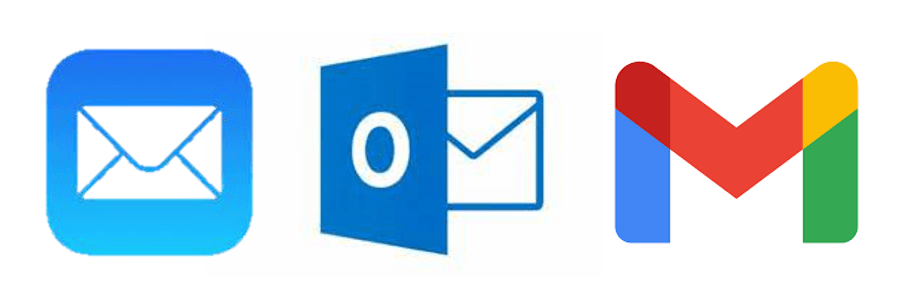
For example, nearly every operating system you use will use some variation of an envelope to mean “mail”. They might look different, but we can usually figure out what they mean.

iOS mail icon, Microsoft mail icon, and Google mail icon

Are they simple and easy to recognize?

Avoid icons with a lot of details and icons that are overly stylized. Look for a happy medium. Flat, lower detail icons are generally going to be easier to recognize and interpret. Once you’ve chosen an icon style, use that style for all icons.

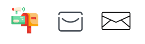
In this example below, the first icon is a very detailed, colorful mail icon, the second is a stylized envelope, and the third is a simple outline of an envelope. The third icon is going to be recognizable for the most people.

colored mail icon, stylized mail icon, simple mail icon
detailed, stylized, and minimal icon (From Icons8.com)

Is there a text label or will you include alt-text and tooltips?

Text labels and alt-text are not only important for accessibility, they can help bridge any gaps in understanding and clarity.

Does it improve the clarity or readability of the visualization?

Avoid icons that distract or are unnecessary. Using icons strategically and sparingly will ensure they draw the eye to the most important areas and reduce visual clutter.

This quote from the Nielsen Norman Group is a good way to think about using icons in your designs:

“Use the 5-second rule: if it takes you more than 5 seconds to think of an appropriate icon for something, it is unlikely that an icon can effectively communicate that meaning.”

Nielsen Norman Group

Some places to use icons:

  • Information:
    • Including an information icon can be a great way to use a small amount of real estate and a recognizable symbol to give users supplemental information about a dashboard without cluttering the dashboard
  • Filters:
    • Hiding infrequently used filters in a collapsible container can reduce clutter on the dashboard while still providing what is needed
  • Show/Hide alternate or detailed views:
    • An icon to allow the user to switch to an alternate view such as a different chart type or a detailed crosstab view, or to show a more detailed view on demand

Background Layouts

Background designs can help create a polished, slick, dashboard. Something you might use for marketing collateral, infographics, and executive or customer-facing dashboards. A nicely designed background can elevate a visualization but they do come with trade-offs.

Does it improve the visual flow of information?

Backgrounds can be used to add visual hierarchy, segmentation, and to orient or guide the user.

Does it distract from the information being presented?

When backgrounds are busy or crowded, they take away from rather than elevate the data being visualized.

Does it affect the maintainability of the dashboard?

Custom background images need to be maintained when a dashboard is changed, so they should be included thoughtfully.

Does it adhere to your company’s branding and marketing guidance?

Background images that are cohesive with other areas will feel more familiar to your users which can make your solution feel more friendly

Does it have text?

Whenever possible, use the text in Tableau as it will be easier to update and maintain, and is available to screen readers. If you need to put the text in the background image for custom fonts, you can use alt-text or hidden text within Tableau.

Find Inspiration

If you’re looking for a place to start with designing layouts, I suggest checking out Chantilly Jaggernauth’s blog series, “Design Secrets for a Non-Designer“, and conference presentation of the same name.

Look at Tableau Public, websites you find easy to use, product packaging. Take note of what works well (and what doesn’t).

This Viz of the Day by Nicole Klassen is a great example of using images that set the theme, elevate the visualizations, and create visual flow and hierarchy.

Of course, it’s not just the data-art and infographic style dashboards that can benefit from this. If you peruse Mark Bradbourne‘s community project #RWFD on Tableau Public, you’ll see plenty of examples using the same concepts to improve business dashboards. Don’t underestimate the impact of good design on usability and perception… It matters.

*Tip: When you use background layouts, you usually have to use floating objects— Floating a large container and tiling your other objects within that container can make it easier to maintain down the line #TeamFloaTiled

Overlays

Overlays can be used to provide instructions to users at the point where they need them. They provide a nice user experience, allow users to answer their own questions, and can save a lot of time in training and ad hoc questions.

Example overlay

Can instructions be embedded in the visualization headings or tooltips effectively?

Overlays are fantastic for giving a brief training overview to users, but they are not usually necessary. Instructions are usually most helpful if 1) the user knows they exist and 2) the information is accessible where it will be needed.

Does the overlay improve clarity, and reduce the need for the user to ask questions?

Overlays should help the user help themselves. If the user still needs training or hands-on help, then it might not be the right solution, or it might need to be changed to help improve the clarity. Sometimes the users just need to be reminded of how to find the information.

Is your dashboard too complex?

Sometimes dashboards need to be complex or they have a lot of hidden interactivity, and there’s nothing wrong with that. However, if you feel like you need to provide instructions it’s always a good idea to step back and consider if the solution is more complex than necessary, or if you can make the design more intuitive. Sometimes complexity isn’t a bad thing, but it’s always worth asking the question of yourself.

Will it be maintained?

Similar to background layouts, overlays will need to be changed whenever the dashboard is changed. Make sure there is enough value in adding an overlay, and that if needed, it will be maintained going forward.

Wireframes, Mockups, and Prototypes

Wireframes, mock-ups, and prototypes are a staple of UX design, and for a good reason. They help articulate the requirements in a way that feels more tangible, they force us to ask questions that will inevitably arise during the development process, and they help solidify the flow and structure. In dashboard design, they can get early stakeholder buy-in, ownership, and feedback. They also help us get clearer requirements before investing in data engineering and dashboard development (and having to rework things later — Tina Covelli has a great post on this subject here). You can talk conceptually about what they need to see, how it needs to work, and the look and feel earlier so it can save time on big projects. I’m a big fan of this process.

So, what’s the difference between wireframes, mockups, and prototypes, and when might you use them?

Wireframes

Wireframes are rough sketches of the layout and components. They can be very low fidelity — think whiteboard drawings of a dashboard. These are great very early on in your process.

Hand drawn wireframe

They can also be a slightly higher fidelity wireframe that starts to show what the dashboard components will be. These are the bones of a dashboard or interface, but can help articulate the dashboard design and move forward the requirements discussion.

Digital wireframe

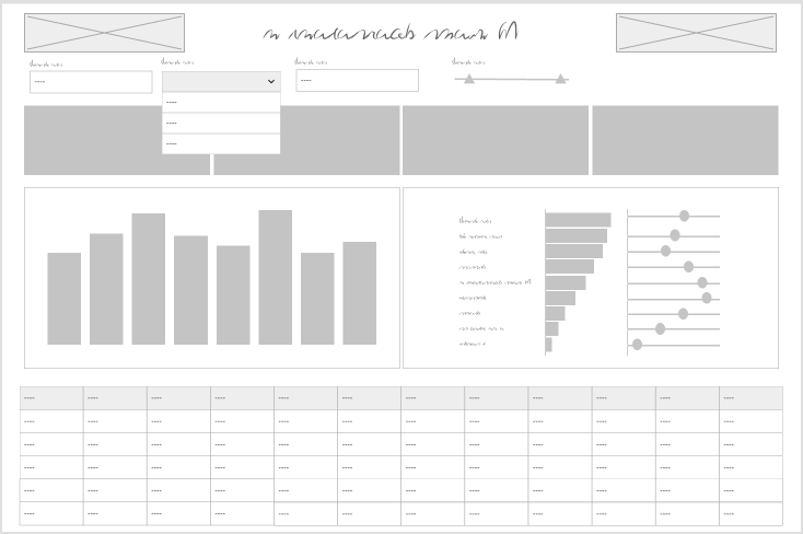
Even if your stakeholders never see the wireframe, sketching out what your dashboard and thinking about what the layout, hierarchy, interactivity will look like helps organize your thoughts before you get too far or get locked in on a specific idea.

There’s really no reason not to start any project with a wireframe of some sort. This is a tool for the beginning of your process, but once you’ve moved on to mockups or design there’s no reason to do a wireframe unless a complete teardown and rebuild are needed.

Mockups

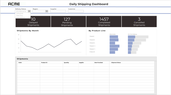
Mockups are a graphic rendering of what the dashboard might look like. These are high (or at least higher) fidelity designs that allow the user to see what the final product might look like. Exactly how high-fidelity to make the mockups will depend on the project and level of effort you want to invest. You don’t want to spend more time on this process than you would to just do it in Tableau.

Mockup

I think it’s worth noting here: the mockup should be done by the Tableau developer or someone who is very familiar with Tableau functionality. Otherwise, you run the risk that the mockup shows functionality that isn’t going to work well or appearances that aren’t accurate.

If a lot of data prep is required or you are working on a time or resource intensive project, a good mockup is worth its weight in gold. If you jump right into Tableau and find out that it’s more complicated than you initially thought, it’s not too late to pivot and come up with mockups.

Mockups can save you quite a bit of time in the development process. I will use mockups to think about the right data structure and level of detail, and think about how metrics will be calculated or what fields will be needed. And, if your users see a preview of the result and have an opportunity to get involved in feedback early, you are less likely to end up delivering a project that dies on the vine.

Prototypes

As soon as you need to demonstrate interactivity, prototypes come into play. These can be low-fi or high-fi but are useful whenever there is a lot of interactivity to demonstrate. To build interactivity, you’re going to need a prototyping tool. You can get creative and mark up your wireframes and mockups with arrows and comments to show how a user will interact, but prototypes make it feel more real.

The goal of prototypes isn’t to fully replicate the dashboard. A sampling of the interactivity can be included for a demonstration to better convey the idea without spending a lot of time.

You may not need prototypes on many projects, but similar to mockups, if you’re working on a large, complicated project where the stakeholders and users won’t get their hands on a fully functional product for some time, a prototype can be very helpful.

Some things to consider:

  • Is there interactivity that can’t be demonstrated by describing it?
  • Are your users unfamiliar with the types of interaction?
  • Is the user journey complex or multi-stepped?
  • How much functionality needs to be demonstrated?

To sum it up

I believe that involving your stakeholders and user representatives early in the process yields better requirements and a sense of ownership and buy-in. Your stakeholders and users are more likely to engage with, adopt, and encourage the adoption of your solution if they feel ownership.

Knowing that time isn’t an infinite resource, these steps can also take time away from other aspects of the solution or extend the timeline. Sometimes mocking up or iterating right in Tableau will be faster and produce the same result. If you start in the tool, presenting rough versions and getting feedback early is still valuable for the same reasons. Consider if these steps are taking more time than the build itself, or when they add a step that’s not needed to clarify or establish the end goal.

Bonus: Diagrams

Most design tools can also be used to create diagrams. While diagrams aren’t “dashboard design” per se, they are often an important part of documenting or describing a full data solution. What kinds of diagrams might you use in your data solution process?

  • Relationships
    • The good old entity relationship diagram, whether it is a detailed version used for data engineering, or an abstracted version to present to stakeholders
  • User journeys
    • Map out the ways a user can enter the solution, and how they progress through and interact
  • Process flows
    • Flow charts… whether it’s mapping out the process that creates the data, the process for how the solution will be used, or the steps in the data transformation process

Thanks for reading!

Categories
How-To's Tableau Techniques

It Depends: Techniques for Disabling the Default Highlighting in Tableau

The thing that I love most about Tableau is the incredible flexibility. No matter what you are trying to do, there is a way to do it. And more often than not, there are actually several ways to do it. That’s where this series comes in. There are so many incredible hacks and techniques floating out there in the Tableau Universe, it can be difficult to figure out which ones to use and when. In each installment of this series we’ll be focusing on one specific ‘question’ and discuss the pros, cons, and use cases of various techniques. And our first question of the series is… “How do I turn off the default highlighting in Tableau when I click on a mark?”. And the answer is, of course, “It Depends”.

First off, what are we talking about when we say ‘default highlighting’? As I’m sure you have noticed, when you click on a mark in Tableau, something happens to the mark you selected, and to all of the other marks in your view. When you click on a text mark, you get a blue box on the selected mark and all of the other marks fade. When you click on any other type of mark, that mark retains it’s formatting (sometimes with an extra black box around it) and the rest of the marks fade. And then everything in that view goes back to normal when you click on something else.

This behavior makes sense. When a mark is selected, you should know which mark that is. But the result, in my opinion, does not look great. It would be really nice if we could control what the selected and non-selected marks look like.

This post is going to focus on three techniques that will allow you to do just that. We’ll call them the ‘Highlight Technique’, the ‘Filter Technique’, and the ‘Transparent Technique’. First, let’s talk a little bit about each of these techniques, and then we’ll walk through how to apply them. If you’re familiar with the techniques and are just looking for a reminder on how to do one of them, feel free to skip ahead.

The Highlight Technique – This technique leverages a highlight action and essentially highlights every mark when any mark is selected. What I love about this technique is that it’s very simple to set up, and it can be applied to multiple worksheets. With a single action, you can ‘turn off’ highlighting for your entire dashboard…as long as your dashboard doesn’t contain a specific mark type. One of the major drawbacks of this approach is that it does not work with text marks. Instead of getting rid of the blue boxes on your BANs, this technique will turn them yellow. Another drawback of this approach is that it doesn’t actually de-select the mark, it just masks the selection. You can still see a black border around the selected mark, and if you have something that could be clicked on multiple times in a row (like a scroll button), it makes for a clunky user experience. Users would have to click the mark three times to run the action twice (once to run the action, a second time to de-select the mark, and a third time to run the action again). And one last drawback is if you have the opacity turned down on a mark, when you click on it, the mark will show at full opacity.

The Filter Technique – This technique leverages a filter action, and to be completely honest, I’m not entirely sure how it works. But it works great! I was first introduced to this technique by Yuri Fal, during a Twitter discussion on this exact topic, and several others have written about it since. What I love about this technique is that it actually de-selects the mark after you click on it, unlike the Highlight Technique. It also works on any chart type. The only downsides I have found with this approach are that it’s a little tricky to set up, you have to create a separate action for every worksheet on your dashboard, and it does not work well in conjunction with some other actions, mainly other filter actions and set controls. The issue with using this technique with other actions is that you cannot leverage the ‘Clearing the selection will…’ options. So basically there is no option to undo your action. This is a major drawback if you’re trying to use set controls, or another filter action, but not so much with parameter actions since you can replicate that ‘Clearing’ function with a calculated field.

The Transparent Technique – I haven’t used this technique much in the past (mainly because I learned the other techniques first), but it’s definitely something I will use more in the future. I first came across this approach in Kevin Flerlage’s blog post, 14 Use Cases for Transparent Shapes. It leverages a transparent shape that can be built in PowerPoint or other design tools and, unlike the other techniques, it does not rely on dashboard actions. Everything can be done in your worksheet. Because the transparent shape doesn’t have a border, or any fill, there is nothing for Tableau to highlight when it’s selected. Another way that it differs from the other approaches is that the Highlight and Filter techniques can be used almost universally (with the few exceptions we discussed earlier), but this approach has pretty limited applications when it comes to avoiding highlighting (but a wide variety of other awesome applications that you can read more about in Kevin’s post). The two use cases that we’ll focus on are text marks and buttons. Personally, I wouldn’t recommend trying this approach for any chart type where the marks aren’t uniform in size and spacing (but that doesn’t mean you can’t try it). Another downside of this approach is that it does not actually de-select a mark, it just masks it, similar to the Highlight Technique. But on the upside, it’s probably the easiest of the three methods to implement, at least for text marks.

Alright, so let’s bring that all together

Now it should be clear which technique you should use right? Of course not. It depends. So let’s look at a few specific common use cases.

Which Technique to Use When

Text Marks

As I mentioned earlier, the Highlight Technique does not work with text marks, so that leaves two options. Up until recently I would have said with 100% confidence that you should use the Filter Technique. The main difference here is that if you have more than one mark in your worksheet, the Transparent Technique will fade the other marks, and the Filter Technique will retain all formatting (so you’ll want to use other indicators, like color, to show which mark is selected). With most mark types you’re trying to avoid that fading, but it actually works pretty well with text marks. What we really want to do here is get rid of that blue box, which both options will do. Here are the two methods, the Transparent Technique as is, and the Filter Technique using color to indicate the selected mark

Transparent Technique

Filter Technique

Both look great, but I would give the edge to the Transparent Technique because of how easy it is to set up. But I encourage you to try both methods and see which one you prefer

Buttons

There aren’t really any limitations on this use case. All three methods will work, but what works best might depend on how your buttons are built and how they will be used. If you built your button in Tableau using the Circle or Square mark type, or if you built them in another tool and brought them in as custom shapes, I wouldn’t recommend using the Transparent Technique. For this technique to work you would have to create two worksheets, one with buttons and one with transparent shapes, and then layer the sheets so that the transparent shapes in your top sheet are aligned perfectly with the buttons on your bottom sheet. Not terribly difficult, but the other methods are easier in this case. The only time I would recommend using the Transparent Technique for buttons over the other techniques, is if your buttons are not actually in Tableau at all, and are instead, part of a background image. You could design and incorporate your buttons directly into your background with other design tools, and then use this technique to make them act and appear as buttons in Tableau.

The next consideration would be whether or not a button might be clicked multiple times in a row, like it would with a scroll button. In that case I would definitely go with the Filter Technique as that’s the only one of these techniques that actually de-selects the mark. As I mentioned earlier, without that de-selection, users will have to click the button three times to run the action twice in a row. If multiple clicks aren’t a concern, you can also use the Highlight Technique, but my vote goes to the Filter Technique. Overall it makes for the best user experience and can make running your dashboard actions smooth and app-like. It’s worth the little bit of extra effort to set it up.

Any Other Chart Type

If you’re running an action from any other type of chart, like a bar chart or a scatterplot, I would not recommend using the Transparent Technique. You may be able to get it to work (on a scatterplot at least), but similar to the Buttons use case, there is an easier way. I will always default to the Filter Technique, because I think it provides the best user experience. Again, it may take longer to set up, but in my experience, it’s usually worth it. However, there are times when that is not an option. As I mentioned before, with that technique, you lose the ability to ‘Clear the Selection’. That means no set controls, no filter actions, and extra work for parameter actions. If I’m running a parameter action, I will usually still put in the effort to use the Filter Technique (and use a calculated field in the action to clear the selection). If I’m running a filter action, or using set controls, I will use the Highlight Technique. So my vote here again goes to the Filter Technique (when possible).

Turn Off All Highlighting

Sometimes, I have a dashboard with no interactivity, but I still don’t want users to click on something and trigger that highlighting. If you aren’t using your tooltips you could just put a floating blank over your whole dashboard and call it a day. But in most cases I still want the users to see the tooltips. In that case, the Highlight Trick is fantastic. It’s quick to set up and it can be applied to every chart in your dashboard with a single action (except for text marks). You could set up the Filter Technique on each of your worksheets individually, or build duplicates of each and try to layer them with the Transparent Technique, but in this case, the Highlight Technique definitely gets the vote.

The Verdict

So to summarize; for text marks, like BANs, I recommend the Transparent Technique, for any other types of charts that are running a parameter action, I recommend the Filter Technique, and for charts running filter actions or using set controls, or for mass highlight removal, I recommend the Highlight Technique.

Perfect, now what exactly are these techniques?

The Three Techniques

Here’s a quick walk-through of each of the three techniques. One thing to keep in mind is that we are only going to cover how to remove the highlighting. In a lot of cases, once you remove the highlighting, it’s still important to indicate which mark is selected. This is especially true if you are using actions to filter your dashboard. I review a few ways to do this in a post I wrote a while back on the Highlight Technique, but this post is already long enough so I’m not going to repeat them here.

The Highlight Technique

  • Create a calculated field. This field can be called whatever you want and can contain any non-aggregate value. The key is that this field will be the same on every single row in your data (and every mark in your worksheet). I typically name my field ‘HL’ and use a blank value (in calc body, just enter ”). For this example, I’m going to use ‘I<3Tableau’
  • Drag your ‘HL’ field to Detail on the marks card on ALL worksheets where you want to disable highlighting
  • Go back to your dashboard and add a Highlight Action by clicking on ‘Dashboard’ in the upper section above the toolbar, and then selecting ‘Actions’. Then click ‘Add Action’ and select ‘Highlight’
  • Update your Highlight Action. In this example I want to turn off the highlighting on my bar chart and my scatterplot, so I’ve added the ‘HL’ field to detail on both of those worksheets
    • Give your action a descriptive name so it’s easy to find and edit later on
    • Under Source Sheets, select ALL of the worksheets where you want to disable highlighting
    • Under Target Sheets, also select ALL of the worksheets where you want to disable highlighting
    • Run the Action on Select
    • Under Target Highlighting choose ‘Selected Fields’
    • Choose the ‘HL’ field from the list of fields
  • Your updated action should look like this

Once that’s done, click ‘OK’ and test your action. Usually if the action is not working as expected it’s because the ‘HL’ field is not on detail, or because it’s a mark type that’s not supported by this technique (Text marks).

The Filter Technique

  • Create a calculated field called 0 and enter the number 0 in the body of the calculation
  • Repeat the step above but use 1 for the calculation name and the value in the body of the calculation
  • Right click on both new fields, 0 and 1, and change them to a dimension
  • Drag both new fields to Detail on the marks card on the worksheet where you want to disable highlighting (this technique can only support one sheet at a time)
  • Go back to your dashboard and add a Filter Action by clicking on ‘Dashboard’ in the upper section above the toolbar, and then selecting ‘Actions’. Then click ‘Add Action’ and select ‘Filter’
  • Update your Filter Action. In this example I want to turn off the highlighting on the BANs, so I’ve added the 0 and 1 fields to detail on that worksheet.
    • Give your action a descriptive name so it’s easy to find and edit later on
    • Under Source Sheets, keep the active dashboard selected in the drop-down and then select the worksheet where you want to disable highlighting from the options below (the list of sheets in your dashboard)
    • Under Target Sheets, select your worksheet from the drop-down. Make sure that you select it from the drop-down and not from the options below the drop-down
    • Run the Action on Select
    • Set the ‘Clearing the selection will’ option to ‘Show all values’
    • Under Filter, choose ‘Selected Fields’
    • In the table below, on the left side in the Source Field column, click ‘Click to add’ and choose 0 from the list of fields
    • On the right side, in the Target Field column, choose 1 from the list of fields
  • Your updated action should look like this

Once all of the options are updated, click OK and test your action. If your action is not working as expected, the most common issues are;

  • Under Target Sheets, you may have the dashboard selected in the drop-down and your worksheet selected in the options below that. You can fix this by selecting your worksheet in the drop-down instead of the dashboard
  • 0 and 1 were added to detail as measures with aggregation. If this is the cause, you’ll see a warning at the bottom of the screenshot above that says ‘Missing fields from…’. The 0 and 1 need to be converted to dimensions, or added to detail without aggregation.

The Transparent Technique

So there are actually two different techniques here, one for text marks, and one for buttons. I am going to cover the technique for text marks because I think it’s the best technique for this mark type. But definitely check out Kevin’s post here to learn more about the technique with buttons and 12 other awesome uses cases for transparent shapes.

The first step is to create your transparent shape. I usually do this in PowerPoint but you can use any design program.

  • In PowerPoint, click on ‘Insert’ in the upper toolbar
  • Click on ‘Shapes’ and select a circle
  • Click anywhere on your slide to insert the circle
  • In the ‘Shape Format’ tab, click on ‘Shape Fill’ and select ‘No Fill’
  • In the ‘Shape Format’ tab, click on ‘Shape Outline’ and select ‘No Outline’
  • Right click on your transparent shape and select ‘Save Picture As’
  • Save the transparent shape to a sub-folder in the Shapes folder in your Tableau Repository
    • The path for this is usually C:\Users\Username\Documents\My Tableau Repository\Shapes unless you changed the location
    • Within the Shapes folder you can create sub-folders. I have a folder called ‘Transparent’ with just my transparent shape, so it’s easy to find

Once your transparent shape is created and saved you can apply it to your Text marks.

  • Go to the worksheet with the text marks
  • On the marks card, change the mark type to ‘Shape’
  • Click on ‘Shape’ then ‘More Shapes…’
  • At the bottom right of the window, click ‘Reload Shapes’
  • In the ‘Select Shape Palette’ drop-down, select the sub-folder where you saved your transparent shape
  • Click ‘Assign Palette’

When you do this, Tableau automatically moves all of your text to the Labels for the transparent shape, but if you have a field on color, you may notice that the color isn’t applied to those labels. To fix this, there’s one additional step.

  • Click on ‘Label’ on the marks card
  • Click on ‘Font’
  • Click the ‘Match Mark Color’ box

Now the color should be applied to each mark and if you click on any of the text marks, the blue box should be gone. You should see the selected mark retain it’s formatting, and the non-selected marks fade slightly.

The End

So that’s it for this installment of ‘It Depends’. Please keep in mind that these recommendations are all personal opinions based on my experiences. I encourage you to learn and try all of these different techniques on your own and figure out what works best for you.

And I hope you’ll join us for the next installment of ‘It Depends’ where we’ll discuss the different methods for filtering a dashboard with an action that supports multiple selections (Filter Action vs Set Action vs Set Control vs Parameter Action). Thanks everybody!