If we build (or buy) the best data platform we can afford, the users will be clamoring to use it, right?
…and when they don’t, we’ll blame the software, switch platforms, and repeat the cycle. Or we’ll just grumble and stick with Excel.
When this happens, there’s understandable frustration from leadership and staff, disengagement, lost trust, missed opportunities, and a lot of wasted time and money.
Why implementations fail
Sure, some platforms are better than others. Some are better for specific purposes. Is it possible you chose the wrong software? Yes, of course. However, the reason for failure is usually not the platform itself. It often comes down to implementation, the people, and the culture.
Even the best software can fail to be adopted. Let’s look at some of the reasons why.
Unrealistic Expectations
Everyone wants an easy button for data analytics, but the truth is, even the best analytics software relies on your organization’s data and culture. This expectation of an “easy button” causes companies to abandon products, let them languish, or continually switch products in search of that elusive solution. (And some business intelligence vendors are marketing and profiting from this very expectation… tsk tsk.)
What contributes to unmet expectations?
Number of source systems: The more applications or data inputs you have, the more complex and challenging it becomes to establish and support your data ecosystem.
Data warehousing: A well-structured data warehouse, data strategy, and supporting toolset improve the durability and scalability of your BI implementation. This involves a technology stack and architecture that supports transferring data from source systems, loading data to your data warehouse, and transforming the data to suit reporting needs.
Reporting Maturity: If you don’t have a good handle on historical reporting and business definitions, you won’t immediately jump into advanced analytics. A couple of side notes:
Does AI solve this? Probably not. You still need a solid understanding of data quality, business rules, and metric definitions to get meaningful insights and interpret what’s presented. Worst case, you could get bad insights and not even realize it.
If you currently create reports manually, someone is likely also doing manual data cleanup and review. Automation means you’ll need to address any sparse or unclean data and clarify any loosely defined logic. This can be time-consuming and catch business leaders off guard.
Learning Curve: No matter how user-friendly a tool is, there’s always a learning curve.
Analysts need time to learn the tool. If you’re implementing a new tool, analysts (or report creators) will need to learn it, which means initial rollout and adoption will be slower.
General business users will need time to get comfortable with the new reports, which may have a different look, feel, and functionality.
If you’ve had data quality issues (or no reporting) in the past, there can also be a lag in adoption while trust is established.
So, what happens when we’ve properly set expectations and understand what we’re getting into, but the product still doesn’t support the business needs? Let’s look at some other factors:
Implementation Choices
We tend to make choices based on what we know. It’s human nature. The modern data stack, however, changes how we can think about implementing a data warehouse. A note on cost: Quality tools don’t necessarily have to be the most expensive, but be very cautious about over-indexing on cost or not considering long-term or at-scale costs.
ETL vs. ELT: With ETL (Extract, Transform, Load), we extract only the necessary data from the source system, transform it to fit specific purposes, and load the transformed data to the data warehouse. This means each new use case may require new data engineering efforts. With ELT (Extract, Load, Transform), the raw or near-raw data is stored in the data warehouse, allowing for more flexibility in how that data is used downstream. Because of this, modular and reusable transformations can significantly reduce the maintenance of deployed models and reduce the effort required for new data models.
Availability and Usability: Decisions made due to lack of knowledge or in an attempt to control costs can sink your project.
Governance & Security: This is a balancing act. Data security is a top concern for most companies. Governance is critical to a secure, scalable, and trusted business intelligence practice. But consider the scale and processes carefully. Excessive security or red tape will cause a lack of adoption, increased turnaround time, frustration, and eventually, abandonment. This abandonment may not always be immediately apparent—it’s nearly impossible to understand the scale and impact of “Shadow BI.”
People and Culture
Make sure everyone knows why:
Change Management: Depending on the organization’s data literacy and analytics maturity, you could have a significant challenge to drive adoption.
Trust and Quality: If you aren’t currently using analytics extensively, you may not realize how sparse, out-of-date, or disparate your data is. Be prepared to invest time in understanding data quality and improving data stewardship.
Resistance: Change is hard. Some users resist new processes and automation. If leadership fails to communicate the reasons for the change or isn’t fully bought in, resistance can stifle adoption, lead to silos, and create a general mess.
Change Fatigue: If staff have recently experienced a lot of change (including previous attempts at implementing new BI tools), they’ll be tired. It’s not always avoidable but may need to be handled with more patience and support.
Enablement and Support: Would you rather learn to swim in a warm pool with a lifeguard or be thrown off a boat into the cold ocean and told to swim to shore?
Training: Many software companies offer free resources to get different types of users started. Beyond that, you can contract expert trainers or pay for e-learning resources. You may even have training resources already on your company learning platform. Please don’t skip this.
Support: Do you have individuals or teams who can support users in identifying, understanding, and using data? Where can users go with questions or issues? This is likely a combination of resources like product documentation and forums, an internal expert for environment-specific questions, and peer-to-peer support.
Community: Connect new users by creating an internal data community. No one is alone in this, so help your users help each other. Your community (or CoE, or CoP) can be large, but don’t underestimate the value of something as simple as a Slack channel for knowledge sharing, peer-to-peer support, and organic connection.
Resources: Make sure people know what resources exist, have the information they need readily available, and know how to get help. You didn’t create all these resources and documentation for them to sit unused.
How to increase your chances of success
Invest in a well-planned foundation.
Prioritize user enablement and user needs.
Champion effective change management.
Foster a data-driven culture: Promote data literacy, celebrate successes, and reward data-driven decision-making.
Because, even the best software can fail to be adopted.
One of the reasons I love Tableau is that they’ve long recognized the role of the many factors and decisions that lead to successful implementation and created the Tableau Blueprint. This is an amazing resource to guide organizations, their tech teams, and their users through many of the considerations, options, and steps to ensure success. It’s very thorough and definitely worth a read.
You’ve seen the memes. You’ve laughed at them. You’ve LIVED them. Because we all have.
You released your awesome dashboard that you put so much time and effort into, and then the users get their hands on it, and this happens:
Or, how about this one? You’ve got all the best data warehouse technology, your ETL game is tight, and yet… Spreadsheets.
We joke about this stuff ALL THE TIME. It’s funny because it’s true, and frustrating, and laughter is cathartic… it’s why they’re memes.
But, we don’t often stop to think about why this is the case and how we are complicit. 😳 Now, I’m not looking to blame the victim here, but maybe there are some things we can do to make our own lives a little easier in the future!
Because, at the core, these are both about unmet user needs. We can’t always solve them, and we definitely can’t always solve them alone. But, we can, occasionally, prevent some of this from happening.
How? Get curious. Roll your eyes and shake your head first if you need to. Then, ask a lot of questions.
Excel as a Data Source
Why does this live in a spreadsheet?
Does this data have a place to live?
If so, why does it not live there?
Does it have a place it should or could live?
If yes, how do we make that happen, and how quickly can it happen?
Where does the data come from originally?
If it’s exported from a system, is the data accessible in another way, such as an API or back-end database?
Can we get access? Or is there an application owner that can help?
If we’ve gone through this line of inquiry, and still land on using a spreadsheet as a data source, how do we mitigate the risks inherent in manually maintained data sources?
How do we mitigate the risk?
Unstandardized and easily changeable data structures will inevitably break any automated process.
What can we do to mitigate the risk in the near term?
Can we put this in a form so users don’t actually edit the spreadsheet directly?
If not, can we use validated lists, or some other way to at least consolidate and standardize the data?
Can the file at the very least be stored in a location with change tracking, version control, and shared access?
Once you’ve asked all the right questions, and you’re still going to have to use that spreadsheet in your dashboard, now we advise.
Have we made the users and stakeholders aware of the risks inherent in using spreadsheets as data sources?
Have we made it well known that they cannot, under any circumstances, change the field names, file location, or file names!? (No, <you know who>, the refresh didn’t fail… Tableau Server can’t refresh a file that is only updated on your personal downloaded version…)
Is there a plan of action to move to a real solution, or will this inevitably become that fragile block in your data stack? This goes back to the questions we asked earlier.
This is the time to kick off any medium to long-term changes that are needed to ‘officially’ house the data in the proper system. This doesn’t have to be you, but you can advise the business owners and help kick off the process.
Now you can go ahead and build the dashboard, knowing you’ve done your best.
But, how do I export it to Excel?
I know how frustrating this is. The dashboard meets all of the requirements, it’s been tested, and feedback has been taken. And yet, here we are.
So, what do we do? Get curious.
The request to export data, in my experience, typically comes back to the same few causes.
Trust
The user ‘needs’ to see the row-level data because, for some reason or another, they don’t trust the dashboard.
How can you build trust? Usually, transparency. Share things like data dictionaries, helper text, tooltips, source-to-target mapping, etc. This will often help alleviate the ‘unknown’ and ‘magic black box’ feeling the user has.
Change
Change is uncomfortable. They have a process that they are used to, and using a new tool to do their job is confusing them or slowing them down. Maybe they weren’t on board with the change in the first place.
How can you help make change easier?
Involve the user in the process from the start
Understand the user’s perspective, and how this tool fits into their job flow
Include easily accessible documentation like overlays and helper text
Do a training or a live demo – Not all users will just know to interact with your dashboard, even if it’s default functionality
Show them how it makes their job easier
Fear
This one is closely related to change, but worth mentioning separately. If you’ve taken a report that took them 2 weeks to build every month and automated it, they might be afraid it’s taken half of their job. We can show this user how it can help them find more valuable insights they didn’t have time to identify before.
Lack of Alignment
When the direction and requirements come from only one persona the goals, metrics, or job flow will be insufficient for someone, no matter what you do.
If we only listen to direction and requirements from leadership stakeholders, we will miss the needs and nuances relevant to the users ‘on the ground’.
If we only listen to the end-user, we will miss the big picture, and leadership will not see the value. We also run the risk of ‘fixing a cog in a broken system’ instead of an opportunity to fix the system.
We need to do our best to see the metaphorical forest AND the trees.
Unmet needs
If we don’t understand how the user actually interacts with the dashboard and how it fits in their job flow, we will miss something. Now, I’m not suggesting that we will be able to do a full UX project for every dashboard. That would be incredibly time-consuming, and not always valuable.
What we can do is learn from UX methods to ask the right questions, observe the users, and understand the audience(s) and their individual goals.
Often, you’ll find that the dashboard isn’t showing them what they need or want to know, or there is a piece of their workflow that doesn’t currently have a working solution. Sometimes it’s easily fixable with minor changes or some hands-on training.
Usability
We can sometimes meet all of the requirements and still produce something unusable. This usually happens when:
One Size Fits All = One Size Fits None
It’s trying to be everything to everyone and is too difficult to use. These are often the product of ‘too many cooks in the kitchen’ when it comes to requirements.
But, What does it all MEAN!?
There’s a lack of clarity on what the goal, metrics, and supporting metrics are. If you measure everything, you can’t tell what’s important.
What are the 3-5 measures that tell someone whether things are good, bad, or neutral? (These are the BANs)
How do they know it is good or bad? (These are the year-over-year comparisons, progress to a goal, etc.)
What are the supporting measures and dimensions that are needed for the immediate follow-up questions? (These are the first few charts on the dashboard)
What does someone need in order to ‘get into the weeds’ once they know what a problem is? (These are your drill-downs and supporting dashboards)
It takes too long to load!
Your end users are probably expecting quick load times (I try my darndest to stay under 3-5 seconds). To address this, you will probably need to work with the stakeholders and users to inform them of the options and tradeoffs. Asking the questions, and letting the users decide what’s worth waiting for can help.
Do they really need to see individual days, or are 99% of the metrics monitored monthly? Aggregate that data source!
Do they really need 50 quick filters? Quick filters take time to compute, especially if they are long lists of values.
Is anyone really looking at all 20,000 customers? Or are they typically interested in the top or bottom 5, 10, 20, etc.?
Can any of the sheets be moved to a supporting dashboard or made available only on drill down?
Does it need to be live, or is an extract ok?
Do they need all of the fancy bells and whistles? LODs, Table Calcs, Parameters – these things take longer to compute and will slow it down. What, if any of this can be removed entirely, or pushed back to the data model so it isn’t computed while the user waits?
Can it be split up into separate dashboards?
We can’t completely satisfy everyone, and we can’t always ensure these things don’t happen, but we can take steps to avoid these pitfalls and save our users and ourselves time and frustration.
This guy will still want a download to Excel option.
Shrug your shoulders and let him have it in Excel, knowing you did your best.
Welcome to another installment of “It Depends”. In this post we’re going to look at three different methods for using Tableau for Market Basket Analysis. If you aren’t familiar with this type of analysis, it’s basically a data mining technique used by retailers to understand the relationships between different products based on past transactions.
If you do a quick Google Search for “Market Basket Analysis in Tableau”, chances are you’re going to come across 50 different images and blog posts that look exactly like this.
The chart above shows how many times products from two different categories have been purchased together. While that information may be helpful, it’s not a true Market Basket Analysis. This approach only looks at the frequency of those items being purchased together and doesn’t take other factors into consideration, like how often they are purchased separately. It doesn’t provide any insight into the strength of the relationships, or how likely a customer will purchase Product B when they purchase Product A. Just looking at the chart above, it looks like Paper and Binders must have a pretty strong relationship. But let’s look at the data another way.
Paper and Binders are the two most frequently ordered product categories, so chances are, even by random chance, that there will be a high number of purchases containing both of those categories. But that doesn’t mean there is a significant relationship between the two, or that the purchase of one in any way affects the purchase of the other. That’s where the real Market Basket Analysis comes in.
As I mentioned, we’re going to cover three different methods in this post. Which is the right one for you? Well, it depends. The right method depends on your data source, and what you hope to get out of the analysis. Feel free to download the sample workbook here and follow along. Here’s a quick overview of each method and when to use it.
Methods
Method 1: Basic
This method is the one that is shown in the intro to this post. Use this method if you are just looking for quick counts of co-occurrences and aren’t interested in further analysis on those relationships. This method also only works if you are able to self-join (or self-relate) your data source. So if you are working with a published data source, or if your data set is too large to self-join (which is often the case with transactional data), then move on to Method 3.
Method 2: Advanced
This is the ideal scenario. This method provides all of the insight lacking from the Basic Method above, but it also relies on self-joining your data.
Method 3: Limited
This method is a little less flexible/robust than Method 2, but often times, it’s the only option. You can use this method without having to make any changes to your data source, and it still provides all of the same insight as Method 2. The real downside is that you can only view one product at a time.
Let’s start by setting up your data source. If you are using Method 3, you can skip over this section, as you won’t be making any changes to the data source with that approach.
Setting Up Your Data Source
For these examples we are going to use the Superstore data that comes packaged with Tableau. So start by connecting to that data source.
Once you’re connected, click on the Data Source tab at the bottom left of the screen.
Next, remove the People and Returns tables.
Then drag out the Orders table again and click on the line to edit the relationships.
Add the following conditions: Order ID = Order ID and Sub-Category <> Sub-Category
Your data source should look like this.
Just a quick pause to explain why we are setting up the data this way. By joining the data to itself on Order ID, we are creating additional records. The result is that for each order, we now have a row for every product combination for each order. The second clause (sub-category), eliminates the records where the sub-categories are the same. Here is a quick example.
For the order above, there were three sub-categories purchased together. By self-joining the data, we can now count that same order at the intersection of each of the products (Furnishings-Paper, Furnishings-Phones, Paper-Furnishings, etc.).
Now that our data source is set, let’s get building.
Method 1: Basic
This method is very quick to build and doesn’t require any additional calculations.
Drag [Sub-Category] to Rows
Drag [Sub-Category (Orders1)] to Columns
Change the Mark Type to Square
Right-click on Order ID and drag it to Label. Select CNTD(Order ID) for the aggregation
Right-click on Order ID and drag it to Color. Select CNTD(Order ID) for the aggregation
Drag [Sub-Category (Orders1)] to the Filter shelf and Exclude Null (these are orders with a single sub-category)
You can do some additional formatting, like adding row/column borders, hiding field labels, and formatting the text, but as far as building the view, that’s all there is to it. When you’re done, it should look something like this.
Method 2: Advanced
This method is a little bit more complicated, but the insight it provides is definitely worth the extra effort. The calculations are relatively simple and I will explain what each of them is measuring and how to interpret it.
To start, I am going to re-name a few fields in my data source. Going forward I am going to refer to the first product as the Antecedent and the product ordered along with that product as the Consequent.
Rename [Sub-Category] to [Antecedent]
Rename [Order ID] to [Antecedent_Order ID]
Rename [Sub-Category (Orders1)] to [Consequent]
Rename [Order ID (Orders1)] to [Consequent_Order ID]
Now for our calculations.
Total Orders = The total number of orders in our data source
{COUNTD([Antecedent_Order ID])}
Antecedent_Occurrences = The total number of orders containing the Antecedent product
P(A) = The probability of an order containing the Antecedent product
[Antecedent_Occurrences]/[Total Orders]
P(C) = The probability of an order containing the Consequent product
[Consequent_Occurrences]/[Total Orders]
Support = The probability of an order containing both the Antecedent and Consequent products
[Combined_Occurrences]/[Total Orders]
These last two metrics are the ones that you would want to focus on when analyzing the relationships between products.
Confidence = This is the probability that if the Antecedent is ordered, that the Consequent will also be ordered. For example, if a customer purchases Product A, there is a xx% likelihood that they will also order Product B.
[Support]/[P(A)]
Lift = This metric measures the strength of the relationship between the two products. The higher the number, the stronger the relationship. A higher number would imply that the ordering of Product A, increases the likelihood of Product B being ordered in the same transaction. Here is an easy way to interpret the Lift value
Lift = 1: Product A and Product B are randomly ordered together, but there is no relationship between the two
Lift > 1: Product A and Product B are purchased together more frequently than random. There is a positive relationship.
Lift < 1: Product A and Product B are purchased together less frequently than random. There is a negative relationship.
[Support]/([P(A)]*[P(C)])
Once you have these calculations, there are a number of ways you can visualize the data. One simple way is to put all of these metrics into a Table so you can easily sort on Confidence and Lift. Another option is to build the same view we had built in Method 1, but use Lift as the metric instead of order counts. Here is how to build that matrix.
Drag [Antecedent] to Rows
Drag [Consequent] to Columns
Change the Mark Type to Square
Drag [Lift] to Color (here you can use a diverging color palette and set the Center value to 1)
Drag [Lift] to Label
After some formatting, your view should look something like this.
If you compare this matrix to the one in Method 1, you may notice that the Lift on Paper & Binders is actually less than 1. So even though those products are present together on more orders than any other combination of products, the presence of one of those products on an order, does not impact the likelihood of the other.
Method 3: Limited
This is the method that I have used most frequently because it doesn’t rely on self-joining your data. Typically, transactional databases have millions of records, which can quickly turn to billions after the self-join. So this method is much better for performance, and it can even be used with published data sources. The fields that we need to calculate are all the same as in Method 2, but the calculations themselves are a bit different.
If you skipped over Method 2, we had renamed a few of the fields. With this approach, we’re just going to rename one field. Change the name of the [Sub-Category] field to [Consequent].
As I mentioned before, with this method, users can only view one product at a time, so the first thing we need to do is build a parameter for selecting products. Create a new parameter that is set up like the image below and name it [Select Product]. In the lower section, make sure to select “When workbook opens” and select the [Consequent] field, so that parameter will update when new values come in.
Before we build the calculations we had used in Method 2, there are a few other supporting calcs that we will need. Build the following calculations.
Antecedent = This is set equal to the parameter we built above
[Select Product]
Product Filter = This Boolean calculation tests the Consequent (Sub-Category) field to see if it is equal to the parameter selection
[Consequent]=[Select Product]
Product Combination = This is a simple concatenation for the combinations of Product A (Antecedent) and Product B (Consequent)
[Antecedent] + ‘ – ‘ + [Consequent]
Order Contains = This LOD calculation returns true for any orders that contain the product selected in the parameter
{ FIXED [Order ID] : MAX([Product Filter])}
Item Type = For orders that contain the selected product, this will flag items as the Antecedent (the product selected) and Consequent (other items on the order). For orders that don’t contain the selected product, it will set all records to Exclude
IF [Product Filter] AND [Order Contains] then ‘Antecedent’ ELSEIF [Order Contains] THEN ‘Consequent’ ELSE ‘Exclude’ END
With those out of the way, we are going to build all of the same calculations as we did in Method 2, but with some slight modifications. If you skipped over Method 2, I will include the descriptions of each of the calculations again.
Total Orders = The total number of orders in our data source
{COUNTD([Order ID])}
Antecedent_Occurrences = The total number of orders containing the Antecedent product
{COUNTD(IF [Product Filter] THEN [Order ID] END)}
Consequent_Occurrences = The total number of orders containing the Consequent product
{FIXED [Consequent] : COUNTD([Order ID])}
Combined_Occurrences = The total number of orders that contain both the Antecedent and Consequent products
COUNTD([Order ID])
P(A) = The probability of an order containing the Antecedent product
[Antecedent_Occurrences]/[Total Orders]
P(C) = The probability of an order containing the Consequent product
[Consequent_Occurrences]/[Total Orders]
Support = The probability of an order containing both the Antecedent and Consequent products
[Combined_Occurrences]/MIN([Total Orders])
These last two metrics are the ones that you would want to focus on when analyzing the relationships between products.
Confidence = This is the probability that if the Antecedent is ordered, that the Consequent will also be ordered. For example, if a customer purchases Product A, there is a xx% likelihood that they will also order Product B.
[Support]/MIN([P(A)])
Lift = This metric measures the strength of the relationship between the two products. The higher the number, the stronger the relationship. A higher number would imply that the ordering of Product A, increases the likelihood of Product B being ordered in the same transaction. Here is an easy way to interpret the Lift value
Lift = 1: Product A and Product B are randomly ordered together, but there is no relationship between the two
Lift > 1: Product A and Product B are purchased together more frequently than random. There is a positive relationship.
Lift < 1: Product A and Product B are purchased together less frequently than random. There is a negative relationship.
[Support]/(MIN([P(A)])*MIN([P(C)]))
The visualization options are a little more limited with this approach. I usually go with a simple bar chart, or just a probability table with all of the metrics calculated above. Something simple like this usually does the trick.
Whatever visual you choose, make sure to display the parameter so users can select a product, make sure to include the Product Combination somewhere in the view, and make sure to add the following filter.
Item Type = Consequent
If you don’t filter out the “Exclude” records, the Confidence and Lift values will be significantly inflated
That’s it, those are the three methods that I have used for Market Basket Analysis in Tableau. In my opinion, Method 2 is by far the best, but often times unrealistic. But with a little creativity, you can replicate it without blowing up your data source and you can build it using a published data source. Thank you for following along with another installment of “It Depends”.
What do optical illusions have to do with data visualization?
Aside from being kind of fun, optical illusions tell us a lot about how human visual perception changes how we interpret what we see. These illusions expose to us areas to be aware of when presenting information visually, and how perception can change the interpretation of the information when presented to different individuals or in different circumstances. As data visualization practitioners, we are communicating with images. Our work is subject to these same visual systems, but the result is less fun when your charts are misinterpreted, but they can also be used to benefit the user.
Our brains interpret the right circle as larger due to its size relative to the smaller circles around it. In reality, the circles are the same size.
When we use size to encode data, being aware of how a mark appears relative to other objects in a chart can help avoid misinterpretation of the data. For example, from the Superstore dataset, I have placed Discount on size.
It’s difficult to see what marks have the same discount, until they are highlighted using color.
We can run into this effect any time we are encoding data on size, so double encoding the data may be needed to make the visual more clear.
This illusion illustrates the effect additional shapes can have on the perception of length.
If the additional shape equally impacts all marks, such as with a dumbbell or lollipop chart, this is less of a concern. The precision of the chart can be affected, but the interpretation won’t be heavily impacted.
If we are using additional marks to encode more information, we should be aware of the fact that it can alter the interpretation, or change the perceived (or actual) size of the primary mark.
Now, this doesn’t mean you can’t use shapes with other marks. If the actual value is less important than the information conveyed with additional marks, perhaps this is ok. It depends on the goals of the visual.
Color and Shade
Which Color is Darker?
Color Saturation Illusion
In this illusion, we can see that the circles appear darker on a lighter background, and lighter on a darker background, even though they are the same color.
When using a continuous color palette, we want to beware that a color can be interpreted differently depending on how the shades are distributed.
So a similar value could be interpreted as being good or bad simply based on the other marks in close proximity, even though the number itself is the same. This can be used to call attention to outliers, like an unusual seasonal ordering pattern, if that is the intention of the chart.
When using gradient backgrounds, it can also alter the perception of the colors used in the visual, making those on the lighter section of the background appear darker, and those on the darker section of the background appear lighter.
Many of us have seen the famous dress illusion or the pink sneaker illusion. Color is tricky! When using color to show dimensions, depending on the other colors used, those colors may be misinterpreted.
Using fewer colors and ensuring they are different enough in hue and value will help ensure this doesn’t hinder or alter the interpretation.
Bonus! It’s also better for users with color vision deficiency and impaired vision.
Attention
Look at right side of the fork. How many tines are there?
Now look at the left side of the fork. How many tines are there?
If we call attention to one thing, we are necessarily calling attention away from something else.
We can use this to our advantage to guide a story, if that is the goal. But, this also means that different users may see different things in a dashboard.
How, and how carefully, we use other visual attributes like color, labels, layout, and helper text can direct the attention and ensure the takeaway is consistent.
Giving the context needed to orient the viewer will take away the ambiguity. Even just a couple of crude lines to show feet, and a pink nose, and now it’s definitely a bunny.
Duck-Rabbit Illusion with Markup
Pattern Finding
Humans have a brain that is made to find patterns. It’s what we do. And, it’s why data visualization can be so effective.
A shape or pattern can be suggested simply by the pattern of those objects (object completion). The brain is going to be looking for patterns, and things can be created out of the white space. This can help identify patterns or trends.
However, this can also trick the user into seeing a pattern that is incorrect based on the context, as this illusion illustrates.
Using visual attributes to help ensure the eye follows the correct pattern can ensure the visual isn’t misinterpreted.
If we know that the human eye is going to be identifying a trend, we can call attention to specific areas to counter this effect. We can also visually identify when a pattern is or isn’t significant. Things like control lines or specifically calling out whether a trend is statistically significant can keep the brain’s pattern finding instinct from causing misunderstanding of what the data actually show or to force a focus on the purpose of the visualization.
For example, all my eye wants to see here is that the totals seem to be trending upward. There are spikes and lulls, but that’s not what my brain is focusing on.
This may be fine if the visual is purely informational, and open to that type of interpretation and analysis. It is often helpful if we can anticipate this and identify if a trend is or is not significant. We can identify things like the impact of seasonality in data. Or we can use things like control charts or highlight colors and indicators to drive attention to the outliers rather than the trend.
This post could probably go on forever, but I’ll stop here. Enjoy, go down the rabbit hole and look up some other optical illusions.
And Remember:
With great power comes great responsibility | Giphy
Welcome to another installment of “It Depends”. In this post we’re going to look at two different ways to use BAN’s to swap KPI’s in your dashboard. If you’re not familiar with the term “BANs”, we’re talking about the large summarized numbers, or Big Ass Numbers, that are common in business dashboards.
When I build a KPI dashboard, I like to give my users the ability to dig into each and every one of their key metrics, and the techniques we cover in this post are a great way to provide that kind of flexibility. Here is a really simple example of what we’re talking about.
In the dashboard above, we have 4 BAN’s across the top; Sales, Quantity, Profit, and Profit Ratio. Below that, we have a bar chart by Sub-Category, and a Line Chart showing the current vs previous year. When a user clicks on any of the BANs in the upper section, the bar chart and the line chart will both update to display that metric. A couple of other things that change along with the metric are the dashboard title, the chart titles, and the formatting on all of the labels.
We’re going to cover two different methods for building this type of flexible KPI dashboard. A lot of what we cover is going to be the same, regardless of which method you choose, but there are some pretty big differences in how both the BANs and the Dashboard Actions are constructed in each method.
For this exercise we’re going to use Superstore Data, so you can connect to that source directly in Tableau Desktop. If you would like to follow along in the Sample Workbook, you can download that here.
The Two Methods
Measure Names/Values – In the first method we’re going to use Measure Names and Measure Values to build our BANs. When a user clicks on one of the Measure Values, we will have a dashboard action that passes the Measure Name to a parameter.
Individual BANs – In the second method, we’re going to use separate worksheets for each of one of our BANs. When a user clicks on one of the BANs, we’ll pass a static value that identifies that metric (similar to the Measure Name) to a parameter. With this method, we’ll need a separate dashboard action for each of our BANs.
Method Comparison
So at this point you may be wondering, why would you waste time building out separate worksheets and separate dashboard actions when it can all be done with a single sheet and a single action. Fair question. As you’re probably aware, Measure Names and Measure Values cannot be used in calculated fields, so with the Measure Names/Values method, you are going to be pretty limited in what you can do with your BANs. Let’s take another look at the BANs in the example dashboard from earlier.
Numbers alone aren’t always very helpful. It’s important to have context, something to compare those numbers to. Anytime I put a BAN on a dashboard, I like to add some kind of indicator, like percent to a goal, or growth versus previous periods. Another thing I like to do is to use color to make it very obvious which metric is selected and being displayed in the rest of the dashboard. Neither of these are possible with the first method as they both require calculated fields that reference either the selected measure or the value of that measure.
Unlike some of our other “It Depends” posts, the decision here is pretty easy.
Method 2 does take a little more time to set up, but in my opinion, it’s usually the way to go. Beyond the two decision points above, the second method also provides a lot more flexibility when it comes to formatting. But if you’re looking for something quick and these other considerations aren’t all that important to you or your users, by all means, go with the first one.
Methods in Practice
This section is going to focus only on building the BANs and setting up the dashboard actions. We’ll walk through how to do that with both of the methods first, and then we’ll move onto setting up the rest of the dashboard, since those steps will be the same for both methods.
Before we get started, let’s build out just a couple of quick calculations that we’ll be using in one or both methods.
First, let’s calculate the most recent date in our data source. Often, in real world scenarios, you’ll be able to use TODAY() instead of the most recent date, but since this Superstore Data only goes through the end of 2021, we’re going to calculate the latest date.
Max Date: {FIXED : MAX([Order Date])}
Now, let’s calculate the Relative Year for each date in our data source. So everything in the most recent year will have a value of 0, everything in the previous year will have a value of -1, and so on.
And lastly, we’re working with full years of data here, but that’s usually not the case. In my BANs, I want to be able to show a Growth Indicator, but in a real world scenario, that growth should be based on the value of that metric at the same point in time during the previous year. So let’s build a Year to Date Filter.
Year to Date Filter: DATEDIFF(“day”,DATETRUNC(“year”,[Order Date]),[Order Date])<=DATEDIFF(“day”,DATETRUNC(“year”,[Max Date]),[Max Date])
And that calculation is basically just calculating the day of the year for each order (by comparing the order date to the start of that year), and then comparing it to the day of the year for the most recent order. Again, in a real world scenario, you would probably use TODAY() instead of the [Max Date] calculation.
And finally, we just need one parameter that will store our selection when we click on any of the BANs. For this, just create a parameter, call it “Selected Metric”, set the Data Type to “String”, and set the Current Value to “Sales”.
Ok, that’s enough for now, let’s start building.
Measure Names/Values
Follow the steps below to build your BANs using the Measure Names/Values method. I’m going to provide the steps on how the ones in the sample dashboard were built, but feel free to format however you would like.
Building
Right click on [Relative Year] and select “Convert to Dimension”
Drag [Relative Year] to filter shelf and filter on 0 (for current year)
Drag Measure Names to Columns
Drag Measure Values to Text
Drag Measure Names to Filter and select Sales, Quantity, Profit, and Profit Ratio
Right click on Measure Names on the Column Shelf and de-select “Show Header”
Drag Measure Names to “Text” on the Marks Card
Formatting
Change Fit to “Entire View”
Click on “Text” on the Marks Card and change the Horizontal Alignment to Center
Click on “Text” on the Marks Card, click on the ellipses next to “Text” and format
Position Measure Names above Measure Values and set font size to 12
Change font size of Measure Values to 28
Set desired color
On the Measure Values Shelf, below the Marks Card, right click on each Measure and format appropriately (Currency, Percentage, etc.)
Go to Format > Borders and add Column Dividers (increase Level to get dividers between BANs)
Click on Tooltip on the Marks Card and de-select all checkboxes to “turn off”
When you’re done building and formatting your BANs, your worksheet should look something like this
Now we just need to add this to our dashboard, and then add a a Parameter Action that will pass the Measure Name from our BANs worksheet to our [Selected Metric] parameter.
Go to Dashboard > Actions and click “Add Action”
Select “Change Parameter” when prompted
Give your Parameter Action a descriptive Name
Under Source Sheets, select the BANs worksheet that you created in the previous steps
Under Target Parameter, select the “Selected Metric” parameter we created earlier
Under Source Field, select “Measure Names”
Under Aggregation, select “None”
Under Run Action on, choose “Select”
Under Clearing the Selection Will, select “Keep Current Value”
The Parameter Action should look something like this.
One last formatting recommendation that I would make is to use one of the methods described in this post, to remove the blue box highlight when you click on one of the BANs. Use either the Filter Technique, or the Transparent Technique.
So that’s it for this method…for now. We’re going to switch over to setting up the BANs and dashboard actions for Method 2 first, and then we’ll regroup and walk through the rest of the dashboard setup. If you plan on using Method 1, please skip ahead to the “Setting up the Dashboard” section below.
Individual BANs
Follow the steps below to build your BANs using the Individual BANs method. I’m going to walk through how to build one of the BANs, and then you’ll need to repeat that process for each one in your dashboard. A couple of other things we’ll do in these BANs include adding growth indicators vs the previous year, and adding color to show when that BAN’s measure is selected/not selected. And as I mentioned in the previous example, I’m going to cover how I formatted these BANs in the sample workbook, but feel free to format however you see fit.
Let’s start by building our “Sales” BAN.
Building
Right click on [Relative Year] and select “Convert to Dimension”
Drag [Relative Year] to filter shelf and filter on 0 and -1 (for current and prior year)
Drag [Year to Date Filter] to filter shelf and filter on True
Drag Relative Year to Columns and make sure that 0 is to the right of -1
Drag your Measure (Sales) to Text on the Marks Card
Add Growth Indicator
Drag your Measure (Sales) to Detail
Right click and select “Add Table Calculation”
Under Calculation Type, select “Percent Difference From”
Next to “Relative To”, make sure that “Previous” is selected
Drag the Measure with the Table Calculation from Detail onto Text on the Marks Card
Right click on the “-1” in the Header and select “Hide”
Right click on Relative Year on the Column Shelf and de-select “Show Header”
Formatting
Change Fit to “Entire View”
Click on “Text” on the Marks Card and change the Horizontal Alignment to Center
Click on “Text” on the Marks Card, click on the ellipses next to “Text” and format
Insert a line above your Measure and add a label for it (ex. “Sales”). Set font size to 12.
Change font size of the measure (ex. SUM(Sales)) to 28
Change font size of growth indicator (ex. % Difference in SUM(Sales)) to 14
Right click on your measure on the Marks Card and format appropriately (for Sales, set to Currency)
Right click on your growth measure on the Marks Card, select Format, select Custom, and then paste in the string below
▲ 0.0%;▼ 0.0%; 0%
When the growth is positive, this will display an upward facing triangle, along with a percentage set to 1 decimal point
When the growth is negative, this will display a downward facing triangle, along with a percentage set to 1 decimal point
When there is 0 growth, this will display 0% with no indicator
Click on Tooltip on the Marks Card and de-select all checkboxes to “turn off”
When you’re done building and formatting your Sales BAN, it should look something like this.
There are a couple more additional steps before we move on to the dashboard actions. First, we need a field that we can pass from this BAN to our parameter. For this, just create a calculated field called “Par Value – Sales”, and in the calculation, just type the word “Sales” (with quotes).
Par Value Sales: “Sales”
And then drag the [Par Value – Sales] field to Detail on your Sales BAN worksheet.
Just a quick note here. If I was building this for a client, I would probably use a numeric parameter, and pass a number from this BAN instead of a text value. It’s a little cleaner and better for performance, but for simplicity and continuity, we’ll use the same parameter we used in Method 1. Ok, back to it.
Now, we need one more calculated field to test if this measure is the currently selected one. This is just a simple boolean calc, and we’ll call it “Metric Selected – Sales”.
Now drag that field to Color on your Sales BAN worksheet. Set the [Selected Metric] Parameter to “Sales” (so the result of the calculation is True) and assign a Color. Now, set the [Selected Metric] Parameter to anything else (so the result of the calculation is False) and assign a color.
Now our Sales BAN is built, we just need to add it to our dashboard and then add a Parameter Action that will pass our [Par Value – Sales] field to our [Selected Metric] parameter when a user clicks on the Sales Ban.
Go to Dashboard > Actions and click “Add Action”
Select “Change Parameter” when prompted
Give your Parameter Action a descriptive Name
Under Source Sheets, select the Sales BAN worksheet that you created in the previous steps
Under Target Parameter, select the “Selected Metric” parameter we created earlier
Under Source Field, select [Par Value – Sales]
Under Aggregation, select “None”
Under Run Action on, choose “Select”
Under Clearing the Selection Will, select “Keep Current Value”
The Parameter Action should look something like this.
And just like with Method 1, I would recommend using one of the methods described in this post, to remove the blue box highlight when you click on the Sales BAN. You could use either the Transparent or the Filter Technique, but with this method, I would really recommend using the Filter Technique.
Now, repeat every step from the “Individual BANs” header above to this step, for each of your BANs. I warned you it would take a little longer to set up, but it’s totally worth it. And once you’re comfortable with this technique, it moves very quickly. To save some time, you can probably duplicate your Sales BAN worksheet and swap out some of the metrics and calculations, but be careful you don’t miss anything.
Setting up the Dashboard
Now our BANs are built and our dashboard actions are in place. Either method you chose has brought you here. We just have a few steps left to finish building our flexible KPI dashboard. Here’s what we’re going to do next.
Adjust our other worksheets to use the selected metric
Dynamically format the measures in our labels and tooltips
Update our Headers and Titles to display the selected metric
Show Selected Metric in Worksheets
The first thing we need to do here is to create a calculated field that will return the correct measure based on what is in the parameter. So users will click on a BAN, let’s say “Sales”. The word “Sales” will then get passed to our [Selected Metric] parameter. Then our calculation will test that parameter, and when that parameter’s value is “Sales”, we want it to return the value of the [Sales] Measure. Same thing for Quantity, Profit, etc. So let’s create a CASE statement with a test for each of our BAN measures, and call it “Metric Calc”.
Metric Calc
CASE [Selected Metric] WHEN “Sales” then SUM([Sales]) WHEN “Quantity” then SUM([Quantity]) WHEN “Profit” then SUM([Profit]) WHEN “Profit Ratio” then [Profit Ratio] END
Now, we just need to use this measure in all of our worksheets, instead of a static measure. In our Bar Chart, we’re going to drag this measure to Columns. In our Line Chart, we’re going to drag this measure to Rows.
Now, whenever you click on a BAN in the dashboard, these charts will reflect the measure that you clicked on. Pretty cool right? But there is a glaring problem that needs to be addressed.
Dynamic Formatting on Labels/Tooltips
In our example, we have 4 possible measures that could be viewed in the bar chart and line chart; Sales, Quantity, Profit, and Profit Ratio. So 4 possible measures, with 3 different number formats.
Sales = Currency
Quantity = Whole Number
Profit = Currency
Profit Ratio = Percentage
At the time of writing this post, Tableau only allows you to assign one number format per measure. But luckily, as with all things Tableau, there is a pretty easy way to do what we want. We’re going to create one calculated field for each potential number format; Currency, Whole Number, and Percentage.
Metric Label – Currency: IF [Selected Metric]=”Sales” or [Selected Metric]=”Profit” then [Metric Calc] END
Metric Label – Whole: IF [Selected Metric]=”Quantity” then [Metric Calc] END
Metric Label – Percentage: IF [Selected Metric]=”Profit Ratio” then [Metric Calc] END
Here’s how these calculations are going to work together. When a user selects;
Sales
[Metric Label – Currency] = [Metric Calc]
[Metric Label – Whole] = Null
[Metric Label – Percentage] = Null
Quantity
[Metric Label – Currency] = Null
[Metric Label – Whole] = [Metric Calc]
[Metric Label – Percentage] = Null
Profit
[Metric Label – Currency] = [Metric Calc]
[Metric Label – Whole] = Null
[Metric Label – Percentage] = Null
Profit Ratio
[Metric Label – Currency] = Null
[Metric Label – Whole] = Null
[Metric Label – Percentage] = [Metric Calc]
No matter what BAN is selected, ONE of these calculations will return the appropriate value and TWO of these calculations will be Null. In Tableau, Null values do not occupy any space in labels and tooltips. So all we need to do is line up these three calculations together. The two Null values will collapse, leaving just the populated value. Here’s how you do that.
Go to the Metric by Sub-Category sheet (or one of the dynamic charts in your workbook)
If [Metric Calc] is on Label, remove it
Format your measures
Right click on [Metric Label – Currency] in the Data Pane, select “Default Properties” and then “Number Format”
Set the appropriate format
Repeat for [Metric Label – Whole] and [Metric Label – Percentage]
Drag all 3 [Metric Label] fields to “Label” on the Marks Card
Click on “Label” on the Marks Card and click on the ellipses next to “Text”
Align all of the [Metric Label] fields on the first row in the Edit Label box, with no spaces between fields (see image below)
Your Label should look like this.
If all of your calculations and default formatting are correct, your Chart labels should now be dynamic. When you click on Sales or Profit, your labels should show as currency. When you click on Quantity, your labels should show as whole numbers. And when you click on Profit Ratio, your labels should show as Percentages. You can repeat this same process for all of your Labels and Tooltips.
Displaying Parameter in Titles
Saving the easiest for last! One last thing you’ll want to do is to update your chart titles so that they describe what is in the view. The view is going to be changing, so the titles need to change as well. Luckily this is incredibly easy.
Double click on any chart title, or text box being used as a title
Place your cursor where you would like the [Selected Metric] value to appear
In the top right corner, select “Insert”
Choose the [Selected Metric] parameter
It should look like this. Just repeat for all of your other titles (can work in Tooltips as well).
Finally, I think we’re done! Those are two different methods for building really flexible KPI dashboards. This is a model that I use all the time, and users always love it! It’s incredibly powerful and just a really great way to let your users explore their data without having to build different dashboards for each of your key indicators.
As always, thank you so much for reading, and see you next time!
Many of us have been asked at some point to build an org chart, or something like it, in Tableau. And, like most of you, I started off with some ideas on how it could work, played with it a little bit, and then went to trusty ol’ Google, to see what the community had come up with. And as usual, the community delivered. I found two posts that set me on the right direction, even though they weren’t quite working for what I needed to do. So, credit, and a huge thank you to Jeff Schaffer, for his post on the subject from 2017, and to Nathan Smith for his post.
Starting with the data…
In order to build an org chart, you will need, at minimum — two fields:
Employee
Manager
Ideally you will have unique IDs for these records, and additional information such as departments and titles. But those two fields are all you really need.
Next, you will need to shape your data to create the hierarchical relationships between the Employee, their direct subordinates, and all of their supervisors. There are two approaches you can take to model the data. Whether you can transform the data using Tableau Prep, Alteryx, SQL, etc. will probably be the main factor in the decision. Both methods will produce the same end result from the user’s perspective.
Method 1: Preparing the data outside of Tableau Desktop
Using this method, we will prepare the data in Tableau Prep* to create a table that has one record for each employee-supervisor, and one record for each employee-subordinate relationship. We will then use the output to build the org chart visual in Tableau Desktop.
*I’ve used Prep to demonstrate because it does a nice job of visually showing what is happening, and many Tableau Creators have access to Tableau Prep. You can use the same concepts in your data prep tool of choice.
Pro: If the hierarchy becomes deeper, you can make the change once in the workflow and the Tableau dashboard will not need to be updated to scale with your organization. (If using Alteryx or SQL, this can be fully automated)
Con: You need the ability and access to use a data preparation tool and refresh the data on a schedule.
Using this method, we will create a data source in Tableau Desktop with one record for each employee with one column for each supervisor in the hierarchy, and one record for each employee-subordinate relationship. We will then use the data source to build the org chart visual.
Pro: You an do all the data preparation you need right within Tableau Desktop, with no other tools or schedulers necessary.
Con: There will be more to update in the event the organizational hierarchy gets deeper.
What I ended up with was an interactive org chart dashboard that thrilled my stakeholders, complete with name search and PDF downloads, and a lot of interactivity. I’ve published a couple of variations with fewer bells and whistles to my Tableau Public profile.
An interactive org chart navigator dashboard:
And, a static vertical layout for printing to PDF:
Welcome to installment #3 of the “It Depends” blog series. If you’re not familiar with the series, each installment will cover a question where there is no clear definitive answer. We’ll talk through all of the different scenarios and approaches and give our recommendations on what approach to use and when. The question we are tackling this week is “How can dashboard actions be used to filter on multiple selections in a sheet?”. Pretty easy right. Just use a filter action…or a set action…or set controls…or a parameter action. There are clearly a lot of different ways to accomplish this, but which one should you use? And I think you know the answer…It depends!
But before we start…why does this even matter? Why not just throw a quick filter on the dashboard and call it a day? For me, it’s about user experience. When a user sees a mark on a dashboard and they want to dig into it, would they rather a) mouse over to a container filled with filters, find the right filter, click on a drop down, search for the value they want to filter, click that value, and then hit apply, or b) just click on the mark? Don’t get me wrong, quick filters are important, and often times essential, but they can also be a bit clunky, and can hinder performance. So whenever possible, I opt for dashboard actions.
Using dashboard actions to filter from a single mark is pretty easy, but the process gets a little more complicated when you want to be able to select multiple marks. And as developers, we have a choice on whether or not we want to push that burden onto our users. We have to decide what’s more important, ease of use for our users, or ease of setup for ourselves. We’ll also need to take performance into consideration. Those will be the two biggest decision points for which of these 4 methods to implement. And those methods are, as I mentioned above; Filter Actions, Set Actions, Set Controls, and Parameter Actions. There are no restrictions on these four approaches. Any one of them could be used in any scenario, but it’s up to you to weigh the importance of those two decision points and to determine which method gives you the right balance for your specific situation.
The Four Methods
Filter Action – This is the easiest of the four methods to implement and provides users with a better user experience than quick filters, both in terms of interacting with the dashboard and performance. But there are some downsides. First off, in order to select multiple marks, users would either need to hold down the CTRL key while making their selections, or those marks would need to be adjacent so that users could click and drag to select multiple marks together. Not ideal. Also, with Filter Actions, the selections cannot be used in other elements of your dashboard (calculated fields, text boxes, etc), like they can with other methods. And finally, and this one might be a bit personal, you can’t leverage any of the highlighting tips that I discussed in Installment 1 of this series, Techniques for Disabling the Default Highlighting in Tableau. Technically, you could use the “Highlight Technique” but because you can’t use the selected values in a calculated field, there would be no clear way to identify which mark(s) have been selected. Full disclosure, I never use this technique, but I’m going to include it because technically it will accomplish what we’re trying to do.
Set Action – This method provides a somewhat similar user experience to Filter Actions. Better performance than quick filters, but users still need to hold CTRL, or click and drag to select multiple marks. The main benefit of this approach over Filter Actions is it’s flexibility. You can use it to filter some views, and in other views you can compare the selected values to the rest of the population. This type of analysis isn’t possible with Filter Actions. With Filter Actions, your only option is to filter out all of the data that is not selected. With Set Actions, you can segment your data into selected and not selected. You can also use those segments in calculated fields, which is another huge benefit over Filter Actions.
Set Controls – This method provides all of the same benefits of Set Actions, but with one major improvement. Users do not need to hold CTRL or click and drag. They can click on individual marks and add them one by one to their set. This method is a little more difficult to set up than the previous two, but in my opinion, it is 100% worth it. It’s possible that it may be marginally worse for performance, but I have never had performance issues using this method. The only things that I don’t like about this approach are that you can’t easily toggle marks in and out of the set (you can do this with a second set action in the ‘menu’, but it’s a bit clunky), and you can’t leverage the Filter Technique for disabling the default highlighting (we’ll talk more about this later).
Parameter Action – In my opinion this approach provides the best user experience. Users can select marks one by one to add to their “filter”, and can also, depending on how you set it up, toggle marks in and out of that filter. The main downside here is performance. This technique relies on some somewhat complicated string calculations that can really hurt performance when you’re dealing with large or complex data sets. It’s also the most difficult to implement. But when performance isn’t a concern, I love this approach.
Method Comparison
So which method should you use? Let’s take a look at those two decision points that I mentioned earlier, User Experience and Performance.
If neither of these decision points are important then you can ignore this entire post and just use a quick filter. But that’s usually not the case. If Performance is important, but you’re less concerned with User Experience, you can use either a Set Action or a Filter Action (but I would recommend Set Actions over Filter Actions). If User Experience is important and Performance is not a concern, you can use a Parameter Action. And if both User Experience and Performance are important, then Set Controls are the way to go. But as I mentioned earlier, you are not limited to any of these methods in any scenario, and there could be other elements that influence your decision. So let’s do a closer comparison of these methods.
*Flexibility refers to how the selected values can be used in other elements of the dashboard **Default Highlight Techniques refer to which technique (from Installment 1) can be used with each method
So now we have a pretty good idea which method we should use in any given scenario. Now let’s look at how to implement each of these.
Methods in Practice
For each of these methods we are going to use this ridiculously simple Sales dashboard. We’re going to use the bar chart on the left (Sales by Subcat) to filter the line chart on the right (Sales by Quarter). If you’d like to follow along, you can download the sample workbook here.
Filter Action
As I mentioned earlier, this is the easiest method to set up, but will require your users to either hold CTRL or click and drag to select multiple marks.
Go to Dashboard > Actions and click “Add Action”
Select “Filter” from the list of options
Give your Action a descriptive Name (ex. SubCat Filter)
Under “Source Sheets” select the worksheet that will drive the action. In this example it is our bar chart “Sales by SubCat”.
Under “Target Sheets” select the worksheet that will be affected by the action. In this example it is our line chart “Sales by Quarter”
Under “Run action on” choose “Select”
Under “Clearing the selection will” choose “Show All Values”
Click “OK”
When you’re finished, your “Add Filter Action” box should look like this
And now when we click on a mark, hold CTRL and click multiple marks, or click and drag to select multiple marks our line chart will be filtered to just the selected value(s). And when we click in the white space on that sheet, or the selected value (when only one mark is selected) the filter will clear and the line chart will revert to show all values
Set Action
Filtering with Set Actions is slightly more involved but still pretty straightforward. For this method we need to create our set, we need to add that set to the Filter Shelf on our line chart, and then we need to add the dashboard action to update that set.
Go to the sheet that will be affected by the action. In this case it is our line chart (Sales by Quarter).
Create a set for the field that will be used for the filter. In this case it is our [Sub-Category] field.
Right click on [Sub-Category]
Click on “Create”
Click on “Set”
Click the “All” option to select all values
Click “OK”
Add the filter to the sheet that will be affected by the action (Sales by Quarter).
Drag the [Sub-Category Set] to the filter shelf on the “Sales by Quarter” worksheet
It should default to “Show Members in Set”, but just in case, click on the drop-down on the [Sub-Category Set] pill on the filter shelf and make sure that is the option selected
Add the dashboard action to update the [Sub-Category Set]
Navigate back to the dashboard
Go to Dashboard > Actions and click “Add Action”
Select “Change Set Values” from the list of options
Give your Action a descriptive Name (ex. SubCat Set Action Filter)
Under “Source Sheets” select the worksheet that will drive the action. In this example it is our bar chart “Sales by SubCat”.
Under “Target Set” select the set that was used as the filter in the previous steps. In this case it is our [Sub-Category Set]
Under “Run action on” choose “Select”
Under “Running the action will” choose “Assign values to set”
Under “Clearing the selection will” choose “Add all values to set”
Click “OK”
When you’re finished your “Add Set Action” box should look like this.
The way this Set Action configuration works is that each time you make a new selection, the contents of the set are being completely overwritten with the newly selected values. That’s what the “Assign values to set” option does. And when you clear the selection, by clicking on white space in the sheet, or the last selected value, the contents of the set are replaced again with all of the values. That’s what the “Add all values to set” option does.
I would recommend one additional step if you’re using this method to override the default highlighting. When using Set Actions you are somewhat limited on what techniques you can use for this, but the “Highlight Technique” works great. You can read about how to use that technique here. Once you’ve added the Highlight Action, just put the [Sub-Category Set] field on color on your “Sales by Subcat” sheet and select the colors you want to display for marks that are selected (in the set) and marks that are not selected (out of the set). When you’re done, your dashboard should look and function like this. Keep in mind that similar to Filter Actions, users will need to hold CTRL and click, or click and drag to select multiple marks.
Set Controls
Setting up our filter with Set Controls is going to be very similar to Set Actions, but with one major difference. The way Set Controls work is that they allow you to select marks one by one and either add them to your set or remove them from your set. This is a great feature, but it makes filtering with them a little tricky.
If we were to start with all of our values in the set, we couldn’t just click on a value in our bar chart to add it to the set, since it’s already there (as well as all of the other values). So we need to start with the set empty and then start adding values when we click on them. But if our set is empty, and we use that set as a filter, as we did in the previous example, then our line chart will be blank until we start adding values. And we don’t want that. We want the line chart to show all of the values, until we start selecting values, and then we want it to just show those values. And we can accomplish this with a calculated field. So first, we’re going to create our set, then we’ll create our calculated field, then we’ll add that field as a filter to our line chart, and then we’ll add the action to update the set.
Go to the sheet that will be affected by the action. In this case it is our line chart (Sales by Quarter).
Create a set for the field that will be used for the filter . In this case it is our [Sub-Category] field. (skip this step if you followed along with the Set Action example)
Right click on [Sub-Category]
Click on “Create”
Click on “Set”
Click the “All” option to select all values
Click “OK”
Create a calculated field called [SubCat Filter]
{ FIXED : COUNTD([Sub-Category Set])}=1 OR [Sub-Category Set]
Add the filter to the sheet that will be affected by the action (Sales by Quarter).
Drag the [SubCat Filter] field to the filter shelf on the “Sales by Quarter” worksheet
Filter on “True”
Add the dashboard action to update the [Sub-Category Set]
Navigate back to the dashboard
Go to Dashboard > Actions and click “Add Action”
Select “Change Set Values” from the list of options
Give your Action a descriptive Name (ex. SubCat Set Control Filter)
Under “Source Sheets” select the worksheet that will drive the action. In this example it is our bar chart “Sales by SubCat”.
Under “Target Set” select the set that was used as the filter in the previous steps. In this case it is our [Sub-Category Set]
Under “Run action on” choose “Select”
Under “Running the action will” choose “Add values to set”
Under “Clearing the selection will” choose “Remove all values from set”
Click “OK”
When you’re finished your “Add Set Action” box should look like this.
So there are a couple of things we should cover here, starting with the calculated field. Here it is again.
{ FIXED : COUNTD([Sub-Category Set])}=1 OR [Sub-Category Set]
Sets only have two possible values; IN or OUT. The set may contain hundreds or even thousands of values from the source field, but the sets themselves can only have these two values. So if we use a FIXED Level of Detail expression and count the distinct values, the result will be either 1 or 2. If the set is empty, the value for every record will be OUT, so the result of the LOD will be 1. Similarly, if the set contains all values, the value for every record will be IN, so the result of the LOD will still be 1. But if some values are in the set (IN) and other values are not in the set (OUT), then the result of the LOD will be 2 (IN and OUT).
So the first part of this calculated field ( FIXED : COUNTD([Sub-Category Set])}=1) will be true for all records when the set is empty, or if it contains all values. The second part of this calculated field (OR [Sub-Category Set]) will only be true for records in the set. So when we start with an empty set, the overall result of this calculated field will be True for every record, so everything will be included in our line chart. As soon as we add a value to our set, the first part becomes false for every record, but the second part becomes true for the values in our set. Because we are using an OR operator, the overall result, once we click on some values, will be true for the selected values and false for the rest of the values.
Next, let’s look at the Set Control options. We are starting with an empty set. Each time we click on a new mark, that value will be added to our set. That’s what the “Add values to set” option does. Unlike the “Assign values to set”, it does not override the set, it just adds new values to the existing ones. And then when we click on some white space in the sheet, or the last selected value, the set will go back to being empty. That’s what the “Remove all values from set” option does.
And just like in the previous example, I would recommend using the “Highlight Technique” covered here, and then adding the [SubCat Filter] field to color on the bar chart (Sales by SubCat).
And now your dashboard should look and function like this. Notice that you no longer need to CTRL click, or click and drag, to select multiple values. Nice!
Parameter Action
This method is by far the most complex, but if done correctly, it provides a really smooth user experience. The thing that I like most about this approach is that you can set it up so that you can “toggle” values in and out of the filter. There are a few extra steps in this approach, and some somewhat complex calculations. We need to create our parameter, create a calculated field that will be passed to that parameter, add that field to Detail on our bar chart, create a calculated field for our filter, add that filter to our line chart, and add the dashboard action that will update the parameter.
Create a string parameter called [SubCat Select] and set the “Current value” to the pipe character “|”
Create a calculated field called [SubCat String]
IF CONTAINS([SubCat Select], ‘|’ + [Sub-Category] + ‘|’) THEN REPLACE([SubCat Select],’|’ + [Sub-Category] + ‘|’,’|’)
ELSE [SubCat Select] + [Sub-Category] + ‘|’
END
Go to the sheet that will drive the parameter action and drag the [SubCat String] field to Detail. In this example, that is the “Sales by SubCat” sheet
Create a calculated field called [SubCat String Filter]
[SubCat Select]=’|’ OR CONTAINS([SubCat Select],’|’+[Sub-Category]+’|’)
Add the filter to the sheet that will be affected by the action (Sales by Quarter).
Drag the [SubCat String Filter] field to the filter shelf on the “Sales by Quarter” worksheet
Filter on “True”
Add the dashboard action to update the [Sub-Category Set]
Navigate back to the dashboard
Go to Dashboard > Actions and click “Add Action”
Select “Change Parameter” from the list of options
Give your Action a descriptive Name (ex. SubCat Parameter Filter)
Under “Source Sheets” select the worksheet that will drive the action. In this example it is our bar chart “Sales by SubCat”.
Under “Target Parameter” select the parameter that was set up in the previous steps. In this example it is [SubCat Select]
Under “Source Field” select the [SubCat String] Field
Under “Aggregation”, leave set to “None”
Under “Run action on” choose “Select”
Under “Clearing the selection will” choose “Keep Current Value”
Click “OK”
When you’re finished, your “Add Parameter Action” box should look like this
Alright, let’s talk through some of those calculations, starting with the [SubCat String] Field. Basically, what this calculation is doing is building and modifying a concatenated string of values. Here’s that calculation again.
IF CONTAINS([SubCat Select],’|’ + [Sub-Category] + ‘|’) THEN REPLACE([SubCat Select],’|’ + [Sub-Category] + ‘|’,’|’) ELSE [SubCat Select] + [Sub-Category] + ‘|’ END
We set up our parameter to have a default value of just the pipe character (“|”). I’ll explain the use of the pipes a little later on. The first line of the calculation looks to see if the selected value is already contained in our string. So it’s searching our entire concatenated string for the pipe + selected value + pipe (ex. |phones|). If it finds that value in our string, it will replace it with just a pipe. So for our example, if our parameter value was |phones|binders|storage| and we click on phones, it will replace “|phones|” with a pipe, leaving “|binders|storage|”
The second line of this calculation will add the selected value. The calc has already tested to see if it’s there in the previous step, and if it’s not, this line will add it along with a pipe. Now let’s look at our parameter action…in action.
Take a look at the parameter at the top. As we click on each Sub-Category, its added to our string. Now look what happens when we click on those selected marks again.
As we click on each previously selected mark, that mark is removed from our string, until we’re left with just our starting value, the pipe.
The reason I use pipes on both sides, instead of just a comma separated list is to avoid situations where one potential value could be equal to a part of another value (ex. Springfield and West Springfield). The pipes ensure we are matching exact values in the next step, our filter calculation. Here’s that filter calculation again.
[SubCat Select]=’|’ OR CONTAINS([SubCat Select],’|’+[Sub-Category]+’|’)
This is pretty similar to the filter that we created in our Set Controls example. The first part is checking to see if our concatenated string is “empty”, meaning nothing has been selected yet and it’s just a pipe. If that’s the case, the result of this calculated field will be true for every record. The second part of the calculated field is checking the [Sub-Category] field in each record and seeing if that value is contained within our parameter string (along with the starting and ending pipe). If it is, the result of this calculation will be True for those records and False for all of the other records.
When using this method, I would highly, highly, highly recommend using the “Filter Action” technique for disabling the default highlighting. You can find it here. This technique not only masks the selection, but it also automatically de-selects a mark after you click on it. That is really important when using this method. Once you add that Filter Action, just add the [SubCat String Filter] field to color, and you should be good to go. Here’s what it looks like in action.
And there you have it. Four different methods for filtering your dashboards on multiple selections. As I mentioned before, some of these are much more complex than others, but they provide a much better user experience. In my opinion, it’s worth it to put in the extra time and effort to save your users frustration later on. I hope you enjoyed this post, and keep an eye out for more installments of “It Depends”.
You may have heard people talk about Figma or Illustrator, or maybe you’ve heard people talking about wireframes or prototypes. Perhaps you’ve seen dashboards with custom backgrounds. Some questions seem to come up often: What do you use Figma for? What are wireframes? Do I need prototypes? Should I use background images in my dashboards? Are these tools just something to use for flashy dashboards for Tableau Public? Why wouldn’t you just do your mockup in Tableau?
These are all really good questions to be asking, especially if you haven’t used these tools in your work before. In this installment of the “It Depends” series, I’ll unpack how and when I use design tools in my dashboard development process.
Just a quick note to say, I might talk about Figma a lot here, but this post isn’t about Figma specifically. There are other tools that you can use to accomplish similar things to varying degrees. Plenty of people use PowerPoint, Google Slides, and Adobe Illustrator just to name a few. Autumn Battani hosted a series on her YouTube channel that demonstrates this very well (link). If you want to see how different tools can accomplish the same task, give them a watch!
Why would I use design tools?
In my mind, it boils down to two reasons to use a design tool like Figma in your process:
Create design components such as icons, buttons, overlays, and background layouts, or
Create wireframes, mockups, and prototypes
So, let’s get into when and why you might use these…
Design Components
For business dashboards, it’s usually best to try to keep external design components to a minimum, but when used effectively, they can improve your dashboard’s appearance and the user’s experience.
Icons and Buttons
Icons can be a nice way to draw the user’s eye or convey information in a small space. Custom buttons and icons can add polish to your dashboard’s interactivity. But, they can also be confusing to the user if they’re not well-chosen. So, what are some considerations that can help ensure your icons are well-chosen?
Is the meaning well understood?
While there are no completely universal icons, stick to icons that commonly have the same meaning across various sites, applications, operating systems, and regions.
For example, nearly every operating system you use will use some variation of an envelope to mean “mail”. They might look different, but we can usually figure out what they mean.
iOS mail icon, Microsoft mail icon, and Google mail icon
Are they simple and easy to recognize?
Avoid icons with a lot of details and icons that are overly stylized. Look for a happy medium. Flat, lower detail icons are generally going to be easier to recognize and interpret. Once you’ve chosen an icon style, use that style for all icons.
In this example below, the first icon is a very detailed, colorful mail icon, the second is a stylized envelope, and the third is a simple outline of an envelope. The third icon is going to be recognizable for the most people.
detailed, stylized, and minimal icon (From Icons8.com)
Is there a text label or will you include alt-text and tooltips?
Text labels and alt-text are not only important for accessibility, they can help bridge any gaps in understanding and clarity.
Does it improve the clarity or readability of the visualization?
Avoid icons that distract or are unnecessary. Using icons strategically and sparingly will ensure they draw the eye to the most important areas and reduce visual clutter.
This quote from the Nielsen Norman Group is a good way to think about using icons in your designs:
“Use the 5-second rule: if it takes you more than 5 seconds to think of an appropriate icon for something, it is unlikely that an icon can effectively communicate that meaning.”
Including an information icon can be a great way to use a small amount of real estate and a recognizable symbol to give users supplemental information about a dashboard without cluttering the dashboard
Filters:
Hiding infrequently used filters in a collapsible container can reduce clutter on the dashboard while still providing what is needed
Show/Hide alternate or detailed views:
An icon to allow the user to switch to an alternate view such as a different chart type or a detailed crosstab view, or to show a more detailed view on demand
Background Layouts
Background designs can help create a polished, slick, dashboard. Something you might use for marketing collateral, infographics, and executive or customer-facing dashboards. A nicely designed background can elevate a visualization but they do come with trade-offs.
Does it improve the visual flow of information?
Backgrounds can be used to add visual hierarchy, segmentation, and to orient or guide the user.
Does it distract from the information being presented?
When backgrounds are busy or crowded, they take away from rather than elevate the data being visualized.
Does it affect the maintainability of the dashboard?
Custom background images need to be maintained when a dashboard is changed, so they should be included thoughtfully.
Does it adhere to your company’s branding and marketing guidance?
Background images that are cohesive with other areas will feel more familiar to your users which can make your solution feel more friendly
Does it have text?
Whenever possible, use the text in Tableau as it will be easier to update and maintain, and is available to screen readers. If you need to put the text in the background image for custom fonts, you can use alt-text or hidden text within Tableau.
Look at Tableau Public, websites you find easy to use, product packaging. Take note of what works well (and what doesn’t).
This Viz of the Day by Nicole Klassen is a great example of using images that set the theme, elevate the visualizations, and create visual flow and hierarchy.
Of course, it’s not just the data-art and infographic style dashboards that can benefit from this. If you peruse Mark Bradbourne‘s community project #RWFD on Tableau Public, you’ll see plenty of examples using the same concepts to improve business dashboards. Don’t underestimate the impact of good design on usability and perception… It matters.
*Tip: When you use background layouts, you usually have to use floating objects— Floating a large container and tiling your other objects within that container can make it easier to maintain down the line #TeamFloaTiled
Overlays
Overlays can be used to provide instructions to users at the point where they need them. They provide a nice user experience, allow users to answer their own questions, and can save a lot of time in training and ad hoc questions.
Example overlay
Can instructions be embedded in the visualization headings or tooltips effectively?
Overlays are fantastic for giving a brief training overview to users, but they are not usually necessary. Instructions are usually most helpful if 1) the user knows they exist and 2) the information is accessible where it will be needed.
Does the overlay improve clarity, and reduce the need for the user to ask questions?
Overlays should help the user help themselves. If the user still needs training or hands-on help, then it might not be the right solution, or it might need to be changed to help improve the clarity. Sometimes the users just need to be reminded of how to find the information.
Is your dashboard too complex?
Sometimes dashboards need to be complex or they have a lot of hidden interactivity, and there’s nothing wrong with that. However, if you feel like you need to provide instructions it’s always a good idea to step back and consider if the solution is more complex than necessary, or if you can make the design more intuitive. Sometimes complexity isn’t a bad thing, but it’s always worth asking the question of yourself.
Will it be maintained?
Similar to background layouts, overlays will need to be changed whenever the dashboard is changed. Make sure there is enough value in adding an overlay, and that if needed, it will be maintained going forward.
Wireframes, Mockups, and Prototypes
Wireframes, mock-ups, and prototypes are a staple of UX design, and for a good reason. They help articulate the requirements in a way that feels more tangible, they force us to ask questions that will inevitably arise during the development process, and they help solidify the flow and structure. In dashboard design, they can get early stakeholder buy-in, ownership, and feedback. They also help us get clearer requirements before investing in data engineering and dashboard development (and having to rework things later — Tina Covelli has a great post on this subject here). You can talk conceptually about what they need to see, how it needs to work, and the look and feel earlier so it can save time on big projects. I’m a big fan of this process.
So, what’s the difference between wireframes, mockups, and prototypes, and when might you use them?
Wireframes
Wireframes are rough sketches of the layout and components. They can be very low fidelity — think whiteboard drawings of a dashboard. These are great very early on in your process.
Hand drawn wireframe
They can also be a slightly higher fidelity wireframe that starts to show what the dashboard components will be. These are the bones of a dashboard or interface, but can help articulate the dashboard design and move forward the requirements discussion.
Digital wireframe
Even if your stakeholders never see the wireframe, sketching out what your dashboard and thinking about what the layout, hierarchy, interactivity will look like helps organize your thoughts before you get too far or get locked in on a specific idea.
There’s really no reason not to start any project with a wireframe of some sort. This is a tool for the beginning of your process, but once you’ve moved on to mockups or design there’s no reason to do a wireframe unless a complete teardown and rebuild are needed.
Mockups
Mockups are a graphic rendering of what the dashboard might look like. These are high (or at least higher) fidelity designs that allow the user to see what the final product might look like. Exactly how high-fidelity to make the mockups will depend on the project and level of effort you want to invest. You don’t want to spend more time on this process than you would to just do it in Tableau.
Mockup
I think it’s worth noting here: the mockup should be done by the Tableau developer or someone who is very familiar with Tableau functionality. Otherwise, you run the risk that the mockup shows functionality that isn’t going to work well or appearances that aren’t accurate.
If a lot of data prep is required or you are working on a time or resource intensive project, a good mockup is worth its weight in gold. If you jump right into Tableau and find out that it’s more complicated than you initially thought, it’s not too late to pivot and come up with mockups.
Mockups can save you quite a bit of time in the development process. I will use mockups to think about the right data structure and level of detail, and think about how metrics will be calculated or what fields will be needed. And, if your users see a preview of the result and have an opportunity to get involved in feedback early, you are less likely to end up delivering a project that dies on the vine.
Prototypes
As soon as you need to demonstrate interactivity, prototypes come into play. These can be low-fi or high-fi but are useful whenever there is a lot of interactivity to demonstrate. To build interactivity, you’re going to need a prototyping tool. You can get creative and mark up your wireframes and mockups with arrows and comments to show how a user will interact, but prototypes make it feel more real.
The goal of prototypes isn’t to fully replicate the dashboard. A sampling of the interactivity can be included for a demonstration to better convey the idea without spending a lot of time.
You may not need prototypes on many projects, but similar to mockups, if you’re working on a large, complicated project where the stakeholders and users won’t get their hands on a fully functional product for some time, a prototype can be very helpful.
Some things to consider:
Is there interactivity that can’t be demonstrated by describing it?
Are your users unfamiliar with the types of interaction?
Is the user journey complex or multi-stepped?
How much functionality needs to be demonstrated?
To sum it up
I believe that involving your stakeholders and user representatives early in the process yields better requirements and a sense of ownership and buy-in. Your stakeholders and users are more likely to engage with, adopt, and encourage the adoption of your solution if they feel ownership.
Knowing that time isn’t an infinite resource, these steps can also take time away from other aspects of the solution or extend the timeline. Sometimes mocking up or iterating right in Tableau will be faster and produce the same result. If you start in the tool, presenting rough versions and getting feedback early is still valuable for the same reasons. Consider if these steps are taking more time than the build itself, or when they add a step that’s not needed to clarify or establish the end goal.
Bonus: Diagrams
Most design tools can also be used to create diagrams. While diagrams aren’t “dashboard design” per se, they are often an important part of documenting or describing a full data solution. What kinds of diagrams might you use in your data solution process?
Relationships
The good old entity relationship diagram, whether it is a detailed version used for data engineering, or an abstracted version to present to stakeholders
User journeys
Map out the ways a user can enter the solution, and how they progress through and interact
Process flows
Flow charts… whether it’s mapping out the process that creates the data, the process for how the solution will be used, or the steps in the data transformation process
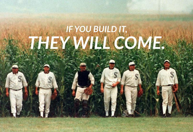


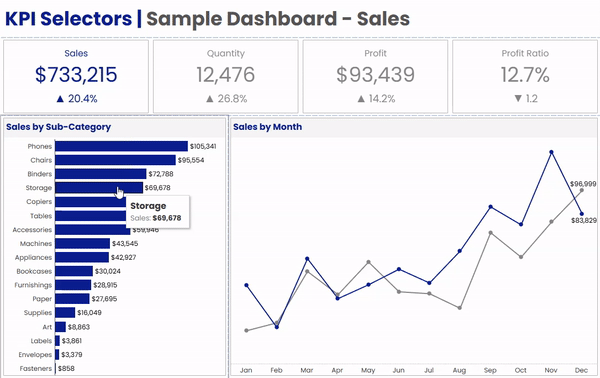
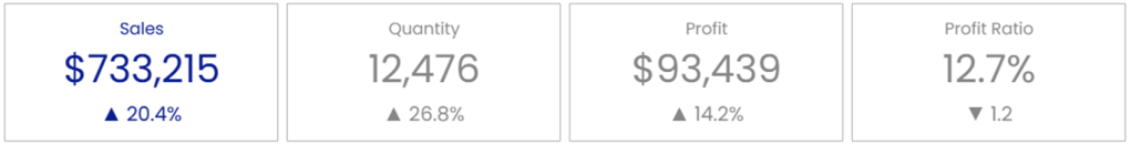

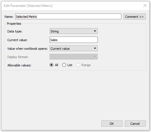


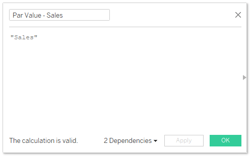

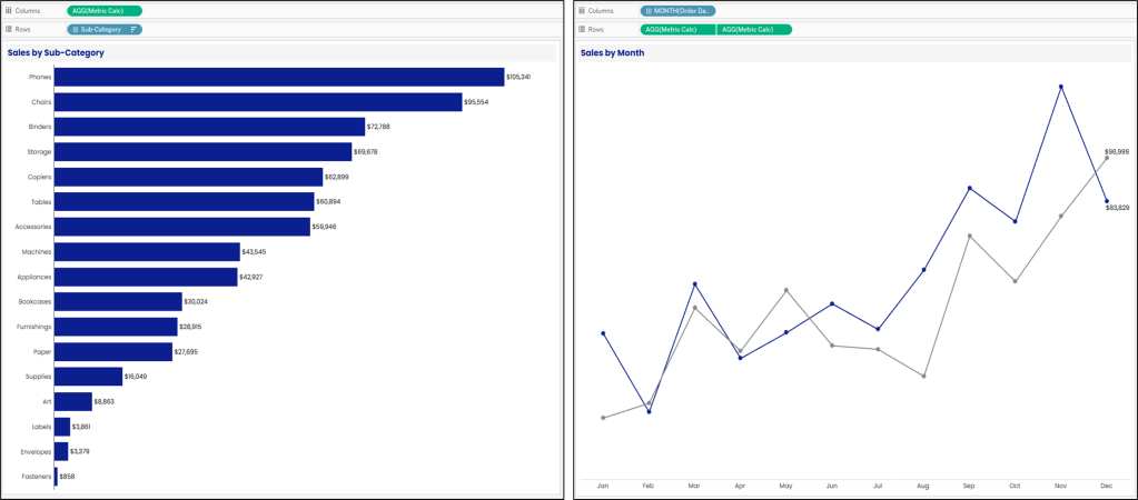
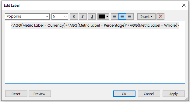


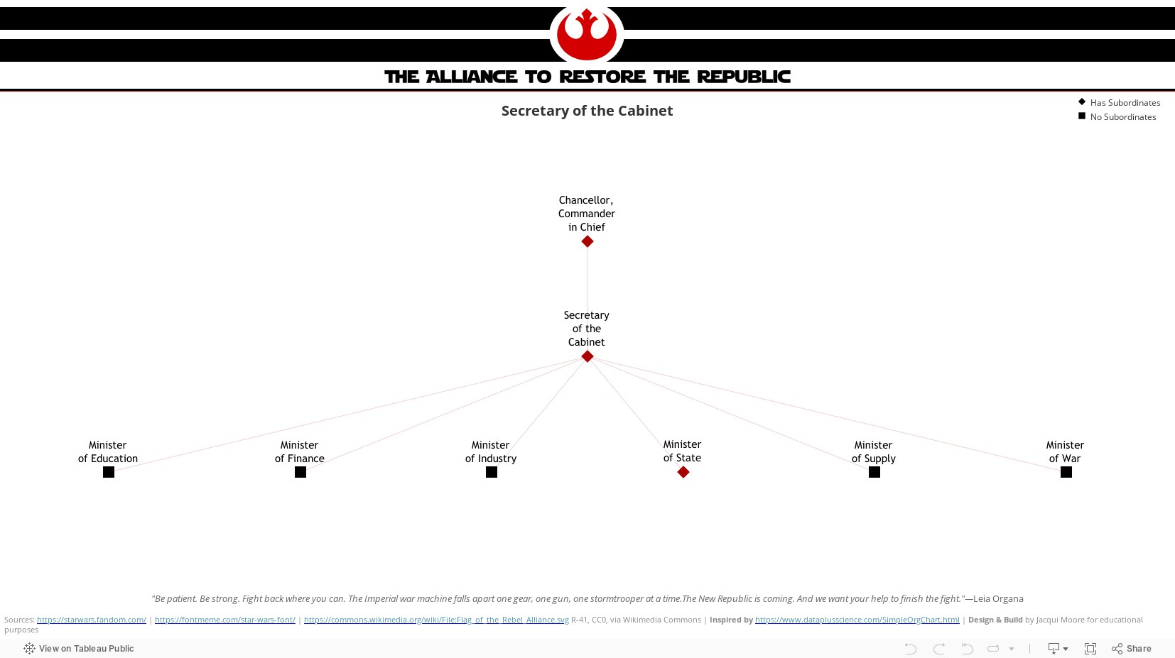


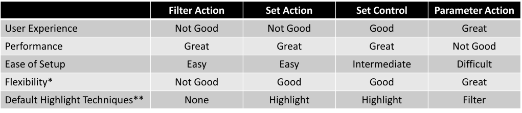
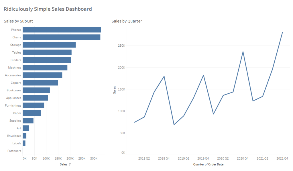
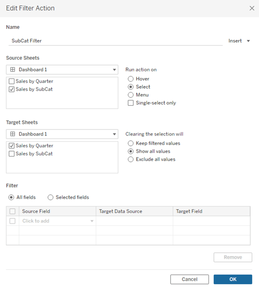
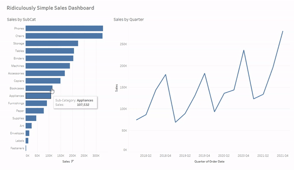


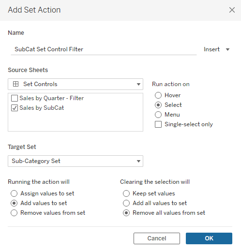
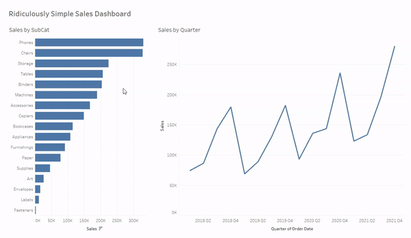


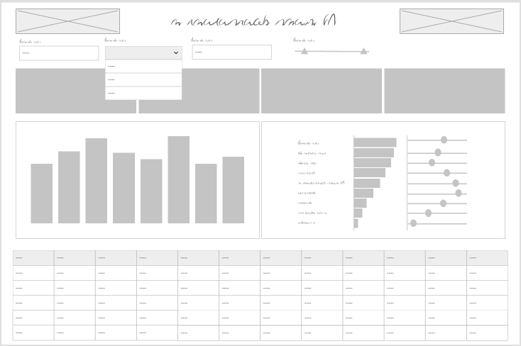
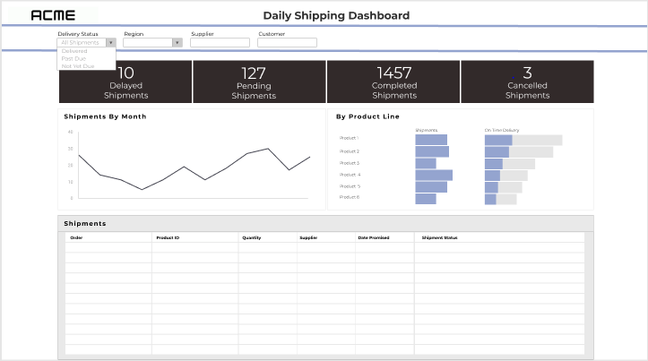

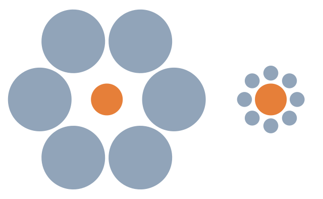