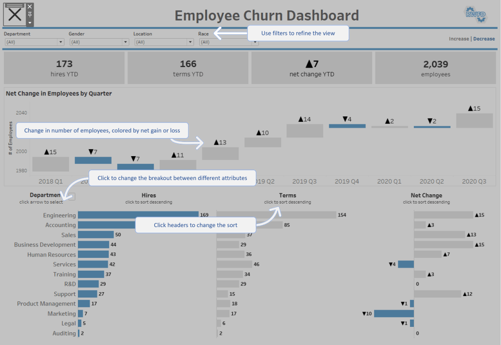
This will most likely be the shortest blog post that I ever write. Not because there’s not much to talk about when it comes to Best Practices for Dashboard Design. There certainly is. But, I would much rather demonstrate how to apply these principles than just talk about them. That’s why I built an interactive presentation (in Tableau of course), that walks through an actual rebuild of a dashboard. It goes step by step, applying various best practices and explaining why each of them are important. It focuses on key design elements including:
Chart Selection
Dashboard Layout
Chart Formatting
Color Application
Titles & Fonts
Branding
Tooltips
Dynamic Design
I will be sharing this presentation at various Tableau User Groups, but, to be honest, you don’t really need me. I would only be getting in the way. The presentation has everything you need to master your dashboard design. You can get started by checking out the links below. The first link is to the presentation. The second link can be used to download the starter workbook (if you want to follow along with the redesign).
A few years back I came across this beautiful, impactful viz by the incredibly talented Ivett Kovács. I was already amazed by the design, but when I realized that those gradient circles weren’t custom shapes, but actually built directly in Tableau using standard mark types, my mind was blown. I was brand new to the Tableau Community when this viz was published, and it was one of the first truly custom visualizations I had ever seen built entirely in Tableau. It was one of those AHA moments that you look back on years later and realize just how much of an impact it had on you. It was a sudden realization that with a little math and a little creativity, you can create things in Tableau that really just don’t seem possible…until somebody does it.
In her visualization (and her blog post about gradients), Ivett credits another amazingly talented individual, Ludovic Tavernier, for this gradient color concept. Ken & Kevin Flerlage have also done a lot of really cool stuff in Tableau with gradients. So I, in no way, shape, or form, invented the concept of creating gradients in Tableau. But, over the past couple of years, I have taken that concept and come up with a few different techniques for applying it in Tableau.
In this blog post, I’m going to cover 3 different methods. We’ll call them the No-Math Method, the Straight-Line Method, and the Vertex Method. If you would like to follow along with this post and build these yourself, you can download the sample data here and download the sample workbook here.
But before we get started, a quick disclaimer. Like most of the things I share on Tableau Public, I would never, ever, ever try to do something like this at work. Adding gradients to your charts will not make them better at communicating important information. They will, however, make them load much, much slower. All of the techniques we’re going to discuss today rely on data densification, where we are going to blow up our data source and create a bunch of new records that we can use to draw the lines and shapes needed to create that gradient effect. Also, if you don’t have any experience with data densification, or drawing curved lines and/or polygons, I would recommend checking out part 1 of the 3-part blog series below. Not required, but it might help.
This part is totally optional. The foundation of any of these methods, or the methods created by others before me, is that we are basically placing a bunch of overlapping but slightly offset marks on the Tableau canvas, and then assigning a sequential color palette to create that gradient effect. The measure we use on color will go from a lower value to a higher value, and that value will align with the shade the color (so low values have a lighter shade and high values have a darker shade or vice versa). So, in order for this to work, we need to have a sequential color palette available for each color we want to use in our viz. Tableau already has many of these available so you don’t necessarily need to create your own, but if you have custom colors that you want to use, this is how I would go about setting up your palettes.
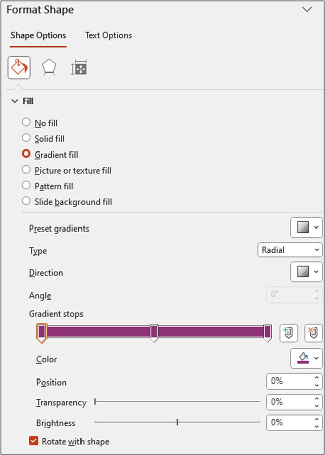
The nice thing about sequential color palettes is that we really only need two color codes to build our gradients. We need a light shade on one end and a dark shade on the other end, and Tableau will automatically fill in all of the shades in between. One option to get these codes is to use an online color shade generator, like this one. You can enter your “base” color and then select a lighter shade and a darker shade to use in your palette. But I like to play around with the shades and see exactly how it’s going to look when I bring it in to Tableau. This way I can kind of lock it in before editing my preferences file and cut down on the back and forth that goes with editing color palettes. This is how I build and test my sequential palettes using PowerPoint
Building a Sequential Color Palette in PowerPoint
Open PowerPoint
Click on Insert > Shapes and select the Circle shape type
Format the Circle
Increase the size so you can see the gradient better (I set it to around 4 x 4 inches)
Right click on shape and select “Format Shape”
Change the “Fill” type to “Gradient Fill”
Change the “Type” to “Radial”
For “Direction” choose the center option (gradient radiates from the center of the shape)
Change the number of “Gradient stops” to 3 (add or delete stops so that you have a total of 3)
Click on each of the stops and set the color to your “base” color (in my example the base color is #8D3276)
Update Position of Each Stop
Stop 1: 0%
Stop 2: 50%
Stop 3: 100%
At this point your settings should look something like this and your shape should be a circle that appears to be one solid color (even though it is set to Gradient)
Edit the stop colors
Edit stop #1
Click on the 1st stop to select it
Below the stops click on the Color selector
Click on “More Colors”
Click on the “Custom” tab
Click and drag the arrow next to the color bar upward to change to a lighter shade of your “base” color
Edit stop #3
Click on the last stop to select it
Below the stops click on the Color selector
Click on “More Colors”
Click on the “Custom” tab
Click and drag the arrow next to the color bar downward to change to a darker shade of your base color
This is how my color selectors look for the 1st and last (3rd) stops
And here is what my gradient circle looks like
You can continue clicking on the 1st and 3rd stops and tweaking the shades lighter and darker until you have a gradient you are happy with. And then we just need to add these colors to our preferences file as a sequential color palette. You don’t have to include the “base” color, but I like to include it so I have it if I need to edit my palette later on.
Go to Documents > My Tableau Repository
Right click on your Preferences file and open with a Text Editor program (like Notepad)
Add the palette to the end of your preferences file before the line containing the </preferences> closing tag
The palette should be in the format below
Once your palette is added, close out of Tableau and re-open it. I have put a sample preferences file with a few of these gradient palettes in a Google Drive folder here.
Choosing the right Method
As I mentioned earlier, this post is going to cover three different methods for building gradients in Tableau. Which one is best? Well, as with most things Tableau…it depends.
The No-Math Method
I really like the No-Math method. It’s by far the easiest to implement, requires no complicated calculations, and it can be used on different mark types (gradient lines, bars, etc.). The only real downside is that you can’t really control the direction of the gradient or the “position” of the light source. With this method, the gradient will always be lightest in the center and darkest on the edges, as if the light source was shining from directly in front of the object. Another nice thing about this method is that you don’t have to worry about the size/shape of your view. In the other methods we are “drawing” the circles, so the X and Y axis ranges need to be equal, and the Height and Width of the view need to be equal when placed on the dashboard. Otherwise, you will end up with ovals instead of circles. But with this method we are using the Circle mark type, so we don’t have to worry about any of that.
The Straight-Line Method
This method requires a little bit of math, but nothing too complicated. It’s definitely easier than the Vertex Method, but more difficult than the No-Math method. This method provides some flexibility on the gradient direction, but the main limitation is that the gradient has to start on one edge of the object. With this method, the gradient will always be lighest on one edge and darkest on the opposite edge, as if the light source was shining from the side of the object.
The Vertex Method
This method is by far the most complicated, but it’s also my favorite, as it gives you the most flexibility in terms of design. With this method you can use parameters to “move” the light source so that it looks like the light is shining on the object from any direction, giving it a much more realistic 3D look compared to any of the other methods. But, just for reference, the no-math method uses 3 calculations, the straight-line method uses 7 calculations, and this method uses almost 20.
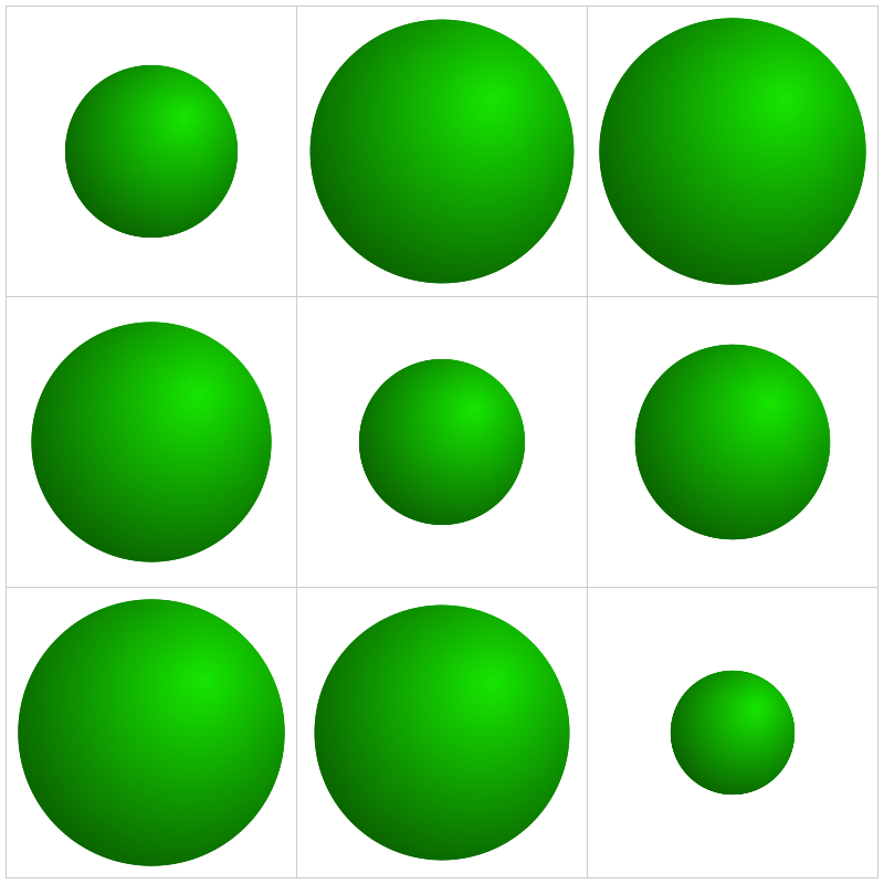
Method 1: The No-Math Method
Of the three methods in this post, this is the only one that does not use the Line mark type. The way that this one works is that we are basically stacking a bunch of circles right on top of each other. Each circle is a slightly different size and a slightly different shade of our “base” color. The smallest, and lightest colored circle will be on the top of the stack, and the largest, darkest colored circle will be on the top of the stack.
If you haven’t already I would recommend downloading the base data and sample workbook. Our base data (Method 1 Data) is a simple file with just 9 records. We have a Dimension field and a Size field (and a few other fields that aren’t required). And then we have a Densification table (Method 1 Densification), with 100 records and one column called “Points”. To build our Data source we are going to do a Physical join between these two tables by creating a join calculation, with a value = 1, on each side of the join. The result will be a data source with 900 records (100 densification records for each of our 9 data source records). It should look like this.
Now this part may get a little confusing as we’re going to be talking about two different types of circles here. So, for the rest of these section, I am going to refer to the main gradient circles that we are trying to create as “Design Circles” and the individual circles used to create the gradient effect as “Building Circles”. So in all of the screenshots above, those 9 gradient circles are our “Design Circles”, and each of those is made up of 100 “Building Circles”.
The exact way that you build this is going to depend on how your chart is set up. In this example, we are going to build a simple 3 x 3 Panel chart, using the Size field to determine the size of our “Design Circles”. So to build my panel, I’m going to use some of those extra columns from my data source (row and column, but these could be easily calculated in the workbook instead). I’ll change them both to dimensions and bring them out on to the Rows and Columns shelves respectively.
Also, on each of these shelves, I’m going to double click in the blank space on the shelf and enter MIN(0.0). The reason for this is that we need to have a numeric measure on columns and/or rows to be able to “stack” these marks on top of each other. Otherwise we’ll end up with a unit chart with 100 circles next to each other. However, if you were building a scatterplot, or something like that where you already have numeric measures on rows and/or columns, you would not need to do this. So to start, my rows and column shelves are going to look like this.
Next, let’s build the calculations we’re going to need for the size and color of each of our circles. First, we’re going to build an L.O.D. to get the maximum number of densification records (in our case, this will be 100)
Max Points = {MAX([Points])}
Now we’ll build a calculated field that determines the size of every “Building Circle”. So we already determined that we are going to use the [Size] field to determine the size of our “Design Circles”. So we need our largest “Building Circle” to have that same value. And then we want the size of the rest of our “Building Circles” to get smaller and smaller. In our densification table, we have 100 records with values from 1 to 100. So if we divide each of those values by the maximum value (in our case that’s 100) that will give us percentages from 1% to 100%. And then if we multiply that by our [Size] field, we’ll end up with 100 different values, with the largest value being equal to the [Size] field, and the smallest value being equal to 1% of that value. But note that you do not need exactly 100 records for this to work. Your densification table could have 200 records. The largest circle will still have the same value as the [Size] field, and the smallest would be equal to .5% of that value. Or it could have 1000 records. Or it could have 53,469 records. It doesn’t matter, as long as the numbers in the [Points] field are sequential and you’re dividing each [Points] value by the maximum [Points] value.
Circle Size = ([Points]/[Max Points])*[Size]
And then lastly we need a field to use on Color. The logic here is basically the same as our [Circle Size] calculation. We’re just dividing the [Points] value by the maximum value to get 100 evenly spaced values from 1% to 100%
Color = [Points]/[Max Points]
Now, let’s build our view
If you haven’t already, complete the first few steps mentioned above (drag rows/columns to shelves, add MIN(0.0) to both shelves)
Right click on [Points] and “Convert to Dimension”
Drag [Points] to Detail on the Marks Card
Set Mark Type to “Circle” on the Marks Card
Drag [Circle Size] to Size on the Marks Card
Drag [Color] to Color on the Marks Card
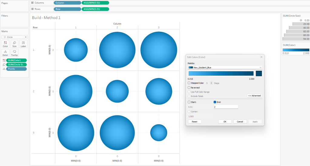
Edit the Colors
Click on the Color card and select Edit Colors
Select your sequential color palette from the “Palette” drop-down
Click on Advanced and tweak the “End” value
Using the standard color range usually results in the outer edge being too dark
If you want the gradient to match the one in PowerPoint, set the “End” value to somewhere between 1.5 and 2
When complete, your worksheet should look something like this
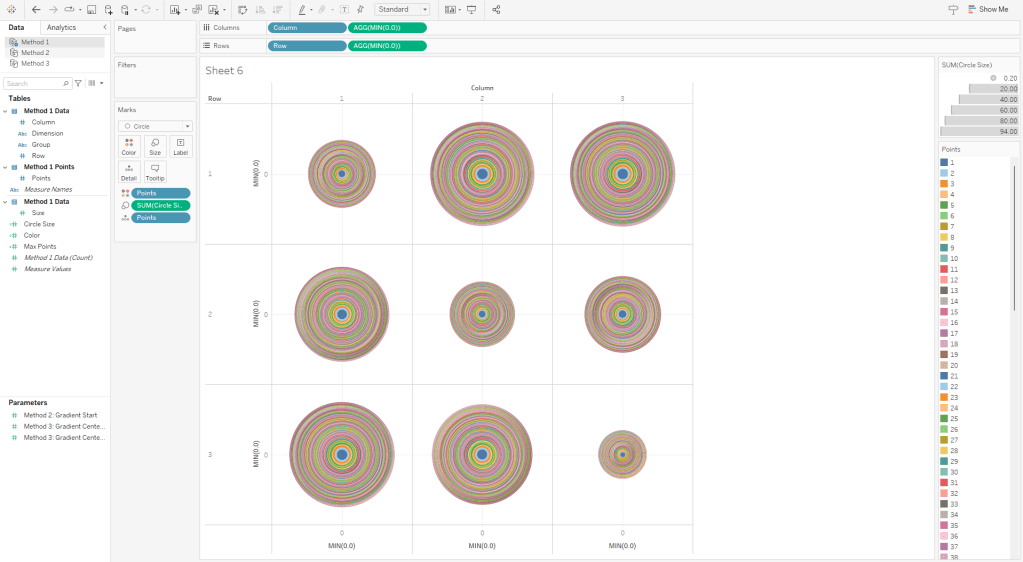
To illustrate how this method works, this is what this view would look like if we put the [Points] field on Color as a Dimension. You can see that each of our “Design Circles” is made up of 100 different “Building Circles”, each slightly bigger than the one on top of it and slightly smaller than the one below it.
Method 2: The Straight-Line Method
On to Method #2. As I mentioned earlier, this method is going to use lines to create the gradient effect. In Method #1, we stacked 100 circles on top of each other. In Method #2, we are going to place 600 lines right next to each other.
The data source set up for this method is very similar to Method #1, except that it has 600 densification records instead of 100, and we are going to add an additional “table”. This “table” just has 1 field called [Order] and just two records (with values of 1 and 2). Alternatively you could just add this column to the Densification table and have two records for each [Points] value, but it’s a lot easier to increase or decrease the number of densification records (which I do pretty frequently) if you put this in it’s own table. So again, we are going to do a Physical join between our data table and our densification table and then we’ll add another join for our order table (once again using the join calculation).
As I mentioned earlier, the main limitation of this method is that the gradient has to start on one edge of the circle. But I like to make it dynamic so you can tweak where that starting edge is (top/bottom/left/right/etc.). So I use a numeric parameter where the range of acceptable values is between 0 and 1. This will be used to rotate the circle between 0% and 100%.
Now we’ll start building our calculations. The first one is going to be our [Max Points] field, which is the same as the one in Method #1
Max Points = {MAX([Points])}
In order to draw a circle in Tableau (check out the blog post at the beginning of this article if you haven’t already) using the method that I typically use, we need two inputs: radius and position. Let’s start with the radius. Once again we are going to use the [Size] field to size our circles, and that value is going to represent the Area of the circle. So if the [Size] field is the Area, then we can calculate the radius using the calculation below
Radius = SQRT([Size]/PI())
Now, the position. The position is a value between 0 and 1 (or 0% to 100%) that represents how far around the circle that point would appear. So 25% would be at 90 degrees, or 3 o’clock, 50% would be at 180 degrees, or 6 o’clock, and so on. So to get that value, similar to how we calculated the color and size in Method 1, we can just divide the [Points] value by the maximum [Points] value (and subtract 1 from both the numerator and denominator to start at exactly 0%). Let’s call this [Position_Base]
Position_Base = (([Points]-1)/([Max Points]-1))
Now if we were to plug our [Radius] and [Position_Base] fields into our X and Y calcs (which I will get to in a minute), we would end up with something like this. To make it a little easier to see, for this example, I limited the number of densification records to 50. So we end up with 50 points evenly spaced around a circle.
But now we need to adjust those positions a bit. Ultimately, what we want to do is to draw perpendicular lines across the circle. So in the example image above, we would want to draw a line from 1 to 50 (50 is hidden behind 1 in the image), another line from 2 to 49, then 3 to 48, and so on until we get all the way around the circle. So let’s start by getting all of our points on 1 side of the circle. And we’ll do that by dividing our [Position_Base] field in half. And we’ll call it [Position_Offset]
Position_Offset = [Position_Base]/2
So now, instead of our points being evenly spread between 0% and 100% around the circle, they are spread between 0% and 50%, with all of the points on the same side of the circle.
And now here is where our [Order] field comes in from that new table we added. Each of the points in the screenshots above actually consists of 2 records, one where [Order]=1 and one where [Order]=2. So we are going to create one more calculation that will basically create a mirror image of these points so that each [Point] value from our densification table has one mark on the right side of the circle, and then a second mark on the mirror opposite side of the circle. And this will be our final [Position] calc.
Position = if [Order]=1 then [Position_Offset] else 1-[Position_Offset] END + [Method 2: Gradient Start]
So if [Order]=1 we’ll use that position on the right side of the circle that we calculated previously. If [Order]=2, we’ll subtract that value from 1 to give us the position that is the mirror opposite of it on the circle. So for example, if our [Order]=1 mark is at 10%, the [Order]=2 mark would be at 90%. If 1 is at 35%, then 2 is at 65% and so on. And then finally, we add the value from the parameter we created earlier (in the screenshot below it is set to 0%) to “rotate” the circle. And then if we connected those marks, it would look something like this.
So that is the meat of this technique. Basically we are going to draw a bunch of perpendicular lines that go from one side of the circle to the mirror opposite side. Now for the rest of the calculations. Here are the [X] and [Y] calcs that I mentioned earlier that are used to actually plot the points around the circle using the [Radius] and [Position] inputs.
X = [Radius] * SIN(2 * PI() * [Position])
Y = [Radius] * SIN(2 * PI() * [Position])
And then finally our [Color] calculation is going to be exactly the same as Method #1. We’ll use the [Points] field to evenly calculate values between 0% and 100%.
Color = [Points]/[Max Points]
And now we are ready to build our view.
Similar to Method #1, if you are going to build a panel chart, drag the [Column] and [Row] fields to their respective shelves
Right click on [X] and drag to Columns shelf. When prompted, choose no aggregation
Right click on [Y] and drag to Rows shelf. When prompted, choose no aggregation
Change Mark Type to Line
Adjust the Size so the line thickness is at or near the minimum width
Change [Order] to a dimension and drag to Path
Change [Points] to a dimension and drag to Detail
Drag [Color] to color
Edit Colors and select your desired sequential palette
Use the parameter to rotate the circle if desired
Edit the X and Y axes so that the ranges are equal
It’s important to note that with this method, the X and Y axis ranges need to be equal for the circles to appear as perfect circles. If one axis range is longer/shorter than the other axis range, you will end up with ovals
It’s also important to note that when you place this worksheet on a dashboard, the Height and Width of the worksheet need to be equal to maintain it’s perfectly circular shape
When finished, your sheet should look something like this
If you are drawing large circles, you may need to add more densification records. Alternatively, you can increase the line thickness. But I have found that adding more records typically looks better than thicker lines, as the thickness of the lines can have an impact on the shape of the full circle. If you are drawing small circles, you can delete densification records. You can play around with the number of records you need until it looks just right.
Method 3: The Vertex Method
Now on to our final and most complicated method. There are a few differences between The Vertex Method and the Straight-Line Method, but the main difference is that our lines are going to use 3 points instead of 2. That 3rd point will allow us to control how the gradient appears (or where the “light” is coming from).
Setting up the data source for this method is exactly the same as Method #2. The only difference is that our Order table has 3 records instead of 2.
Similar to Method #2 we’re going to want to use parameters to “move” the light source, but in this case, we’ll have a lot more flexibility on how we can move it. We can move it up, down, left, right, basically anywhere. So we’ll use two parameters, one to move it up or down (adjusting the Y coordinate), and one to move it left or right (adjusting the X coordinate).
And then the start of this method is exactly the same as Method #2. We need to calculate our two inputs for the circle, the radius and the position. So our first few calculations are going to be identical.
Max Points = {MAX([Points])}
Radius = SQRT([Size]/PI())
Position_Base = (([Points]-1)/([Max Points]-1))
Position_Offset = [Position_Base]/2
Once again we’re calculating the Radius using the [Size] field, and then we’re calculating the Base position, and then dividing that by 2 to get all of our points evenly spaced along the right side of the circle. Now this is where the two methods begin to diverge. In Method #2, we were drawing perpendicular lines across the circle. With Method #3 the end of the line is going to be at the polar opposite of the start. Something like this.
So our lines will start on one side of the circle, pass through the center, and then end at the point directly opposite of the starting point. And then what we’ll do is use our parameters to “move” that center. But we’re not there quite yet. First, let’s finish calculating our [Position] field.
Position = [Position_Offset] + IF [Order]=3 THEN .5 ELSE 0 END
So if [Order]=1 it’s going to use the [Position_Offset] value, which is the starting point, or the position along the right side of the circle. And then if [Order]=3, it’s going to add .5 (or 50%) to that value, which would be the position at the direct opposite side of the starting point. Next, let’s plug our Radius and Position into our X and Y calculations, but we’re going to call them [X_Base] and [Y_Base] since we’re not quite done with them.
X_Base = [Radius] * SIN(2 * PI() * [Position])
Y_Base = [Radius] * SIN(2 * PI() * [Position])
So for each of our lines, we need 3 sets of coordinates, or 6 values in total. We need X and Y values for the start of the line, the center of the line, and the end of the line. We’ve already done all the math we need to calculate each of those, but to make things easier, let’s build a few really simple calculations to isolate these. Let’s start with the X coordinate calculations.
Line_X_Start = [X_Base]
Line_X_Center = [Method 3: Gradient Center X] * [Radius]
Line_X_End = [X_Base]
I told you they were simple calcs. For the Start and End of our lines, we already calculated those values. Those will just be equal to that [X_Base] calc we built above. And the center of the line is going to use that parameter we built to move the “light” source left and right across the X axis. We just multiply that value, which is a decimal between -1 and 1, by the radius to determine how far to move it.
-1 would be all the way to the left.
1 would be all the way to the right.
0 would keep it in the center.
-.5 would move it halfway between the center of the circle and the left edge
and so on
Now, let’s build our Y coordinate calculations, which are nearly identical the X calcs above, except they’re going to use the [Y_Base] field, and the Y coordinate parameter
Line_Y_Start = [Y_Base]
Line_Y_Center = [Method 3: Gradient Center Y] * [Radius]
Line_Y_End = [Y_Base]
And then a couple of final calculations to bring all of these values together.
X = CASE [Order] WHEN 1 then [Line_X_Start] WHEN 2 then [Line_X_Center] WHEN 3 then [Line_X_End] END
Y = CASE [Order] WHEN 1 then [Line_Y_Start] WHEN 2 then [Line_Y_Center] WHEN 3 then [Line_Y_End] END
With this method, the center point of the lines is going to be where the light source “shines”. So if we were to leave those parameters at 0 & 0, the light would shine at the center of the circle and look similar to what we built with Method #1. Our individual lines would look like they did in the screenshot above (and the one on the left below). But if we adjust those parameters to say, .5 and .5, then the center point of the lines would move up and to the right (like the one on the right below). And once we add the gradient color to our lines, it will look like the light is shining from the upper right of the object.
It’s all starting to come together. We’ve calculated all of the points we need to draw the lines, we just need to add some color. This part is a little trickier than it was in the other two methods, but nothing we can’t handle. Similar to the other methods, we are going to use a value between 0 and 1 (or 0% and 100%) to assign our color. The main difference here is that we are going to use the length of each line segment to calculate that value. Each of our lines has two segments; start to center, and center to end. We’re going to use the Pythagorean Theorem to calculate both of those.
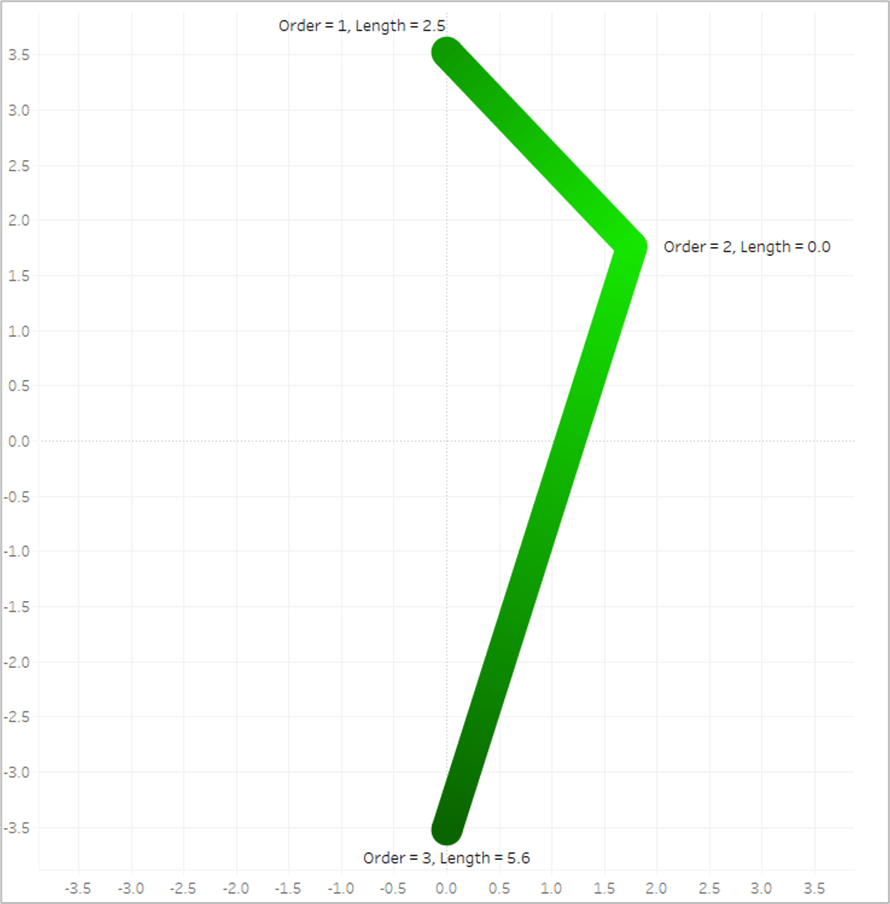
Each line segment is essentially the hypotenuse of a right triangle, so we can calculate that if we know the lengths of the other two sides of the triangle…which we do. Let’s isolate one of the lines from our screenshot above. Here is Line #1
If it’s been a while since you’ve taken a Geometry class, which it certainly has for me, Pythagorean’s Theorem is a^2 + b^2 = c^2 where c is the hypotenuse. Now let’s look at this image again, but with the rest of our triangles drawn.
So for each of these triangles we can calculate the length of the “a” side, by subtracting the [Line_Y_Start] value (or [Line_Y_End] value depending on which segment you are measuring) from the [Line_Y_Center] value (result may be a negative number but the ABS of that value would equal the length). And we can get the length of the “b” side by subtracting the [Line_X_Start] or [Line_X_End] value from the [Line_X_Center] value. And with both of those, we can calculate the length of the “c” side, which is what we’re going to use in our color calculation.
First, let’s calculate the length of the first line segment, from the start of the line to the center of the line (which would be the red triangle in the screenshot above)
And to calculate the length of the second line segment, from the center of the line to the end of the line (the purple triangle above), it will be the same calculation but we’ll swap out the “Start” coordinates with the “End” coordinates.
And then one last calculation called [Line_Length] to bring those values together and assign a value to each [Order] value. So if [Order]=1 we want to use the length of the first line segment (from start to center). If [Order]=2, we want to use a value of 0. And if [Order]=3, we want to use the length of the second line segment (from center to end). This may be confusing at the moment, but stick with me.
Line_Length = CASE [Order] WHEN 1 then [Line_Length_Start_to_Center] WHEN 2 then 0 WHEN 3 then [Line_Length_Center_to_End] END
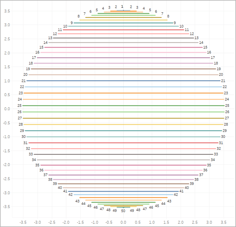
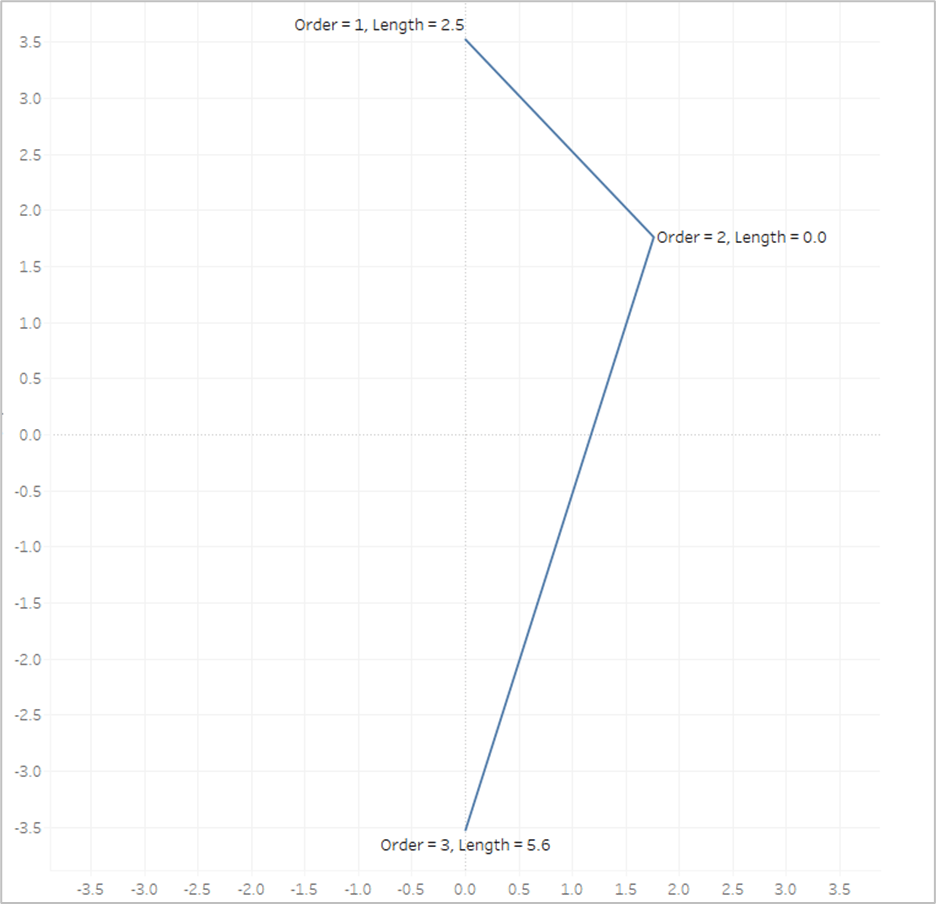
So let’s look at our example again with the Line Length value on Label
The length of the first line segment is 2.5, so we’ll assign that value to the 1st point, where [Order]=1. The length of the second line segment is 5.6, so we’ll assign that value to the last point, where [Order]=3. And when [Order]=2, we assign a value of 0. Now look what happens if we put that [Line_Length] field on Color and apply a sequential color palette.
Tableau assigns the lightest shade from our palette to the lowest number, which is 0, and assigns the darkest shade from our palette to the highest number, which is 5.6. And then it automatically generates all of the appropriate shades in between.
Now the last thing we need to do is to translate those numbers into percentages between 0 and 1. When we have different sized circles in the same view, they’re going to end up with different lengths, so we don’t want to use the actual length of each line, we want to use the length relative to the longest line for that circle. So the longest line will have a value of 1. And this will be our [Color] calculation.
Color = [Line_Length]/{FIXED [Dimension] : MAX([Line_Length])}
And now we are finally ready to build our view, which is going to be exactly the same as Method #2
Similar to Method #1 & #2, if you are going to build a panel chart, drag the [Column] and [Row] fields to their respective shelves
Right click on [X] and drag to Columns shelf. When prompted, choose no aggregation
Right click on [Y] and drag to Rows shelf. When prompted, choose no aggregation
Change Mark Type to Line
Adjust the Size so the line thickness is at or near the minimum width
Change [Order] to a dimension and drag to Path
Change [Points] to a dimension and drag to Detail
Drag [Color] to color
Edit Colors and select your desired sequential palette
Use the parameters to adjust the light source up/down/left/right
Similar to Method #2 you will need adjust the X and Y axis ranges so that they are equal (and make sure that the Height and Width of the worksheet are equal when placed on your dashboard)
When we’re done, our sheet should look like this
So this blog post is already much, much longer than I planned, but there is one last thing I want to touch on. What if you want to have multiple gradients in the same sheet?
Assigning Multiple Gradients
Use Map Layers. I’m not going to go through the entire process of building a view with map layers as that would double length of this already ridiculously long post. But that is how you would go about assigning multiple gradients. So in this last example, I’m going to use the [Group] field from our data source. It just has three different values, 3 of the records are assigned to Group A, 3 to Group B, and 3 to Group C.
I have 3 different groups that I want to assign 3 different colors, so I will create 3 different MAKEPOINT calculations.
Final_Group_A = if [Group]=’A’ then MAKEPOINT([X],[Y]) END
Final_Group_B = if [Group]=’B’ then MAKEPOINT([X],[Y]) END
Final_Group_C = if [Group]=’C’ then MAKEPOINT([X],[Y]) END
So each of these calculations will only return results if the records are in the associated group. The result will be null for anything outside of that group. Next, you just need to duplicate your [Color] field 3 times so you can assign a different palette to each Group
Color_Group_A = [Color]
Color_Group_B = [Color]
Color_Group_C = [Color]
And then you build the view exactly the same way, except that you add multiple layers, one for each of the Groups using the appropriate MAKEPOINT field. Instead of using the [X] and [Y] fields, it will use the generated latitude and longitude from those MAKEPOINT calcs. At the end, your view should look something like this.
Alright, that was a long one. As always, I hope you enjoyed this post, and please let us know if you try out any of these gradient methods. We would love to see what you create with them!
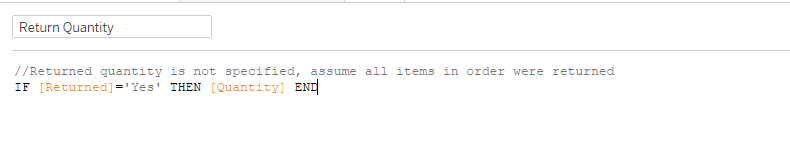
What-if analysis is an extremely powerful tool for decision making. Being able to explore different scenarios and understand the potential impact on your business is critical when deciding if, when, and how to implement changes. But if you have ever tried building this type of tool in Tableau, chances are, you have run into a few limitations.
When your simulations are limited to changing a single data point or a single measure, parameters are a helpful way to calculate the impact of that change. For example, if you wanted to increase the price of all of your products by a specific percentage, you can use a parameter to play with that percentage and see the overall impact. Ok, but what if there is a change in costs that is driving the need to adjust prices? Well, I guess you could use two parameters. But what if those changes aren’t uniform across all of your products? How do you change some, but not others, and how do you apply different changes to different sets of products? Well, at this point, most people will dump their data into Excel and do the work there. But I’m here to tell you that there is a better way.
This technique still leverages parameters, but all of the changes are stored in a single, long, string parameter. You can make as many changes as you want and all of the data is stored in one giant string. Then, there are a number of calculations you can use to parse that string into usable fields.
If you are a frequent visitor to this blog, you probably know that a lot of my blog posts are about building Useless Charts. Funny enough, I figured out this technique when I was attempting to build possibly the most useless chart of all time; a functioning Rubik’s Cube in Tableau. I have since used the same technique in several other other Tableau Public visualizations, including Checkers and the Tableau Drawing Tool. So although we’re going to be walking through a specific use case today, this same technique can be applied to countless other situations. So I’m going to focus mostly on the technique, and less on this specific use case.
What-If Scenario
Here is the scenario we are going to look at today. Our user wants to select a group of stores, and then be able to make the following changes to any Product Category, Product Sub-Category, Manufacturer, or individual Product. The user should be able to
Apply a percentage price change (ex. +/- 10%)
Apply a specific price change (ex. New Price = $5)
Apply a percentage change to units to account for the impact to demand from the price change
Apply a percentage change to unit cost
Measure the impact to Revenue, Cost of Goods Sold, and Profit by Store, by Product Category, and Overall
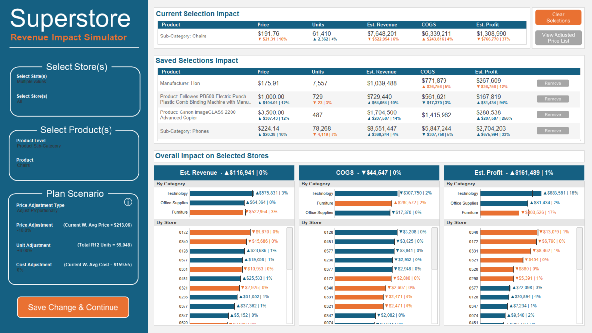
Well, it just so happens that I recently published a visualization for this exact scenario. I would recommend downloading the workbook from here if you want to follow along. Here is a quick look at that this tool in action.
In the GIF above, I made the following changes to all of the stores in Massachusetts and Connecticut
For the Sub-Category “Phones”, I increased the price by 10% and reduced the expected units by 5%
For the Product “Canon imageClass…” I changed the price to $3,500
For the Product “Fellowes PB500 Electric…” I changed the price to $1,000 and reduced the expected units by 3%
For the Manufacturer “Hon”, I increased the Unit Cost by 5%
For the Sub-Category “Chairs”, I reduced the price by 10% and increased the expected units by 4%
In a matter of minutes I was able to make adjustments to different groups of products, change different metrics for each group by different amounts, and then view the overall impact to Revenue, Cost of Goods Sold, and Profit. And all without ever leaving Tableau.
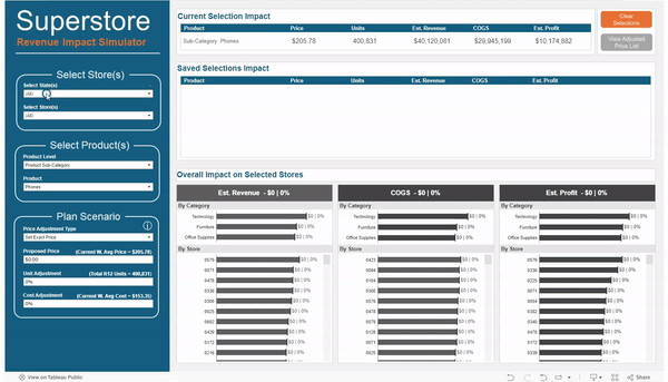
The Data Source
The data for this example is very simple, and can be downloaded here. The granularity for the data source is by store and by product, with 1 record for each store/product combination. We have a few store attributes (State, City, Region, and Store ID), a few product attributes (Category, Sub-Category, Manufacturer, and Product Name), and our measures (Current Price, R12 Units, R12 Sales, and Current Unit Cost)
The Simulation Options
As I mentioned before, this technique can apply to countless scenarios. The technique will stay the same, but the options will change depending on your situation. For my use case, I separated the options into 3 groups; Store Selection, Product Selection, and Scenario Adjustments. Your use case may, and most likely will, call for completely different options. But I will touch on the Sets & Parameters I used for my example use case
Store Selection
For my use case I used two sets; one for selecting state(s) and one for selecting store(s). The reason I chose to use sets instead of filters is so that you could apply the changes to certain stores (and not others) and then view the company wide impact. Keep in mind, that this approach will not let you apply different changes to different stores. All changes will be applied to all of the selected stores. However, if that was a requirement, you could adjust your options to be able to do that.
Product Selection
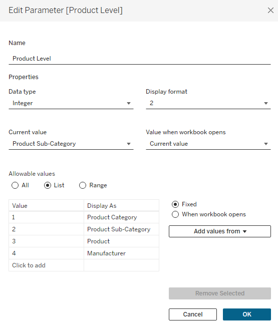
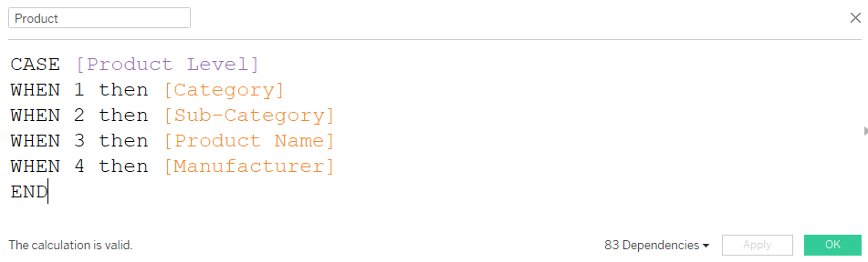
The requirements for this tool called for being able to adjust prices at 4 different product “levels”, or groups of products. So the first option I added was to select that Product Level. I chose to use an Integer parameter with values 1 to 4, with each number assigned to a different Product Level ( 1=Product Category, 2=Product Sub-Category, 3=Product, and 4=Manufacturer)
Next, I created a simple case statement to return the appropriate values depending on which Product Level is selected and called this [Product]
And finally, I created a set using the [Product] field called [Product Set]. Even if you are using just a single field for your use case (instead of the 4 I have here), you will still want to create a Set to be used for the selection on the dashboard (or you can use a Parameter).
In order to add my Sets to my dashboard (so users could make their selections), they need to be on a worksheet that is on the dashboard. I created a hidden worksheet called “Options” that has all 3 of my sets either on Detail, or on the Filter Shelf (the State Set is on the Filter Shelf so that the options in the Store Set are limited to the selected States). There is also 1 other field on the Filter Shelf that we will revisit later. This is to remove products from the list that have already been adjusted. I added this sheet as a Floating object to my dashboard, and set it so that the X and Y coordinates were 0,0 and the Height/Width were 1,1.
Its important to note that for this technique to work, you must limit the selection for the thing you want to change, in this case [Product], to a single selection at a time. When displaying this Set on the dashboard, make sure to select “Single Value (dropdown)” and in the “Customize” menu, de-select the “Show All Value” option.
Scenario Adjustments
For my use case there were 3 measures that we need to adjust; Price, Units, and Cost. The Price one is a little more complicated than the rest. If you are adjusting the price for an entire Product Category, you would probably want to apply a % change. But if you were adjusting the price for a single product, then you would probably want to enter a specific price. So my use case is built to handle both of these situations.
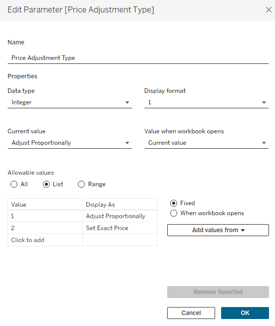
The first option is to choose how you want to adjust the price, either proportionally (with a % change), or by setting an exact price. Similar to the Product Level parameter, this is an Integer Parameter where 1=Proportional and 2=Exact.
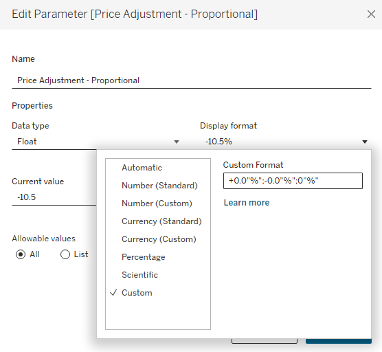
Next, I have 2 separate parameters for the Pricing Adjustment and I am using Dynamic Zone Visibility to display the appropriate one depending on which Price Adjustment Type is selected. These are both ‘Float’ types, but one is formatted as Currency and one is formatted to display as a percentage.
Finally, I have 2 more ‘Float’ type parameters for my last two options; one for the unit adjustment %, and one for the unit cost adjustment %.
This is completely optional, but for my 3 parameters that are based on % change (proportional price change, unit change, and unit cost change), I wanted to make it a little easier on the user to enter the percentages. For a change of 10.5% instead of having them type .105, I set it up so that they could type 10.5. Visually, I did that with the help of custom formatting, and then I’ll adjust that value with a calculation later on.
Capturing the Adjustments
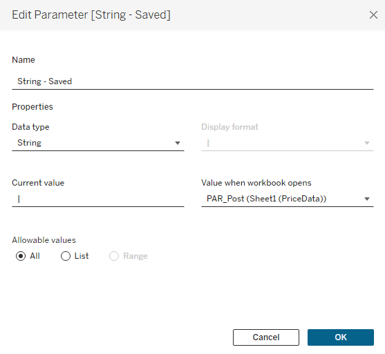
Now on to the fun part. We have set up our dashboard with all of the options we want for our users, now we just need to capture their inputs. The first thing we need to do is to create one more parameter to store all of the user selections. I’m going to call this [String – Saved], it’s going to be a String Type parameter, and the default value will be a ‘|’. I would recommend creating a calculated field with just ‘|’ and setting that field in the ‘Value when workbook opens’ option.
I’m using ‘|’ because it’s a character that is unlikely to show up in any product names. Each Product (or group of products) that is adjusted will be stored in this string, and they will be separated with a ‘|’. Think of each Product as a section in the string, and that section will contain the Product, and all of the other options set by the user for that Product. These options, within each section, will be separated by another character that is unlikely to appear in the Product Name. I typically use a ‘~’. An example with 2 Products (Sub-Category=Chairs and Manufactuer=Hon) adjusted would look something like this:
|Chairs~1~2~50~-4~0|Hon~4~1~0~0~10|
Building the String
There are a few things we need to do here. First, we need to create a calculated field to capture all of the current selections by the user. And second, we need a calculated field that combines that value with all of the changes that have already been saved.
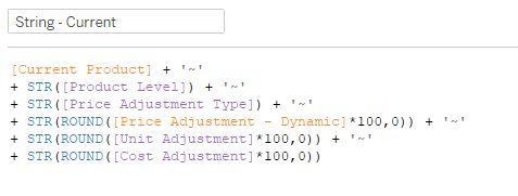
String – Current
Here is my calculation to capture all of the user’s current selections. Note, that your calculation will likely look much different. Since this won’t be a copy and paste situation, I’ll walk through the structure of this calculation so you can modify it to fit your needs. Note that because this is a String parameter, you’ll need to Cast all of your numeric parameter values as string using STR(). Also, each line of the calculation, except for the last one, ends with adding ‘~’ to separate that input in the string.
Line 1 – [Current Product] is a calculated field to capture what is selected in the [Product Set].
IFNULL({MIN(if [Product Set] then [Product] end)},”)
Line 2 – This casts the Product Level parameter (which is an integer) as a String. The Product Level parameter is the integer parameter that let’s users choose between Product Category, Product Sub-Category, Manufacturer, and Product.
Line 3 – This casts the Price Adjustment Type parameter (which is an integer) as a String. The Price Adjustment Type parameter is the integer parameter that allows users to choose between adjusting a price proportionally, or setting an exact price.
Line 4 – [Price Adjustment – Dynamic] is a calculated field that returns the value of either the Proportional or Exact parameter depending on what is selected for the Price Adjustment Type, and casts it as a String
CASE [Price Adjustment Type] WHEN 1 then [Price Adjustment – Proportional] WHEN 2 then [Price Adjustment – Exact] END
*You will notice that this line of the calculation is rounded and multiplied by 100. The same is true with the next two lines. The reason for this is that Tableau does not handle rounding well when you are casting a decimal value as a string. You can round to 0 decimal points just fine, but are not able to round to 2, 3, etc. So this part of the calculation multiplies the value by 100 and then rounds to 0 decimal places (which would be the equivalent of rounding to 2 decimal points once you translate it back to a decimal value later on). If you need to be more precise than 2 decimal places, you can increase this value to 1000, 10000, etc.
Line 5 – This casts the Unit Adjustment parameter (which is Float) as a String
Line 6 – This casts the Cost Adjustment parameter (which is Float) as a String
Now you have a string that captures all of the current selections/options, with each option separated by a ‘~’. Here is an example:
Product = Chairs
Product Level = Sub-Category (parameter value = 2)
Price Adjustment Type = Adjust Proportionally (parameter value = 1)
Price Adjustment = +10%
Unit Adjustment = -4.5%
Cost Adjustment = +2%
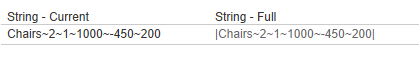
Our string would look like this:
Chairs~2~1~1000~-450~200
Chairs = The current Product Selection
2 = the Product Level parameter value (Sub-Category)
1 = the Price Adjustment Type parameter value (Adjust Proportionally)
1000 = 10 X 100 rounded to 0 decimal places
-450 = -4.5 X 100 rounded to 0 decimal places
200 = 2 X 100 rounded to 0 decimal places
As I mentioned before, this calculation is going to look different depending on your use case, but the format should be the same. It’s the thing your changing + all of the different options you are giving the user, with each piece of the calculation separated by a ‘~’ (or another similarly unused character).
[Thing You’re Changing] + ‘~’ + [Option 1] + ‘~’ + [Option 2] + ‘~’ + [Option 3] and so on.
String – Full
This calculation is far simpler, and you should be able to copy and paste this no matter what your set up looks like. All it is doing is taking the [String – Current] value that you just built, and adding it to what has already been saved in the [String – Saved] parameter. So you build a string with all of the current options, then hit the “Save” button to add that string to the rest of the changes. This is how the string continues to build.
‘|’ + [String – Current] + [String – Saved]
Let’s say the string we built above was our 1st change. The result of the [String – Full] calc would be this. It’s just our [String – Current] value with a Post on each end
Now, let’s say we saved that change and then decided to increase the price of all Phones by 5%. Now our string calculations would look something like this.
Now the [String – Current] field has the selections for the Phones that we are currently working on, and the [String – Full] field has the selections for the Phones, and the selections for the Chairs that we already saved.
Saving the String
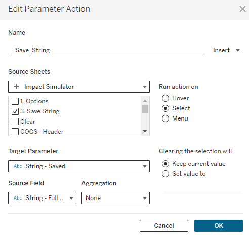
Now that we have our string, we need to build the mechanism to save it. This is pretty straightforward. You just build a worksheet with some type of button and drag the [String – Full] field to Detail. I’m using a Custom Shape, but you can also use any of the native Tableau Shapes or even Text. Customize it however you would like.
Then add that sheet to your dashboard and add a Parameter Action to update the [String – Saved] Parameter with the [String – Full] Field.
You can also add additional Parameter Actions from this ‘Save’ button. In my sample dashboard I am setting all of the Options back to 0 and clearing the Product Set each time this button is clicked. This gives the user a clean slate for each change and reduces the risk of applying unintended changes. I am also using the ‘Filter Action‘ technique to disable the highlighting when you click this button.
Parsing the String
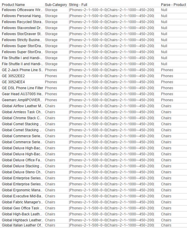
We’re about half-way there. We have the ability to save all of the user’s selections but we still need to get that data into a usable format. The first thing we need to do is to identify which records in our data source are being adjusted. We’re going to do this by testing each of the Product Level fields (in this case those fields are Product Category, Product Sub-Category, Product, and Manufacturer) to see if they contain the Products in our String. This formula will change depending on your use case, but the basic premise is to check all of the fields that could have been used to populate the [Thing You’re Changing] in the [String – Current] calculation to see if there is a match. And if there is a match, to return that value. Here is my calculation called [Parse – Product].
if CONTAINS([String – Full],”|”+[Product Name]+”~”) then [Product Name] elseif CONTAINS([String – Full],”|”+[Sub-Category]+”~”) then [Sub-Category] elseif CONTAINS([String – Full],”|”+[Manufacturer]+”~”) then [Manufacturer] elseif CONTAINS([String – Full],”|”+[Category]+”~”) then [Category] END
Line 1 tests the Product Name field to see if that value exists anywhere in the [String – Full] calculation, Line 2 tests the Sub-Category field, Line 3 tests the Manufacturer field, and Line 4 tests the Category field. The result of this calculation will be the appropriate Product Level value for any records that are being adjusted, and will be NULL for all records that are not being adjusted.
And notice that it is not just looking for the field value in [String – Full], it’s looking for that value with a ‘|’ at the front and a ‘~’ at the end (since this is how we built our String). This ensures that it is an exact match, and excludes partial matches. An example of this would be if we had two products, one named ‘Binder Clips‘ and one named ‘Binder Clips 2-pack‘. If we made changes to ‘Binder Clips 2-pack‘ (ex. string would be |Binder Clips 2-pack~3~1~500~0~0) and not ‘Binder Clips‘, then ‘Binder Clips‘ would still return as a match, since that Product Name is contained in the String (even though it’s not an exact match). The string would contain ‘Binder Clips‘, but it would not contain ‘|Binder Clips~‘ so it would not return as a match.
Continuing on with our Phones|Chairs example, you can see below that the [Parse – Product] calculation will return the value ‘Phones’ for any products where the Sub-Category = ‘Phones’, ‘Chairs’ for any products where the Sub-Category = ‘Chairs’, and NULL for all other records.
Next, we want to isolate the appropriate section of the [String-Full] field for each Product. I’m going to do this with a Regex calculation, but it could also be done with FIND/MID. Here is my calculation called [Parse – Product String]
This REGEX calculation will look to the [String – Full] field and capture everything starting at, and including, the value that was returned in the [Parse – Product] calculation, up through the first ‘|’. With this calculation in place, we now have all of the options selected by the user, in a single field, in the appropriate rows.
Now all we need to do is parse this single field into individual fields, which can easily be done with the SPLIT() function. We already have product, so we don’t need to split the first value, which leaves 5 remaining fields. If you look back at how we constructed our string, the order of these fields is 1. Product Level, 2. Price Adjustment Type, 3. Price Adjustment, 4. Unit Adjustment, 5. Cost Adjustment. So we will create a calculated field for each of these.
These calculations are all pretty straightforward. I’m splitting the field using the ‘~’ character that we used to build our string, and I’m using either INT() or FLOAT() to turn these strings back into numbers. On the last 3 calculations, you may notice that I am dividing the result by 10,000. This is to turn those values back into decimals. When building the strings I multiplied the value by 100 so I could round them. But in the % parameters, I also allowed users to enter whole numbers instead of real percentages. So to translate those into decimals, I need to divide by 100 again. So to turn one of those percentage values into an actual percentage I need to divide by 10,000 (100 X 100). The Price Adj Value has a little extra logic because if they are changing a price proportionally (they entered a percentage change) I need to divide by 10,000, but if they are setting an exact price, I only need to divide by 100 (to account for when the value was multiplied by 100 when building the string).
There are 2 additional calculations you can build here but they are completely optional. They are only used to get an Order of the products in the string. I would recommend building these for two reasons. It will allow you to sort the Products on your dashboard if you are displaying all of the changes, and it will let you separate the Product that is currently being adjusted vs ones that have already been saved. I like to separate these in the dashboard so users can review the impact in a separate table before saving the change.
The first calculation will look at the [String – Full] field and return everything to the left of the [Parse – Product String]. The second calculation will count the number of ‘|’ that appear in that value to calculate the Order.
Parse – Product Order = LEN([Parse – Left String])-LEN(REPLACE([Parse – Left String],’|’,”))
At this point we have captured every single option entered by the user, for every product (or group of products), and we have all of those values separated out into individual fields for the appropriate rows. Pretty cool right?
Applying the Changes
Our next step, now that we have captured all of the changes and parsed them into usable fields, is to apply those changes so our users can view the impact. This can be done with just a few relatively simple calculation.
Determine Which Rows to Adjust
Our first few calculations are row-level calcs that determine if our changes should be applied to that row. We will build one calc to test if a specific Store should be included, another calc to test if a specific product should be included, and then one last calc that combines them.
First, our [Selected Store Filter] is just a boolean calc that tests to see if a store is in the State Set and in the Store Set. I am including a check on both sets because if a user selects just a state, and doesn’t change anything in the Store set, I want to make sure that it captures just the Stores in the selected State(s).
Selected Store Filter = [State/Province Set] and [Store Set]
Our next calc, [Selected Product Filter] is another simple boolean calc that tests to see if a specific product was included in any of the adjustments. For this, we’ll go back to one of our previous calcs. The [Parse – Product] field will only be populated when that product was included in the adjustments. So if it’s not NULL, then it’s included.
Selected Product Filter = NOT ISNULL([Parse – Product])
Now we’ll just combine those into one more boolean calc, so we don’t have to address them separately in the rest of the calculations. We’ll call this [Row Adjust] and it will be a boolean value telling us whether or not the values in that specific row should be adjusted or not.
Row Adjust = [Selected Store Filter] and [Selected Product Filter]
Apply the Changes
Now we know which rows we should adjust, and which rows shouldn’t change. The next step is to create calculated fields to adjust the 3 measures that we gave our users the ability to change; Price, Units, and Cost. These are all relatively simple, but the Price one is a little more complicated because we gave the users multiple options for adjusting it. Let’s start with that one.
The [Price – Adj] field will look like this. Line 1 checks to see if the row should be adjusted. If it should NOT be adjusted, then it returns the value of the [Price] field, which represents the current Price. Line 2 checks to see if there was a price change at all (it’s possible that the user just modified the units or cost to see the impact). If they did not change the price, the value of the Price Change Parameters would have stayed at 0. So if that value is 0, once again, we’ll return the current [Price]. Next, if the user had selected to enter an Exact price ([Price Adjustment Type]=2) then we’ll use the value that was entered. And finally, if the user had selected to enter a Proportional Change ([Price Adjustment Type]=1), then multiply the current [Price] by 1+ the % Change.
if not [Row Adjust] then [Price] elseif [Parse – Price Adj Value]=0 then [Price] elseif [Parse – Price Adj Type]=2 then [Parse – Price Adj Value] elseif [Parse – Price Adj Type]=1 then [Price]*(1+[Parse – Price Adj Value]) END
The [Units – Adj] and [Unit Cost – Adj] calculations are much more straightforward as the user could only enter a % change for these. For both of these calculations, if the row should be adjusted, we’ll multiply the current value * 1 + the % change, and if the row should not be adjusted, we’ll keep the current value.
Units – Adj = if [Row Adjust] then [R12 Units]*(1+[Parse – Unit Adj]) else [R12 Units] END
Unit Cost – Adj = if [Row Adjust] then [Unit Cost]*(1+[Parse – Cost Adj]) else [Unit Cost] END
Measure the Impact
If we go back to the requirements for this dashboard, the users wanted to be able to measure the impact on Revenue, Cost, and Profit. So our next step is to calculate estimates for those values based on the current Price, Units, and Unit Cost, and estimates for those values based on the new Price, Units, and Unit Cost.
There are a lot of ways you can do this, but I am just going to use the Rolling 12 month Units, and the current Price and Cost to calculate our baseline. You could also use different lengths of time, or use forecasts in place of actuals. But this analysis is basically comparing what our Revenue, Profit, and COGS would look like if we sold the exact same units as we did last year, at our current Price and Cost, versus what our Revenue, Profit, and COGS would look like if we applied all of our adjustments.
These are all very simple calculations. Let’s start by calculating the Estimated Revenue, Estimated COGS, and Estimated Profit for our baseline.
Est Revenue = [R12 Units]*[Price]
Est COGS = [R12 Units]*[Unit Cost]
Est Profit = SUM([Est Revenue])-SUM([Est COGS])
Now we’ll repeat the exact same calculations, but with our ‘Adjusted’ measures
And now we can compare our baseline to our estimates from all of the applied changes
Est Revenue Change = SUM([Est Revenue – Adj])-SUM([Est Revenue])
Est COGS Change = SUM([Est COGS – Adj])-SUM([Est COGS])
Est Profit Change = [Est Profit – Adj]-[Est Profit]
And that’s it! Now you can aggregate these measures any way you want to show the impact at different levels (Overall, by Store, by Product Category, etc.)
Optional (but Encouraged) Enhancements
But we aren’t quite done yet. There are a few other ‘Optional’ Enhancements I would recommend incorporating into your dashboard. At the very least, I would strongly encourage you to build in 1 thru 3 from the list below, and at the absolute minimum, add number 1. But they don’t take very long, and they make for a better user experience, so go ahead and add them all.
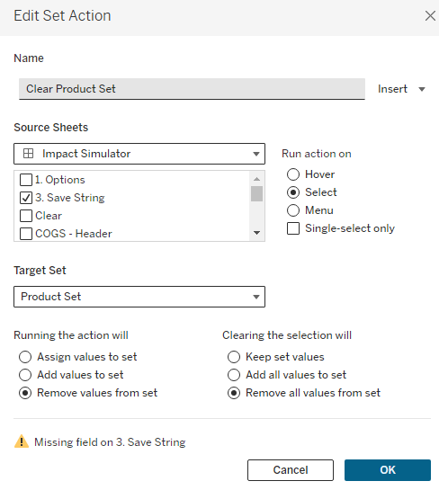
1. Block Products From Being Selected Again After Adjustment
The way this technique is set up, because the string we are working off of is a combination of ‘Saved’ adjustments, and the ‘Current’ adjustment, it can act a little strange if the Product that is currently selected is already in the Saved String. Basically, this Product will appear twice and the ‘Current’ will override the ‘Saved’. There are 2 different ways this can happen.
After you click the ‘Save’ button, the same Product is still selected. So even though you have Saved that change, it won’t show up in your Saved changes, because it’s appearing twice in the string (once for the Current and once for the Saved). Once you select a different Product, you’ll see that Product show up in the Saved Changes. This can be really confusing for the user.
If you have already adjusted a Product, but then manually select that same Product from the list again.
To combat number 1, we just need to add one additional Action to our ‘Save’ button. Make sure that the [Product Set] is on Detail on your Save button. Also, make sure that it is showing as ‘Product Set’ and not ‘IN/OUT (Product Set)’. If it is showing as ‘IN/OUT…’, just right click on that field and select ‘Show Members in Set’. Then we are going to create a Set Action that clears our Product Set when you click on the Save button. The Set Action should look like this. And don’t worry about the Warning at the bottom, the Action will still function as intended (if you want to get rid of the error, you can put [Product] on Detail, just make sure that you are filtering the Save sheet to what is in the set so your button doesn’t duplicate. But this isn’t necessary as it will still work with the error showing).
Once this action is in place, when you click the ‘Save’ button, the selection in the Product Set will go to ‘None’ and your adjustments will show up in the ‘Saved’ changes.
To combat number 2, we just need to add a filter to our ‘Options’ sheet. This is the sheet we built at the beginning of this process to be able to display our Sets on the dashboard. To start, we are going to create a calculated field, similar to our [Parse – Product] calculation, but in this case, we only want to check the [String – Saved], not the [String – Full], which contains the Saved and Current adjustments. This is exactly the same as [Parse – Product], but we’re going to swap out those two fields and call it [Parse – Product – Adj]
if CONTAINS([String – Saved],”|”+[Product Name]+”~”) then [Product Name] elseif CONTAINS([String – Saved],”|”+[Sub-Category]+”~”) then [Sub-Category] elseif CONTAINS([String – Saved],”|”+[Manufacturer]+”~”) then [Manufacturer] elseif CONTAINS([String – Saved],”|”+[Category]+”~”) then [Category] END
Similar to the [Parse – Product] field, this field will return the appropriate value if it exists in the Saved changes, and Null if it’s not in the Saved Changes. So we can just drag this field onto our Filter Shelf, filter on NULL and then add that filter to Context. Then, on our Dashboard, right click on the Product Set and choose the ‘All Values in Context’ option. Now, once a Product has been saved, it cannot be selected again.
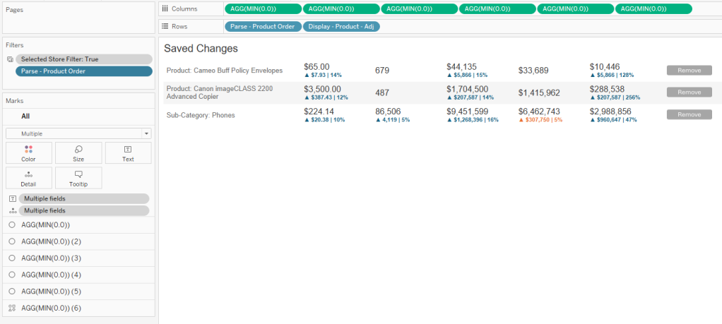
2. Displaying Current vs Saved Changes
When I am using this technique in a dashboard, I like to show all of the relevant information for the changes in Tables, so the user has a clear view of everything that has been adjusted and how those adjustments are impacting the overall metrics. I also like to separate the adjustment they are currently working on from the ones that have already been saved. The good news is, if you went ahead and built the 2 additional Parse fields earlier in this process, [Parse – Left String] and [Parse – Product Order], this is really easy to do. If you decided to skip those steps, I would go back to that section now and create those.
Once those calculations are available, you can filter on [Parse – Product Order]=1 to get the ‘Current’ change, and then in a separate sheet, exclude 1 and NULL to get all of the ‘Saved’ changes. I also like to sort my Saved Changes in Ascending Order on the [Parse – Product Order] field, so that the most recent Saved changes always appear the top.
I also set up my tables using multiple Axes, rather than using Measure Names/Values, so I have more control over how I can display the information. My table for Saved Changes would look something like this. This table design also helps with #3 on the list, which we’ll discuss next.
3. Add option to Remove changes
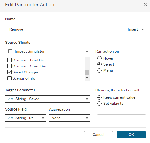
One important feature that I like to add is the ability to ‘Remove’ a change once it’s saved. In #1 we made it so that users can’t select a Product that has already been adjusted, so in order for them to change an adjustment, they’ll need a mechanism for deleting it from the ‘Saved’ changes. Because I set up my table using multiple axes, I can leverage one of these to add a ‘Remove’ button.
In my example, I am using a custom shape, but you can use whatever you would like here (custom shape, native shape, text, etc.). We’re then going to create one additional calculated field called [Remove – String] and add this to Detail on that last axes.
This calculation will be used to update the [String – Saved] parameter with a modified string that replaces the whole string for the selected product with just a “|”. It will essentially ‘Delete’ that Product from the [String – Saved] parameter. Once this field is on Detail, we just need to create one additional Parameter Action driven from our Saved Changes worksheet.
After adding this action, users will be able to click on the ‘Remove’ button you’ve added to remove it from their Saved Changes. One thing to keep in mind is that clicking on any of the Row Headers will also remove that row. Because of that, I will typically float a Blank object over the table, covering everything except for the ‘Remove’ column.
4. Reset button
This is a nice feature, but not completely necessary. Since this will most likely be used on Tableau Server or Tableau Cloud, the user could just refresh the browser if they wanted to start over. But to make it a little easier for the user, I put a ‘Clear Selections’ button right on the dashboard. This is just a sheet, with a custom shape for the button, that uses a series of Dashboard Actions to reset all of the Parameters
5. Hiding Save button until changes are made
This is another completely optional feature. I like to hide the ‘Save’ button until the user has actually made some type of change. This just helps to avoid accidentally saving something before the user finishes with their adjustments. For this, I am using Dynamic Zone Visibility, and using a calculated field called [Show Save Button]. This calculation checks all of the different Adjustment parameters to see if a value has been entered or if they are all still set to 0.
([Price Adjustment Type]=1 and [Price Adjustment – Proportional]!=0) or ([Price Adjustment Type]=2 and [Price Adjustment – Exact]!=0) or [Unit Adjustment]!=0 or [Cost Adjustment]!=0
Recap
That about covers it. This is a pretty complicated technique, but it can be an extremely powerful tool for your users. As I mentioned a few times throughout this post, this post walked through a specific use case, but this same technique can be applied to countless others. The specifics will change, but the overall process and technique will stay the same. No matter what the situation, these are the steps you will want to follow
Build your Selection Options
For the ‘Thing that is being changed’, in this case ‘Product’, make sure that the user can only select one value at a time
You can use a Parameter, or a Set (but I recommend Set so you can remove products that have already been adjusted)
If you are using a Set, make sure that on the dashboard you choose ‘Single Value Dropdown’ and disable the ‘Show All’ option
Create a numeric parameter for each of the measures you want to adjust
Capture the Selections
Use a calculated field to capture the ‘Current’ adjustments in a string
Make sure that the ‘Thing that is being changed’ appears first in the string. The order after that does not matter
Make sure to use unique characters to separate the data in your string
Make sure to cast all numeric values as strings. If you need to capture decimals, use the multiply and round approach from earlier in this post
Use a parameter to capture the ‘Saved’ adjustments
Build a ‘Save’ button that combines the ‘Current’ adjustments string with the ‘Saved’ adjustments string and pass that to your Saved String Parameter
Remember #1 from the Optional Enhancements section – Use additional actions to clear the Set/Parameters used for selections
Parse the Data
Use the calculated fields in the ‘Parsing the String’ section to parse the selection string into usable fields
First, parse the ‘Thing that is being changed’
Second, capture the section of the full string for that ‘Thing that is being changed’, along with all of the other selections
Third, build one calculated field for each user option to parse that selection into it’s own field
Fourth, use the two calculated fields provided (Parse – Left String and Parse – Product Order) to calculate the order in which the ‘Things’ have been adjusted
Apply the Changes
Determine which rows need to be adjusted
Use calculated fields to return the current value for rows that are not being adjusted, and the adjusted value for rows that are being adjusted
Measure the Impact
Create calculated fields to create ‘baseline’ and ‘adjusted’ values
Create additional calculated fields to compare the ‘baseline’ to ‘adjusted’ values
Visualize the Impact
Add visuals to your dashboard
I would recommend showing a table view of the ‘Saved’ and the ‘Current’ changes. I like to do this in separate tables
Build additional views to visualize the impact of the adjustments
I hope you enjoyed this post. If you use this technique in your work, please let me know. I am very interested to see some of the different applications of this technique. And, as always, if you have any questions about this post, or run into issues trying to implement this technique, please feel free to reach out to me on Twitter or LinkedIn. Thanks for reading!
This documentation was created by Joy Victor who had reached out about collaborating on this project. It is incredibly detailed and thorough, and I can’t thank her enough for all of the time and effort that she has put into it. Follow Joy on Twitter and LinkedIn
GET STARTED
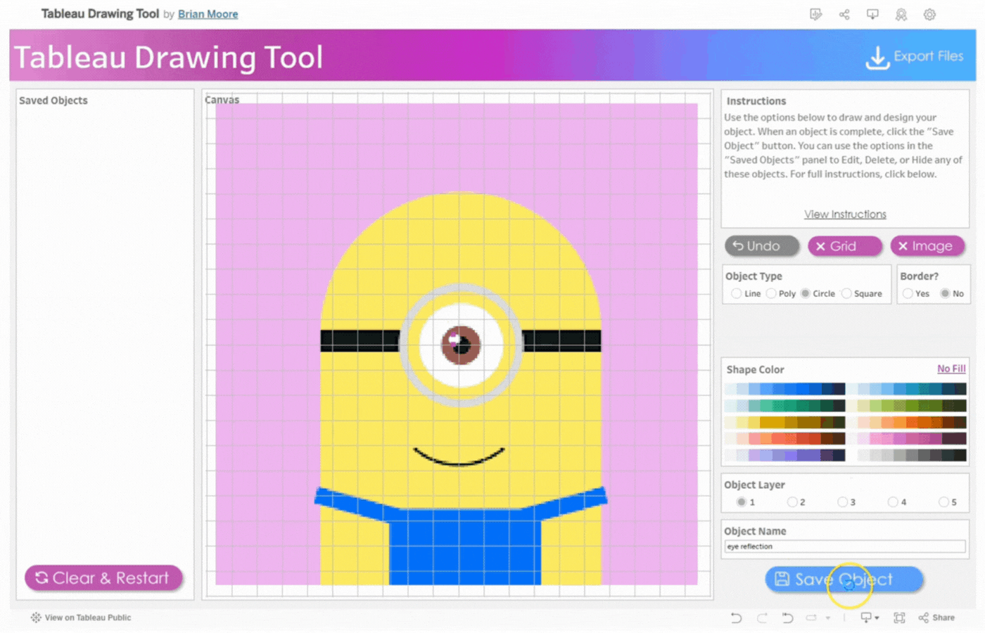
Tableau Drawing Tool is a free tool directly available in Tableau that lets you create custom designs by tracing images or drawing “freehand” directly in Tableau.
With this tool, you can create custom shapes and incredible images. The Tableau Drawing Tool allows you to express your creativity on Tableau Public or Tableau Desktop.
This documentation gives you a walkthrough on how to use this tool and its features for your work.
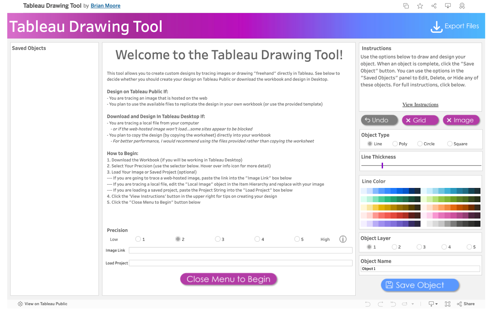
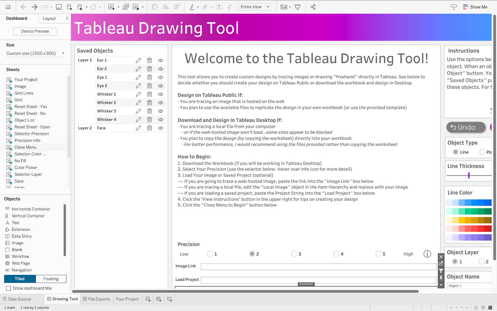
Upon clicking the link, you are welcomed to the exceptionalTableau Drawing Tool. The workspace consists of different sections with lines, objects, buttons, and much more.
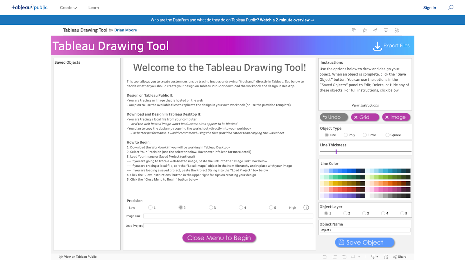
The Workspace
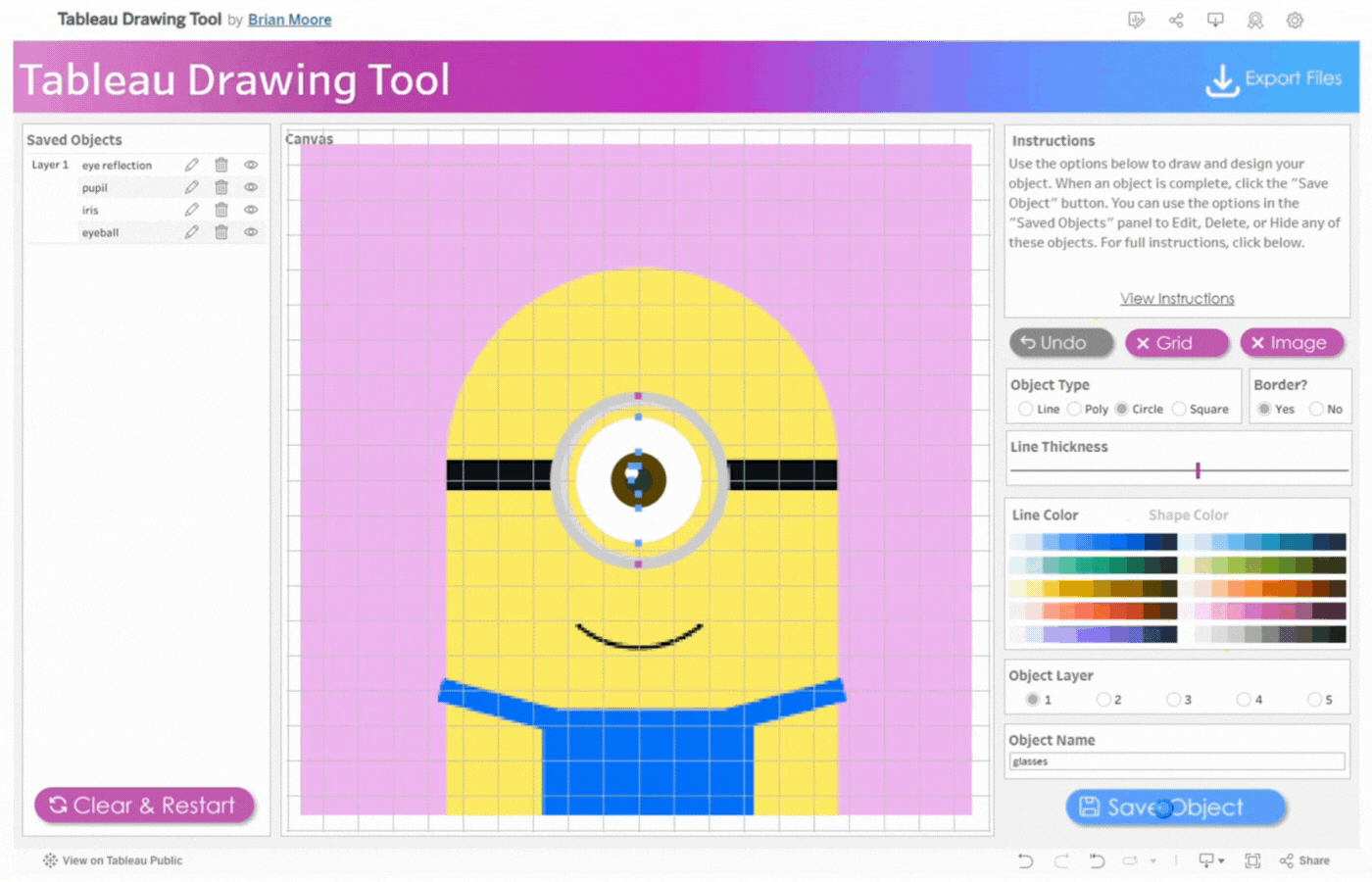
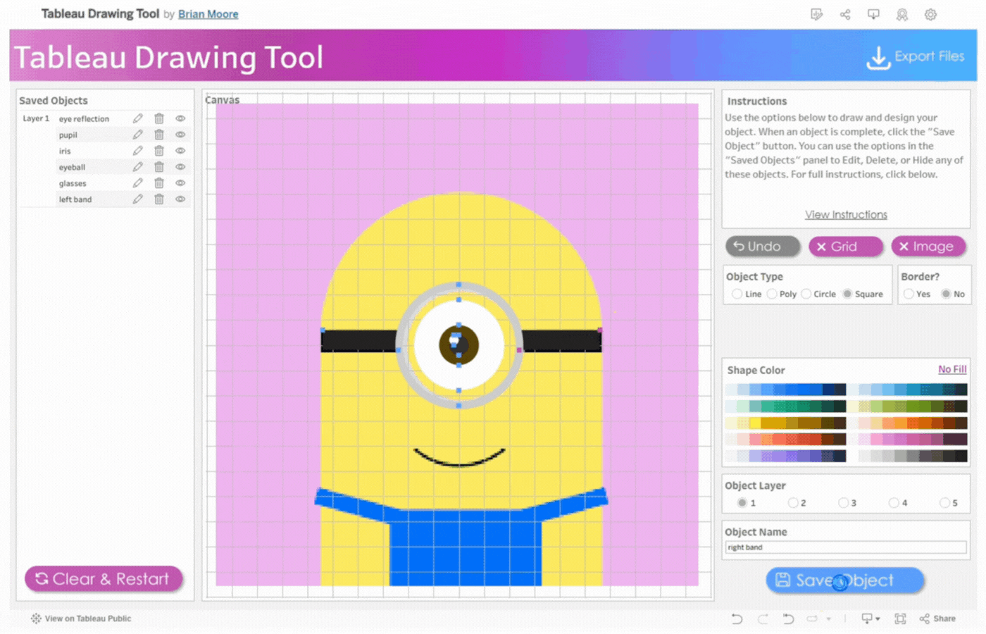
The workspace UI consists of three panes: Saved Objects, Menu, and Instructions.
Saved Objects: Images and custom shapes (anything designed on the tool) are referred to as Objects. Objects appear on this pane and can be edited, hidden, or deleted.
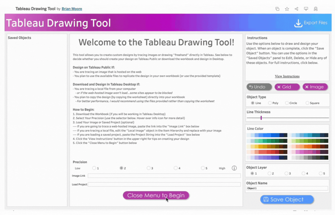
Menu: The menu pane contains directions on how to design based on Tableau Desktop or Tableau Public. Click the “Close Menu to Begin” button to open the Drawing Canvas.
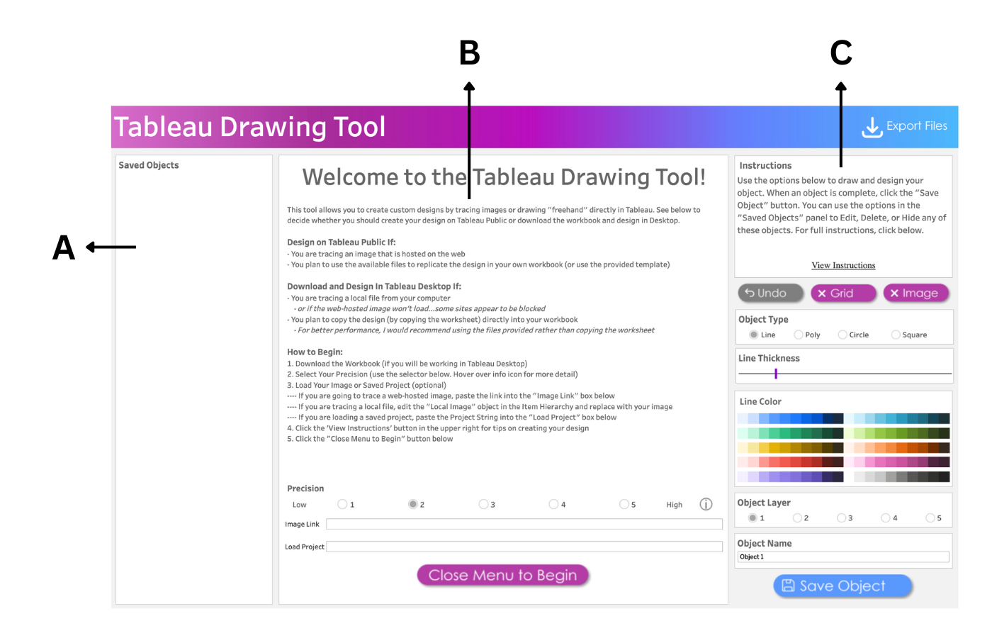
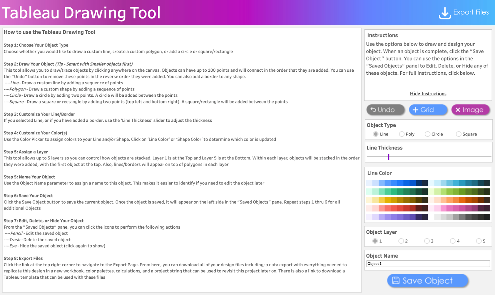
Instructions: This contains brief instructions on how to draw and design objects. You can click “View Instructions” to view more instructions or “Hide Instructions” to hide. The image below shows the display of the workspace when “View Instructions” is clicked.
Workspace Options
The workspace options give flexibility to draw and design objects of different shapes and sizes.
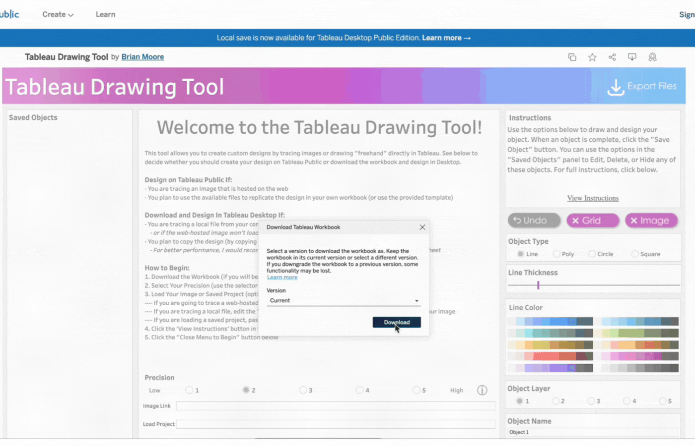
Export Button: Downloads all your design files including color palettes, calculations, and project string.
Undo button: Reverts action.
Grid Button: Displays or hides gridlines. Gridlines are also adjustable by pixels.
Image Button: Displays or hides image to be traced.
Save Object Button: To save the current object. Once the object is saved, it will appear on the left side in the Saved Objects pane.
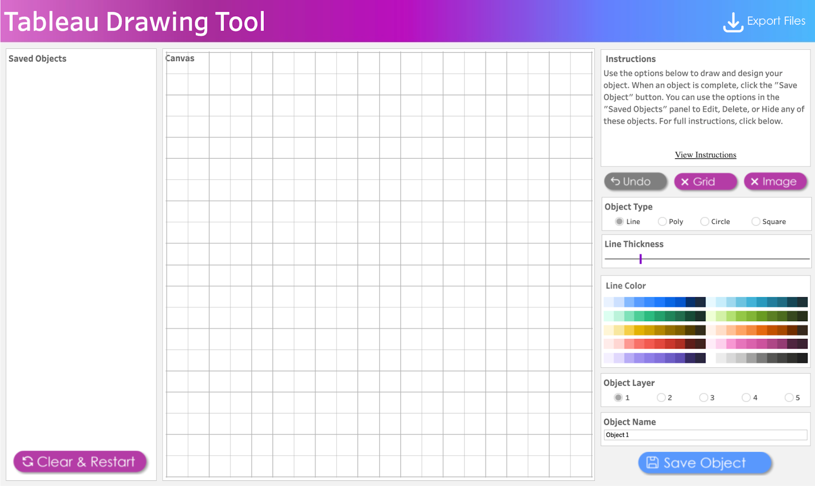
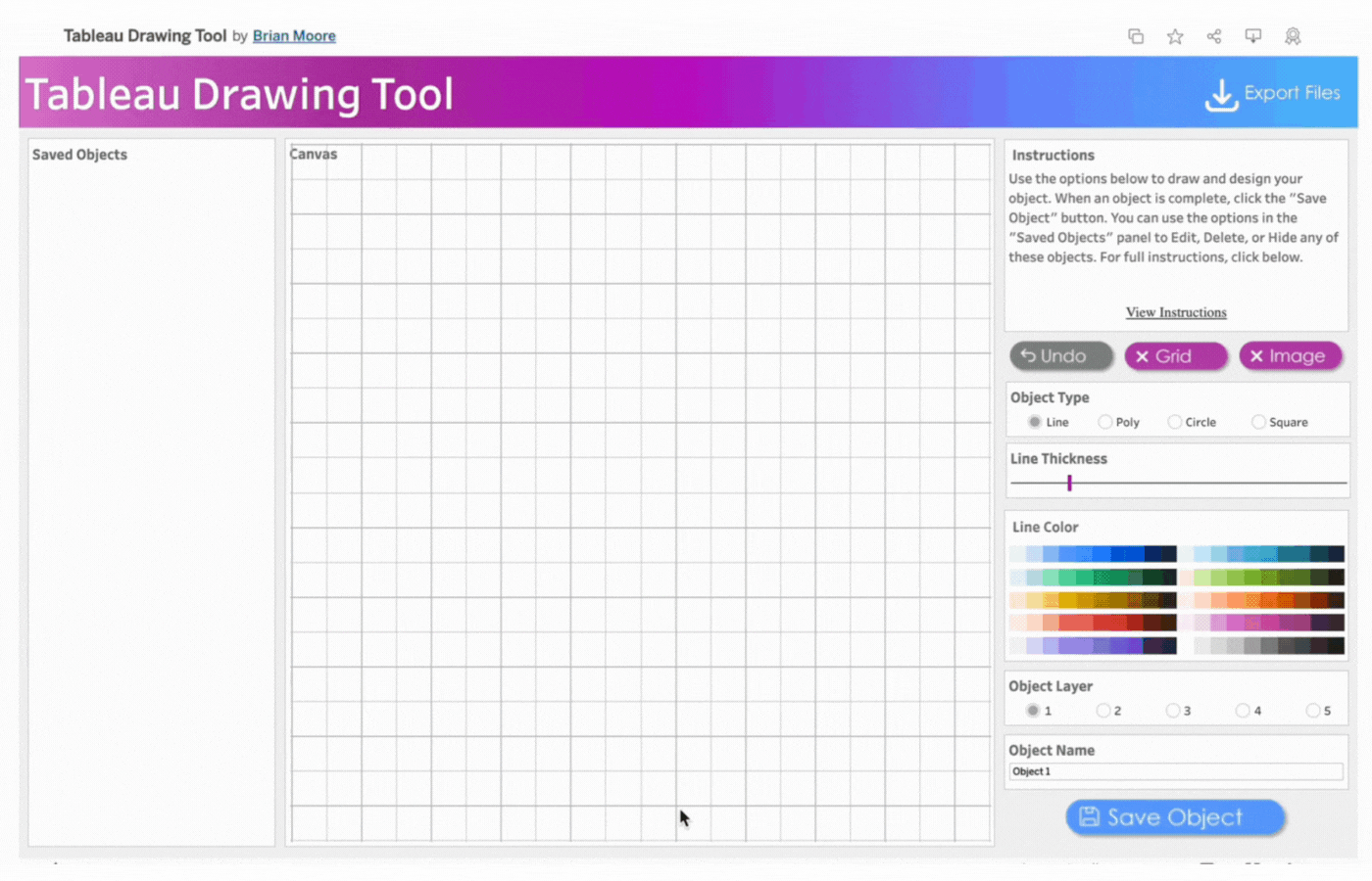
Close Menu to Begin Button: This opens the drawing Canvas and closes the menu. SeeImage 3
Clear & Restart Button: This button appears after the Close Menu to Begin Button is clicked. It is used to clear and restart the drawing as the name implies.
Canvas: This pane opens up to replace the Menu Pane(B). All drawings will be done on the Canvas pane.
Object Type: Specifies the geometric object to be drawn. Line, Poly(Polygon), Circle, and Square are the available selection options.
Border: This option appears when either Poly, Circle, or Square is selected. It is a visible line that marks the boundary of the shape. Select Yes to display the border or No to hide it.
Line Thickness Slider: Use the slider to adjust the thickness of a line or border.
Shape Color and Line Color: Use the Color Picker to select colors for your Line and/or Shape. Click on Line Color or Shape Color to choose colors. Select No Fill to remove colors.
Object Layer: The Tableau Drawing Tool allows up to 5 layers to control how objects are stacked. Layer 1 is at the Top and Layer 5 is at the Bottom. Objects are stacked in the order they were added, with the first object at the top.
Object Name: Assign a name to each object you create. This makes it easier to identify if you need to edit the object later.Tip: Assign the name before creating the object.
Precision: This option determines how precise the clicks are when drawing an object. It utilizes an invisible grid with selectable points. The higher the precision, the more points there are available. However, higher precision slows down performance.
Info Icon: Hover over the info icon for more details on the precision.The Lowest Precision option utilizes roughly 4,000 points. The Highest Precision option utilizes roughly 20,000 points.
Tip: Use low precision for free drawing basic shapes and/or objects that have mostly straight lines.Use high precision for small objects with a lot of curves.
Image Link: Paste a link in the Image Link box to trace a web-hosted image.
Load Project: Paste the Project String (See Page X) If you are loading a saved project, into the “Load Project” box below.
HOW TO DRAW WITH TABLEAU PUBLIC
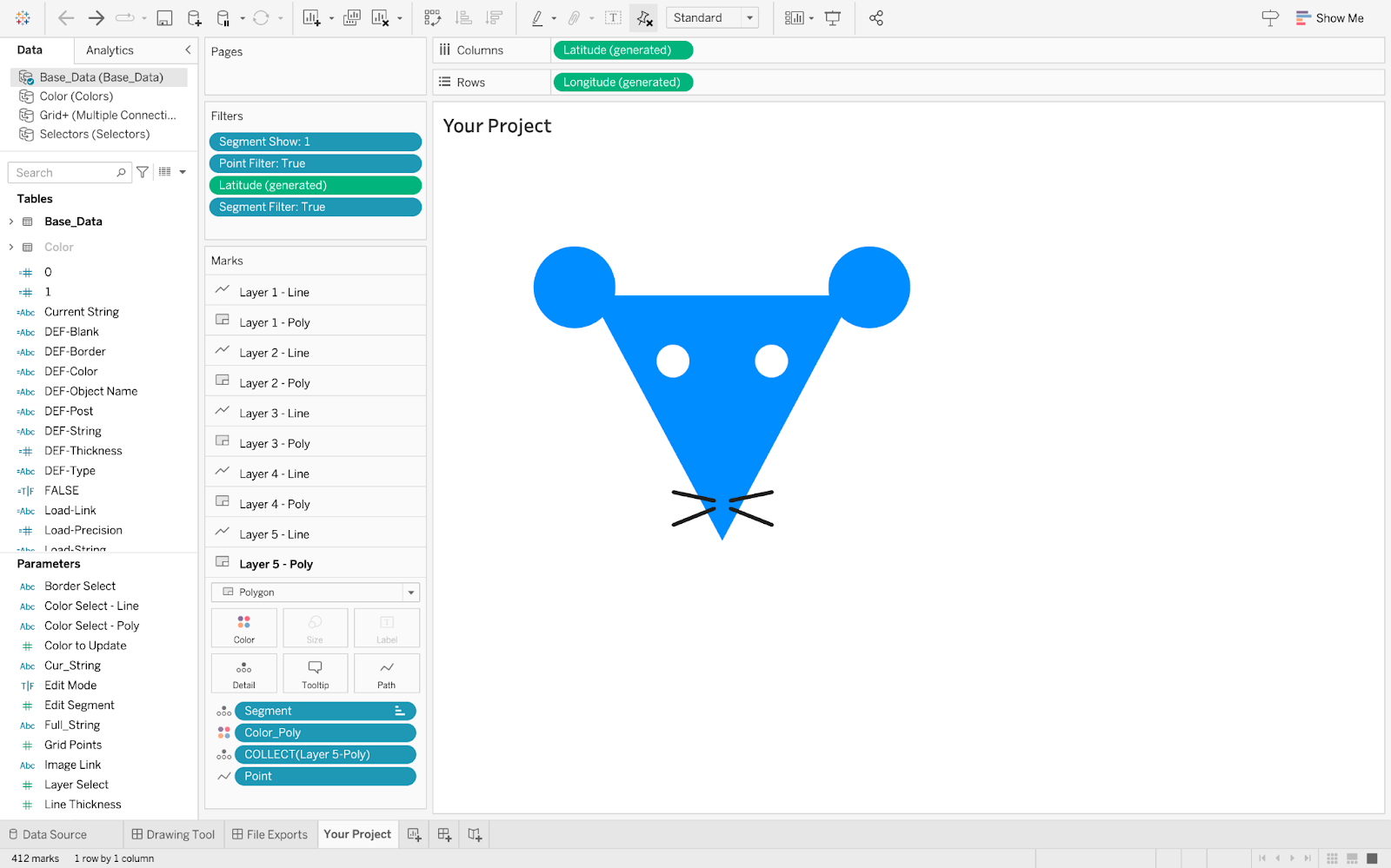
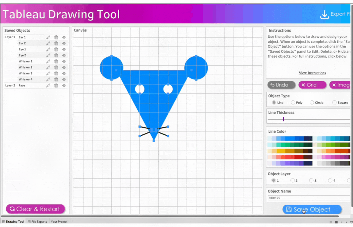
This section of the documentation gives you a step-by-step guide on how to draw a little mouse using Tableau Public.
NB: This section only covers how to draw using Tableau Public. More sections in this documentation include:
How to Draw with Tableau Desktop
How to Export Images
How to Save and Resume Your Work
How to Trace a Web-hosted Image
STEPS
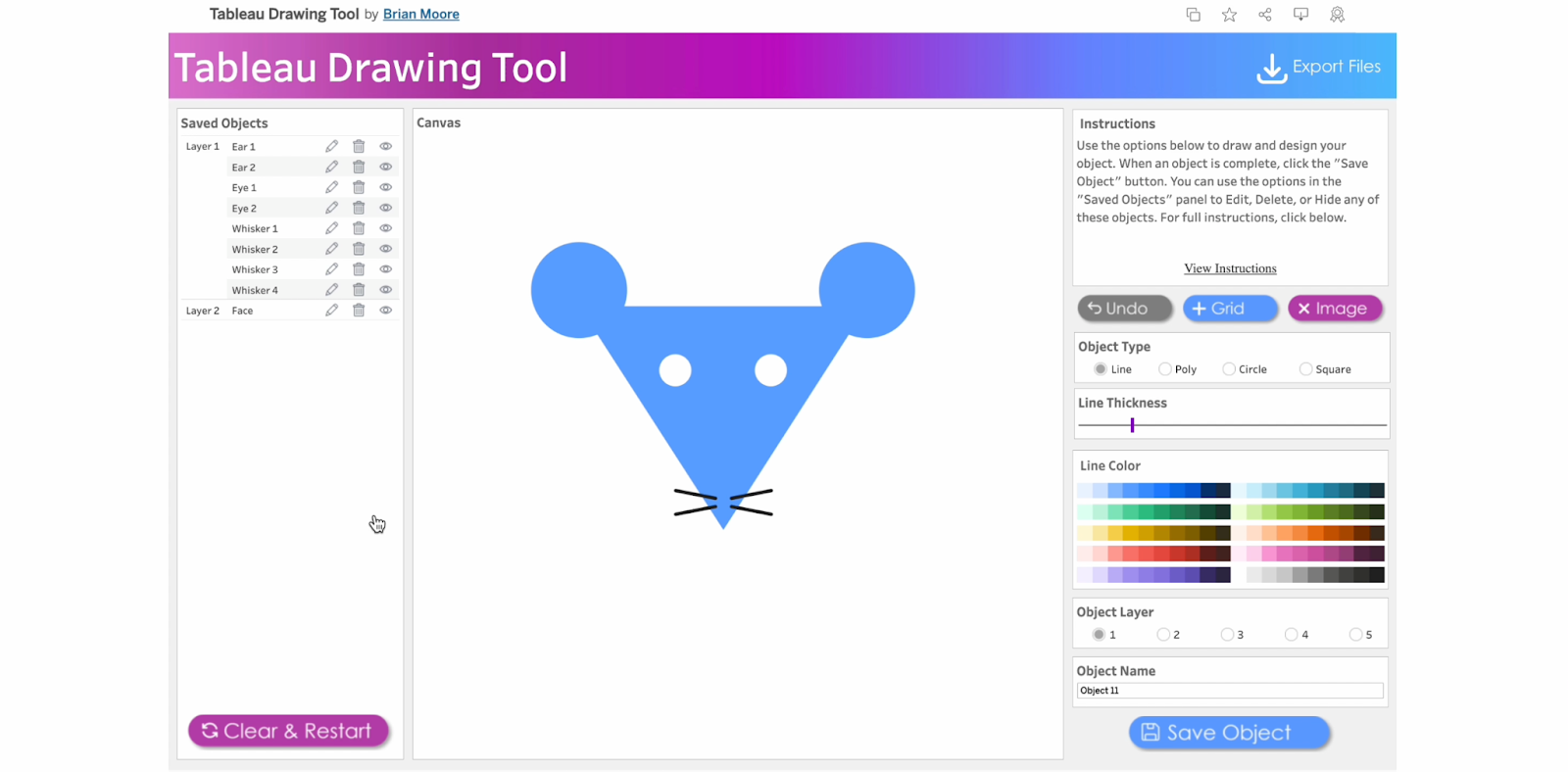
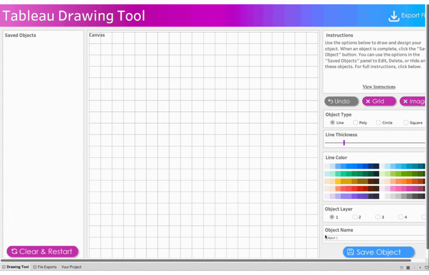
Close the Menu to open the drawing Canvas and begin
1. Close the Menu to open the drawing Canvas and begin
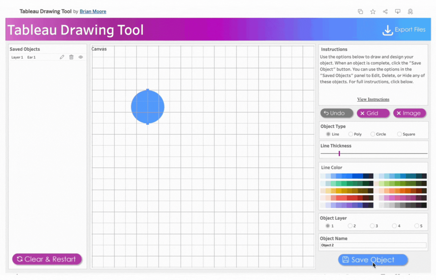
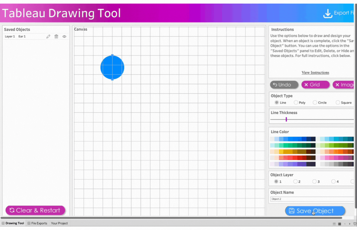
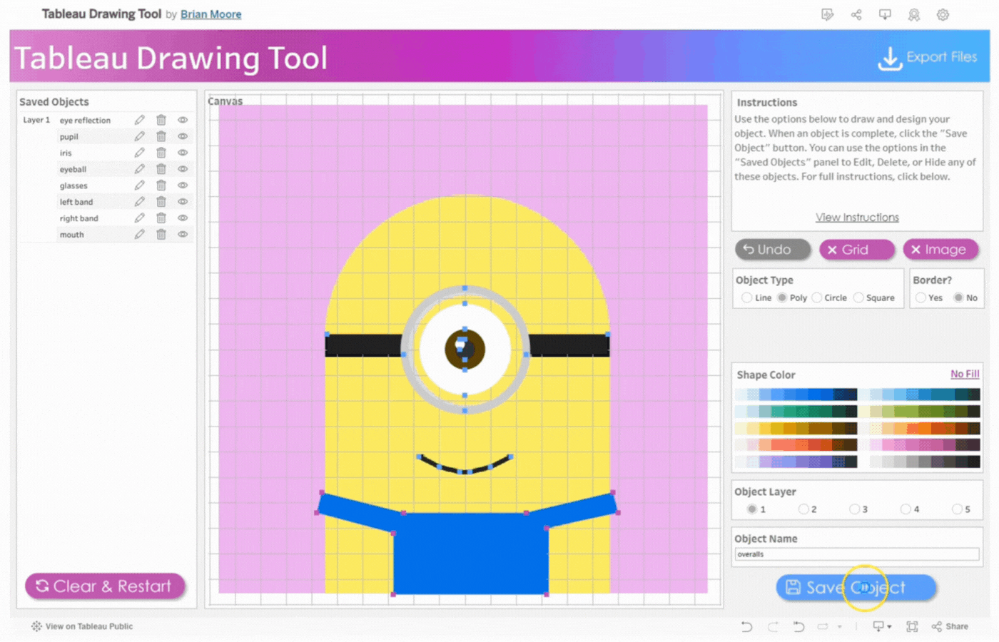
2. Create the first ear
Name the first object, Ear 1
Click object type, Circle
Click two points to determine the size of the circle
Remove the border
Select the color, blue
Save the object
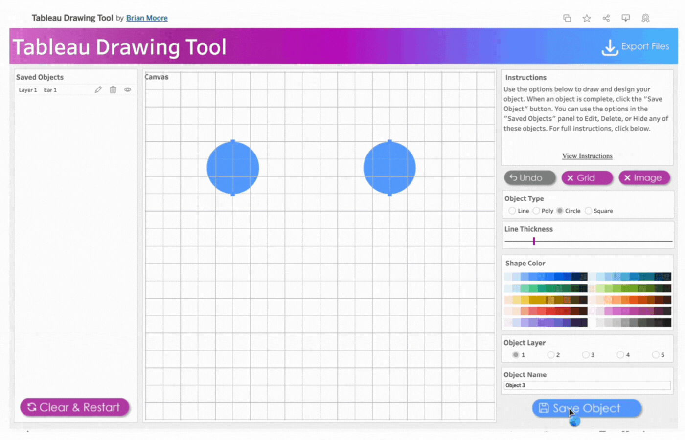
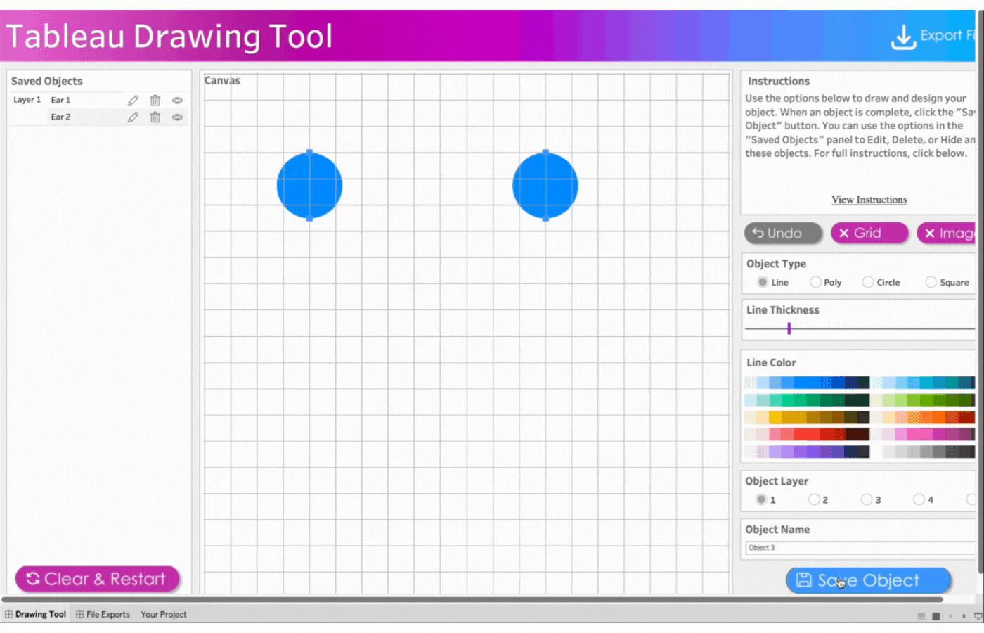
3. Create the second ear
Name the object, Ear 2
Repeat the process above for the second ear
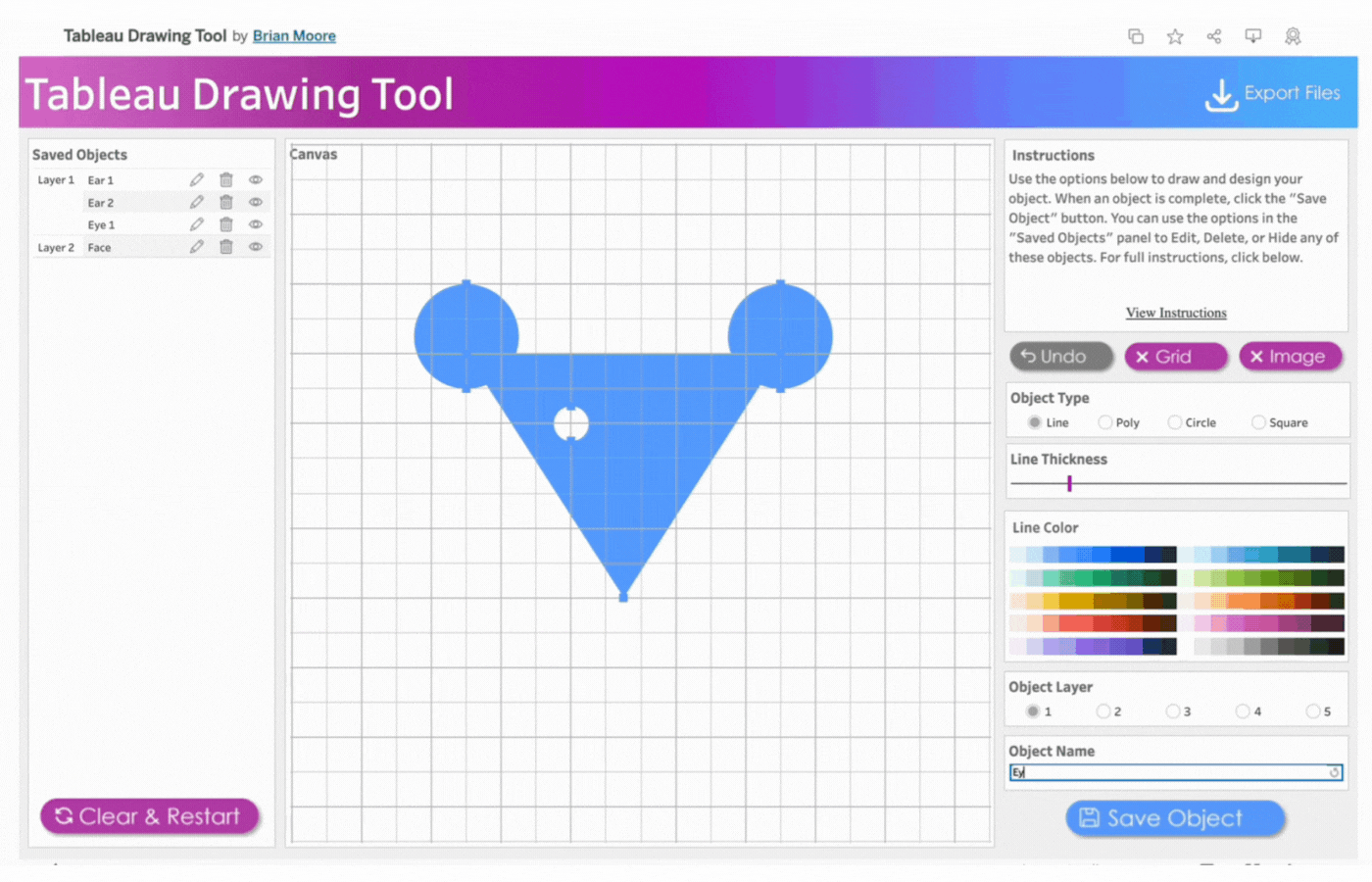
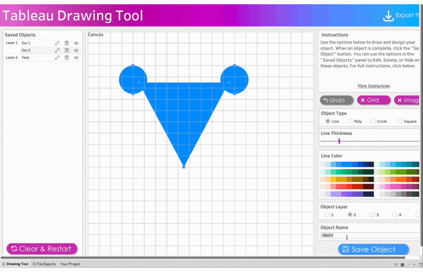
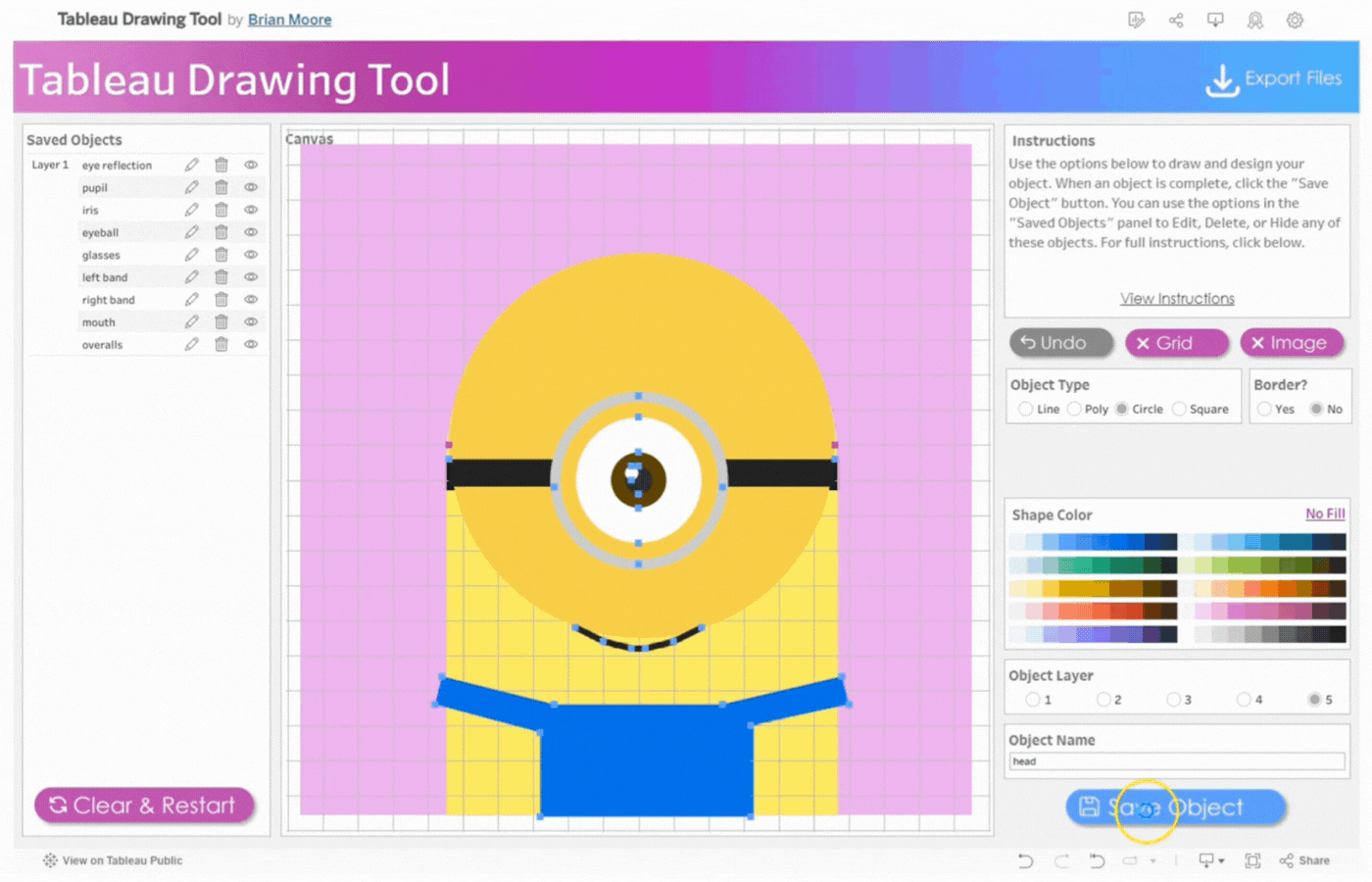
4. Create the face
Name the object, Face
Select Object Layer 2 to send the triangle behind the circles (ears)
Click object type, Line
Click three points to form a triangle
Change object type to Polygon by clicking on Poly
Remove the border
Select the color, blue
Save the object
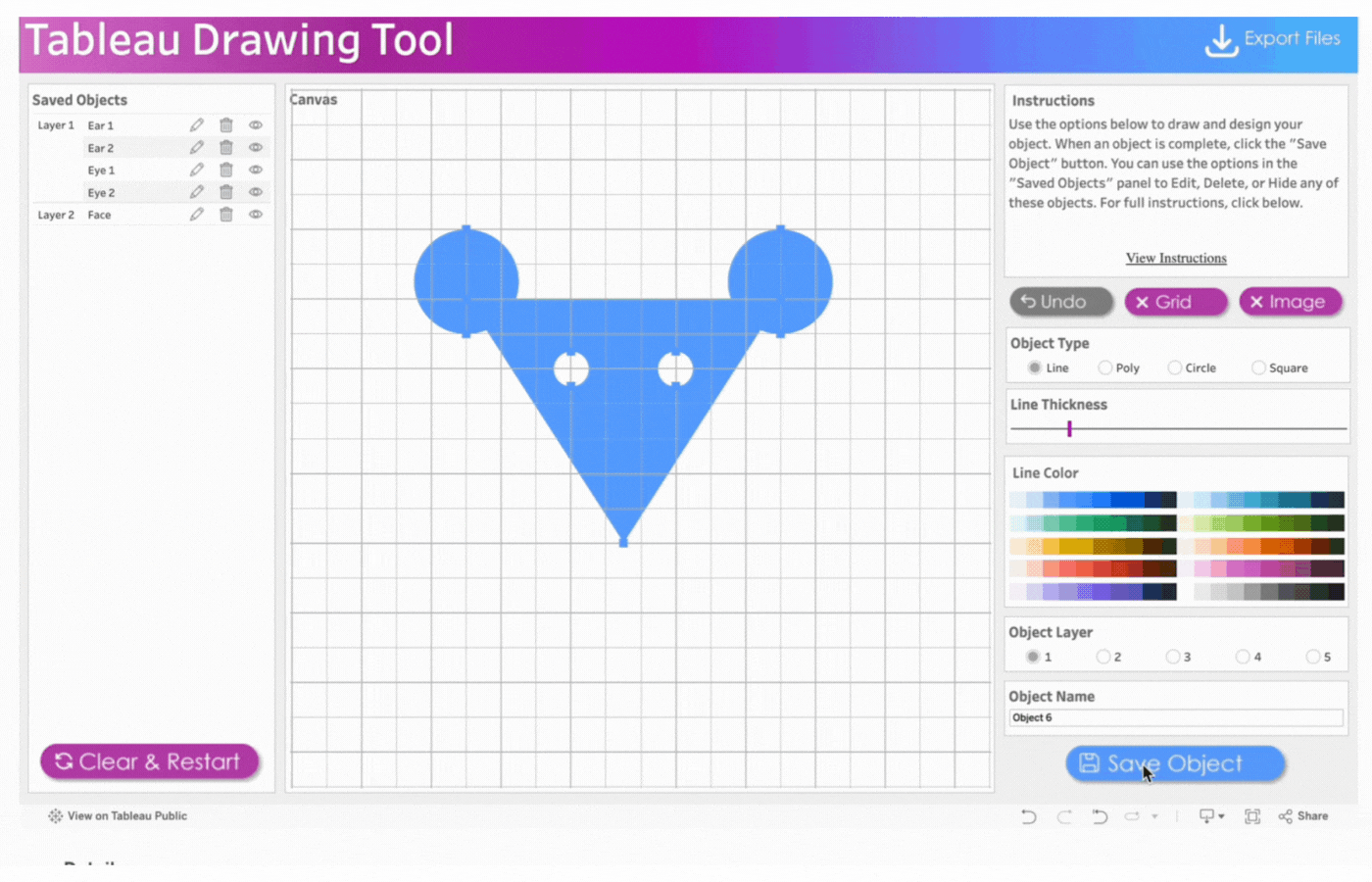
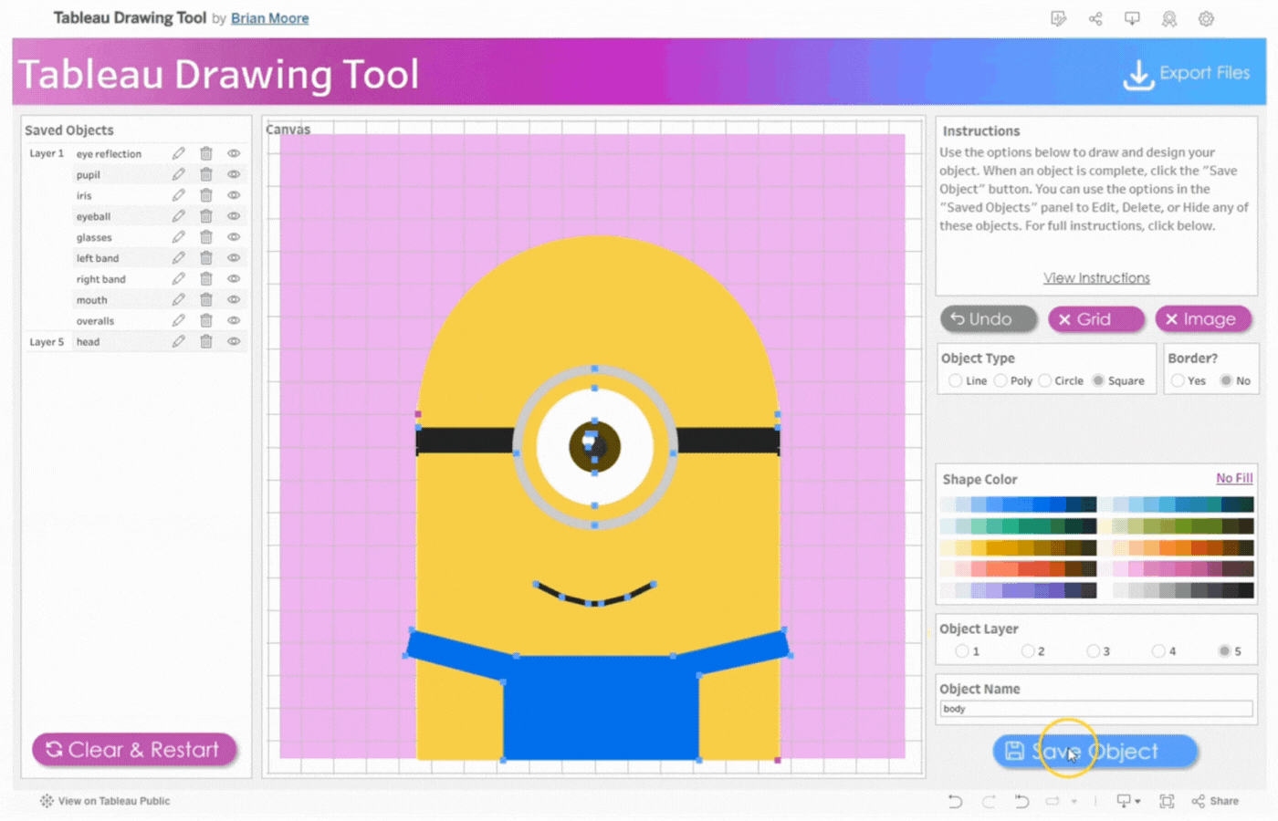
5. Create the first eye
Name the object, Eye 1
Select Object Layer 1 to have the eyes(circle) on the face(triangle)
Click object type, Circle
Click two points to determine the size of the circle
Remove the border
Select the color, white
Save the object
6. Create the second eye
Name the object, Eye 2
Repeat the process above for the second eye
7. Create the whiskers
Name the object, Whiskers 1
Click object type, Line
Click two points to determine the length and angle of the whiskers
Save the object
Repeat this process for three more whiskers. Remember the name and save the objects.
8. Export the project by clicking the Export button
Here, you can download all design files including; a data export (with everything needed to replicate this design in a new workbook), color palettes, calculations, and a project string that can be reused.
HOW TO DRAW WITH TABLEAU DESKTOP
This section of the documentation gives you a step-by-step guide on how to draw a little mouse using Tableau Desktop.
NB: This section only covers how to draw using Tableau Desktop. More sections in this documentation include:
Open the workbook on your local Tableau Desktop software. If you do not have the software on your local computer, download it from Tableau’s website.
2. Open the workbook on your local computer
Open the downloaded workbook
Switch to the presentation screen to view the entire drawing tool
Alternatively, adjust the size or scroll down to view the entire drawing tool
Close the Menu to open the drawing Canvas and begin
3. Create the first ear
Name the first object, Ear 1
Click object type, Circle
Click two points to determine the size of the circle
Remove the border
Select the color, blue
Save the object
4. Create the second ear
Name the object, Ear 2
Repeat the process above for the second ear
5. Create the face
Name the object, Face
Select Object Layer 2 to send the triangle behind the circles (ears)
Click object type, Line
Click three points to form a triangle
Change object type to Polygon by clicking on Poly
Remove the border
Select the color, blue
Save the object
6. Create the first eye
Name the object, Eye 1
Select Object Layer 1 to have the eyes(circle) on the face(triangle)
Click object type, Circle
Click two points to determine the size of the circle
Remove the border
Select the color, white
Save the object
7. Create the second eye
Name the object, Eye 2
Repeat the process above for the second eye
8. Create the Whiskers
Name the object, Whiskers 1
Click object type, Line
Click two points to determine the length and angle of the whiskers
Save the object
Repeat this process for three more whiskers. Remember the name and save the objects.
9. Save the project
Save the drawing like you would any regular Tableau viz.
OPTIONAL
Observe that the workspace layout looks slightly different on Tableau Desktop compared to Tableau Public. Here are some differences to take note of:
Drawing Tool Dashboard – This is where all drawings are made. It also houses hidden sheets to allow the drawing tool to function optimally.
File Exports – This contains export information on your drawing. It also houses hidden sheets to allow the drawing tool to function optimally.
Your Project – This is the worksheet where your final drawing appears. This can be saved on your Tableau Public profile.
HOW TO EXPORT DRAWINGS
This step is necessary when using Tableau Public to draw or trace images. It contains the metadata of your drawings and allows for easy replication or transfer. File Export is available for use in the Tableau Public or Desktop version of the Drawing Tool.
Click on the Export Files link at the top of the drawing tool
Click the Export Files Button
Select the ‘Export-Data’ file and choose CSV for the format image.png
In the Tableau Workbook Template, edit the existing Data Source and connect it to the ‘Export-Data’ file you just downloaded
HOW TO SAVE AND RESUME YOUR WORK
To save and resume your work in Tableau Public, use the project string feature. Follow these steps to export and load your project string.
Go to the Export Files page.
Click the Export Files button.
Select the Export-Project String file.
To resume your design, open the Drawing Tool.
Paste the entire string from the downloaded file into the Load Project box.
Press Enter before closing the menu.
HOW TO TRACE AN IMAGE FROM THE WEB
To trace an image from the web, start by selecting the image you wish to trace. Load the image to the Tableau Drawing Tool and trace it as you would in traditional image tracing.
Have you ever published a dashboard to have the users come back and say “The dashboard is broken”?
Everyone should be raising their hands. We’ve all done it at some point.
Checklists to the rescue!
By going through a list of common data source and dashboard items before publishing, you can prevent a lot of common issues with data sources and dashboards from making it to your users.
Using a checklist such as this can help reduce errors, increase efficiency, improve confidence and trust, and act as training and process documentation. Having a checklist review as part of your dashboard development process can help catch bugs and errors that are sometimes easily overlooked — especially on large, complicated, or fast-moving projects.
Initial Development: Review the checklist prior to first publishing to production
Enhancements and Updates: Use the checklist as a script for regression testing when making changes
Code Review/Peer Review: Having a second set of eyes on your work will often catch items that you may not, being too close to the project
User Testing: Providing users a modified list of these items can provide guidance on what they should be testing and providing feedback on, which can produce more actionable and organized feedback
But, you’re not here to hear me talk about checklists, you’re here to see the checklist! So, without further ado…
This is not necessarily fully comprehensive of everything that can/should be tested or reviewed
However, it is fairly comprehensive and not every one of these items will apply to every dashboard, environment, or organization
I firmly believe processes should be helpful, not just add work. If a process is adding more overhead than it is adding value, modify it and make it suit your needs!
Think of this as a living document, and update it as the technology, product versions, and your own processes change. Make it work for you!
I didn’t come up with the concept of Publishing Checklists. This is mine. I’m certain there are others out there, so please share!
How did you build that in Tableau? That’s a question I get pretty frequently. If you look at my Tableau Public profile you may notice that most of my visualizations are pretty unique. And there’s good reason for that. Every visualization I build for Tableau Public, I try to do something I haven’t done before, and preferably, something I haven’t seen anybody else do. What I love about this approach is that I am continuously learning. I am constantly learning new techniques, combining those with other things I have learned along the way, and creating something new and, to me at least, something exciting. My favorite part about building these unique visualizations is figuring out how to do it. Sometimes it’s really challenging, but it’s also extremely satisfying when you finally figure it out and see your ideas come to life.
There are, of course, downsides to this approach. Inspiration and ideas are very hard to come by. I hear people all the time saying that they have so many viz ideas and not enough time to work on them. It’s the complete opposite for me. I will come up with one good idea every couple of months, and then spend days, weeks, sometimes months, figuring it out. That’s why I only have about 55 vizzes on my profile, even though I’ve been using Tableau Public consistently for about 4 1/2 years. That’s an average of about 12 per year. Some people seem to publish that many each month.
But it seems that every time I do publish something, I get at least a handful of messages on Twitter and LinkedIn asking “How did you build that?”, or often times, a much more general question “Can you tell/teach me how to build things like that?”
The first question is a little easier to answer, and could probably be done through a single blog post (which I plan to start doing in a new series with the same title “How did you build that in Tableau”). The second question is much harder to answer. It seems a lot of the time, people are looking for a silver bullet, one piece of advice, or one technique, that will allow them to build weird and crazy vizzes. And I really wish I had something like that to give them, but I don’t. As I mentioned earlier, every visualization I build is different. There isn’t a set technique or approach. But if I sit down and think about it, I do think there is a, at least somewhat, consistent process I go through with each build. And that’s what this post is about. This isn’t a technical walk-through, it’s more about the process. I will walk through a pretty basic example using that process, and if you’re interested in the calculations, please download the workbook here.
Step 1: The Idea
In my opinion, this is the hardest part. If you want to build something unique, you have to have a general idea of what it is you want to build. If you can imagine it, chances are there is a way to make it happen. And I am sending out an open invitation now: If you are taking the time to read this post, and you have a unique idea, but don’t know how to build it, feel free to reach out to me on Twitter or LinkedIn, and I will do my best to help you. As I mentioned earlier, I love trying to figure this stuff out.
Back to the idea. The idea gives you a starting point and something to work towards. But keep in mind that that idea is likely to change and evolve as you go through the rest of the process. I have very few examples of vizzes where the end result is exactly like what I had set out to build. It’s usually an iterative process. Come up with an idea, that idea doesn’t work the way you wanted it to work, but it sparks other ideas. Or maybe it did work, but along the way you got other ideas that would make it better. So the process I’m laying out here may not be completely sequential. You may find yourself back at this Step a few times before you build something you’re excited about.
Step 2: The Data
For me, this step and step 1 are interchangeable. I told you this process wasn’t always sequential right?
Sometimes I have an idea and then I go looking for the specific data I need.
Sometimes I come across a cool dataset, and then try to come up with ideas on how to visualize it.
Sometimes I have 0 ideas and I just browse Kaggle, Data.World, or Google and a dataset will spark a cool idea.
Sometimes I have an idea for a type of chart I want to try to build, and then go looking for any kind of interesting data I could use for that chart type.
There is no right way to do this. Think of it as writing a song. You need lyrics and you need music, but you don’t necessarily need to work on either of those things before the other. It could be a lyric or a melody that pops into your head and then you work around that. And chances are both the lyrics and the music are going to change when you start working them together.
So start with what you have and then go from there.
Step 3: The Plan
The next step is to start planning the build. You know what you want to build, but you need to figure out how to get there. If you want to start building truly unique visualizations in Tableau, you need to get comfortable with scatterplots. Nearly every single visualization on my profile is built using X and Y coordinates. I like to think of it like drawing, but more specifically, like drawing with connect-the-dots. That’s really all it is. It’s figuring out where to put the dots and how to connect them. With those two things figured out, you can draw anything you want in Tableau.
When I’m planning out my build, I like to break it out into smaller pieces. Let’s say we wanted to make this Smiley Face in Tableau, where would you start?
If I was trying to build this, I would start by figuring out the individual pieces that need to be built. In this case, I have one large yellow circle, two small black circles, and one curved black line. I don’t have to figure out how to build the entire thing at once, I just need to figure out how to build each piece and then figure out how to put them together.
I know how to draw circles in Tableau and I know how to draw curved lines in Tableau. I’m basically done. Not quite, but it’s a good start. Pretty much everything on my Tableau Public profile is built using some combination of circles and curved lines. The variety comes from combining those things in different ways. If you’re looking for more technical walk-throughs on how to build circles and curved lines in Tableau, check out the 3-part series on our blog:
For my Smiley Face, I am going to use Techniques from Part 1 and Part 2 of that series. I’m going to draw 3 circles and 1 bezier curve. I’m not going to share all of the formulas here, so if you’re interested in following along, I would recommend reading Part 1 and Part 2, and downloading the example workbook here.
Step 4: The Data Structure
This part can be difficult. Figuring out how to structure your data so you can build the pieces you need to build. If you are trying to build something unique, chances are you will not be able to use your data as is. You’ll have to put some work into it, and chances are, you’ll revisit it and change it and re-arrange it as you go through the build. The technique I typically use, I like to call a “Stacked” Densification Table. If you’re not familiar with Densification, we’re basically creating additional records in our data source that we can use in our calculations. I am blowing up my data source, but I’m doing it with purpose.
For this example, I am going to use a data source with just a single record. If I wanted to draw more than one smiley face, I could add more. But here is my “Base” data.
Object ID
Object Name
Size
1
Smiley Face 1
10
Now I’ll create my Densification Table. I’ll start by adding records to “draw” my first object; the Left Eye.
Type
Points
Left Eye
1
Left Eye
2
Left Eye
3
Left Eye
…
Left Eye
20
I used 20 points, which works pretty well for smaller circles. The more points you add, the smoother your curves/circles will appear. Curves in Tableau are essentially a bunch of really short straight lines, so the more lines you have, the shorter those lines will be, and the smoother the curves will appear.
Now, in the same table, I’ll add another 20 records for the Right Eye.
Type
Points
Left Eye
1
Left Eye
…
Left Eye
20
Right Eye
1
Right Eye
2
Right Eye
3
Right Eye
…
Right Eye
20
Then I’m going to add 100 points for the body or face or whatever you want to call it. I’m using more points for this because the circle is much larger. Then I’ll add another 50 points for the mouth. The end result should be a table with 190 records; 20 for the Left Eye, 20 for the Right Eye, 100 for the Body, and 50 for the Mouth
The reason I like to set it up this way is that I can use different calculations and different techniques on each section, or Type, and then combine them later using a couple of simple calculations.
The last step in setting up my data source is to join these 2 tables using a physical join and a join calculation.
Step 5: The Build
Once I have my data structure in place, it’s time to start building. When I’m on Step 3 and planning out my build, I identify the individual pieces that need to be built. When I’m on Step 4 and building out my data source, I create the data I need to build each one of those individual pieces. And when I’m on Step 5 and actually building the viz, I work on each one of those pieces individually. I’m going to start with the body/face because it’s the biggest and because the position of all of the other pieces are going to rely on that piece.
The Build Part A: Building the Circles
My first step in building this circle would be to go to a new worksheet, and filter on Type = Body, because that’s the piece I’m working on first. My next step would be to build the calculations. If you looked at Part 1 of the Fun with Curves series, you’ll know that in order to draw a circle in Tableau, we need two inputs; the distance of each point from the center of the circle (the radius), and the position of each point around the circle.
In this case, I’m going to use the [Size] field from my data source for the size of the body/face circle. That value is going to represent the Area of the circle, so I’ll calculate the radius using that, and that will be the first input. Once I have that, and the Position input, I plug those into my X and Y calculations and build the circle. When I’m done, it will look something like this.
So far so good.
Next, I’m going to build the Left Eye. When I’m building something like this, I like to parametrize everything, so I can easily tweak the size and position of things, and so that the sizing will stay consistent, even if the values in the data change. And I always choose an “Anchor” value. Something I can use along with those parameters to calculate “relative” values for everything else. For this build, I’ll use the radius of the body/face as the “Anchor” because all of the other objects are going to go inside of (or really on top of) that main circle.
So in this case, I’ll build a parameter and set the value to .1 to start. Now, to calculate the radius for the eyes, I just multiply that parameter by the radius of the body/face. By using this technique, I can ensure that the radius of the eyes will always be 1/10th of the radius of the body/face. And I can also tweak that value to easily make the eyes larger or smaller.
My next step would be to repeat the process I used to build the body/face to build the left eye. I would go to a new worksheet, filter on Type = Left Eye, plug my eye radius and position into the X and Y calcs and build my circle. Then repeat for for the Right Eye.
The Build Part B: Placing the Circles
At this point, I would have 3 sheets and 3 sets of X and Y coordinates, one for each of the objects. Now I would bring them together with a couple of simple calculations called “Final_X” and “Final_Y”, which are just CASE statements that look at the TYPE field from my densification table and return the values of the appropriate X and Y fields that I have already calculated for each type.
Then I would go to a new sheet, filter on my 3 Types, and build the circles using those “Final” X and Y fields.
When I’m done, it would look something like this.
Hmmm, that looks exactly like the “Body” worksheet. One thing to always keep in mind when layering these objects is how Tableau sorts them. In this case, Tableau sorted the “Types” alphabetically, so the Body is in front of the Left Eye and Right Eye. So next, I would click on the color legend and drag Body to the bottom and the objects will sort correctly. With a lot of objects, sometimes this sorting piece can become pretty complicated. Once sorted, it would look something like this.
Now unless I was building a cyclops smiley face, this still doesn’t look right. As it stands now, all of my circles have the same starting point. They all start at 0,0 and build around that. I want the Body to start at 0,0 but I need to offset the eyes to get them in the right position. Basically, the eyes need new starting points.
Offsetting these values is really easy. If you want to move something up? Add a positive value to it’s Y coordinate. Want to move something down? Add a negative value to it’s Y coordinate. To the right? I’m sure you’ve guessed it, add a positive value to the X coordinate.
This is something I struggled with early on, but once I understood it, it became really simple. Basically, what I am trying to do is to create a new starting point for each of these circles, instead of starting them at 0,0. And to do that, all I have to do is add those new starting coordinates directly to the X and Y calcs for each of the circles, and all of the other points I have already calculated to form those circles, will move accordingly.
Once again I would use parameters to determine how far to move the circles, one for moving them up and down, and one for moving them left and right. Then it’s just a matter of multiplying those parameters by my “Anchor” value, the radius of the body/face, to get the actual values and then adding (or subtracting) those values to the X and Y fields for the Left and Right Eye.
After moving the eyes, I have something like this.
It’s starting to look pretty good, but, in my opinion, those eyes look a little too small, a little bit too spread out, and just a touch too high. This is why I use parameters. Now I can easily tweak all of my parameters to change the look of it.
This looks much better, but now I notice another problem. Now that I made the eyes a little bigger, I can really see the lines instead of a smooth curve. This happens to me pretty frequently, but there is an easy fix. I go back to my data source and add more rows to the “Stacked” Densification table for the Left Eye and the Right Eye. If I increase that count to 40 (from 20), it looks much better. No more jagged lines.
The Build Part C: Building the Line
Now for the mouth. Like most things in Tableau, there are a couple of ways to accomplish this, but I am going to use a bezier curve. And I am going to start on this the same way I started with the circles, with a fresh worksheet filtered on the object I’m working on (in this case [Type] = Mouth).
To draw a bezier curve, I need the coordinates for 3 points…the Start of the line, the End of the line, and the Mid-point. And, just like I did for the eyes, I’m going to create some parameters so I can play with how the mouth looks. I’m going to create a total of 3 parameters; 1 for the width of the mouth, one for the vertical starting position of the line, and one for how far down the line dips. And again, just like I did for the eyes, I’m going to multiply these by the “Anchor” value to calculate the coordinates.
Once I have all of my calculations and I plug them into the X and Y calculations for bezier curves, I have something like this.
Now I have my curved line, but I can’t really tell what it’s going to look like until I place it on my Smiley Face. So I’ll do that next.
The Build Part D: Placing the Line
Now this part is a little tricky. I have my “Final_X”and “Final_Y” calcs that I used to bring the three circles together in the same view. But now I have 2 different mark types; Polygon for the Circles, and Line for the Mouth. So here is a technique I use to bring different Mark Types together on the same view.
I need to create a Dual Axis chart, so I can assign a different Mark Type to each axis. So Instead of “Final_X”, I would build “Final_X_Circle”, which would include all of my Circle X calculations, and “Final_X_Line”, which would include all of my Line X calculations. For each of those Fields, the result would be populated for the included “Types” and NULL for all other Types.
Then, I would add all of the Types to the “Final_Y” calculation. If I built separate calculations for the Mark Types here, I would not be able to layer them together in the view.
So I end up with a common measure for the Y axis, and two different measures for the X axis
Now I can create a dual axis chart, and set the appropriate mark type for each of my Types. With a few more minor tweaks, I have something like this.
Now, just like I did with the eyes, I can play around with the parameters to get the smile to look how I want.
Step 6: Ideate & Iterate
At this point, I have built what I set out to build, so I should stop right? As I mentioned earlier, as I’m working through this process, I usually have other ideas to try out. Now that the foundation is built, how can I make it better?
What if I added another record to my “Base” data?
What if I added 100 records and made a 10×10 panel chart?
What if I put some real data behind this? Since I’m working with Smiley Faces, how about data from the World Happiness Report? What if I made them all the same size, but used color for the Happiness Score?
That’s looking better. But maybe the faces with the lower scores should be frowning instead of smiling. What if I could use the score to control the shape of the mouth too?
Now what if I used population on Size?
Hmmm, that doesn’t really work. Most of those faces are way too small. I would need to make them all bigger, but I can’t really do that with a panel/trellis chart. But what if I made this into a Packed Bubble Chart and limited it to the 50 largest Countries?
Ooohh, now we’re getting somewhere. Now what if I grouped the countries by Continent?
That’s it! That’s the one. Now it may seem like a huge leap going from a single smiley face to this, but it was actually a really easy update. I set up everything with parameters and used “Anchor” values, so no matter how many records I added to my data source, I would have a smiley face, with the correct proportions for the features, for every record.
And moving from a Panel Chart to a Packed Bubble chart was easy as well. CJ Mayes has a really great tutorial on Circular Packing, which is what I used. The output of that process is a file with an X coordinate, a Y coordinate, and a Radius for each circle. That means I could take what I had already built, and just add the X coordinate to my “Final” X calcs, and the Y coordinate to my “Final” Y calc to give all of my circles a new starting point. Then I swapped out the Radius calc I had used for the body/face with the one in the output. Because everything else I built was Anchored to that Radius value, everything updated and moved automatically.
Step 7: Final Touches
Now that I have built something I’m happy with, it’s time to finish off the design. I typically don’t spend a lot of time on this. If you look at my profile you’ll notice that nearly all of my vizzes are a single unique chart, with a light background, a title, some text, and some ways to interactive with the viz. I’m not a great designer, so I try not to put too much effort into the design. Also, I spend a lot of time building those charts, and I want those to be the focal point.
If I was going to publish this, it would probably look something like this.
I would play around with the design of the chart a little bit, add a Title and Subtitle, and some text describing the chart. If I was going to publish this I would also probably add some kind of interactivity to highlight specific countries to make them easier to find, and maybe bring this into Figma to add some labels for the continents. But, since I’m not publishing it, this seems like a good place to stop.
Wrap-Up
I hope you found this helpful. This is the exact process I would have gone through if I was trying to build a Smiley Face in Tableau. I know it is, because I wrote this post as I was building it. This was my actual process from trying to build this:
To actually building this:
As I mentioned earlier, there isn’t a single, universal technique that will let you build anything and everything in Tableau, but there is a process you can follow that may help you. I know it helps me. The most important parts of that process, in my opinion, are Step 1, Step 3, and Step 6.
Coming up with unique ideas is tough, but you have to know what you want to build, or at least attempt to build, before you can start building it. If you don’t have an idea, start looking for some interesting datasets, and then think of unique ways you can visualize it.
And then you have to plan. If you just sit down with an idea and start writing calculations, maybe you’ll get there, maybe you won’t, but your chances will increase significantly if you have a plan. These builds can be overwhelming, so you’ll want to break it down into smaller, more manageable pieces. Work on those pieces individually, and then start bringing them together. I recently published a few games, and although the goal of those was completely different than one of my visualizations, the process was exactly the same. I broke it down into smaller pieces. How would I build and position each of the pieces? What are the rules for the game? What has to happen each time a user clicks? What restrictions should there be when it’s time to make a move? How would a winner be determined? I sat down and thought through all of these questions before I ever opened Tableau and I came up with a plan for addressing each of them.
And then once you have something built, experiment with it. Every change you make might not be an improvement, but it’s still worth trying. Maybe you’ll love it, or maybe it’ll spark other ideas you can experiment with. Or maybe you’ll have to hit undo 100 times. It doesn’t matter, try it anyways.
If you use this process for a new visualization, or if you have your own process, please reach out and tell me about it. And, as I mentioned earlier, if you have a unique viz idea but can’t figure out how to build it, reach out and I’ll do my best to help. And keep an eye on our blog for the new series “How Did You Build That in Tableau”, where we’ll walk through the process of how we built specific vizzes.
Welcome to another installment of “It Depends”. In this post we’re going to look at three different methods for using Tableau for Market Basket Analysis. If you aren’t familiar with this type of analysis, it’s basically a data mining technique used by retailers to understand the relationships between different products based on past transactions.
If you do a quick Google Search for “Market Basket Analysis in Tableau”, chances are you’re going to come across 50 different images and blog posts that look exactly like this.
The chart above shows how many times products from two different categories have been purchased together. While that information may be helpful, it’s not a true Market Basket Analysis. This approach only looks at the frequency of those items being purchased together and doesn’t take other factors into consideration, like how often they are purchased separately. It doesn’t provide any insight into the strength of the relationships, or how likely a customer will purchase Product B when they purchase Product A. Just looking at the chart above, it looks like Paper and Binders must have a pretty strong relationship. But let’s look at the data another way.
Paper and Binders are the two most frequently ordered product categories, so chances are, even by random chance, that there will be a high number of purchases containing both of those categories. But that doesn’t mean there is a significant relationship between the two, or that the purchase of one in any way affects the purchase of the other. That’s where the real Market Basket Analysis comes in.
As I mentioned, we’re going to cover three different methods in this post. Which is the right one for you? Well, it depends. The right method depends on your data source, and what you hope to get out of the analysis. Feel free to download the sample workbook here and follow along. Here’s a quick overview of each method and when to use it.
Methods
Method 1: Basic
This method is the one that is shown in the intro to this post. Use this method if you are just looking for quick counts of co-occurrences and aren’t interested in further analysis on those relationships. This method also only works if you are able to self-join (or self-relate) your data source. So if you are working with a published data source, or if your data set is too large to self-join (which is often the case with transactional data), then move on to Method 3.
Method 2: Advanced
This is the ideal scenario. This method provides all of the insight lacking from the Basic Method above, but it also relies on self-joining your data.
Method 3: Limited
This method is a little less flexible/robust than Method 2, but often times, it’s the only option. You can use this method without having to make any changes to your data source, and it still provides all of the same insight as Method 2. The real downside is that you can only view one product at a time.
Let’s start by setting up your data source. If you are using Method 3, you can skip over this section, as you won’t be making any changes to the data source with that approach.
Setting Up Your Data Source
For these examples we are going to use the Superstore data that comes packaged with Tableau. So start by connecting to that data source.
Once you’re connected, click on the Data Source tab at the bottom left of the screen.
Next, remove the People and Returns tables.
Then drag out the Orders table again and click on the line to edit the relationships.
Add the following conditions: Order ID = Order ID and Sub-Category <> Sub-Category
Your data source should look like this.
Just a quick pause to explain why we are setting up the data this way. By joining the data to itself on Order ID, we are creating additional records. The result is that for each order, we now have a row for every product combination for each order. The second clause (sub-category), eliminates the records where the sub-categories are the same. Here is a quick example.
For the order above, there were three sub-categories purchased together. By self-joining the data, we can now count that same order at the intersection of each of the products (Furnishings-Paper, Furnishings-Phones, Paper-Furnishings, etc.).
Now that our data source is set, let’s get building.
Method 1: Basic
This method is very quick to build and doesn’t require any additional calculations.
Drag [Sub-Category] to Rows
Drag [Sub-Category (Orders1)] to Columns
Change the Mark Type to Square
Right-click on Order ID and drag it to Label. Select CNTD(Order ID) for the aggregation
Right-click on Order ID and drag it to Color. Select CNTD(Order ID) for the aggregation
Drag [Sub-Category (Orders1)] to the Filter shelf and Exclude Null (these are orders with a single sub-category)
You can do some additional formatting, like adding row/column borders, hiding field labels, and formatting the text, but as far as building the view, that’s all there is to it. When you’re done, it should look something like this.
Method 2: Advanced
This method is a little bit more complicated, but the insight it provides is definitely worth the extra effort. The calculations are relatively simple and I will explain what each of them is measuring and how to interpret it.
To start, I am going to re-name a few fields in my data source. Going forward I am going to refer to the first product as the Antecedent and the product ordered along with that product as the Consequent.
Rename [Sub-Category] to [Antecedent]
Rename [Order ID] to [Antecedent_Order ID]
Rename [Sub-Category (Orders1)] to [Consequent]
Rename [Order ID (Orders1)] to [Consequent_Order ID]
Now for our calculations.
Total Orders = The total number of orders in our data source
{COUNTD([Antecedent_Order ID])}
Antecedent_Occurrences = The total number of orders containing the Antecedent product
P(A) = The probability of an order containing the Antecedent product
[Antecedent_Occurrences]/[Total Orders]
P(C) = The probability of an order containing the Consequent product
[Consequent_Occurrences]/[Total Orders]
Support = The probability of an order containing both the Antecedent and Consequent products
[Combined_Occurrences]/[Total Orders]
These last two metrics are the ones that you would want to focus on when analyzing the relationships between products.
Confidence = This is the probability that if the Antecedent is ordered, that the Consequent will also be ordered. For example, if a customer purchases Product A, there is a xx% likelihood that they will also order Product B.
[Support]/[P(A)]
Lift = This metric measures the strength of the relationship between the two products. The higher the number, the stronger the relationship. A higher number would imply that the ordering of Product A, increases the likelihood of Product B being ordered in the same transaction. Here is an easy way to interpret the Lift value
Lift = 1: Product A and Product B are randomly ordered together, but there is no relationship between the two
Lift > 1: Product A and Product B are purchased together more frequently than random. There is a positive relationship.
Lift < 1: Product A and Product B are purchased together less frequently than random. There is a negative relationship.
[Support]/([P(A)]*[P(C)])
Once you have these calculations, there are a number of ways you can visualize the data. One simple way is to put all of these metrics into a Table so you can easily sort on Confidence and Lift. Another option is to build the same view we had built in Method 1, but use Lift as the metric instead of order counts. Here is how to build that matrix.
Drag [Antecedent] to Rows
Drag [Consequent] to Columns
Change the Mark Type to Square
Drag [Lift] to Color (here you can use a diverging color palette and set the Center value to 1)
Drag [Lift] to Label
After some formatting, your view should look something like this.
If you compare this matrix to the one in Method 1, you may notice that the Lift on Paper & Binders is actually less than 1. So even though those products are present together on more orders than any other combination of products, the presence of one of those products on an order, does not impact the likelihood of the other.
Method 3: Limited
This is the method that I have used most frequently because it doesn’t rely on self-joining your data. Typically, transactional databases have millions of records, which can quickly turn to billions after the self-join. So this method is much better for performance, and it can even be used with published data sources. The fields that we need to calculate are all the same as in Method 2, but the calculations themselves are a bit different.
If you skipped over Method 2, we had renamed a few of the fields. With this approach, we’re just going to rename one field. Change the name of the [Sub-Category] field to [Consequent].
As I mentioned before, with this method, users can only view one product at a time, so the first thing we need to do is build a parameter for selecting products. Create a new parameter that is set up like the image below and name it [Select Product]. In the lower section, make sure to select “When workbook opens” and select the [Consequent] field, so that parameter will update when new values come in.
Before we build the calculations we had used in Method 2, there are a few other supporting calcs that we will need. Build the following calculations.
Antecedent = This is set equal to the parameter we built above
[Select Product]
Product Filter = This Boolean calculation tests the Consequent (Sub-Category) field to see if it is equal to the parameter selection
[Consequent]=[Select Product]
Product Combination = This is a simple concatenation for the combinations of Product A (Antecedent) and Product B (Consequent)
[Antecedent] + ‘ – ‘ + [Consequent]
Order Contains = This LOD calculation returns true for any orders that contain the product selected in the parameter
{ FIXED [Order ID] : MAX([Product Filter])}
Item Type = For orders that contain the selected product, this will flag items as the Antecedent (the product selected) and Consequent (other items on the order). For orders that don’t contain the selected product, it will set all records to Exclude
IF [Product Filter] AND [Order Contains] then ‘Antecedent’ ELSEIF [Order Contains] THEN ‘Consequent’ ELSE ‘Exclude’ END
With those out of the way, we are going to build all of the same calculations as we did in Method 2, but with some slight modifications. If you skipped over Method 2, I will include the descriptions of each of the calculations again.
Total Orders = The total number of orders in our data source
{COUNTD([Order ID])}
Antecedent_Occurrences = The total number of orders containing the Antecedent product
{COUNTD(IF [Product Filter] THEN [Order ID] END)}
Consequent_Occurrences = The total number of orders containing the Consequent product
{FIXED [Consequent] : COUNTD([Order ID])}
Combined_Occurrences = The total number of orders that contain both the Antecedent and Consequent products
COUNTD([Order ID])
P(A) = The probability of an order containing the Antecedent product
[Antecedent_Occurrences]/[Total Orders]
P(C) = The probability of an order containing the Consequent product
[Consequent_Occurrences]/[Total Orders]
Support = The probability of an order containing both the Antecedent and Consequent products
[Combined_Occurrences]/MIN([Total Orders])
These last two metrics are the ones that you would want to focus on when analyzing the relationships between products.
Confidence = This is the probability that if the Antecedent is ordered, that the Consequent will also be ordered. For example, if a customer purchases Product A, there is a xx% likelihood that they will also order Product B.
[Support]/MIN([P(A)])
Lift = This metric measures the strength of the relationship between the two products. The higher the number, the stronger the relationship. A higher number would imply that the ordering of Product A, increases the likelihood of Product B being ordered in the same transaction. Here is an easy way to interpret the Lift value
Lift = 1: Product A and Product B are randomly ordered together, but there is no relationship between the two
Lift > 1: Product A and Product B are purchased together more frequently than random. There is a positive relationship.
Lift < 1: Product A and Product B are purchased together less frequently than random. There is a negative relationship.
[Support]/(MIN([P(A)])*MIN([P(C)]))
The visualization options are a little more limited with this approach. I usually go with a simple bar chart, or just a probability table with all of the metrics calculated above. Something simple like this usually does the trick.
Whatever visual you choose, make sure to display the parameter so users can select a product, make sure to include the Product Combination somewhere in the view, and make sure to add the following filter.
Item Type = Consequent
If you don’t filter out the “Exclude” records, the Confidence and Lift values will be significantly inflated
That’s it, those are the three methods that I have used for Market Basket Analysis in Tableau. In my opinion, Method 2 is by far the best, but often times unrealistic. But with a little creativity, you can replicate it without blowing up your data source and you can build it using a published data source. Thank you for following along with another installment of “It Depends”.
Recently I shared a visualization mapping the family trees of three Ancient Mythologies (see below). This was one of the more complicated visualizations I have ever worked on, but a few people had asked how it was built, so I’m going to do my best explain the approach. Unlike some of the other tutorials I have written, this won’t be a step by step guide on how to build one of these from scratch, but instead, I’ll explain some of the techniques, provide a template, and go through detailed instructions on how to use that template to build your own. Here is the visualization I mentioned earlier.
The tree we are going to be building today is a little less complex than some of the ones represented above. We are going to build a family tree for the eight main Houses from Game of Thrones, using the tree found here as our base. When we’re finished, it should look something like this.
Save all of the files locally, and then open up the Tableau Workbook (Family Tree Template). Edit the data source and edit both of the connections (Family Tree Data and Lineage) to point to your locally saved files.
I’ve also saved copies of the completed files you can use for reference (Family Tree Template_Complete.twbx and Family_Data_Complete.xlsx).
The Data Source
If you look at the Data Source in the Family Tree Template, you’ll see it’s made up of 5 Tables.
Data: This is the main table. It is the Data sheet in the Family_Data Excel file. There are a number of calculated fields in that Sheet which we’ll discuss a little later on
Densification: This is our densification table. It is the Densification sheet in the Family_Data Excel file. There are records for 7 different “Types”, that will allow us to create calculations for each element of chart and then combine them in the same view.
Lineage: This file is used only for highlighting the lineages in the family tree. It is built using a Tableau Prep workflow and is stored as a separate file (Lineage.xlsx)
Father: This is also the Data sheet from our Excel file. There is a self-join from the Father field in our main table to the Name field in the second instance of this table. This is done to bring in data about the location of the Parent nodes
Mother: Same as above, but in this case the self-join is from the Mother field in our main table to the Name field in the third instance of this table.
For all of the fields coming from the Mother and Father tables, I have renamed the fields in the data source (ex. Column (Mother)), and hidden any fields that aren’t being used. We’ll talk more about each of the fields in our Data Source when we get to the section on filling out the template.
Elements of the Chart
As I mentioned earlier there are 7 “Types” in our densification table that represent 7 different elements of our chart.
Shapes
Base: This is just a colored circle, the base of each node. 1 record in the densification table
Base_II: This is just a white circle, sized slightly smaller than the Base circle. 1 record in the densification table
Selection: This is a colored diamond, sized slightly smaller than the Base_II circle to highlight which person is selected. 1 record in the densification table
Lines
Parent_Line: This line is made up of 3 sections and is only present when a person has two known parents. There is a straight line coming from each of the parents and then a curved line connecting them. There are a total of 104 records in the densification table, 2 for each of the straight lines, and 100 for the curved line.
Group_Line: This is a curved line that connects all of the nodes within a Group (a Group is a set of nodes with the same parents). There are 100 records in the densification table.
Parent_Drop_Line: This is a straight line that connects the Parent_Line to the Group_Line. If there is no Parent_Line (only 1 known parent), then this is a straight line from the Parent node to the Group_Line. There are 2 records in the densification table.
Child_Line: This is a straight line that connects the Group_Line to the Child node. There are 2 records in the densification table.
How it’s Built
I’m not going to go into too much detail here. The techniques I used were very similar to the ones used in previous tutorials. For each element of this chart, there are a separate set of calculations (grouped by Folder in the Tableau workbook). If you’re interested in learning more about these techniques, I would recommend checking out the 3-part series on this site titled “Fun with Curves in Tableau”, especially the 1st installment.
As I mention in that post, and many others on this site, to create any type of radial chart in Tableau, you really only need two inputs. For each point in your visualization, you need to calculate the distance from the center of the circle, and you need to calculate the position of the point around the circle (represented as a percentage from 0 to 100%).
So for each of these elements, I have built calculated fields to calculate the distance and position, and then I have plugged those results into the X and Y calculations to translate those values into coordinates that can be plotted on the chart. If you have questions about how any of these calculations work, please feel free to reach out to me on Twitter or LinkedIn and I’d be happy to talk through them.
Once all of those X and Y coordinates were calculated, I created 3 “Final” calculations that are used to combine all of the different chart elements together.
Final_Y: This is a case statement that returns the value of the appropriate Y calculation for each element “Type”
Final_X_Line: This is a case statement that returns the value of the appropriate X calculation for each of the Line elements
Final_X_Mark: This is a case statement that returns the value of the appropriate X calculation for each of the Shape elements
Then I created a dual axis chart and set the Mark Type to Line for the Final_X_Line axis, and Shape for the Final_X_Mark axis, allowing me to combine the 3 shape elements and the 4 line elements all together in the same chart.
Using the Template
Just a quick warning, even with the template, this is still somewhat difficult to build. This is not a plug and play template and requires a fair amount of manual tweaking to make the chart work. Start by opening up the “Family_Data.xlsx” file and take a look at the different sheets. Updates need to be made to all 3 of the blue sheets to customize your chart.
Data sheet
This is the sheet that ultimately is used as the data source, but it pulls in data from the other 2 tabs and performs some calculations. The 5 black columns are where you enter your Family Tree data. The 3 blue columns need to be filled out for every record. The 10 red columns are calculations and should not be modified.
Name: The name of the person
NameID: A Unique Identifier for each person
Group: The name of the group. A group is any set of persons who share the same parents. You can name the groups whatever you would like, but make sure it is the same for all persons in the group
Mother: The Mother of the person. If the Mother is unknown but the Father is known, enter the Father’s name in this field. If both parents are unknown, enter the Name of the person again here. Do not leave blank
Father: The Father of the person. If the Father is unknown but the Mother is known, enter the Mother’s name in this field. If both parents are unknown, enter the Name of the person again here. Do not leave blank
Color: This can be whatever value you would like, but it will be used to assign color to the nodes and lines in your chart.
Order: This is the Order of persons within a group. If there are 4 people in the same group, they should be numbered 1, 2, 3, and 4.
Level: This is the level where the group will appear on the chart. If you look at the image below, you’ll see that the chart we are building has 4 Levels. The level value should be the same for all persons in the same group. Also, make sure that the level for each row is higher than the level for both of it’s parents. You can use columns I and J in the template to see the levels for each parent
Groups sheet
The next tab in the Excel file is for the Groups. Any group that is assigned in the Data sheet will also need to be added to the Groups sheet (1 record per Group). Similar to the Data sheet, you enter your data in the Black columns (the Groups), and then update the Blue columns. Do not edit/update any of the Red columns.
Order: This is the order of Groups within a level. If there are 5 Groups in the same level, these should be numbered 1, 2, 3, 4, and 5.
Parent_Line_Split: This should be a decimal value between 0 and 1 representing what percentage of the distance between the parent nodes and the child node do you want the Parent_Line to display. In example 1 below, this value is set to .25 so the Parent_Line appears 25% of the way from the Parent Nodes to the Child Nodes. In example 2 below, the value is set to .5, so the Parent_Line appears half way between the Parent Nodes and the Child Nodes. I like to use .3 as the default and then adjust if this line ends up overlapping with other lines.
Group_Line_Split: This is exactly like the Parent_Line_Split, but it determines where the Group_Line will be placed. I like to use .6 as the default and then adjust if the line overlaps with another Group.
Offset_Mother/Offset_Father: These fields are only used if one of the Parents has multiple partners. You can use these fields to slightly offset the Parent_Lines coming from the Parent Nodes so they don’t overlap. If both Parents have only one partner, enter 0 in both of these fields. If just the Mother has multiple partners, enter a small value in the Offset_Mother field and a 0 in the Offset_Father field. You can use positive numbers to offset the lines one direction, and negative numbers to offset the lines in the other direction. You’ll want to enter very small values for these, somewhere between .001 and .01, and note that as the Level increases, the effect will increase, so the value in these fields should be smaller for higher levels. In my Ancient Mythologies viz, Zeus (the blue node) had 8 different partners, so these fields were used to offset those lines (see below)
Drop_Line_Offset: The last option in this sheet is to customize the position of the Parent_Drop_Line. This should be a value between -.5 and .5. By default, if you enter a value of 0, the line will be in the center, halfway between each of the parents. When you enter a value, that value is added to .5 to determine how far along the Parent_Line, the Parent_Drop_Line should be placed. In the example below, in the Red section, the value is 0, so the line is placed right in the center (0 +.5 = 50% of the way along the line). In the Blue section, the value is -.25 (-.25 + .5 = 25% of the way along the line). In the Orange section, the value is .5 (.5 + .5 = 100% of the way along the line).
Levels sheet
The last tab in the Excel sheet is for the Levels. Any Level that is assigned in the Data sheet needs to be added to the Levels Sheet. And, as was the case with the other tabs, you will enter your data in the black columns (Levels) and make your updates in the blue columns.
Distance: This is how far from the center of the circle that level will be plotted. Make sure that the values increase as the Levels go up
Position_Start/Position_End: These are used to set the range for the position of all nodes in that level. For example, in my Mythologies viz, I used .1 for the Position_Start and .9 for the Position_End. So each chart started at 10% (around the circle) and ended at 90%, resulting in that kind of Pac-Man shape. If you want the nodes to go all the way around the circle, use 0 and 1.
One other note about Levels. Each “Level” can contain sub-levels where you can set individual ranges (Position_Start/Position_End). In the example below, I only had 4 nodes (across 2 Groups) in Level 4 of the Egyptian family tree. If I put these Groups in the same Level they would have been evenly spread across whatever range I had entered. But by putting them in separate Sub-Levels, I was able to assign different ranges to each group and have better control over the placement.
Building Our Chart
Hopefully I haven’t lost you yet because we’re just getting to the fun part. Let’s get building! As you’re filling out the template, you can refer to the completed file in the Google Drive, titled “Family_Data_Complete.xlsx”
When I’m using this template, I like to build it one level at a time and make adjustments as necessary. So let’s start with Level 1.
Level 1
In this Tree, instead of using people for the 1st level, I’m going to use the name of each of the major Houses. So in the Data Sheet, I’m going to add 8 records, one for each House. I’m going to put them all in the same Group (Houses) and just enter the House Name in the Mother/Father fields since they don’t have Parents.. I’m going to assign each of them their own color in the Color field by using the House Name as well. For the Order, there are 8 records in this group, so I will number them 1 thru 8, and then assign them all to Level 1. The Data should look like this.
Next, in the Groups sheet, I will enter the new Group (Houses) in column A, set the Order to 1 since there is only 1 Group in this Level, and set the rest of the values to 0 (there will be no Parent or Group lines in this first Level because there are no Parents). The Groups sheet should look like this.
And finally, in the Levels sheet, I will enter my new Level (1) in column A, set the Distance to 3 (you can enter any number in here, but spacing each level by 2 to 3 seems to work pretty well) and I’m going to set my Position_Start to .1 and my Position_End to .9 to get that Pac-Man shape. The Levels data should look like this.
Now if we save our Excel file and refresh the Extract in our Tableau Workbook, we should have something like this.
Level 2
Next up, we have the Heads of each of the Major Houses. Looking at the Family Tree on UsefulCharts, we can see that there is one Head listed for 5 of the Houses, 2 Heads listed for 2 of the Houses (Lannister & Tyrell), and none listed for 1 of the Houses (Martell). We’ll just use an “Unknown” placeholder for House Martell. So our next Level will have 10 nodes.
We’ll enter the names of all of these Characters in Column A. In the Group column, we’ll enter “Head(s) of House….[Insert House Name]”. For Mother & Father, since we want our Level 1 nodes to connect to these new Level 2 nodes, we’ll use the House Names. For Color, once again we’ll use the House Name (we’ll use this on Color for every Level). For the Order, we’ll add a sequential number to each value in each Group. So Groups that only have 1 member, we’ll enter a 1. For Groups that have 2 members, we’ll enter a 1 for the first record and a 2 for the second record. And finally, we’ll assign a value of 2 for the Level for all of these nodes.
The Data sheet for these records should look like this.
Next, on the Groups sheet, we need to add our 8 new Groups in Column A. Since these Groups are all on the same Level, we’ll enter a sequential number in the Order column, 1 thru 8. For the Parent_Line_Split and Group_Line_Split, we’ll use my typical default values of .3 and .6 respectively, and then enter 0’s for the rest of the columns. The Groups sheet, should look like this for those records.
And finally, on the Levels sheet, we’ll add our new Level (2) to Column A. For the Distance for Level 2 we’ll use 6 (adding 3 to the Distance from Level 1), and we’ll use the same Position_Start/Position_End values. The Levels tab should look like this for Level 2.
Now, if we save our Excel file and refresh our extract, it should look something like this.
Now you may notice a few issues with our work so far.
First, it appears as if the 2nd Level is out of Order. Notice in Level 1, we have House Arryn (light blue), then House Tully (dark blue), then House Stark (grey), then House Targaryen (black). But in the 2nd Level, it goes Arryn/Stark/Targaryen/Tully. So let’s adjust the Order in our Groups sheet so that the Level 2 nodes line up better with the Level 1 nodes.
I’ve adjusted the Order field to match the Order of the Houses.
Now save and refresh the extract.
That’s better, but there is still an issue. Look at the Group_Lines for House Baratheon (yellow) and House Lannister (red). They are overlapping. So let’s use our Group_Line_Split field to fix that. In the row for “Head of House Baratheon”, let’s change that from a .6 to a .5 to bring that line inward a bit.
If I save the file and refresh the extract, we can see that that Group Line has shifted inwards and is no longer overlapping.
Level 3
Next up, we have 3 children for Hoster Tully, 3 children for Rickard Stark, 3 children for Aerys Targaryen II, 3 children for Stefon Baratheon, 3 children for Tywin and Joanna Lannister, 1 child for Luthor and Olenna Tyrell, and 3 Children of the Unknown Head of House Martell. So let’s add all of those to Column A in our Data sheet. Each of these groups of children will be their own Group in the Group column, and we’ll add the Mother and Father names to those columns. Remember, if only one parent is known, enter that name in both the Mother and Father column. Again we’ll use the House Name for the Color. For the Order, number each accordingly within each group (1 thru 3 for groups with 3 children, 1 for groups with 1 child). And then assign Level 3 to all of these records. The Data sheet for Level 3 should look like this.
If you are looking at the Family Tree on UsefulCharts, you may have noticed that there is a child for Jon Arryn. However, the mother of this child is going to be in Level 3, so instead of adding them here, we’ll add that child to the next level, Level 4.
Next, we’ll add each of our new Groups to the Groups sheet in Column A. Then, we’ll set the order so it aligns with the previous levels. Finally, we’ll use our default values of .3 and .6 for the Parent_Line_Split and Group_Line_Split and set the other 3 columns to 0. The data in this tab for Level 3, should look like this.
And finally, we’ll add Level 3 to our Levels sheet with a distance of 9 and the same Position_Start/Position_End values as our previous levels. The Levels sheet should look like this for Level 3.
Once you save the Excel file and refresh the extract, the Tree should look like this.
Once again we have some overlap between House Baratheon (yellow) and House Lannister (red). And the lines for House Baratheon and House Targaryen (black) are extremely close. So let’s make some edits to fix both of these. I want to make these so they kind of cascade as they go around the circle, so I’ll keep the Group_Line_Split as it is, at .6 for House Targaryen (in the row for Group = Children of Aerys II), then for House Baratheon, I’ll reduce it slightly to .525 (in the row for Group = Children of Stefon Baratheon), and then reduce it slightly more for House Lannister to .45 (in the row for Group = Tywin and Joanna Lannister).
The revised data in the Groups sheet should look like this.
And now, when I save the file and refresh the extract, there is a little extra room for each of these lines.
Level 4
In our final level, we have 1 child for Jon Arryn and Lysa Tully, 5 children for Eddard Stark and Catelyn Tully, 1 child for Rhaegar Targaryen and Lyanna Stark, 3 children for Jamie and Cersei Lannister, 2 children for Mace Tyrell, and 1 child each for Doran and Oberyn Martell. We’ll add all of these names to column A in our Data sheet, assign an appropriate group, update the Mother and Father, and enter the House name in the Color field. Notice that for the children of Jamie and Cersei Lannister, I assigned House Baratheon, as they were raised as Baratheons. Then assign sequential numbers for each group in the Order field, and assign Level 4 to all of these records.
The data for level 4 in the Data sheet should look like this.
Then update the Groups and Level sheets the same as we had done for the previous levels. The data in those tabs should look like this when you’re finished.
Save and refresh and your Tree should look like this.
It’s difficult to notice at first glance, but we do have one instance of overlapping lines here. In the Stark section (grey) there are actually 2 groups here. The first 5 are children of Eddard Stark and Catelyn Tully. The last one is Jon snow, child of Rhaegar Targaryen and Lyanna Stark, but raised as a Stark. So I’m going to update the Group_Line_Split for the row for Rhaegar Targaryen and Lyanna Stark, and set that to .5 instead of .6. And we’re done!!! Almost.
You could stop here, but one of the elements of the visualization I had created, which I think is really important, is the ability to highlight the lineage of any member of the tree, either by clicking on the node, or by selecting it in the parameter. This template already has that functionality built in, but in order for it to work, you need to update the Lineage.xlsx file.
Updating the Lineage File
The Lineage file has 3 key fields: a concatenated list of all ancestors (parents/grandparents/great-grandparents and so-on), a concatenated list of all spouses or co-parents, and a concatenated list of children. To update this file, start by downloading and opening the Lineage_Builder.tfl file.
First, edit the connection for the “Data” input so that it points to the Data sheet in your local copy of the Family_Data.xlsx file. Then, edit the Output step so it points to your locally saved copy of the Lineage.xlsx file
When running this workflow with new data you will most likely need to make some modifications to the flow. A lot of the steps in this flow rely on pivoting the data, assigning ranks, and then creating crosstabs with those rank values as the headers. Because those ranks will be dynamic depending on your data, you will need to modify some of the calculations. Also, depending on how many generations you are trying to map, you may need to add a few calculations to the first branch of the flow. So let’s go through all of that now. In the flow, you’ll notice there are 3 branches, one for each of our 3 lineage fields.
1st Branch – Parents
This branch of the flow is set up to support up to 6 generations. If your data has less than that (you should be able to tell from the number of levels you used), you do not need to make any major changes to the flow outside of a few calculations and you can skip ahead to the Modifying Calculations section below. If your data has more than 6 levels, you’ll need to add a few steps.
Adding Levels
If you look at the first Group in this flow, you’ll notice that the steps repeat.
The first step pivots the Mother and Father columns so there is a row for each instead of a column for each. Then we rename the field “Level_1_Parent”.
The second step joins that “Level_1_Parent” field back to our Data sheet to get those people’s parents. We remove the extra Name and NameID fields and then we repeat the process.
The third step once again pivots the Mother and Father columns, and this time we rename that field “Level_2_Parent”.
Then we join back to the data again to get those people’s parents. And on and on it goes. If you need to add a Level 7, follow the steps below.
From the last step in the first box, Pivot Level 6 Parents, add a join. This should be a Left join from that step, to the Data input
Remove the extra Name and NameID fields
From the Join step, add a Pivot step
Add the Mother and Father fields to the Pivot Values column
Remove the Pivot Names field
Rename the Pivot Values to “Level_7_Parent”
Repeat for any additional levels
In the first step in the second Group (Create Lineage) named Pivot All Parents, add any new levels to the Pivot Values column
Modifying Calculations
The steps in the “Create Lineage” group will pivot all of the parents/grandparents/great-grandparents and so on and then remove duplicates. It will then assign a sequential number to each of these ancestors. So if person 1 has 10 ancestors, there will be 10 rows, numbered 1 thru 10. For person 2, the numbering will start over at 1. Then the flow creates a crosstab of this data, so there is now a column for each of those numbers. In this sample data, we only have 6 columns (named 1, 2, 3,…)
The last step in this branch of the flow just combines all of these numbered fields into a single, pipe-delimited, concatenated field. Check to see how many numbered fields you have, and then edit the “Lineage_Parent” calculation accordingly.
For example, if your flow has 10 of these columns, you’ll need to add an additional 4 rows to this calculation (one row for [7], one row for [8], and so on). In this same step of the flow, you’ll also want to remove all of those numeric columns. The version as is removes 1 thru 6, but if there are additional columns, you’ll want to remove those as well.
2nd & 3rd Branches
In these branches, you do not need to add any steps, no matter how many children or partners any of the people in your data have had. You will, however, have to update the last step in both of these branches, the same way we did for the 1st Branch.
Modifying Calculations
In the 2nd branch of the flow, go to the 2nd to last step, labelled “Crosstab”, check to see how many number columns were created. In our sample data, there was only 1, but if any of the people in your data had children with multiple partners, there may be additional columns. Go to the last step in the 2nd branch, labelled “Create Strings” and modify the “Lineage_Spouse” calculation the same way we did for the 1st Branch. To make this a little easier, I’ve left up to 6 rows in the calculation and commented them out. You can just remove the // from the start of any line to include that row in your calculation. In this step of the flow, you’ll also want to remove any of the extra number columns.
Repeat all of these steps for the 3rd branch of the flow to get a concatenated list of children.
Other Notes
So that’s pretty much it. Just a few other quick things I want to mention before we wrap it up.
There is a parameter called “Rotation”. You can use this to rotate your viz. In my original Mythologies viz, you’ll notice the first Tree has the opening to the right, the second Tree has the opening to the left, and the third Tree has the opening to the right again. For the first and third, I set this parameter to .25, which rotates the viz 1/4 of the way around, or 25%. For the second, I set this parameter to .75, rotating the Tree 75%.
There is also a parameter called “Thickness”. You can use this to make the white circles (Base_II), larger or smaller. The higher the value, the thicker the colored rings will appear (white circles will shrink). The lower the value, the thinner the colored rings will appear (white circles will grow).
And lastly, you may notice that there are 2 filters applied. If you remove these filters, you may not notice any changes to the chart in Desktop, but it may result in some weird behavior once published to Tableau Public. For some reason, Tableau Public seems to have an issue trying to render identical marks that are stacked on top of each other. Lines end up thicker then they should, and other mark types sometimes get fuzzy and weird. There also seems to be an issue when there are too many points plotted too closely together.
The “Extra_Point_Filter” limits the number of points that are used in all of the curved lines. Remember there are 100 points in our Densification table dedicated to these lines, but sometimes the lines end up being very short. This filter basically allows all 100 points to be used for the longest line, compares the length of all other lines to that longest line, and uses the appropriate number of points (ex. if a line is half as long as the longest line, only 50 points will be used instead of 100)
The “Extra Lines Filter” removes extra Parent and Group Lines. The way this is set up, it will draw these lines for every node, so if there are 5 nodes in a Group, 5 identical lines will be drawn and “stacked” on top of each other. This calculation removes all of those extra lines.
There are also 2 Dashboard Actions set up in the template. One is just to remove the default highlighting when you click on a node. You can read more about that technique here. The second is a Parameter Action to save the selection when a node is clicked. Clicking the same node again will remove that selection.
I think that’s about it. If you made it to the end of this post, and have had a chance to test out this process, please let us know. As always, we would love to see what you were able to create with it!
I’ve written a lot of documentation, and it’s a task that few people enjoy, and I am no exception. I’ve also read a lot of documentation and unwound a lot of undocumented reporting, and it’s a task that is often overlooked and underappreciated. Good documentation can be invaluable in maintainability, training, and knowledge transfer. I’ve certainly come back to a project I worked on six months later, and forgotten why something was done a certain way. Or dug my way through Tableau Workbooks and ETL code to find out where a certain piece of logic is coming from.
I find the most useful documentation in day-to-day work is the documentation that is right where you need it. Making documentation part of your workflow can save your own sanity, and pay dividends in time saved, either your own or whoever inherits your work.
This isn’t to say that a full technical document isn’t helpful or needed. These provide invaluable information on the business context, interactivity, use cases, logic, and more. However, documenting your process right in the tool where you are working will save immense amounts of time and confusion down the line, are easier to keep up-to-date, and you can even use this information at the end of a project to make the creation of technical documents and user documents easier.
So, where does this living documentation, well, live? Ideally, it lives everywhere the data is touched. Keep in mind, this type of documentation isn’t meant to be redundant, but to add context that isn’t immediately apparent.
Data Prep Stage
What to Include
Authors
Date created or modified
Designed purpose and limitations of the data source
Data lineage and dependencies. If you’re using a well-used database, it may not be as important as if you are connecting to spreadsheets or processes that need to be updated or maintained.
Data freshness timestamp, if applicable
Call out any inclusion/exclusion criteria, transformations done, business decisions, or logic explanations
Ensure this makes it to the users of the data! If they won’t open the workflow or see the SQL, then passing this information downstream is key.
Some tools, like dbt’s “Exposures”, include features to surface this type of information to others.
Ways to Document
Commenting and annotating code and workflows is helpful to quickly orient yourself or others on what is happening, where, and why. Naming conventions for fields, subqueries, views, etc. will also go a long way.
Using a very simple example based on the Superstore data set, I’ve shown some ways to document data preparation below. Most of the queries and workflows we create will be much more complex than this, so documentation becomes more important. For this example, I used Ken Flerlage’s SQL Server Superstore instance. If you need a server to connect to for learning how to use data prep tools, check out his post on FlerlageTwins.com!
How this might look in SQL:
Comments should clarify any changes, logic that may be seen as unneeded or is unclear in purpose
Aliases should be easy to identify
Clean formatting to allow easy reading to locate key information
All fields are prefixed with the source table alias
/*
Author: Jacqui Moore
Date Created: 2023-01-19
Purpose: All Orders and returns for West Region
Modified: 2023-01-20 Ticket ABC-123
*/

SELECT
	 o.[Order ID]
	,o.[Order Date]
	,o.[Ship Date]
	,o.[Customer ID]
	,o.[Customer Name]
	,o.Segment
	,o.[Product ID]
	,o.[Product Name]
	,o.[Category]
	,o.[Sub-Category]
	,o.Sales as [Amount Sold]
	,o.Quantity as [Quantity Sold]
--	,o.Discount as [Discount as Sold]  --Removed per ABC-123
--	,o.Profit as [Profit as Sold] -- Removed per ABC-123
        ,r.Returned
FROM
	SuperstoreUS.dbo.Orders o
LEFT JOIN
	SuperstoreUS.dbo.[Returns] r
	ON r.[ORDER ID]=o.[ORDER ID]
WHERE
	o.Region = 'West'
How this might look in Alteryx:
Comment header to indicate name, purpose, creator, and important information about a workflow
Containers can be used to create a “Read Me” for additional information
Tools are annotated descriptively
Calculated fields are commented with assumptions, or additional context the next person needs to know
Containers are used to segment the steps and provide additional context on the processing of the data
How this might look in Tableau Prep
While there are fewer ways to add notes with Tableau Prep, you can add a description to each step
Groups can be used to create a cleaner flow, with the ability to drill in on steps, and act similar to Alteryx containers in some ways
Calculations can be commented using // at the start of a comment line
Other helpful things to include
If you’ve used a macro, tool group, or snippet of code from somewhere else, include a link to the original source
If you’ve used a macro or tool group, include a brief description of the purpose and what operations are being performed
Visualization Stage
On the Data Source
Give your Tableau Data Source a descriptive name
Pre-filter any data in the data source, whenever possible
Rename the tables, if the names aren’t clear
If you are using Custom SQL, comment that code
If the data source is published, a description containing some of the high level information from the data source section is helpful context for users who might try to later connect to the data
On the Data Pane
Rename fields to use ‘friendly’ names, such as the common nomenclature for the field among the business users
Set the right data types
Add a comment to fields if your data source will be used for Ask Data or for business users who are less familiar with the data and/or Tableau
This will appear on hover in the data source pane and Ask Data on Server
If the Table names are enough context to group the fields, then that is fine, but if the data source has a lot of fields, using Folders can be useful
Having a naming convention that makes it clear when LODs or Parameters are being used can be very helpful, but can also sometimes be less friendly with displaying the field names on views
Did you know the field descriptions are searchable? Yep, you can come up with a tag system and include it in the description, and search right in the Tableau Desktop data pane. Field descriptions are also visible on Ask Data.
In addition to the items above, calculations can be commented in the calculation window, just like any other type of code
When you’re ready to publish, cleanup…
Delete calculations you ended up not using, copies of fields, etc.
Hide all unused fields
Hide fields that aren’t meant to be used (such as id fields that you need, but don’t mean anything to the user, or base fields that were replaced with LOD calculations). If they can’t be hidden, putting them in a folder labeled “Do Not Use” is also helpful. If it will mess up someone’s analysis to use that field, hide it.
Sheets
Name the sheets descriptively, with leading names that help identify the section, dashboard, etc.
Color coding your tabs can be very helpful. People use the colors for different things, but I like to use it to show when certain filters will apply
The reason I like to use the colors to show filters, is because when changing filter settings to apply to specific sheets, you can see these colors, making it much easier to select the right sheets for the right filters
If you aren’t using the captions for display on a dashboard, you can use those to add notes on how a more complicated sheet is working
You can include a sheet with a “Read Me” for developers, containing data source or workbook level information. This sheet doesn’t get published, but can contain a wealth of knowledge
Dashboards
Layout containers are awesome. Use layout containers! But, really, containers will help a lot with development, layout, save you from floating many items, and help organize
Name the containers so you can identify them in the layout pane. This has saved me on complicated dashboards, and is definitely worth the time it takes to do it.
Include clear chart headings, axis headings, and helper text so the user knows what they are looking at, and have answers to any logic questions
When you’re done, “Hide all sheets” will clean up your workbook. Delete any unused sheets that you don’t need to keep for a reason.
For The End User
So far, the types of documentation I’ve covered are for developers (or yourself). But, whether you create functional user documentation or not, having documentation baked into the dashboard will be appreciated by the end user. For some users, it’s the only type of documentation they ever even see.
Tool tips can contain descriptions of what the metrics mean, text indicating what actions are available, and more. Don’t neglect tooltips!
Titles, labels and helper text are types of text that are displayed directly on the dashboard, and are important. These are things like clear axis labels, text describing interactivity, color legends, descriptive titles, and so on.
Overlays can be helpful for complicated dashboards with a lot of interactivity, where the visible helper text would be redundant, or just too much.
Include in the header or footer of the dashboard things like:
Data refresh date
Date range included, if different from the refresh date
Business points of contact
Developer point of contact
And now that I have thoroughly talked about one of the most tedious parts of development, go forth and do good data!
Ok, so this chart may not be totally useless, but I’m going to keep it in this category because it’s something I would never build at work. I love a good bump chart, but there is one major limitation with traditional bump charts. They are great for displaying changes in rankings over time, but what about the data driving those rankings. How much has a value changed from one period to the next? How much separation is there between #1 and #2? Surely a bar chart would be better for that type of insight right? Well, in this tutorial, we’re going to walk through building a chart that combines all of the benefits of bump charts and bar charts, and with some fancy curves to boot.
I’m sure I’m not the first to build this type of chart, but the first time I used it was in my 2020 Iron Viz Submission to show Happiness Scores by continent over time.
Looking back, there are definitely some things I would change about this, and I’m going to address those in the chart we are about to build. The data we’re going to be using for today’s walkthrough is on Browser Usage Share over the last 13 Years (showing usage at every 3-year increment). You can find the sample data here, and the sample workbook here. This is what we’re going to build.
Building Your Data Source
Our data source (on the Data tab in the sample file) contains 5 fields. We have a Time Period (our Year field), a Dimension (the Browser), and a Value (the Share of Usage). There are also 2 calculated fields in this file. These could be calculated in Tableau using table calcs, but because of the complexity of some of the other calculations, we’re going to make it as easy as possible and calculate these in the data source. The [Period] field, is just a sequential number, starting at 1, and it is related to the Date field. The [Rank] field is the ranking of each Browser within that period.
On the next tab (Densification), we have our densification data. There is a [Type] field, which will allow us to apply different calculations, in the same view, for our bars and our lines. There is a [Points] field, which will be used to calculate the coordinates for all points for both the bars and the lines. And there is a [T] field, which will be used to draw the sigmoid curves connecting each of the bars.
If you are building this with a different set of data, just replace the Date, Browser, and Share fields in the Data Tab. The calculated fields should update automatically.
Now for joining this data. We are going to do two joins in the Physical layer in Tableau. We are going to do a self-join on the Data to bring in the rank for the next period, and we’re going to join to our densification data using a join calc.
To get started, connect to the Sample Data in Tableau and bring out the Data table. Then double-click to go into the physical layer. Now drag out the Data table again. First, join on [Browser]. Then create a join calculation on the left side of the join, [Period]+1 and join that to [Period]. Then set it as a Left Join. It should look something like this.
Now bring out your Densification table, and join that to the Data Table using a join calculation, with a value of 1 on both sides of the join. Like this.
Now go to a new worksheet and rename the following fields.
Period(Data1) change to Next Period
Rank(Data1) change to Next Rank
I would also recommend hiding all other fields from the Data1 table to avoid confusion later on.
Building the Bars
To build the bars in this chart, we are going to use polygons. So we’ll need to calculate the coordinates for all 4 corners for each of our bars. Let’s start with Y, since that one is a little easier.
The first thing we are going to do is create a parameter to set the thickness of our bars. Create a parameter called [Bar Width], set the Data Type to Float, and set the Current Value to .75.
We are going to use the [Rank] field as the base for these calculations. Then, we are going to add half of the [Bar Width] value to get the upper Y values, and subtract half of the [Bar Width] value to get the lower Y values. Let’s create a calculated field for each of those, called [Y_Top] and [Y_Bottom].
Y_Top = [Rank]+([Bar Width]/2)
Y_Bottom = [Rank]-([Bar Width]/2)
If you look back at our Densification table, we have 4 points for the Bars, one for each corner. The order of these doesn’t really matter (but it is important that you are consistent when calculating the X and Y coordinates). In this example, we are going to start with point 1 at the bottom left, point 2 at the top left, point 3 at the top right, and point 4 at the bottom right. Like this.
Now we’ll create a calculated field that will calculate the Y value for all 4 points. Call this [Bar_Y]
CASE [Points] WHEN 1 THEN [Y_Bottom] WHEN 2 THEN [Y_Top] WHEN 3 THEN [Y_Top] WHEN 4 THEN [Y_Bottom] END
Now we need to do something similar for our X values, but instead of calculating the top and bottom positions, we need to calculate the left and right positions. Here, we will use the [Period] field as the base (which will also be the left side value), and then add the length of the bar to get the right side values.
If you remember from earlier, our [Period] field is a sequential number, starting at 1, and in this example, ending at 6. So each period has a width of 1. But we don’t want our bars going all the way up to the next period, so we’ll use a parameter to add a little spacing. Create a parameter called [Period Spacing], set the Data Type to Float, and set the Current Value to .3.
With this parameter and it’s current value, our largest bar in the chart should have a length of .7 (or 1 minus .3). All of our others bars should be sized relative to that. But first, we need to find our max value, which we will do with a Level of Detailed Calculation called [Max Value].
Max Value = {MAX([Share])}
And now we’ll calculate the length of all of our bars by dividing their [Share] by that [Max Value], and then multiplying that by our maximum bar length of .7 (or 1 minus .3). Call this calculation [Bar Length]
Bar Length = ([Share]/[Max Value])*(1-[Period Spacing])
Now, similar to what we did for our Y values, we are going to create calculated fields for [X_Left] and [X_Right]. [X_Left] will just be the [Period] value, and [X_Right] is just the [Period Value] plus the length of the bar, or [Bar Length]
X_Left = [Period]
X_Right = [Period]+[Bar Length]
Let’s take another quick look at the order of points.
So Point 1 should be the left value, Point 2 should also be the left value, Point 3 should be the right value, and Point 4 should also be the right value. So let’s use this to calculate [Bar_X].
CASE [Points] WHEN 1 THEN [X_Left] WHEN 2 THEN [X_Left] WHEN 3 THEN [X_Right] WHEN 4 THEN [X_Right] END
Now let’s test out our calculations so far.
Drag [Type] to the filter shelf and filter on “Bar”
Right click on [Bar_X], drag it to Columns, and when prompted, choose [Bar_X] without aggregation
Right click on [Bar_Y], drag it to Rows, and when prompted, choose [Bar_Y] without aggregation
Right click on the Y axis, select Edit Axis, and then click on the “Reversed” checkbox
Change the Mark Type to “Polygon”
Right click on [Points], drag it to Path, and when prompted, choose [Points] without aggregation
Drag [Browser] onto Color
Right click on [Period], drag it to Detail, and when prompted, choose [Period] without aggregation
When finished, your view should look something like this.
Now onto our lines!
Building the Lines
Before starting this section, I would recommend taking a look at Part 3 of the Fun With Curves Blog Series on Sigmoid Curves.
The first calculation we need is [Sigmoid]. As I mention in the post above, this is a mathematical function that will appropriately space our Y values.
Sigmoid = 1/(1+EXP(1)^-[T])
Now, let’s calculate the Y coordinates, which in this case, we’ll call [Curve]. To calculate this, we’re going to use the [Rank] field as our base. Then we’re going to calculate the total vertical distance between the rankings for one period and the next and multiply that by our Sigmoid function to get the appropriate spacing. In the calculation below, the first part is optional, and is included only for labelling purposes. For the final period, there is no [Next Period], so this value would end up being blank, resulting in no label in our final step. So feel free to skip it and just use the portion between ELSE and END if you’re not going to label the bars.
Curve = IF [Period]={MAX([Period])} THEN [Rank] ELSE [Rank] + (([Next Rank] – [Rank]) * [Sigmoid]) END
The [Curve] calculation will give us our Y coordinates for all of points, so we just need X. Before we do that, let’s create one more Parameter that will be used to add a little spacing between the end of the bar and the start of our line (so the line doesn’t run through the label, making it difficult to read). Call this Parameter [Label Spacing], set the Data Type to Float, and set the Current Value to .15.
Now, we’re going to create a calculation for the start of our lines, which will be the end of the bar + spacing. I’ve also added a little additional logic so that the amount of spacing will depend on whether the label is 1 or 2 characters. If the [Share] value is less than 10 (1 character), we’ll multiply the [Label Spacing] by .7, and if it’s over 10, we’ll use the [Label Spacing] as is. Call this calculation [Line_Start].
Line Start = [X_Right]+IF [Share]<10 THEN [Label Spacing]*.75 ELSE [Label Spacing] END
Our next calculation will calculate the horizontal spacing for our points. In our Densification table, we have 25 Points for the lines, and this calculation will be used to evenly space those points between the end of one bar (plus the spacing for the label), and the start of the next bar. Call this calculation [Point Spacing].
Point Spacing = if [Period]={MAX([Period])} THEN 0 ELSE ([Next Period]-[Line_Start])/({COUNTD([Points])-1}) END
Similar to the [Curve] calculation, the first part of this IF statement is only for labelling purposes. If you’re not going to label your bars, you can just use the portion of the calculation between ELSE and END.
And now, with our [Line_Start] and our [Point_Spacing] fields, we can calculate the X coordinates for all 25 of points of each line. Call this [Line_X].
Drag [Type] to the filter shelf and filter on “Line”
Right click on [Line_X], drag it to Columns, and when prompted, choose [Line_X] without aggregation
Right click on [Curve], drag it to Rows, and when prompted, choose [Curve] without aggregation
Right click on the Y axis, select Edit Axis, and then click on the “Reversed” checkbox
Change the Mark Type to “Line”
Right click on [Points], drag it to Path, and when prompted, choose [Points] without aggregation
Drag [Browser] onto Color
Right click on [Period], drag it to Detail, and when prompted, choose [Period] without aggregation
When finished, it should look something like this.
Now all that is left to do is to combine our “Bar” calculations and our “Line” calculations in the same view.
Building the Final Chart
Because of the way we set up our Densification table, we have separate points for each of our bars and each of our lines. With just a few more simple calculations, we can bring everything together in the same view.
We want to leverage two different Mark Types in this view, Bar and Line, so we’ll need to create a Dual Axis chart. In order to do this, we’ll need a shared Field on either the Column or Row shelf, and then we’ll need separate fields for our Lines and Bars on the other Shelf. In this example, we’ll create a shared field for Rows, called [Final_Y].
Final_Y = IF [Type]=”Bar” THEN [Bar_Y] ELSE [Curve] END
This calculation is pretty straight forward. For our “Bar” records (where the [Type] field in our densification table = Bar), use the Y coordinates for our Bars, [Bar_Y]. Otherwise, use the Y coordinates for our Lines, [Curve]. We’re going to do something similar for X, but we need separate calculated fields for the Bars and Lines to create our Dual Axis. We’ll call these [Final_X_Bar] and [Final_X_Line].
Final_X_Bar = IF [Type]=”Bar” THEN [Bar_X] END
Final_X_Line = IF [Type]=”Line” THEN [Line_X] END
And now we’ll use those 3 calculated fields to build our final view. Let’s start with the Bars.
Right click on [Final_X_Bar], drag it to Columns, and when prompted, choose [Final_X_Bar] without aggregation
Right click on [Final_Y], drag it to Rows, and when prompted, choose [Final_Y] without aggregation
Right click on the Y axis, select Edit Axis, and then click on the “Reversed” checkbox
Change the Mark Type to “Polygon”
Right click on [Points], drag it to Path, and when prompted, choose [Points] without aggregation
Drag [Browser] onto Color
Right click on [Period], drag it to Detail, and when prompted, choose [Period] without aggregation
Drag [Type] to Detail
And now we’ll add our lines.
Right click on [Final_X_Line], drag it on to Columns to the right of [Final_X_Bar], and when prompted, choose [Final_X_Line] without aggregation
Right click on [Final_X_Line] on the Column Shelf and select “Dual Axis”
Right click on either X axis and choose “Synchronize Axis”
On the Marks Card, select the [Final_X_Line] Card
Change the Mark Type to “Line”
Remove “Measure Names” from Color
On the Marks Card, select the [Final_X_Bar] Card and remove “Measure Names” from Color
Right click on the Null indicator in the bottom right corner and select “Hide Indicator”
When finished, the chart should look something like this.
Now for the final touches
Formatting the Chart
All of these steps are optional and you can format the chart however you’d like. But these are some of the adjustments that I made in my version.
First, I added labels. You can’t label Polygons, so our label has to go on the [Final_X_Line] Card. So click on that Card and then drag the [Share] field out onto Label. Then click on Label and under “Marks to Label”, choose “Line Ends”, and under “Options”, choose “Label start of line”. Then, because the values in my [Share] field are whole numbers instead of percentages (ex. 20% is listed as 20 instead of .2), I added a “%” to the end of the label (by clicking on the Text option) and formatted the field as a Whole Number. The Label options should look like this
Those Label options, along with the [Label Spacing] parameter we created earlier, should give you a pretty nice looking label between the end of your Bar and the start of the Line.
Next, I cleaned up and formatted the Axis. For the X axis, I set the Range from .9 to 7 and then hid both of the X axes. For the Y axis, I set the range from .5 to 9.5, and set the Major Tick Interval to 1. I then removed the Axis title and made the text a bit larger. I also used a Custom Number Format, so I could put a “#” sign before the Ranking number. Like this.
Then I added some Grid Lines on Columns to give the Bars a uniform starting point, and some really faint Grid Lines on Rows to make it easier to track the position for any given Bar.
Finally, on the dashboard, I added a Title, I added a second simple worksheet to display the Years, and added a Color Legend that can also be used to Highlight any of the Browsers. And here’s the final version.
As always, thank you so much for reading, and if you happen to use this tutorial or the template, please reach out and share what you built with us. We would love to see it! Until next time.